
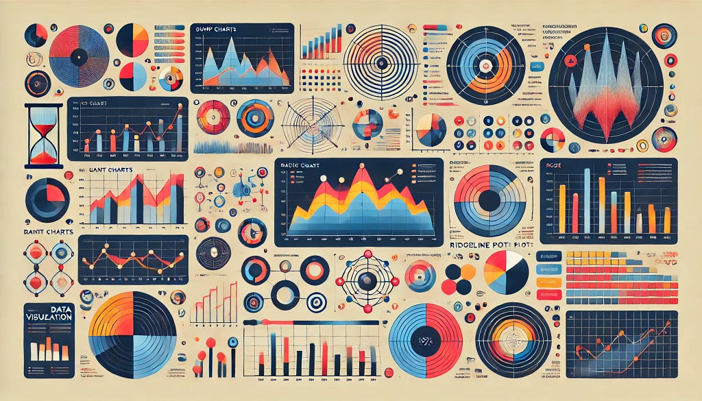
Beyond Line and Bar Charts: 7 Less Common But Powerful Visualization Types
Step up your data storytelling game with these creative and insightful visualizations
In a previous article, I shared my journey of creating one visualization every week since 2018 — I have 350+ of them now on my Tableau Public profile! Not surprisingly, among all the visualization types, I have used bar charts and line charts the most. They are simple but highly effective and intuitive in telling stories. However, I sometimes feel bored making similar charts over and over again, and they could fail to demonstrate complex data patterns.
In this article, I will introduce seven less common but powerful visualization types. I will talk about their specific use cases, share my visualization examples, discuss their strengths and weaknesses, and show you how to create them in visualization tools like Tableau.
1. Bump Chart: Tracking Ranks Over Time
A bump chart is a special type of line chart that visualizes the change in rank of multiple categories over time. Its y-axis is the category ranks, so it shows how the categories “bump” each other up and down over time. Therefore, It is perfect to demonstrate the competition between categories.
Limitations: Since it only keeps the rank information but overlooks the underlying value, it doesn’t show the scale of differences between categories and the value change of each category over time. Therefore, it’s your choice depending on the story you want to tell — If your main goal is to emphasize the relative rank changes among certain categories, it is the perfect visualization type for you; But if you also want to show how the differences between two categories are increasing/shrinking over time, a traditional line chart might be better.
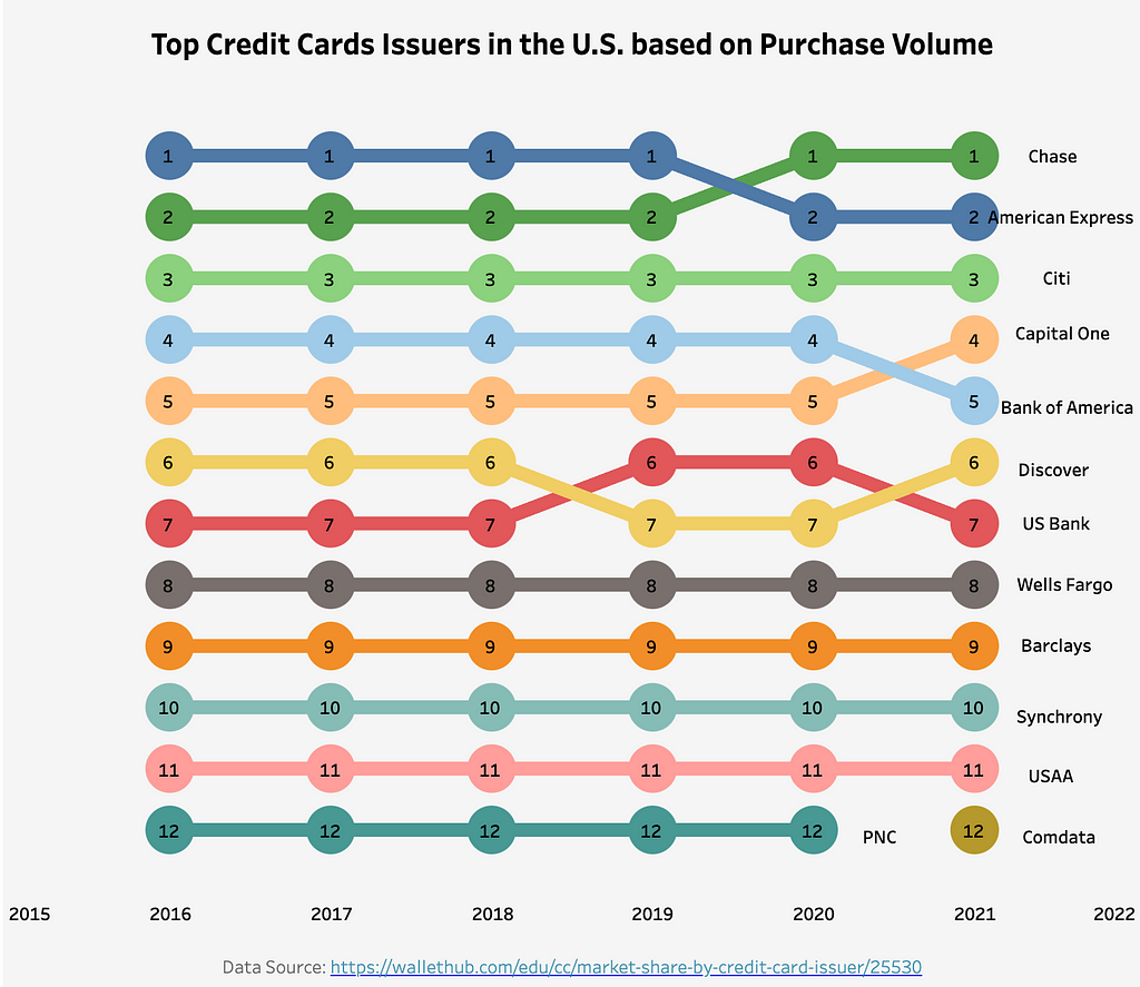
Example: In the above visualization, I plotted the rank of U.S. credit card issuers based on their purchase volume by year. You can clearly see that while American Express was in the 1st place, Chase has surpassed it since 2020. Meanwhile, Citi has always been in the 3rd place between 2016 and 2021. However, as mentioned earlier, this chart does not tell us how large the differences between Chase and American Express are, or if the overall market is expanding or shrinking.
How to make it:
- Set the Time Dimension: Place the time dimension (e.g. years, months) on the x-axis.
- Calculate Ranks: For each category at every time point, calculate the rank based on the metric of interest (purchase volume in my example). In Tableau, this can be done using the RANK() function. Please make sure that you set up the calculation correctly by choosing the appropriate dimension in the Compute Using settings.
- Plot the Lines: Use a line chart to connect the ranks of each category over time.
2. Gantt Plot: Visualizing Schedules and Flows
A Gantt Plot is a special type of bar chart. People often use it in project management to visualize task schedules. You might have seen it in tools like JIRA. Unlike common bar charts, bars in a Gantt Plot do not start at the same value. Instead, the bars start at the event start time, and their lengths represent the duration of the event. You can also use it to show value changes (instead of duration) alongside a series of events or categories.
Limitations: A Gantt plot contains rich information as it shows both the schedules and durations in one chart. However, the fact that not all bars start from the same value makes it less intuitive to compare the duration across the events or categories. If you need to emphasize the duration differences, it might not be the best choice.
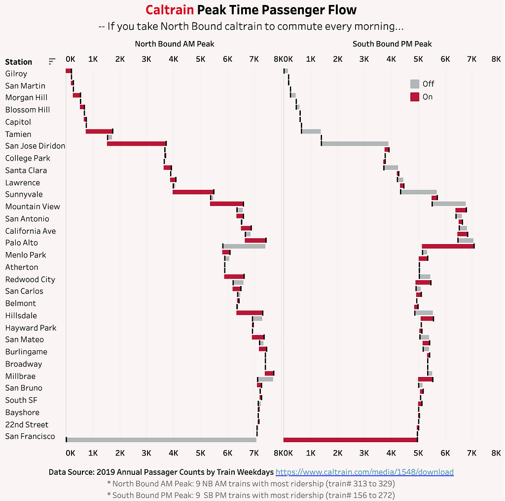
Example: My visualization above shows the Caltrain passenger flow at each station during its peak time. In this Gantt Plot, I do not visualize the time schedule but show the passenger volume changes. The red bars represent how many passengers get on the train, while the grey bars represent the number of passengers getting off. For example, during the morning peak hours, on the northbound trains, we see more passengers board at stations like San Jose and Sunnyvale, while more people get off than get on at the Palo Alto Station.
How to Make It:
1. Define the Two Axes: You should put the numeric variable (e.g. dates, volume) on the X-axis, and have the categories (e.g. tasks, events) listed in sequence on the Y-axis.
2. Plot Bars to Show Duration or Value Changes: For each category, decide the starting point, then draw a bar with the length representing the duration/change size.
Gantt plot is a chart type supported by Tableau natively. You should drag your measure that represents the starting value to the Columns, and put the change size measure on the Size card. Here is an official tutorial.
3. Radar Chart: Visualizing Multi-Dimensional Data
A radar chart is also known as a spider chart or web chart given its shape. It no longer has two axes, but multiple axes depending on how many variables your dataset has. Therefore, it is a great fit for visualizing multivariate data — it allows you to compare multiple aspects of severable records/items at the same time.
Limitations: While radar charts are helpful in visualizing multiple dimensions, that does not mean you can include as many axes as you want. When there are too many dimensions, the chart will get very busy, making it hard for the audience to digest useful information quickly.
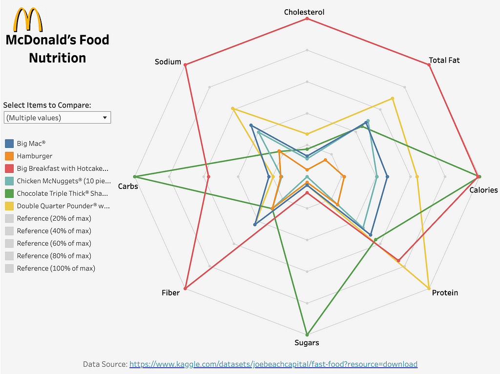
Example: In the visualization above, I compared the nutrition profiles of multiple McDonald’s menu items using a radar chart. Each axis of the chart represents a common nutrient like Carbs or Protein, and each colored curve is one menu item. For example, you can see that the Chocolate Triple Thick Shake is extremely high in Total Carbs and Sugars, while the Hamburger is more balanced across the nutrients. I also normalized the dimensions by the maximum value, so they all start with 0% and end with 100% (of maximum), as shown by the grey reference lines.
How to Make It:
1. Define the Axes: Each axis in the Radar Chart should represent a variable that you want to compare. Generally speaking, you should keep the number of axes in the range between 3 to 8.
2. Normalize the Scale: It is important to make sure all variables are on a similar scale or normalized. This will make the comparison more intuitive and less biased by different scales. For example, you can adjust the axis scale to 0%-100% of its maximum as I did above.
3. Plot the Data: For each item, plot points on each axis based on its value for that variable, then connect the points to form a polygon.
Specifically, if you want to make a Radar Chart in Tableau, you can calculate the x and y coordinates using calculated fields with some simple trigonometric functions. Assuming you have X variables (therfore X axes) and they each have a unique index of 0 to X-1, and the value for each variable is stored in a value field:
- angle = [index] / X * (2 * pi()): this creates a new field angle, representing the angle to the x-axis of each variable on the chart.
- X-coordinate = [value] * COS([angle]) and Y-coordinate = [value] * SIN([angle]) : These two fields calculate the coordinates of an item on a specific variable axis.
You can read more in this article.
4. Rose Chart: Unfolding Data in Circular Form
A rose chart, also known as a polar area chart or wind rose, is a circular visualization. It indeed looks like a rose — each of its “petals” is a data category, and the radius of the “petals” represents the category value. It might look like a pie chart at first glance, but each segment of the rose chart has the same angle but a different radius. Rose charts work best when you want to show the proportional size of each segment and the distribution within it.
Limitations: Rose charts can be difficult to read when there are too many categories or when the differences between the categories are too small. They are also not as intuitive as stacked bar charts for audiences who are unfamiliar with this type of visualization.
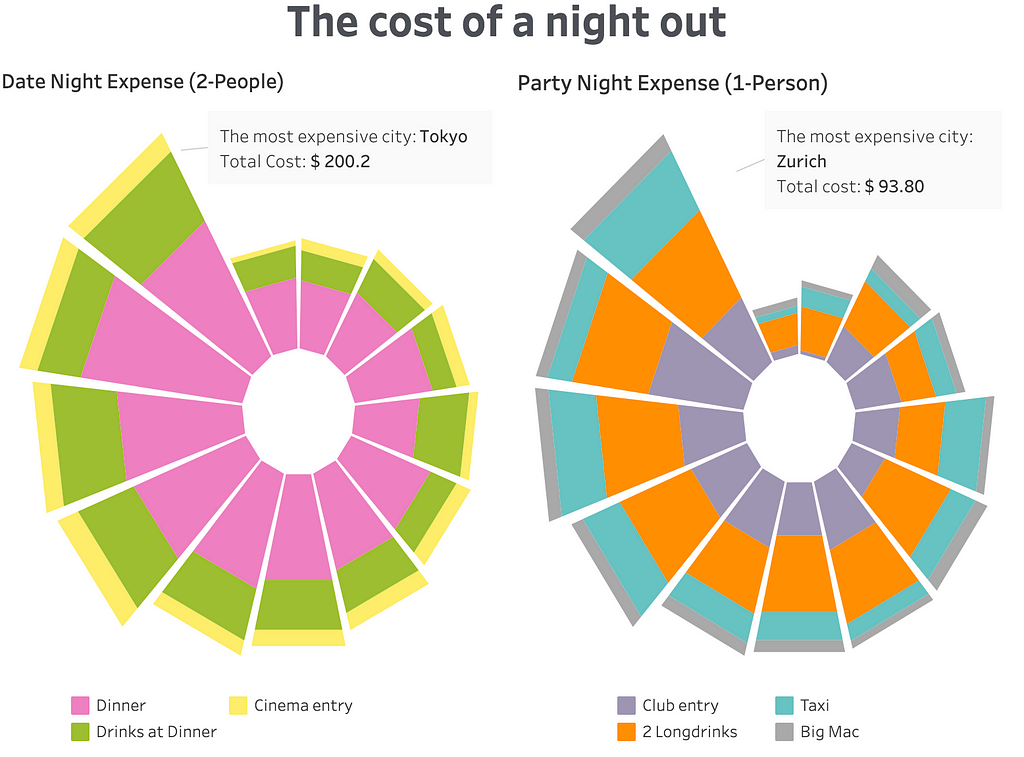
Example: My visualization above compares the cost of a night out in various cities for a date night for two people and a party night for one person. Each rose chart represents a breakdown of expenses for various activities. If you open it in Tableau, you can hover over each segment to see the city name, segment, and costs.
How to Make It:
1. Define the Categories: Determine the categories and allocate them in angular sectors (“petals”) around the circle with the same angle.
2. Calculate the Radius: The radius of each category represents the value for that category. If you have multiple segments within each category, you should place them outward from the center, with their radius proportional to their values.
Making it in Tableau could be pretty tricky as you need to use a Polygon chart with a set of point coordinates to plot a smooth curve. You can see in my example above that I only used minimal points (the four points on the corners) for each segment, so the outer shape looks more straight than it ideally should be. You can read more about the detailed methodology in this article. Alternatively, you can make it more easily in Python with packages like Plotly.
5. Circular Bar Plot: Adding a Twist to Traditional Bar Charts
A circular bar plot is a variation of a bar chart. While the traditional bar charts are plotted on a Cartesian coordinates system as straight bars, the circular bar chart is on a polar coordinates system and plots bars around a circle. It provides a visually attractive way to show the differences across categories.
Limitations: Circular bar plots can be challenging to read when there are many categories. The curvature of the bars can distort perception (just as with the pie chart), making it harder to judge the actual lengths compared to traditional bar charts.
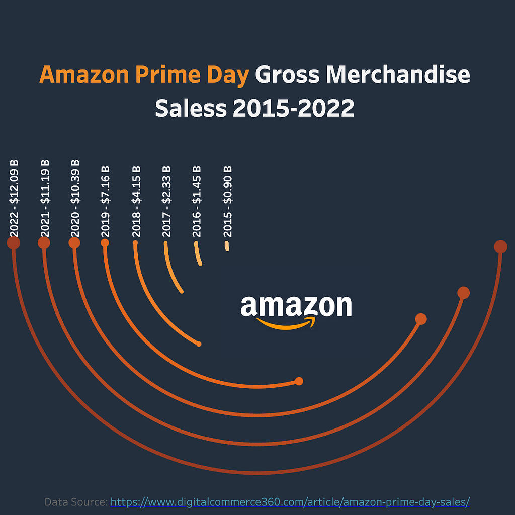
Example: The visualization above shows Amazon Prime Day’s Gross Merchandise Sales from 2015 to 2022. In this chart, each circular bar represents the total sales on that year’s Prime Day. The circular layout also mimics the shape of Amazon’s logo. It might be hard to compare the actual sales without the labels, but it creates a visually appealing way to show the exponential sales growth.
How to Make It:
1. Determine the Categories and Values: Similar to a classic bar chart, you only need two values here— categories and their sizes.
2. Plot the Circular Bars: Each circular bar will represent a category. They should start on the same axis around the same central point. The end angle of each bar should be proportional to its value.
In Tableau, you can achieve this by creating bins to plot each circular bar as a series of points. You can follow a detailed guide here. Alternatively, you can use existing Tableau extensions like this one.
6. Ridgeline Plot: Revealing Trends Across Multiple Distributions
A ridgeline plot is also known as a joyplot. It displays the distribution of multiple categories over time or another continuous dimension. Each category is represented by a density plot or an area chart. Then they are layered one above another (usually along a certain sequence). This special layout makes it just look like the mountain ridgelines. This visualization type is especially useful for showing how each category catches up with and replaces another. One of its very popular use cases is to visualize the Google Search Trends.
Limitations: if the distribution of each “ridge” is not unimodal or when there are too many categories competing with each other, the ridgeline plots could be hard to digest.
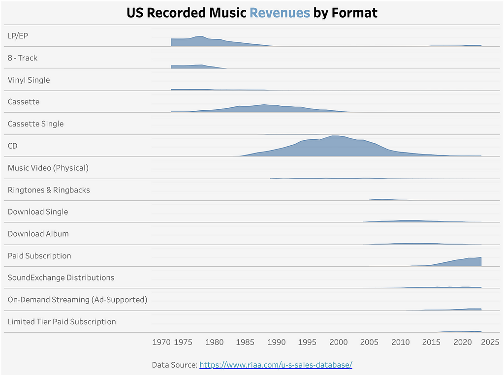
Example: My visualization above shows the evolution of U.S. recorded music revenues by format from 1970 to 2025. Each ridgeline represents the revenue of a different music format over time. The plot shows how the popularity of different formats has shifted. For example, CD was the dominant music distribution format between 1990 to 2010, but it has been replaced by the paid music subscription.
How to Make It:
1. Create Individual Area Charts: For each category, plot an area chart (or density curve or histogram) to represent its value over time (or another numeric dimension).
2. Stack the Plots: Stack the plots vertically, one above another. You should be careful with the sequence of the categories to show the data insights. In my example above, I manually adjusted the order of the music formats to show the evolution of popularity over time.
To make this in Tableau, you can simply use the Area Chart to plot the trend of each category over time, then put the categories on the Rows to stack them.
7. Sankey Diagram: Visualizing Flows and Relationships
A Sankey diagram is a flow chart to show the movement or distribution of resources (e.g. money, energy, people) between different stages or categories. The width of each flow represents the magnitude of the movement. Therefore, it is a powerful visualization type to demonstrate complex changes.
Limitations: Sankey diagrams can become overwhelming to interpret when there are too many categories or flows. They are best used when you want to highlight a few key flows or relationships.
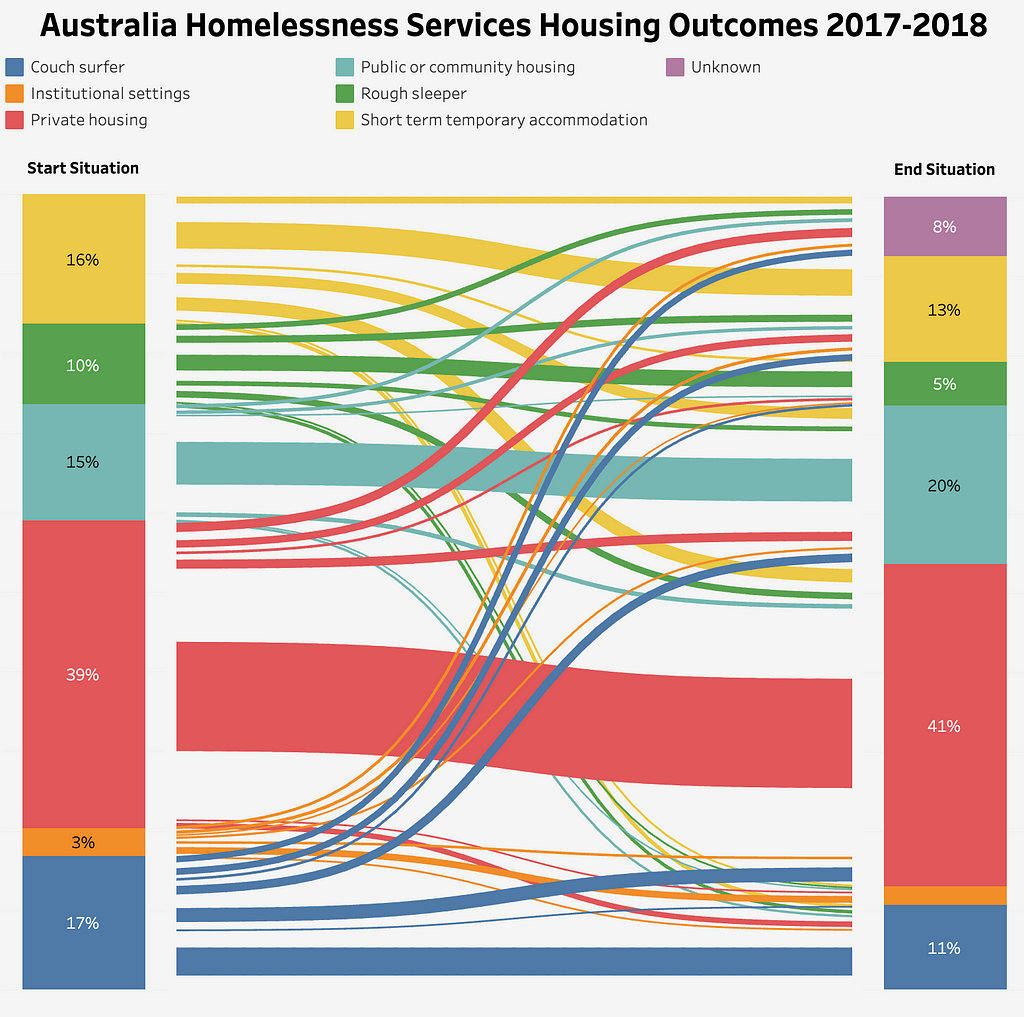
Example: The Sankey Diagram above visualizes the housing situation of participants in the Australia Homelessness Services from 2017 to 2018. It uses different colors to represent the different housing situations. The colors of the flows correspond to their start situations. It shows that fewer participants were couch surfers or in short-term temporary accommodation after the program ended. However, there was an 8% unknown status in the end situation, preventing us from drawing more reliable conclusions.
How to Make It:
1. Identify the Nodes: Nodes in a Sankey Diagram are the starting and end points, and the intermediate stages (if any). They are the essential components of a Sankey Diagram.
2. Plot the Flows: Flows connect the nodes. To define a flow, we need to know: 1. What are the nodes it connects, and 2. The size of the flow (percentage of people in my example).
In Tableau, it is very complicated to create a Sankey Diagram manually, as you will need to create all the points that will be used to draw the curves. This usually needs to be done by creating bins and calculating coordinates with the Sigmoid function. This article provides a clear step-by-step guide. However, Tableau offers an official extension, which you can use to build a Sankey Diagram much more easily.
Plotly also offers an easy way to make a Sankey Diagram in Python.
Conclusion
Each of the above visualization types has its unique strengths (and weaknesses). If used appropriately, they can bring a fresh perspective to your data storytelling. Next time when you want to visualize a dataset differently, consider stepping outside the classic bar and line charts, and using one of these visualizations. It can help you highlight complex data patterns and make your analyses more engaging.
Do you know any other less common but useful visualization types? Please share your thoughts and experiences in the comments below!
If you have enjoyed this article, please follow me and check out my other articles on data science, analytics, and AI.
- Seven Common Causes of Data Leakage in Machine Learning
- 330 Weeks of Data Visualizations: My Journey and Key Takeaways
- Evaluating ChatGPT’s Data Analysis Improvements: Interactive Tables and Charts
Beyond Line and Bar Charts: 7 Less Common But Powerful Visualization Types was originally published in Towards Data Science on Medium, where people are continuing the conversation by highlighting and responding to this story.
from Datascience in Towards Data Science on Medium https://ift.tt/LmMEI0a
via IFTTT
