
Four Ways to Credit a Source in a Chart
Data Visualization, Data Storytelling
A practical tutorial on where you should place credits in your next data visualization

When you build a chart with data that is not ours, you must cite the source from which you took the data. This serves to do justice to the work done by others and increase your credibility towards those who will look at the graph. If you cite the data source, your chart will surely be more authoritative because it is based on verifiable data.
In this article, you will see four strategies for placing credits in a chart, although you can use your creativity to place it wherever you want:
- Under the title/subtitle
- Under the main chart
- Under the next steps
- Sideways.
Under the title/subtitle
Placing the credits under the title/subtitle generates a sense of trust in the audience from the beginning of the story. The following figure shows an example of credits under the title/subtitle.

Use this placement if you want your audience to know the sources from the beginning of the story. Although this placement may generate trust, it could also be distracting since the audience may leave your story to search for the sources.
Under the Main Chart
Placing the credits under the main chart involves adding detail to the story's main point, which helps reinforce the story's essential points. The following figure shows an example of credits placed under the main chart.
Use this placement if you want to reinforce the main message of your chart.
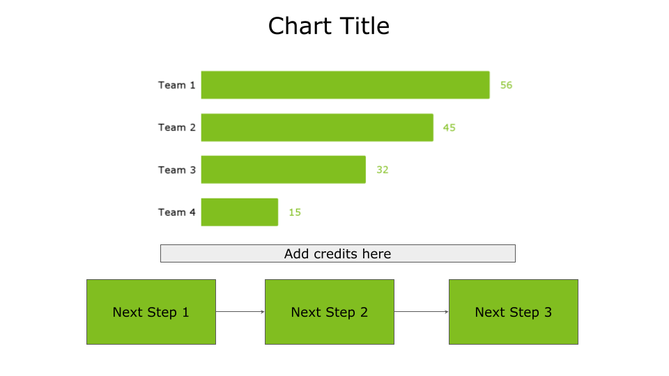
Under the Next Steps
In this case, credit the sources at the end of your story as an appendix to the next steps, as shown in the following figure.

Use this placement if you want to reinforce the next steps of your story.
Sideways
Placing credits sideways means considering them as external to the main data story workflow. You can place credits on the left or right, as shown in the following figure.
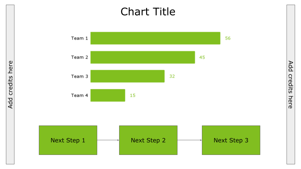
Use this placement to keep credits external to your main data story workflow and keep the audience concentrated on the story.
Discussion
You have seen how to place credits in a chart. If you have read carefully, at a certain point, precisely in the last type of placement—sideways—I talked about the main data story workflow. But what is it exactly? Any chart, if done well, tells a story, and a story normally follows a flow from the initial scene to its completion, with the final scene.
Even in a simple chart, you can tell a story, and precisely, a story in a chart has three main points: a beginning, a main point, and a final part.
The beginning corresponds to the context used to frame the chart's content. Usually, you can insert the context immediately under the title, but you can also put it in other parts, such as on the left of the chart. In general, insert the context before the main chart so the reader can read it before the graph.
Then, there is the main point that corresponds precisely to your chart.
Finally, there is the final part of the story, which corresponds to the next steps. Place the next steps at the bottom, i.e., below the chart or to the right, so the reader will read them after reading the other parts of the graph.
Summary
Congratulations! You have just learned four possible ways to place credits in your chart. You have the following options: under the title/subtitle, under the main chart, under the next steps, or sideways.
Choosing one solution over another depends on your aesthetic taste and the space you have in the chart. The important thing is that the credits do not hinder the normal flow of the story.
This is a small final tip. If you can, always add a link to the data source in the credits so that the reader can personally verify the integrity of the data you show in your chart.
That’s all for me today. Thank you, as always, for reading the article.
You may also be interested in…
- Data Storytelling with Altair and AI
- Four Ways to Explain Insights Extracted from Data
- How to Tailor a Chart to an Audience of Professionals
Extra Bonus…
If you want to learn more about turning your raw chart into a story, you can use the DIKW (Data-Information-Knowledge-Wisdom) pyramid.
Over the past few years, thanks to my children's creativity and work, I have developed a passion for origami. This passion inspired me to create a practical pyramid to keep on the desk as a gadget.
In the DIKW origami pyramid, you will find, in a compact way:
- the steps from data to wisdom
- how to use them to transform data into a story
- how to use Generative AI to help you build the story
In the following video, I explain how to create a DIKW pyramid gadget and how to use it to turn data into a story. You can download the DIKW pyramid origami template here.
Four Ways to Credit a Source in a Chart was originally published in Towards Data Science on Medium, where people are continuing the conversation by highlighting and responding to this story.
from Datascience in Towards Data Science on Medium https://ift.tt/t3XRI8G
via IFTTT


