
Adding Gradient Backgrounds to Plotly Charts
Using Plotly rectangle shapes to improve data visualisation
Adding gradients or segments to the background of a plot can help improve the clarity of the information that you are trying to present. It can help draw attention to areas that are high or low, or it can be used to identify if a measurement is going out of tolerance. For example if an LWD logging tool is experiencing high vibrations which exceed the specification for that tool or it can be used for temperature data to highlight hot and cold areas.
In this article, I will share how we can, with a little bit of code, add a gradient background to a Plotly Express line chart.
Creating the Data
Before we can begin making plots we first need to create a dataset. For this example, I am using randomly generated temperatures over period of time.
First, we will need to import the libraries we are going to use.
- plotly express will be used to generate our plot
- matplotlib will be used to generate our colour map and convert the selected values to hexidecimal
- numpy will be used to help create our colour scale
import plotly.express as px
import matplotlib.pyplot as plt
import matplotlib.colors as mcolors

import numpy as np
Next, we will create two lists. One containing our recorded times, and the second our recorded temperatures.
times = ['2024-08-27 00:00:00', '2024-08-27 01:00:00', '2024-08-27 02:00:00', '2024-08-27 03:00:00', '2024-08-27 04:00:00',
 '2024-08-27 05:00:00', '2024-08-27 06:00:00', '2024-08-27 07:00:00', '2024-08-27 08:00:00', '2024-08-27 09:00:00',
 '2024-08-27 10:00:00', '2024-08-27 11:00:00', '2024-08-27 12:00:00', '2024-08-27 13:00:00', '2024-08-27 14:00:00',
 '2024-08-27 15:00:00', '2024-08-27 16:00:00', '2024-08-27 17:00:00', '2024-08-27 18:00:00', '2024-08-27 19:00:00',
 '2024-08-27 20:00:00', '2024-08-27 21:00:00', '2024-08-27 22:00:00', '2024-08-27 23:00:00', '2024-08-28 00:00:00',
 '2024-08-28 01:00:00', '2024-08-28 02:00:00', '2024-08-28 03:00:00', '2024-08-28 04:00:00', '2024-08-28 05:00:00']

temperatures = [1.2, 18.5, 12.0, 8.0, -5.3, 25.0, -8.3, 16.0, 8.0, 11.2, -9.4, 19.1, 15.0, -3.6, -4.5, -15.0, -0.9, 5.7, 3.0, -1.3,
 8.4, -5.8, -1.2, 1.0, 3.7, 13.6, -4.0, 5.4, 7.8, -8.6]
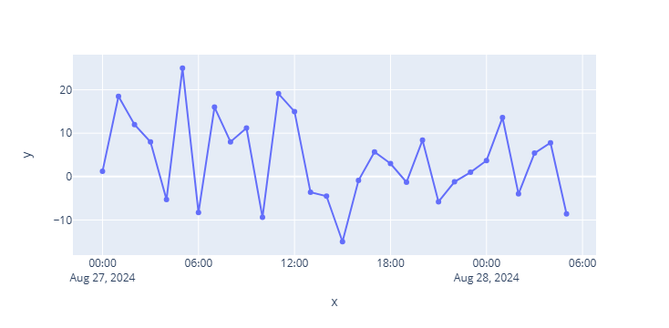
Now that we have created the data and imported the required libraries, we can visualise the data using the plotly express line plot with this simple call.
px.line(x=times, y=temperatures, markers=True)
Adding Coloured Segments to a Plotly Chart
In the case where we only want a few segments on the plot to highlight our ranges. For example, displaying tolerance shading on a plot can help visualise when we are within or outside of predefined limits.
For this first example, we are going to create 5 segments on our chart with colours that are sampled from the coolwarm matplotlib colormap.
We do this by specifying the number of segments we want ( num_segments ) and calling upon the colormap we want from plt.get_cmap()
Once we have these defined we need to loop over the colormap and extract the colours for our 5 segments. This is then converted into hexidecimal values.
num_segments = 5

cmap = plt.get_cmap('coolwarm')
colours = [cmap(i / (num_segments - 1)) for i in range(num_segments)]
hex_colours = [mcolors.rgb2hex(colour) for colour in colours]
In order to give a start and end position for our segments, we need to create a linearly spaced array with np.linspace . In this example, we will create the array between -20 and +30.
min_y = -20
max_y = 30

segment_positions = np.linspace(min_y, max_y, num_segments+1)
This gives us the following array which will form the bounds of each segment.
array([-20., -10., 0., 10., 20., 30.])
We can then recreate our line plot as before, and then initiate a for loop.
Within this loop we are looping over the range of segments we defined above, and then adding a transparent rectangle between the bounds that we have defined.
fig = px.line(x=times, y=temperatures, markers=True)
fig.update_traces(line=dict(color='black'))

for i in range(num_segments):
    fig.add_hrect(y0=segment_positions[i], y1=segment_positions[i+1],
                  line_width = 0,
                  fillcolor=hex_colours[i],
                  opacity=0.4)

fig
When we run the above code we will get the following plot. As we are using coolwarm colormap we have higher temperatures in orange and red, and cooler temperatures tending towards blue.
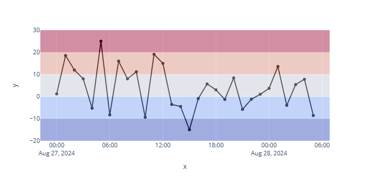
One small issue with the plot above is that the transparent shapes are overlaying the lines.
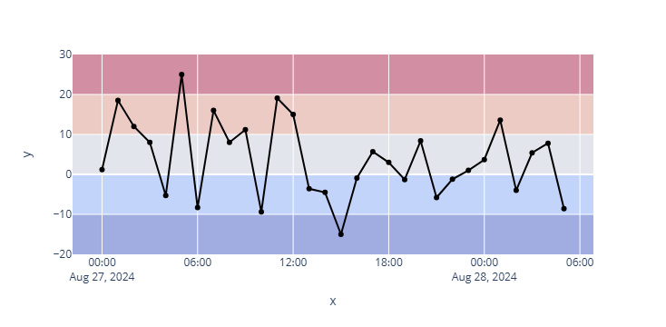
To solve this we need to add a parameter layer to the add_rect function and set it to below .
fig = px.line(x=times, y=temperatures, markers=True)
fig.update_traces(line=dict(color='black'))

for i in range(num_segments):
    fig.add_hrect(y0=segment_positions[i], y1=segment_positions[i+1],
                  line_width = 0,
                  fillcolor=hex_colours[i],
                  opacity=0.4,
                  layer='below')

fig
Now when we run the code we will get the following plot with the shading behind our line.
Combining it Altogether
To make things easier for generating the coloured shading for the plot we can move our code into a function like below.
This will return the list of hex colours alongside the segment positions.
def generate_hex_colours(num_segments=5, min_y=0, max_y=10, cmap_name='coolwarm'):
    """
    Generate a list of hex colors based on a colormap and number of segments.

    Parameters:
    num_segments (int): Number of color segments to generate. Default is 5.
    cmap_name (str): The name of the matplotlib colormap to use. Default is 'coolwarm'.

    Returns:
    list: A list of hex color strings.
    """
    cmap = plt.get_cmap(cmap_name)

    colours = [cmap(i / (num_segments - 1)) for i in range(num_segments)]
    hex_colours = [mcolors.rgb2hex(colour) for colour in colours]

    # Create a linear sequence of values between specified values
    segment_positions = np.linspace(min_y, max_y, num_segments+1)

    return hex_colours, segment_positions
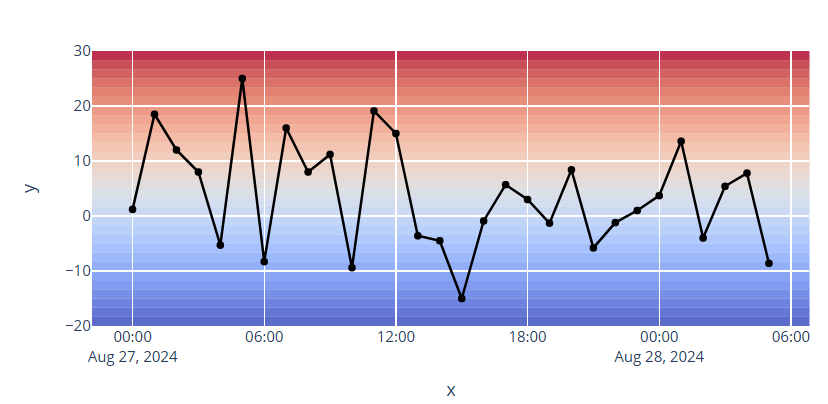
We can then call upon the function, create our line plot and loop through each of the segments. In this case we are going to create a colour gradient on our plot that contains more colours.
num_segments = 30
hex_colours, segment_positions = generate_hex_colours(num_segments, min_y=-20, max_y=30)

fig = px.line(x=times, y=temperatures, markers=True)
fig.update_traces(line=dict(color='black'))

for i in range(num_segments):
    fig.add_hrect(y0=segment_positions[i], y1=segment_positions[i+1],
                  line_width = 0,
                  fillcolor=hex_colours[i],
                  opacity=0.8,
                  layer='below')

fig
When we run the above code, we get back the following figure.
Summary
Within this short article we have seen how we can easily enhance a data visualisation, such as a line plot of temperature variations, by adding a gradient background. This can help improve how readers interpret and understand your chart as well as providing extra visual appeal.
Thanks for reading. Before you go, you should definitely subscribe to my content and get my articles in your inbox. You can do that here! Also, if you have enjoyed this content and want to show your appreciation, consider giving it a few claps.
Adding Gradient Backgrounds to Plotly Charts was originally published in Towards Data Science on Medium, where people are continuing the conversation by highlighting and responding to this story.
from Datascience in Towards Data Science on Medium https://ift.tt/QbXZSV1
via IFTTT


