
All You Need to Know to Build Radial Charts in Tableau
You will never forget it after this!
Radial charts have always intimidated me because I considered them difficult — probably because all the tutorials I came across mentioned copying and pasting a few calculations without any logical explanations. Am I supposed to look it up every time I am in need of a radial chart?!
Well, luckily I am not a copy-paste person. I can remember things only when I understand them, and I like to grasp the concepts behind what I’m doing. So, I tried creating a radial chart while understanding the logic behind various steps involved, and it was like magic unfolding in front of me. So, let’s get to it!
Please note that for this article,
- All images, unless otherwise noted, are by the author.
- The dataset used is : The Sample — Superstore data set.
It is a free dataset which comes with Tableau. It contains information about products, sales, profits, and so on that we can use to identify key areas for improvement within this fictitious company.
We will start by understanding how to plot data on a circle. We will then implement the same principle to create two different types of radial bar charts.
First, some basics, please!
From school geometry, recall what we know about circles.
A circle is a two-dimensional figure consisting of all points equidistant from a given point. The given point is called the center and the distance is called the radius.
To plot a radial chart, we would need a radius and a centre.
Let’s assume, for simplicity, that we have only twelve data points. To plot these, we need :
- Radius(r):
Radius can be any arbitrary number depending on how big you would like the radial chart to be. For our purpose, let’s assume it to be 1. - Angle(θ):
Find a round watch/clock. Notice how all the numbers are spaced at a uniform distance. In a circular watch, there are 12 numbers located at 30° each(12 X 30°=360°). We also need our points to be located uniformly across the circumference. To achieve this, just divide 360 by the number of points to get the angle between them. - Co-ordinates ( x,y):
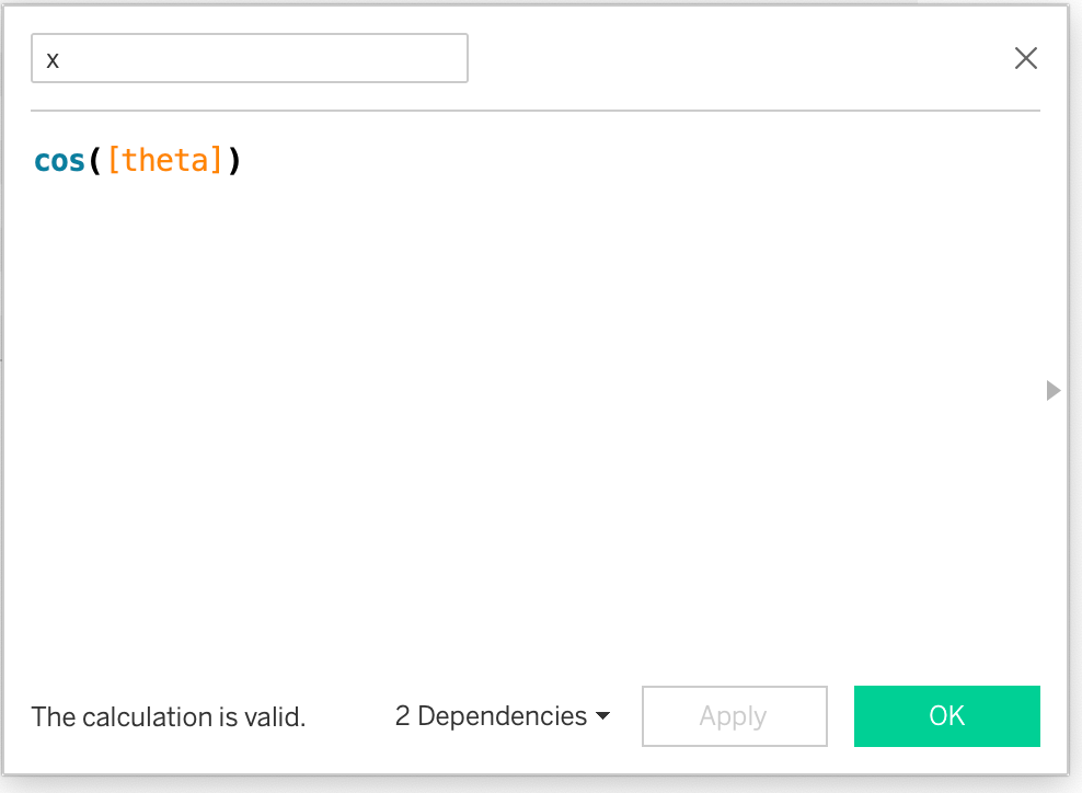
How do we map these twelve data points to the circumference? Recall the basic trigonometry formulas for cos(θ) and sin(θ) for a right-angled triangle :
cos(θ) = Base/Hypotenuse
sin(θ) = Perpendicular/Hypotenuse.
If we consider the radius to be the hypotenuse of a right triangle, then cos(θ) gives us x, and sin(θ) gives us the y-coordinate, since we are assuming radius is 1.
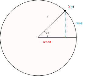
Now, in order to map the data points on a circle, we would need respective x, y co-ordinates for all the twelve data points.
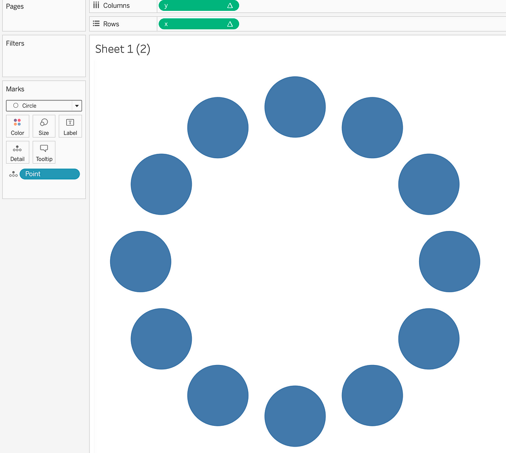
Basic Radial Chart
A basic radial chart can be built in just three steps:
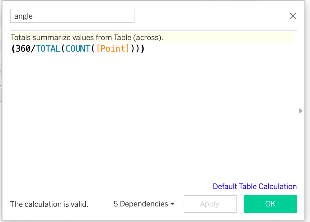
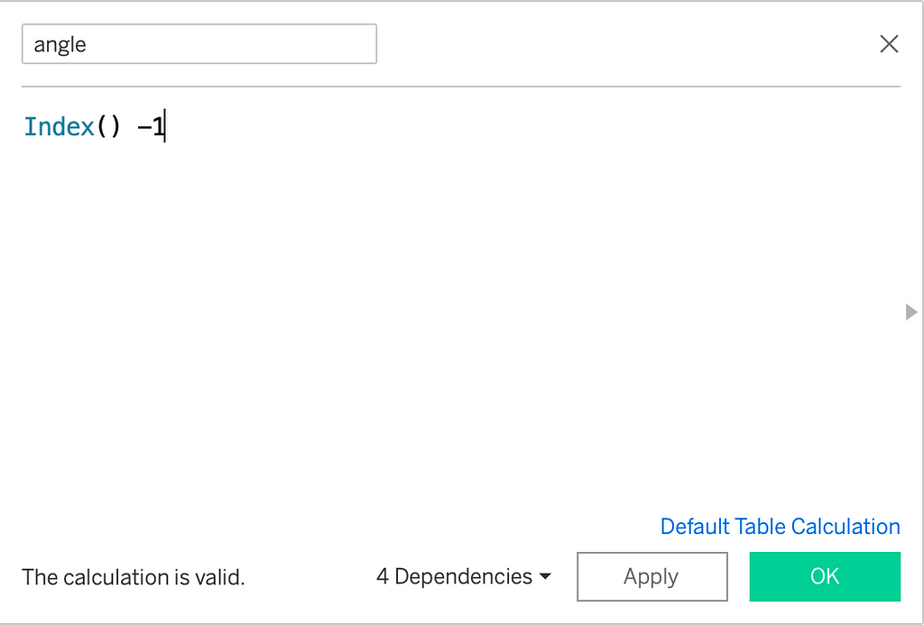
- Calculate Angle(θ):
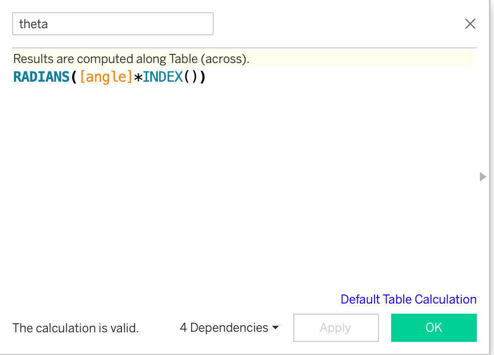
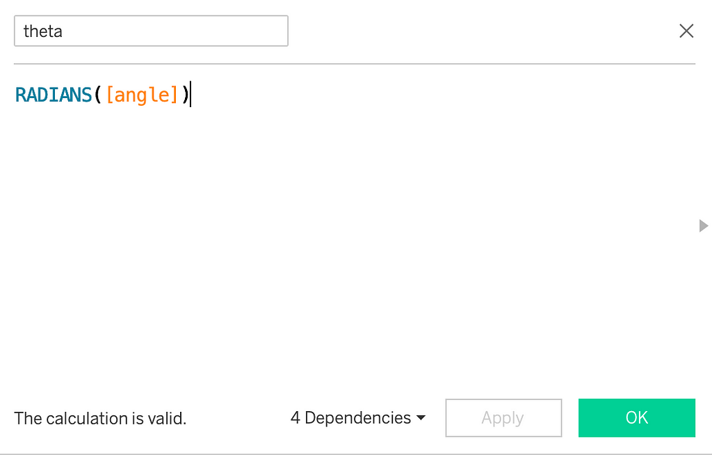
Total(count(Point)) gives the total number of points available in data set. In our case, it is 12. If you consider the Sample Superstore dataset, this point field can be region or city or basically any dimension. Dividing 360° in 12 equal parts gives the angle(𝚹) between two radii as 30°. Next, we multiple this angle by INDEX() to get the angle between the first and all other radii. So, the angle between first and second radii will be 30°. The angle between first and third radii will be 30+30=30 X 2=60° and so on. To convert this angle to radians, we use the in-built RADIANS() function.
2. Calculate (x, y) Co-ordinates:
The (x, y) can then be calculated asr*cos(theta) and r*sin(theta). Here, I have not used r because we have assumed it to be 1.

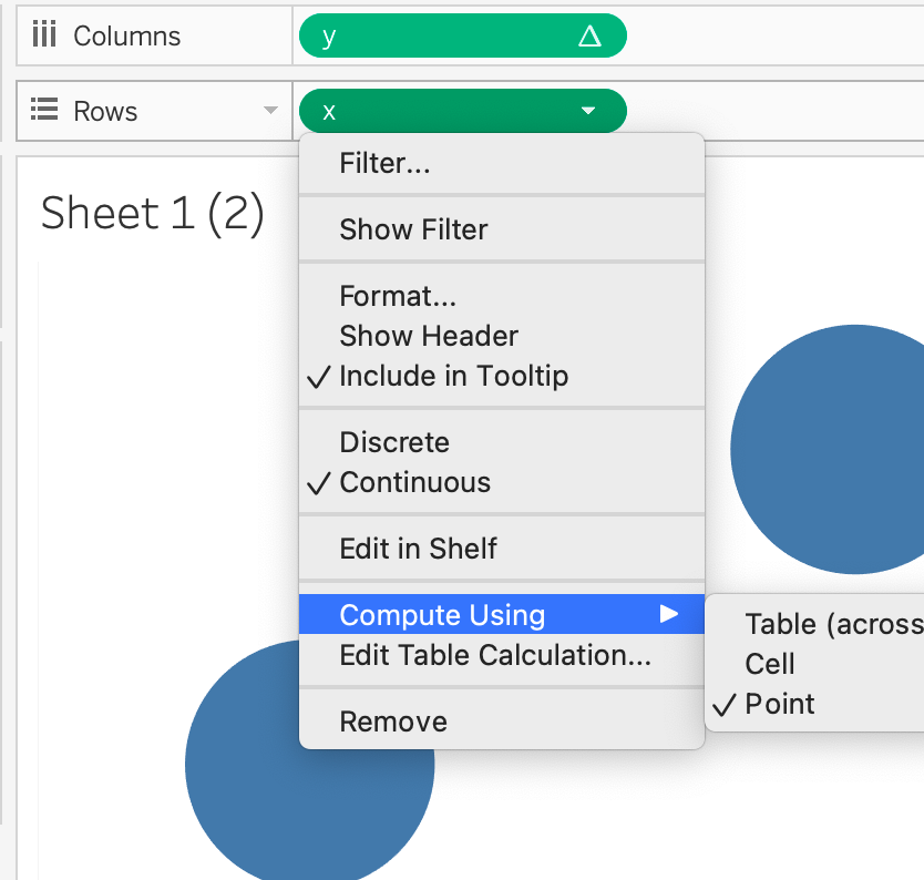
3. Add x,y Fields to the Shelves: Drag x to the rows shelf, y to the columns shelf, andPoint to the Detail Mark. We need to compute these fields using Point.We’re done!
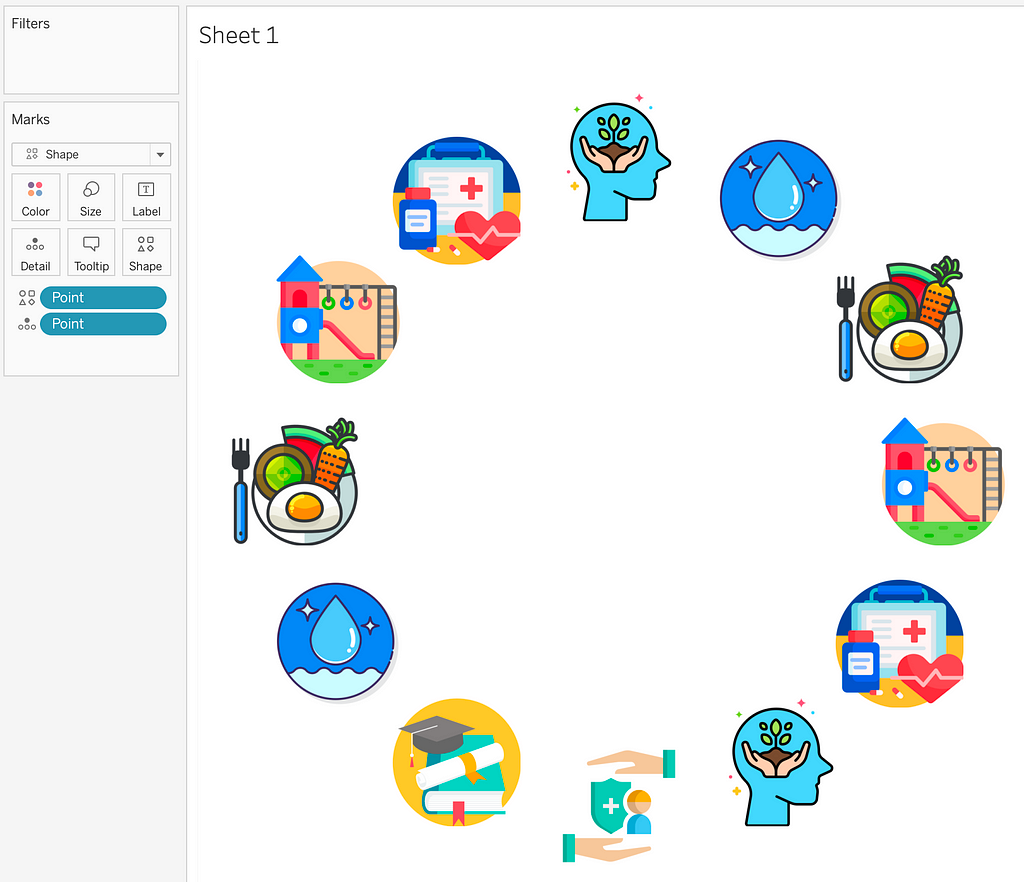
To improve the appearance, there are many options. For instance, we can use Shape as the Mark type instead of Circle and use different icons that can then work as buttons.
I used the same technique to show character traits in a viz on F.R.I.E.N.D.S. Here’s a snapshot from the data viz.

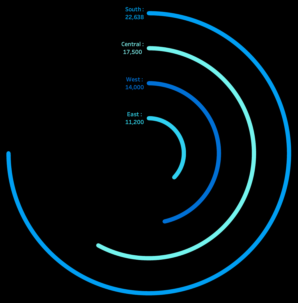
Radial Bar Chart
Now, let’s see how to use the same principle to build a radial bar chart. A typical radial bar chart contains multiple concentric circles-one for each dimension-with circumference length indicating the measure/volume in a three-quarter circle format.
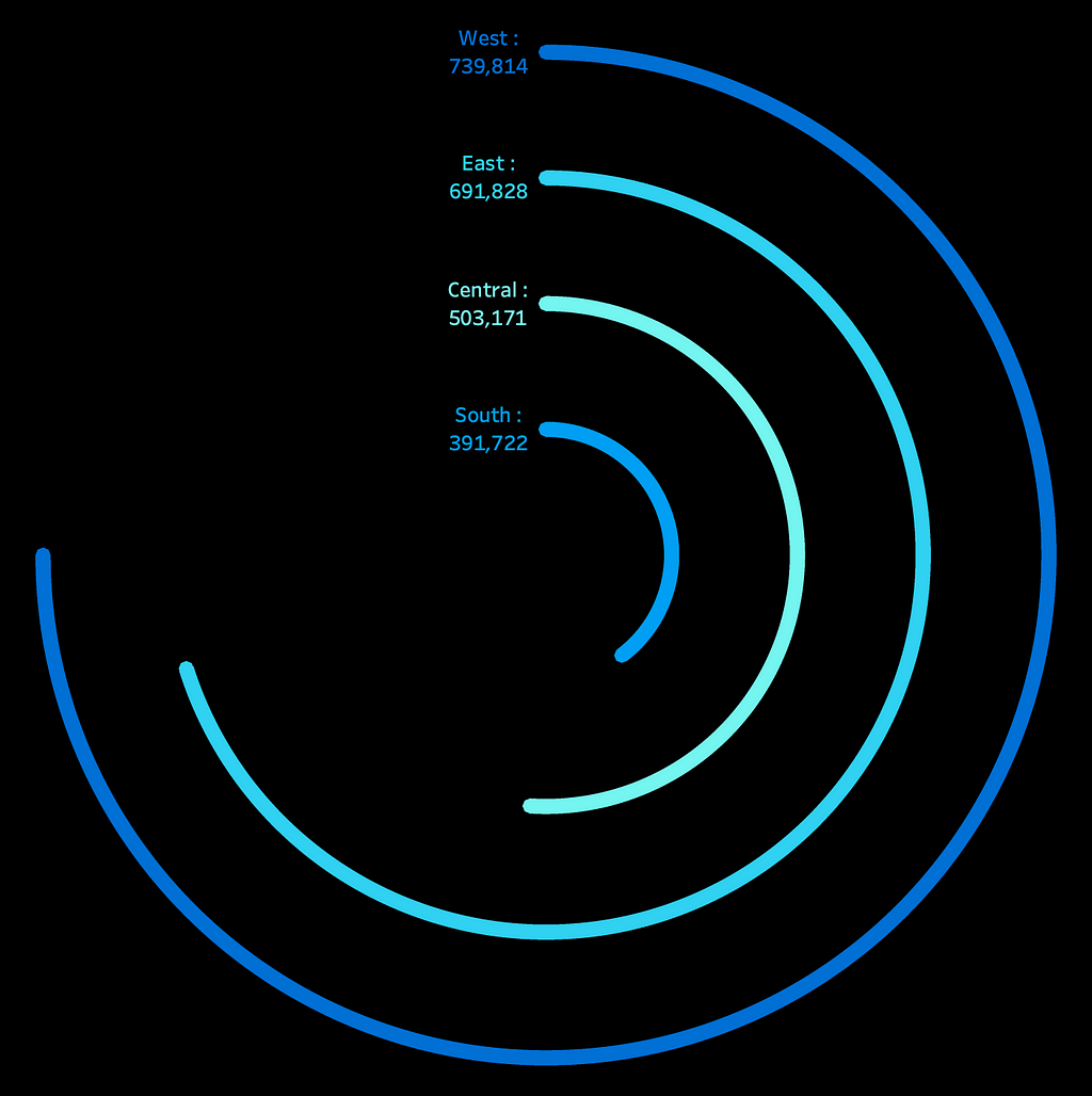
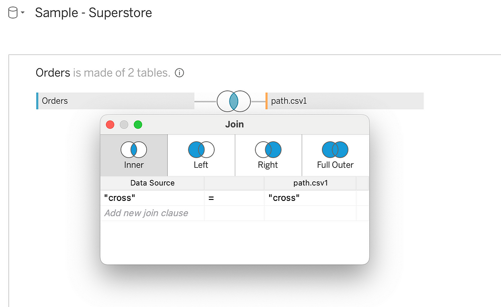
Taking the Sample Superstore example, let’s say we want to plot the regional sales in radial bar chart format. For this, we have one dimension — Region and one measure — Sales. We have four values in the dimension. To plot a circle for each of the four regions, we need to densify the data by creating multiple rows for the same region. This is called data densification. To do that, we will create a CSV file with just two values: 0 and 270.
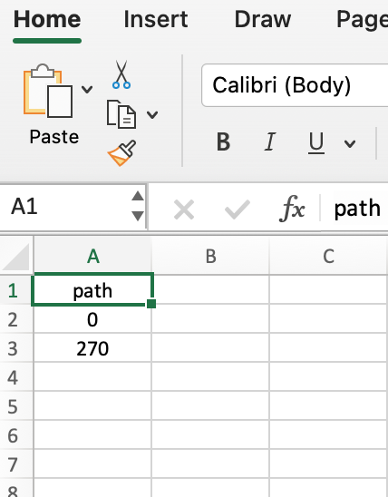
Since we are building only the three-quarter circle, our circumference will go from 0° to 270°. Hence, 0 and 270 in the csv file.
Next, let’s join this file with the Sample Superstore dataset. We will create a join condition to cross-join the two datasets, which will create two rows for each row in the Sample Superstore dataset.
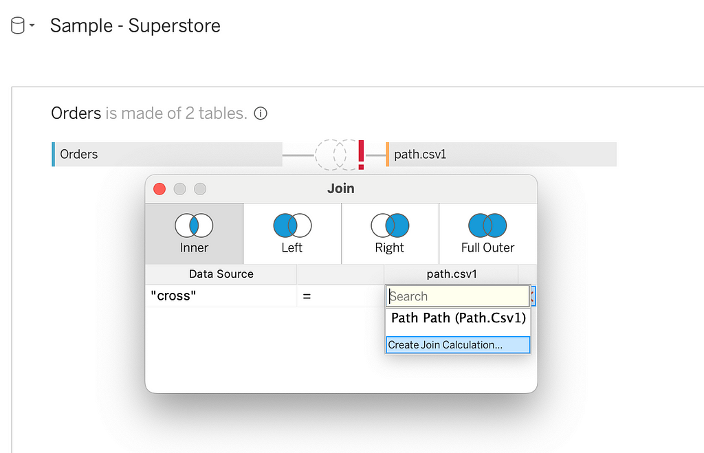
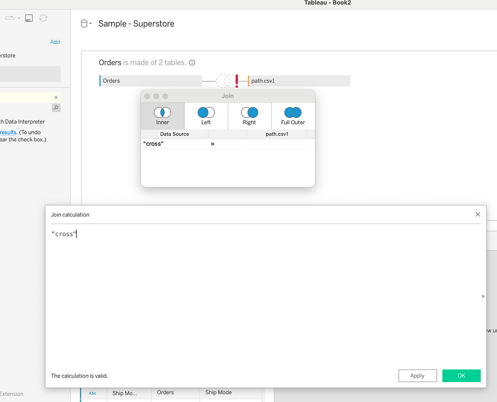
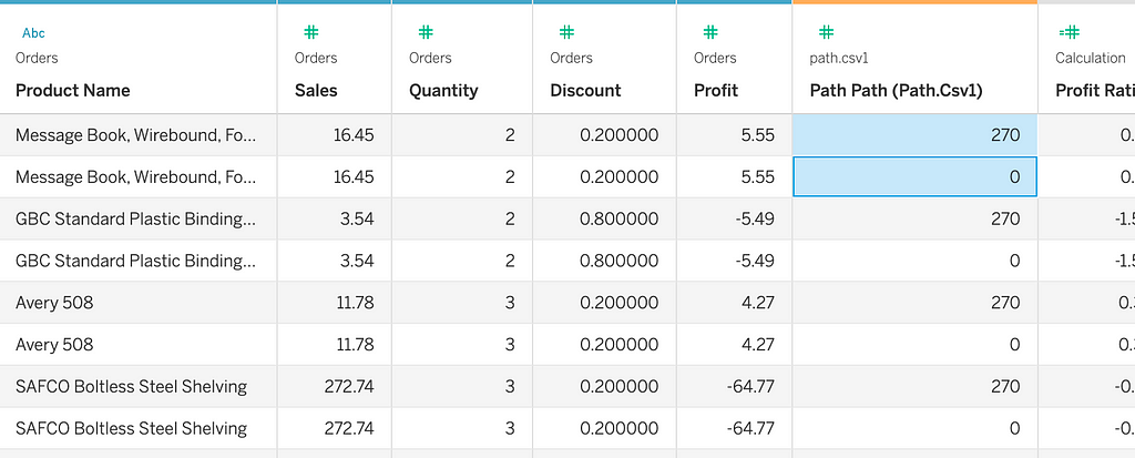
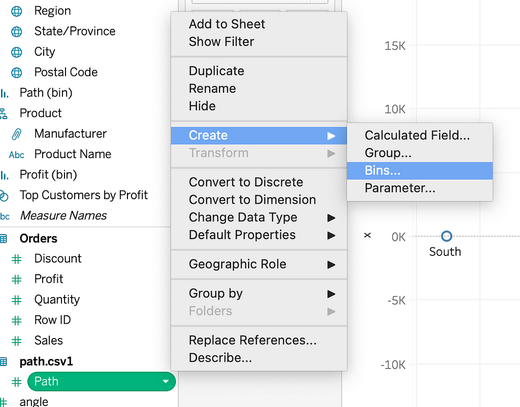
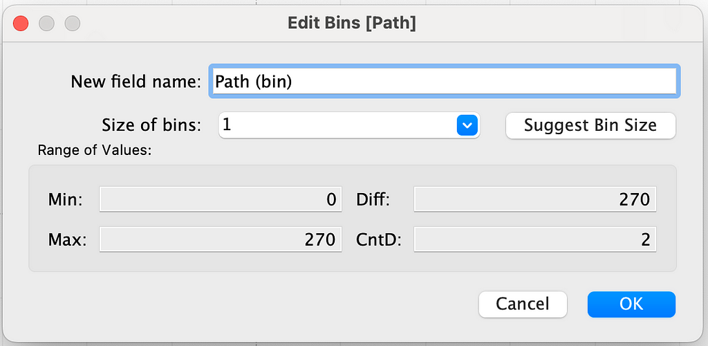
Now, we will densify this by creating a bin dimension. Let’s create a bin using the path dimension and keep the bin size as 1. For each row in the original dataset, we have created 270 rows/data points.
Angle:
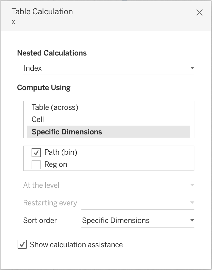
We want each of these data points to be spaced at 1° around the 270° circle. So, for the angle, we will directly use the Index() function. Since we want to start from 0, we will subtract 1 from it. If we go by the previous definition and divide 270 by total number of data points (270 in our case), we still get 1. θ would then be angle in radians.
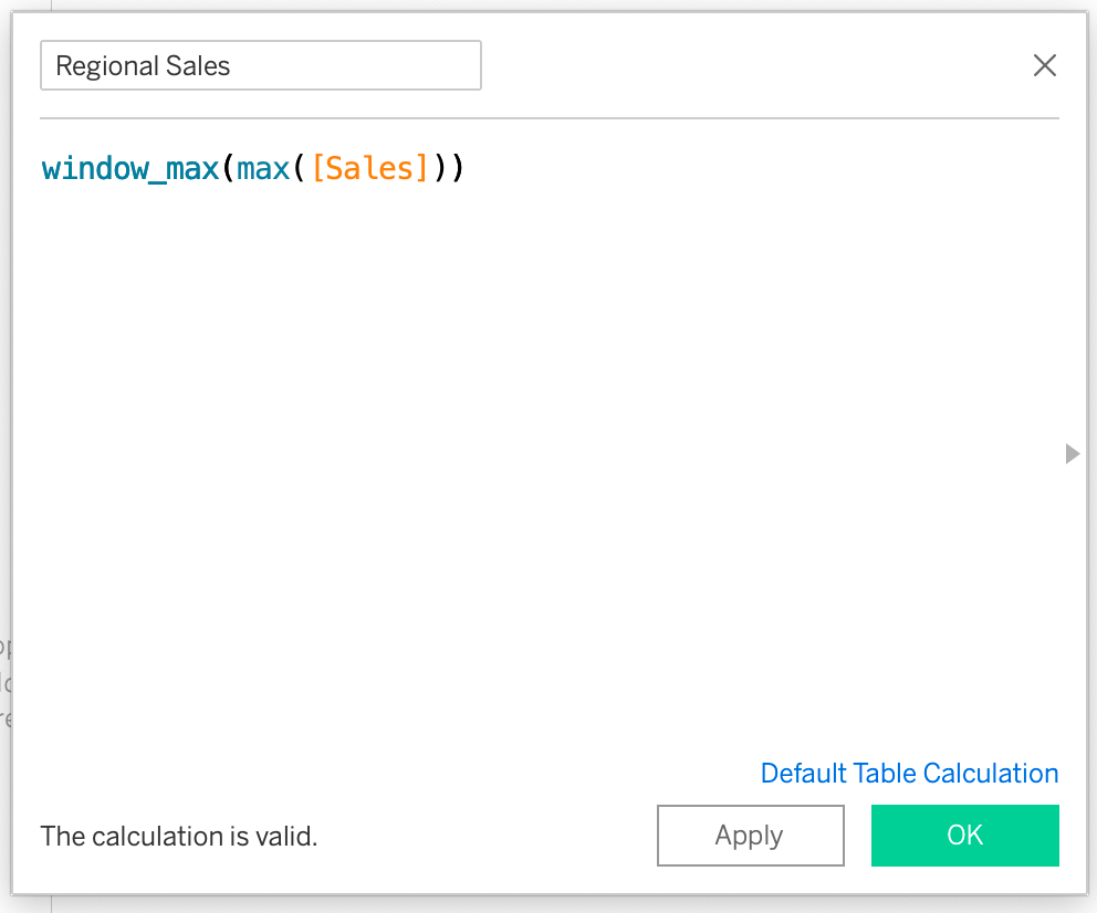
Radius:
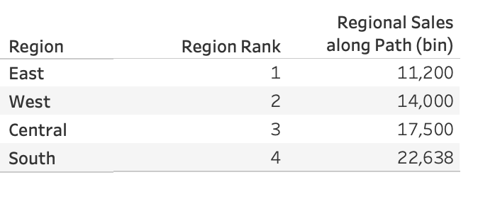
For this example, we want four different circles with different radii for four regions. We will use the window_max function to calculate the highest sales per region, which will be used to calculate the radius of that region. The radius will be calculated using the Rank_unique function. Each of these regions will be assigned a unique rank based on the highest sales per region.
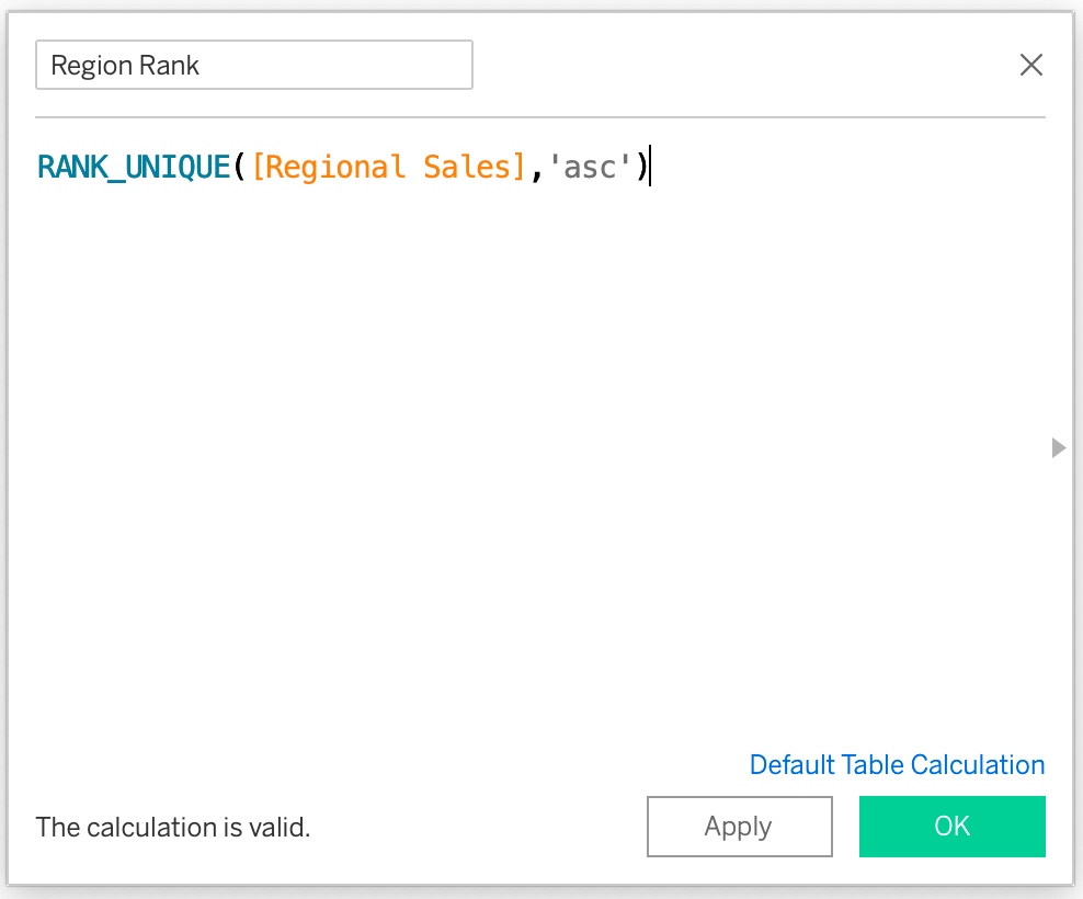
Here’s the highest Regional Sales ranked in ascending order.
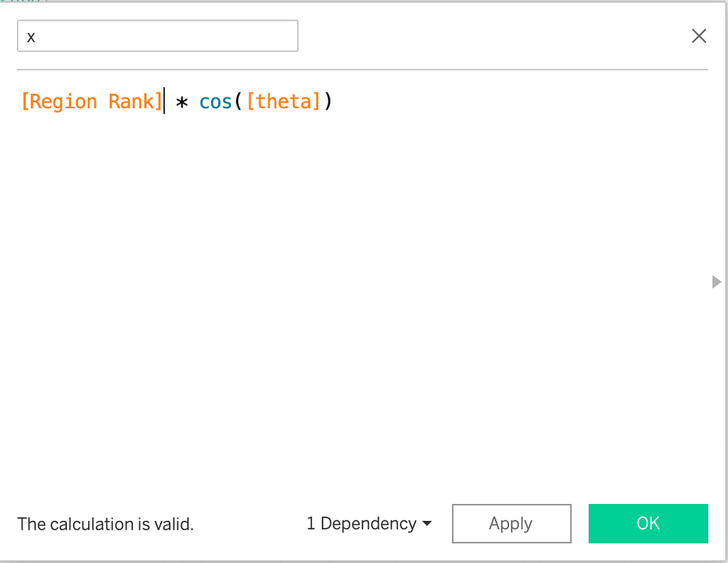
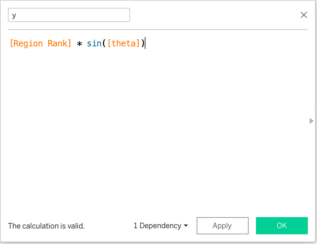
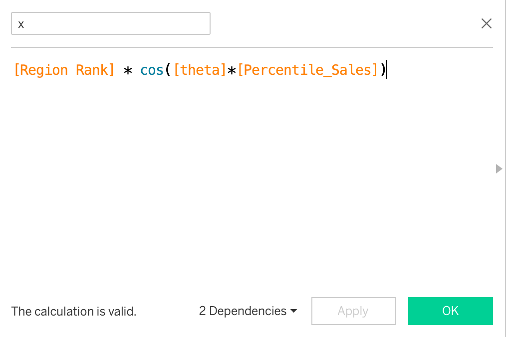
Multiplying x and y by the Regional Rank (radius).
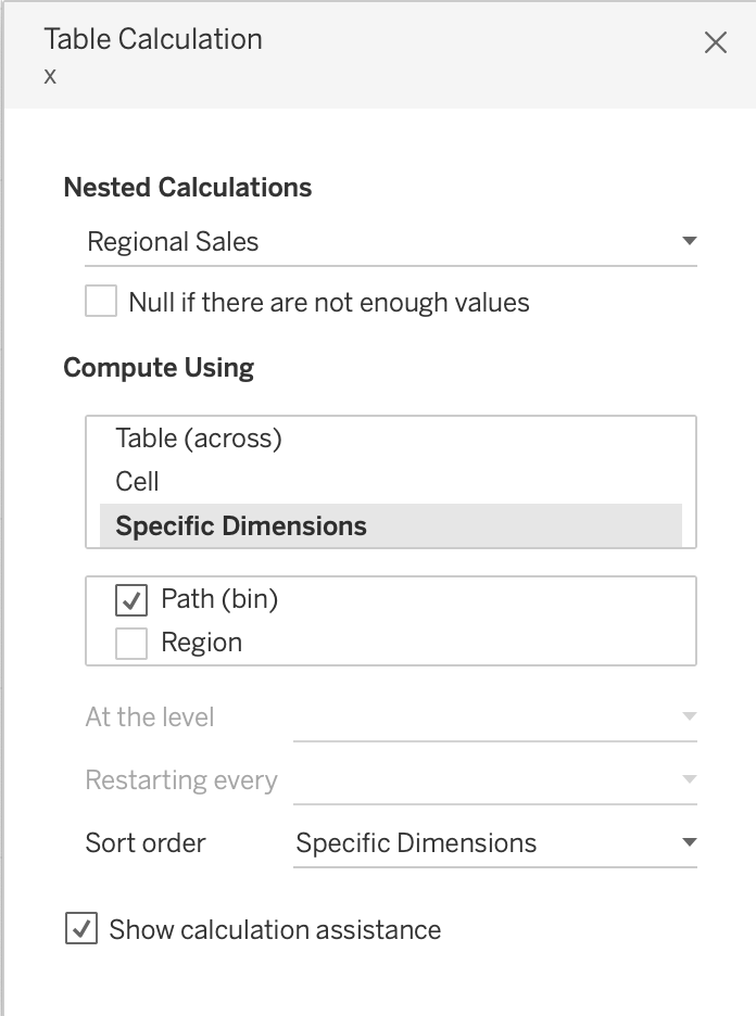
Drag the x and y to rows and columns shelf and path(bin) and region to details card.
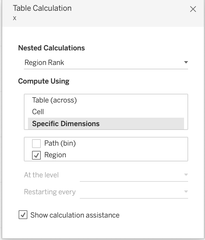
Edit table calculations for both x and y.
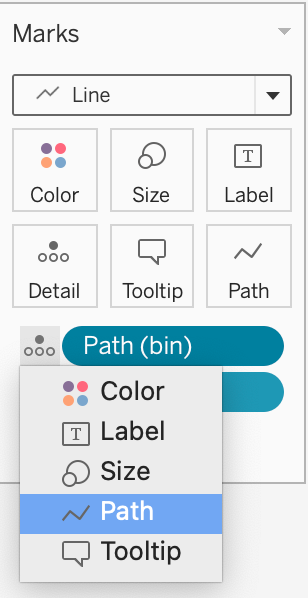
Change the Mark Type to Line and move Path(bin) to path card.
After some basic formatting, such as removing grid lines and axes and changing the colour palette, our viz looks like this:
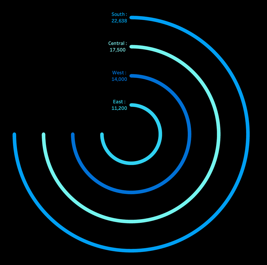
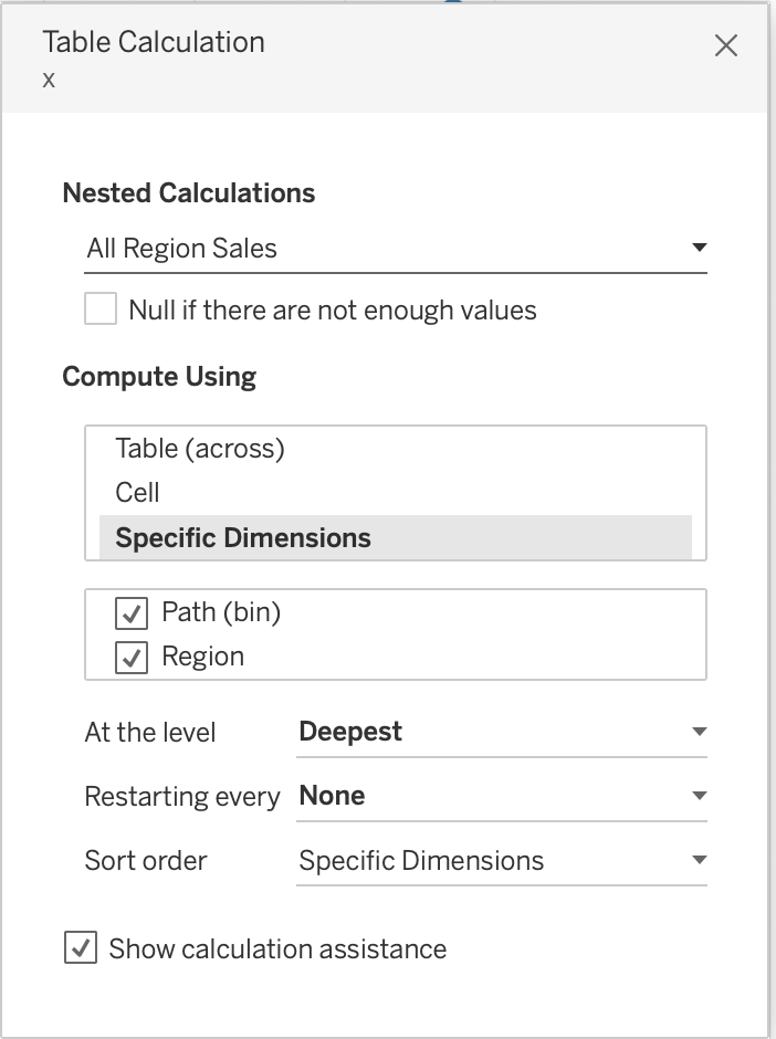
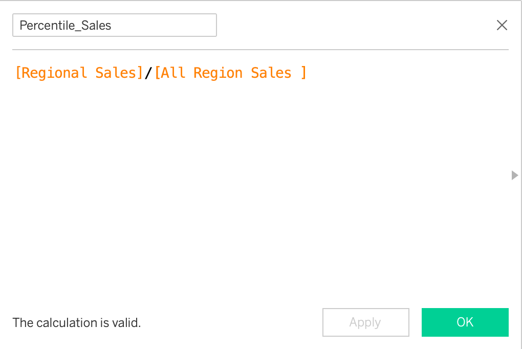
You can see that all four circles go from 0 to 270, but we need them to vary based on sales volume. To do this, we will duplicate the Regional Sales field. Let’s call it All Region Sales. Then, we will divide the Regional Sales by All Region Sales to create a ‘Percentile_Sales’ calculated field. It basically gives the percentile of the highest regional sales out of overall highest sales.
Next, we multiply theta by the Percentile_Sales in both x and y calculated fields to achieve the desired results.
And, our radial bar chart is ready!
I hope you find this article helpful. Please don’t hesitate to reach out in case you have any additional questions.
Thanks for reading!
Until next time…
All You Need to Know to Build Radial Charts in Tableau was originally published in Towards Data Science on Medium, where people are continuing the conversation by highlighting and responding to this story.
from Datascience in Towards Data Science on Medium https://ift.tt/V5XBlJv
via IFTTT


