Awesome Plotly with Code Series (Part 2): Colouring Bar Charts
Don’t create a rainbow coloured bar chart. But don’t make your bar charts boring either.w

Welcome to the second post in my “Plotly with code” series! If you missed the first one, you can check it out in the link below, or browse through my “one post to rule them all” to follow along with the entire series or other topics I have previously written about.
- Awesome Plotly with Code Series (Part 1): Alternatives to Bar Charts
- All my written articles in one place
A short summary on why am I writing this series
My go-to tool for creating visualisations is Plotly. It’s incredibly intuitive, from layering traces to adding interactivity. However, whilst Plotly excels at functionality, it doesn’t come with a “data journalism” template that offers polished charts right out of the box.
That’s where this series comes in — I’ll be sharing how to transform Plotly’s charts into sleek, professional-grade charts that meet data journalism standards.
What will we cover in this blog?
- When should we only use 1 colour for all the bar charts?
- If we wanted to highlight a bar, how should we do it?
- An idea on how to tell the audience that there is a “data issue” with one of the bars.
- A possible way to show a benchmark inside a bar chart.
Intro — A story is always less dull with colours
Most data visualisation libraries or tools have one thing in common: if you are plotting 1 series of data in a bar chart, then only 1 colour should be used. You actively have to work hard to colour the bars differently. My kid does it at pre-school and because he loves colouring shapes, but hey, he is 4. We are adults and need to properly convey a message.
However, because we do need to tell a story, sometimes this story requires highlighting something specific. This is where colours come into play. With a careful selection of colours, we can make a super powerful and engaging plot for our audience.
As always, code and links to my GitHub repository will be provided along the way. Let’s get started!
PS 1: I have no affiliation with Plotly. It is simply my day to day go-to open source library tool. In addition, a lot of inspiration comes from open source content like the one that AddTwoDigital agency provides (again no affiliation here either, just an appreciation on free available content).
PS 2: all images are authored by me unless otherwise specified
Single coloured bars to avoid bias
As mentioned in the introduction, many data visualisation tools would, by default, colour a single series with one colour. Plotly is no different.
Theory: no contrast opens the door for the human brain to make it’s own conclusions.
- Contrast is a pre-attentive visual attribute. The human brain is wired to immediately pick out differences in our environment. Applied to a bar chart, if there is no colour contrast, the human brain would look for other types of differences; for example, bigger or smaller bars. Therefore, in the absence of colour contrast, there’s no subconscious nudge to focus on one element over another.
- Colours might have meaning. When we use multiple colours without purpose, the brain might mistakenly assign meaning to those colours, leading to unintended interpretations. If your goal is to present the facts neutrally, then don’t emphasise one data point over another using colours.
The plotly.express example — 1 colour by default
Imagine that you are making a presentation about South American countries. You want to appear as impartial as possible and it might be very important for all the countries to be treated equally from a visual perspective. This is the data you have access to:
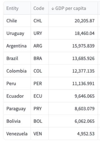
And with this data, you might build a simple default bar chart like the one below.
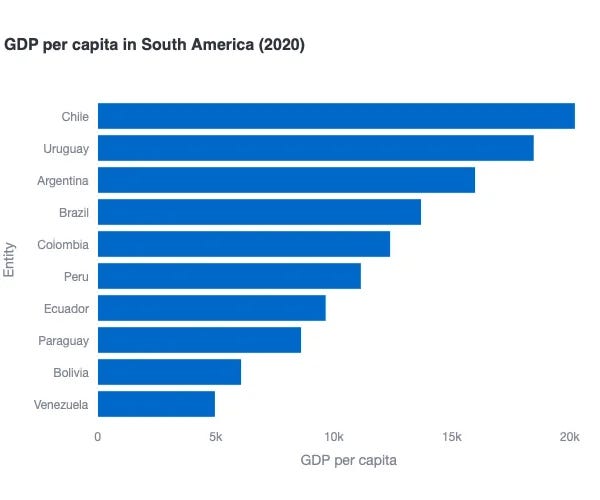
Where do I think this plot has issues?
All in all, the above default plotly.express is actually pretty decent, but some improvements could be done.
- Redundant axis titles
- Difficult to pin-point the exact GDP per capita amount for each country.

The plotly.go example(s) — an improved bar chart
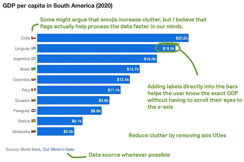
Given how simple this one-coloured bar chart is, there are not many changes to make using plotly.graph_objects , but improvements are possible.

Why do I think this plot is better?
- Reduced clutter by not having axis titles.
- Removing the x-axis and adding the specific values helps the user directly know the GDP per capita and not have to scroll their eyes bottom to top and viceversa.
- Adding flag emojis could increase clutter, but flags are actually well known symbols which can help the reader immediately recognise a country without having to read the full country name text.
- Always add the source of data where possible.
Highlight with 1 colour

When you actually want your audience to care about a specific category, you need to do something about it. Your best option is to make use of colour contrast, as it is a pre-attentive visual attribute.
Let’s say that we want to tell a story about how Uruguay is having a great GDP per capita success but how Venezuela is struggling. In order to highlight these countries using plotly.express there is already manual work to do defining colour categories. For that reason, I will directly jump on using plotly.graph_objects . Check both screenshots below.
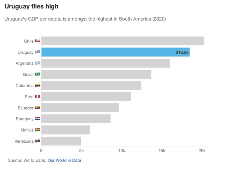
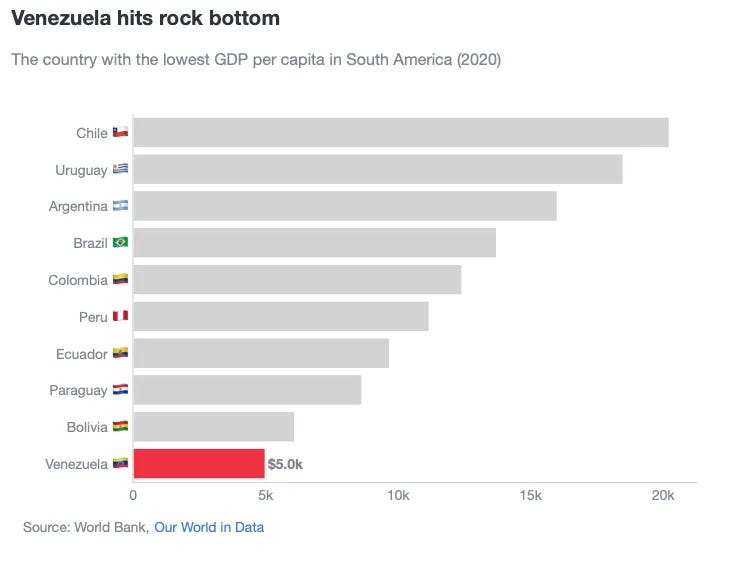
What have we changed in this chart?
- First of all, we have used a grey colour for all countries except for the ones we want to highlight. For Uruguay, we used the specific RGB blue flag colour. For Venezuela, we chose the specific red RGB colour as red can also convey something “bad”.
- We have removed all specific data labels for the bars except for the ones we want to highlight.
- We have re-included the x-axis. Given that we removed the data labels, we still want the audience to be able to compare across bars. But want we really want is for all eyes to be immediately drawn to the highlighted bar.
- Compared to the simple title of “GDP per capita in South America” from the first chart, we are telling the audience exactly what we want to highlight through a title and subtitle.
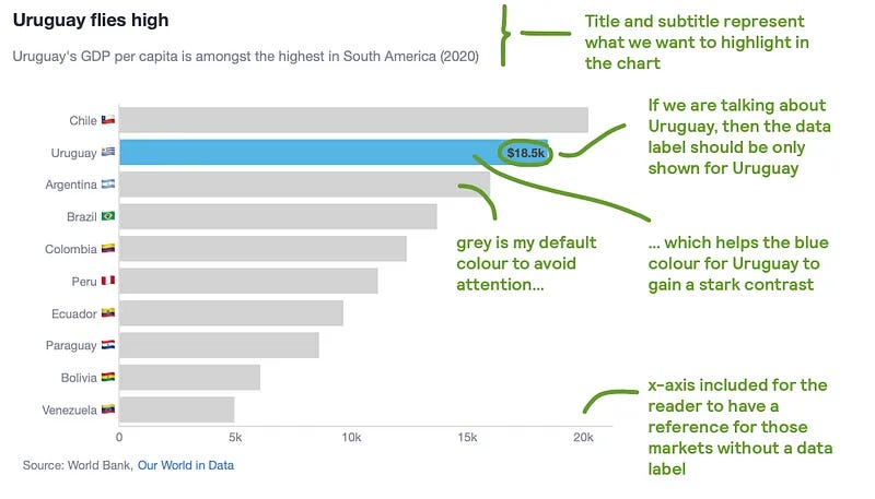
Tips on how to create this plot
How to personalise the colour and text in a bar chart?
- Colour, text and text position selections are easily configurable within a go.Bar() object.
# Choose a colour for Uruguay and for the rest
marker_color_ = ['rgba(85, 181, 229, 1)' if c_ == 'Uruguay' else 'lightgrey' for c_ in df['Entity']]

# Depends on how your dataframe is formatted. In my case, I had to divide by 1_000, format to 1 floating point and add the "k" and the "$" symbols. For the rest of countries, just leave blank.
text_ = [f"<b>${val / 1000:,.1f}k</b>" if c_ == 'Uruguay' else '' for val, c_ in zip(df['GDP per capita'], df['Entity'])]
# Because only 1 value from text_ will be shown (the rest are blank values), we dont need a list comprehension to define the text position.
textposition = 'outside'
fig = go.Figure(
    data=[
        go.Bar(
            y=df['Entity_emoji'],
            x=df['GDP per capita'],
            marker_color=marker_color_,
            text=text_,
            textposition=textposition,
            orientation='h',
            showlegend=False,
        )
    ]
)
How to hide or show the x-axis?
- If you want to control showing the x-axis or not, it can be done configuring the xaxis parameter inside fig.update_layout()
if remove_xaxis:
    xaxis_ = dict(visible=False)
else:
    xaxis_ = dict(
        title='',
        showline=True,
        linecolor='lightgrey',
        linewidth=1,
    )

fig.update_layout(
  ...,
  xaxis=xaxis_,
)
Telling the audience to be careful because of data quality.

As data storytellers, how many times have you encountered dodgy data points? And how many times where you in the fence of saying something about it or not in your documents or charts? I offer you a solution based on contrast.
We could use another colour to indicate a data issue, but then you might end up with 3 colours: 1 for the bar to highlight (say blue), 1 for the rest of the bars (say grey) and 1 for the bar with a data issue (say red). What if we still kept to the rule of using as few colours as possible?
One alternative could then be to use a pattern fill to indicate something strange in the data. In the screenshot below, I have used a striped pattern fill with the same grey colour as the rest of the countries.
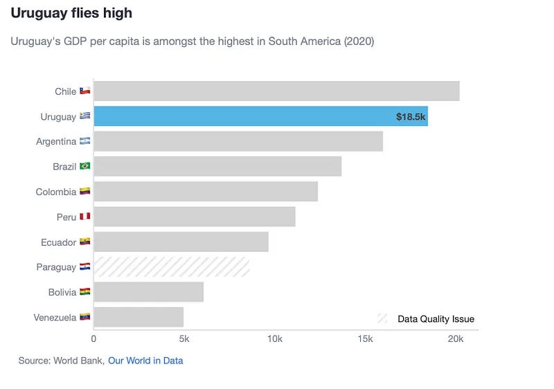
Tips on how to create this plot
How do you fill a bar with a pattern?
- 1st, the bar object has the parameter marker_pattern_shape. In order to specify how to fill the bar, I used “/” for stripes and blank to tell Plotly that I don’t want fill a bar.
pattern_shape_ = ['/' if c_ == 'Paraguay' else '' for c_ in df['Entity']]

fig = go.Figure(
    data=[
        go.Bar(
            y=df['Entity_emoji'],
            x=df['GDP per capita'],
            marker_color=marker_color_,
            marker_pattern_shape=pattern_shape_,
            text=text_,
            textposition=textposition,
            orientation='h',
            showlegend=False,
        )
    ]
)
- 2nd, we need to add the pattern fill in the legend so readers can understand what is this pattern fill. The key here is to create a “dummy” trace, where no data in plotted but you do want to show the trace name in the legend.
fig.add_trace(go.Bar(
    x=[None],  # Dummy value for the x-axis
    y=[None],  # Dummy value for the y-axis
    marker=dict(
        color='rgba(211, 211, 211, 0.5)',
        pattern_shape='/'
    ),
    showlegend=True,
    name='Data Quality Issue',
    legendgroup='Data Quality Issue',
    hoverinfo='none',  # Disable hover info for the dummy bar
))

fig.update_layout(
  ...,
  legend=dict(x=1,
              y=0,
              xanchor='right',
              yanchor='bottom',
              orientation='h'
              ),
)
Highlighting against a benchmark
In my previous post, we highlighted a benchmark using a different colour. This is fine, but if you also want to highlight a specific country, then you would be in the same situation as highlighting a pattern fill: you would need 3 colours. If we want to keep to using only 2, the best option is to add a dotted line to represent the benchmark.
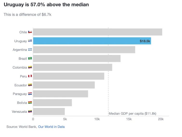
Tips on how to create this plot
How to ddd the reference benchmark using a vertical line
median_ = df['GDP per capita'].median()
fig.add_vline(
  x=median_,
  line_dash='dot',
  line_color='darkgrey',
  line_width=1,
  annotation_text=f'Median GDP per capita (${median_ / 1000:,.1f}k)',
  annotation_position='bottom right',
  layer='below'
)
Summary
In this blog, we have covered a “101 colouring for bar charts” exercise. Always have in mind that…
Colour is another tool to convey a message, not to make a pretty chart.
Therefore, using it sparsely has a more powerful effect than using colour carelessly. In fact, the last 2 examples we have shown how I would rather prefer using other contrasting elements such as pattern fills and benchmark lines, rather than adding more colour to the chart.
Where can you find the code?
In my repo and the live Streamlit app:
Data sources
- World bank, Our World in Data (CC BY 4.0)
Further reading
Thanks for reading the article! If you are interested in more of my written content, here is an article capturing all of my other blogs posts organised by themes: Data Science team and project management, Data storytelling, Marketing & bidding science and Machine Learning & modelling.
All my written articles in one place
Stay tuned!
If you want to get notified when I release new written content, feel free to follow me on Medium or subscribe to my Substack newsletter. In addition, I would be very happy to chat on Linkedin!
- Get notified with my latest written content about Data Science!
- Jose's Substack | Jose Parreño Garcia | Substack
Originally published at https://joseparreogarcia.substack.com.
Awesome Plotly with Code Series (Part 2): Colouring Bar Charts was originally published in Towards Data Science on Medium, where people are continuing the conversation by highlighting and responding to this story.
from Datascience in Towards Data Science on Medium https://ift.tt/Z2X1jcu
via IFTTT


