Practical Guide to Data Analysis and Preprocessing: Techniques for Quality Data
Techniques for data cleaning, transformation, and validation to ensure quality data

In this project, we will utilize a dataset derived from a fictitious company that encompasses demographic data and results from a psychometric test administered to employees.
The key variables include age, gender, education_level, and salary, which are pivotal in a corporate context. The primary objective is to pre-process this data, ensuring both quality and consistency for subsequent analysis.
While the dataset is fictitious, it effectively simulates a real-world scenario, with variables thoughtfully selected to represent practical and applicable information relevant to business environments. All project files and additional resources are accessible on my GitHub:
GitHub - Anello92/data-preprocessing-guide
Throughout this project, we will delve into fundamental pre-processing techniques, addressing common challenges and identifying solutions. The structure of the project will guide us from the initial stages of data import and inspectionthrough the application of each technique, with a strong emphasis on understanding the entire workflow.
It is essential to note that many pre-processing techniques in Python can be executed with a single line of code. However, the true challenge lies in grasping the rationale behind each approach and recognizing the impacts of our decisions.
Let’s begin our journey into data pre-processing and uncover the techniques that will empower our analysis! If you have any questions or would like to connect, feel free to reach out to me on LinkedIn.
Understanding the Data
How can anyone start a data analysis project without first trying to understand the data? Does that make sense? So, take some time to understand the data before even opening your analysis tool, whatever it may be.
Analysis tools are meant for investigating, exploring, and analyzing data. But before diving into that, take a step back and look at the data itself.
You can do this within your analysis tool if that’s more convenient; the key is always to start by trying to understand the data you have at hand. If something isn’t clear, go back to the data source and ask questions: What does this column represent? What does this data point mean? Is there any documentation or a data dictionary available?
If you don’t understand a variable or a column in your dataset, you shouldn’t use it. When someone asks you for an interpretation or a result, what will you say? “Well, I analyzed this variable without knowing what it represented.” That’s not what you want to say, right? So, if you can’t understand a variable, either discard it or gather more information about it.
Let’s take a look at our dataset.

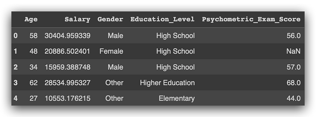
Observe that we have the columns Age, Salary, Gender, Education Level, and Psychometric Exam Score. A company collects various details about its employees, such as age, salary, gender, and education level, and administers a psychometric test to evaluate their profile, resulting in a score.
Our task is to analyze this data: is there a relationship between these variables? Are there any issues that require cleaning? Can we calculate correlations or associations between them? Could we use charts to clarify the dataset structure? Do we fully understand what each column represents? This is a straightforward task in theory: at the start, you try to understand each variable. However, you may not always have clear column labels indicating what each variable represents.
It’s far worse to proceed with analysis without knowing what a variable means than to pause and seek clarification from the data source. You need this information. If no one in the company has it, proceed at your own risk. Personally, I wouldn’t analyze a dataset without understanding what each variable represents; I’d simply inform the decision-maker that this dataset cannot be used for analysis if no one can clarify the columns.
Of course, you might be tempted to guess — perhaps that number represents the salary, and maybe that category indicates education level, or gender might be "male" or "female." However, guessing isn’t an option. You need a data dictionary or direct clarification, or you must collect additional data.
Stay vigilant about this daily, as you’ll encounter datasets with issues. It’s up to you to spot these issues and take necessary actions.
Loading the Data
We can now load the dataset. Here it is for you. I’ll use pd, the nickname we affectionately gave to Pandas, and call the read_csv function, which, as the name suggests, reads CSV files.
# 1. Load the dataset
df = pd.read_csv("dataset.csv")
I’ll store the result in df, which is a Pandas DataFrame. How do I know it’s a DataFrame? Well, I used Pandas to load the file, so by default, it creates a DataFrame. If you want to verify, you can do this as well:
# 2. Check the data type of the dataset
type(df)

Use the type function along with the object name to check its type. And there it is—confirming that it’s a Pandas DataFrame.
Now, let’s examine the shape to understand the dimensions of our DataFrame.
# 3. Check the shape of the dataset
df.shape
The dataset contains 500 rows and 5 columns. Now, let’s check the column names to get an overview of the variables available in our DataFrame.
# 4. Display column names
df.columns

So, I have the columns: Age, Salary, Gender, Education_Level, and Psychometric_Exam_Score. Here's a tip: avoid using column names with accents, special characters, or spaces. While it might work in some cases, it can lead to issues depending on the type of task you are executing.
Now, let’s view the first five rows of the dataset using the head method.
# 5. Display the first 5 rows of the dataset
df.head()
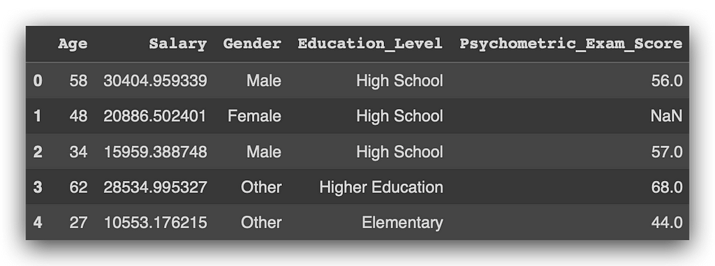
This command lists the first five rows, ok? Let’s take a look. I have Age, Salary, Gender, Education_Level, Psychometric_Exam_Score, and—hold on—I’ve spotted an issue. In the column Psychometric_Exam_Score, there's a NaN. NOT A NUMBER, which means it’s essentially nothing. This indicates a missing value, which is a problem that needs to be addressed.
Soon, we’ll examine this more closely, create a missing values map, and take action to resolve this issue. If you’d like to view the data in a slightly more random way, you can use the sample method.
# 6. Display a sample of 10 rows from the dataset
df.sample(10)
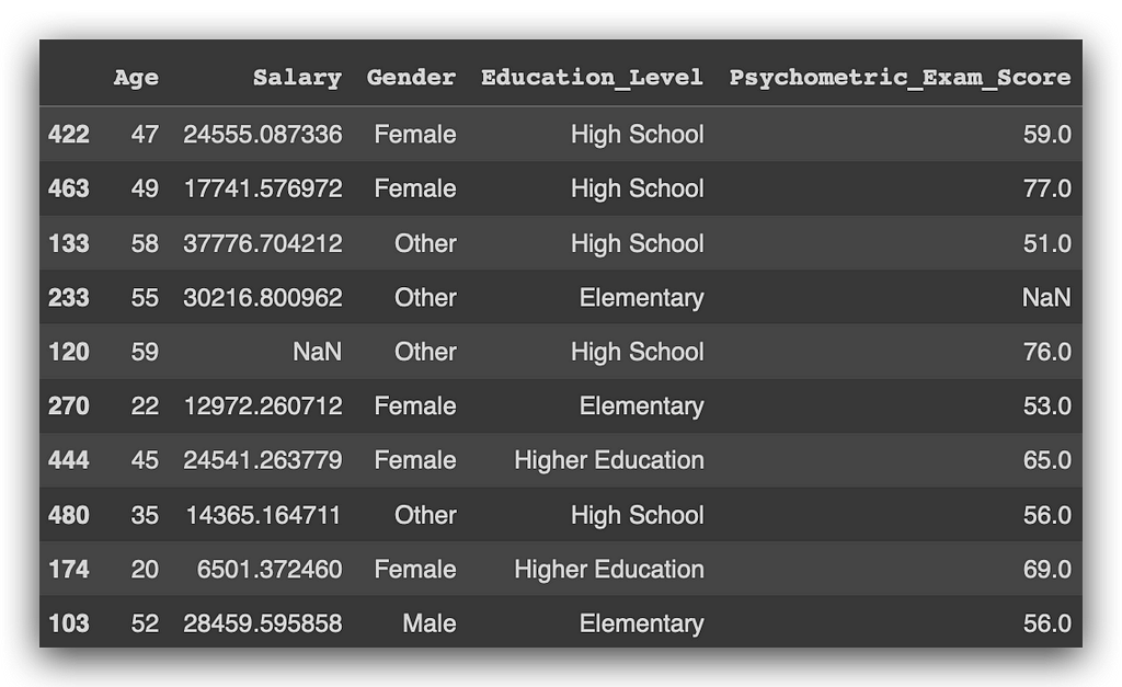
It collects a random sample from the data, in this case with ten records. Notice that I encountered more missing values.
The sample method returns values randomly, so each time you execute it, you’ll get different values, ok? Unlike head, which consistently returns the first five rows, sample retrieves ten records randomly with each execution.
Now, let’s take a look at info, which provides a summary of the variable types.
# 7. Display dataset information
df.info()
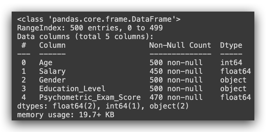
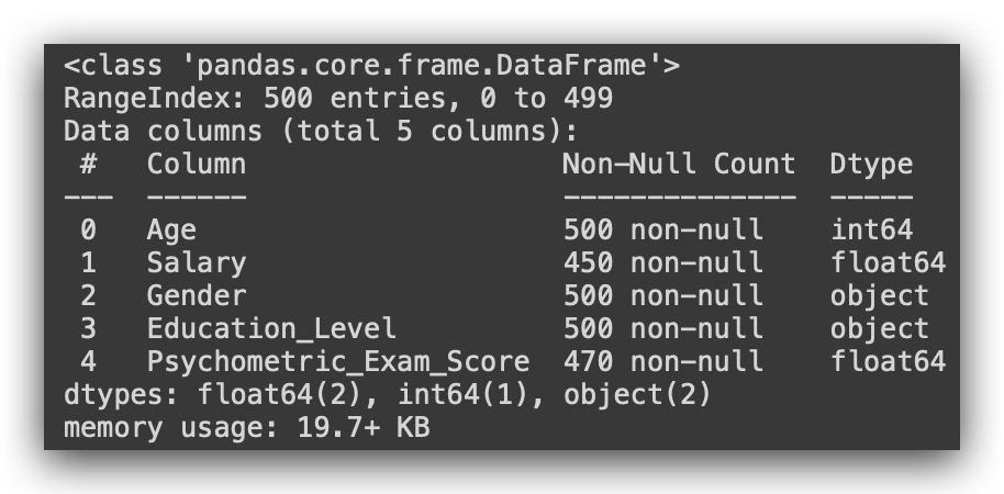
So, notice that Age is classified as integer (64 bits). Salary is recognized as float since it’s a decimal value. Gender is object, which corresponds to string in Python, not a proper text type. The same applies to Education_Level, and Psychometric_Exam_Score is a float.
Always check the data type, as you might need to adjust it. Python isn’t smart enough to automatically understand the exact type you intend. When Python loaded the file, it evaluated the content: if it’s a number, it assigns integer; if there’s a decimal, it assigns float; if it’s text, it uses object.
However, it’s up to you to ensure that each variable has the correct type. We’ll discuss this in more detail shortly.
Exploratory Data Analysis
Now we begin exploratory data analysis. But when should you conduct it? Before data cleaning? After cleaning? Do you transform the data, then analyze and explore it? Should you always start with exploratory analysis?
A straightforward “yes or no” answer would be convenient, but that’s rarely how it works in practice. Whether or not you start with exploration often depends on your familiarity with the data. If you’ve already investigated the source, or you know the data structure from prior work, you may not need to begin with exploratory analysis. You could address missing values first and then perform exploration if needed.
For beginners, I recommend always starting with exploratory analysis. If you’re new, lack experience, or aren’t fully confident in data analysis (which is natural at first), exploratory analysis provides a solid foundation. It familiarizes you with the data structure, highlights potential issues, and builds confidence to proceed with the data analysis process.
If unsure, go with exploratory analysis. At this stage, you’re simply observing the data from various perspectives, not altering it. This exploration is essential for deciding which processing techniques to apply later.
Let’s jump into this phase, where we understand how the data is organized and identify issues that may only be evident during exploratory analysis. I’ve started by dividing the analysis into two groups of variables. First, I’m using the describe() function to generate a statistical summary of the non-numeric variables.
# 8. Describing Non-Numeric Data
df.describe(include=object)
And then for the numeric data.
# 9. Describing Numeric Data
df.describe()

What are the non-numeric data here? Gender and Education_Level. And the numeric data? Age, Salary, and Psychometric_Exam_Score, correct? So, I want a statistical summary. In such a summary, I can calculate the mean, standard deviation, and median.
Does it make sense to calculate the mean for Gender and Education_Level? No, but I can use the describe function to have Pandas summarize these variables by including only those of type Object, which are the categorical variables.
With this approach, Pandas will provide the count, the total number of rows, the number of unique values, the top (the most frequent value in that column), and its frequency.

So, observe the Gender column, where we find three possible values: male, female, and other—three unique values in total. The most frequent value is female. Moving on to the Education_Level column, we again have three possible values: elementary, high school, and higher education, with high school appearing most frequently. This summary captures the essential information available for categorical variables.
On the other hand, if I use describe without specifying the type of variable, Pandas will automatically generate a statistical summary only for numeric variables. Here, I haven't specified the variable type, so the output will include only numeric variables.
This can lead to confusion, as many people don’t realize they need to set include='object' to view summaries of categorical variables. Without this specification, Pandas skips non-numeric columns, as it cannot calculate metrics like mean or median for them. By including include='object', you get a straightforward summary of categorical variablesonly.

For numeric variables, observe that I have the element count. I immediately spotted an issue: the Age variable has 500 rows, matching the total row count of the dataset, as do Gender and Education_Level. But the other two variables—Salary and Psychometric_Exam_Score—only have 450 and 470 entries, respectively. This means we have 50 missing rows in Salary and 30 missing rows in Psychometric_Exam_Score. These variables are not fully populated, indicating missing values.
Notice how a simple statistical summary can highlight potential issues. We’ve already identified missing data in two variables with just one line of code. Some might feel intimidated by programming, but there’s no need — it’s just a line of code. Fetch the DataFrame, call the method, and you’re ready to begin analysis.
Next, let’s check the mean values for Age, Salary, and Psychometric_Exam_Score, along with the standard deviation, minimum, first quartile, median (second quartile, 50%), third quartile, and maximum. Typically, we want to see if the mean and median are close, as this indicates a relatively balanced distribution. If there’s a large difference, it suggests the variable has a skewed distribution, which could impact further analysis.
For Salary, for example, the mean is 21,200, while the median is 21,600—reasonably close, though the missing values (which are not factored into the mean) may slightly skew this figure.
Beyond that, I found another issue.
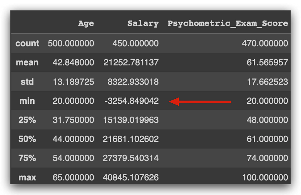
There is someone with a negative salary. Is a negative salary realistic? Probably not, right? This suggests a potential data issue. Notice what we’re doing here: we’re examining the data and using common sense, which is a crucial part of your role as a data analyst. Many people are intimidated by programming and miss what truly matters — analyzing the data. Does a negative salary make sense? I don’t think so. Perhaps it’s due to a loan deduction by the company, as anything can happen. But I must be critical enough to spot and question this. Is it correct? This is when I would consult the business team for clarification.
Let’s continue with this first stage of exploratory analysis. Here, we’re reviewing a statistical summary of the variables. For categorical variables, all we have are the unique values count, frequency, and most common value. For numeric variables, we obtain a statistical summary, including the mean, median, standard deviation, etc.
We start by comparing the mean and median. The median is at the 50% mark, or the second quartile. Soon, we’ll visualize this on a graph. Generally, when the mean and median are close, it indicates a certain distribution. If there’s a significant gap, it might indicate a data problem — often caused by an outlier, an extreme value far from the mean.
To illustrate, imagine a classroom of 15-year-old students. We expect the average height to be around 1.50m to 1.60m. Can there be a student in that class who’s 2.10m tall? Yes, it’s possible, though it’s not an error. However, this value deviates from the mean, raising the average for the class because of one person. This outlier doesn’t affect the median, which is the middle value when data are ordered. Therefore, if there’s a large gap between mean and median, it might indicate a data distribution issue or an outlier.
For the Age variable, the mean and median are close, so there doesn’t seem to be an outlier problem. The same goes for Salary. As for Psychometric_Exam_Score, the mean and median are both 61.
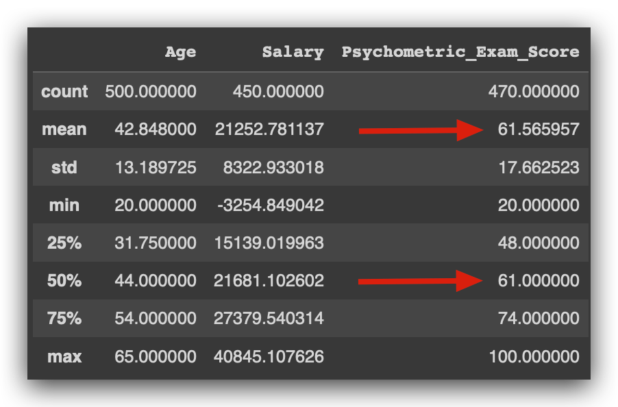
Practically identical, right? This suggests no issues with outliers here either. Notice how this summary table provides significant insights about the data.
Another way to check for outliers is by examining the maximum value. If this value is far from the mean, it could indicate an outlier. The same goes for the minimum value.
For instance, with the Age variable, the mean is 42, the minimum age is 20, and the maximum is 65. There doesn't seem to be any issue here. However, if someone in the dataset were listed as one year old, would that make sense? Perhaps they started working unusually young, but that's unlikely, wouldn't you agree?
At this stage, it’s essential to apply common sense, analyze the data, and identify anomalies. Does it make sense for an employee to be one or two years old, given that these are company records? Or what if the age was 180? To our knowledge, no human has reached that age, so it likely points to an error.
Now, if someone were listed as 100 years old, that’s more plausible, as some people do live to 100. Could an employee actually be 100 years old? This situation brings us back to the tall-student example. A 100-year-old employee may not be an issue but represents an extreme value. It is distant from the mean and influences the mean calculation. Later, you’ll need to decide how to handle such cases.
Examining the Psychometric Exam Score, we find a mean of 61, with a minimum score of 20 — someone scored as low as 20, while the highest score achieved was 100.
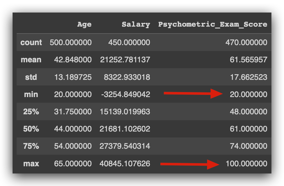
This is a good sign. The exam likely scores from 0 to 100. On average, people scored 61, with some performing poorly at 20, and others achieving a perfect score of 100.
If the maximum score here were 105, I’d need to question that. Is this correct? Does the exam allow a score of 105? Some exams do allow for such variations, so the best approach is to confirm with the business area. I’d ask, “Is this right?” and they might respond that the highest possible score should indeed be 100. In that case, a score of 105 would indicate an issue.
Do you see the thought process we just went through? You’ll need to repeat this constantly for every analysis project you work on.
Notice that up to this point, I haven’t written any Python code. That’s because our primary work is analysis, not writing code in Python. Python is simply a tool — other tools could work too.
Our role involves analyzing, understanding the data, grasping the business problem, identifying the data source, and verifying if everything makes sense. Only after this can we proceed with the analysis process.
The work we’ve done so far has primarily involved examining the data and identifying potential issues. We observed at least two problems: missing values in the Salary and Psychometric Exam Score variables, and a negative salary value. These are things we'll need to investigate further.
If you take no action and leave the data as it is, it may create issues down the line. You can ignore it, but it will come back to affect you later. Or, you could identify it now, take some time to make a decision, document and justify that decision, and then you’ll find it easier to perform more advanced analyses.
I always aim to present the ideal sequence for daily data analysis tasks. Analyzing this table was relatively simple since we only had three columns. However, in many situations, datasets can be much larger.
In such cases, looking at a graph can greatly help in understanding the variable. So let’s do the following: we’ll visualize the distribution of the quantitative variables first, followed by the qualitative variables, as these are different data types and require different kinds of graphs.
Identify early on the types of data you have. For quantitative or numerical variables, you have a set of techniques for processing, analyzing, and exploring. For qualitative or categorical variables, there’s a different set of techniques. So, it’s essential to determine the variable type from the beginning.
Remember, we’re not always going to get it right by default. It’s up to you to verify if the type assigned is suitable. Let’s start by creating histograms for the numerical variables.
I’ll show you a trick here: How can you quickly generate a list of numerical columns? There are several ways to do this. Here’s an example using list comprehension — remember that? It’s a loop, a repetition.
In this case, let’s see what I’m doing. My loop will go through indices 0, 1, and 4. Why these? Let’s take a look at the data.
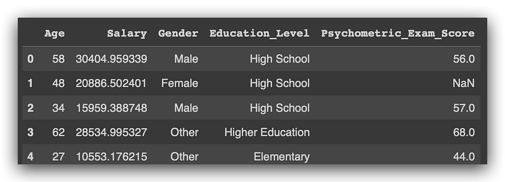
In Python, indexing starts at 0, correct? So, which index does the Age column have? 0.
Based on this, which columns are numerical? Index 0, index 1, and index 4. Now, what will I do?
I’ll use a for loop: for each value i in my list of values… This is a loop that I'll execute three times, once for each value.
So, for each value in the list, I want to fetch the values from the list of columns in my DataFrame at index i. I’ll then convert this result into a Python list.
Execute, and voilà, watch the magic happen.
# 10. Extracting numeric columns with List Comprehension
selected_columns = [list(df.columns.values)[i] for i in [0, 1, 4]]

There you have it. This is a quick way to extract the numerical variables, or if desired, the categorical ones as well — the same approach applies. I consistently provide examples like these to help you automate certain parts of the process during a project.
Here, I created a list of numerical columns. In this case, I accessed them directly by index, just to remind you that Python indexing starts at 0. But I could also automate this process by using, for example, the info() function, which returns data types for each column in a DataFrame.
Now, let’s create three histograms. Notice that the code is identical; the only thing that changes is the variable name: Age, Salary, and Score. I’m using plt to create a figure, defining an 8x6 plotting area. Then, I generate a histplot, specifying the KDE type because I want the density function of that variable. I’ll explain this to you in more detail.
After that, I add the title, label the X-axis, label the Y-axis, and display the plot.
# 11. Age Distribution
plt.figure(figsize=(8, 6))
sns.histplot(df['Age'], kde=True)
plt.title('Age Distribution')
plt.xlabel('Age')
plt.ylabel('Count')
plt.show()

This is a histogram. Essentially, it shows the frequency of occurrences for a variable’s values. For example, the Agevariable might range from 20 up to around 80. Here, I have the frequency, or count, displayed along the vertical axis. Ages between 20 and approximately 23 years occur most frequently.
From this, I’ve gathered another insight from our dataset: most employees at this company are roughly between 20 and 22, up to around 25 years old. The frequency decreases slightly around 30 years and then increases again, showing a pattern.
The line here represents the KDE — the density curve — essentially a way to visualize the distribution across the entire range of the variable. What am I looking for? Any anomalies, potential issues, and whether the variable follows a normal distribution. It seems there’s no problem with the Age variable; no anomalies or irregularities detected.
Now, onto the Salary variable.
# 12. Salary Distribution
plt.figure(figsize=(8, 6))
sns.histplot(df['Salary'], kde=True)
plt.title('Salary Distribution')
plt.xlabel('Salary')
plt.ylabel('Count')
plt.show()

Here is the histogram. Notice that the Salary variable behaves a bit differently. There’s a negative salary appearing here — a bar below zero. This is unusual, right? A negative salary seems problematic.
Aside from this, the distribution of the variable doesn’t show any other apparent issues. Most salaries are concentrated around 20,000 dollars, with the highest frequency occurring a bit above this level. So, most employees earn between 20,000 and 30,000 dollars. Some employees make 40,000, which is entirely normal — likely managers or executives. Others earn below 20,000, also normal.
What stands out is the negative value. This is something I’d need to confirm with the business area to decide how to handle records with negative salaries. Notice how valuable a graph can be to reinforce suspicions about the data, confirm potential issues, and so on.
# 13. Score Distribution
plt.figure(figsize=(8, 6))
sns.histplot(df['Score'], kde=True)
plt.title('Score Distribution')
plt.xlabel('Score')
plt.ylabel('Count')
plt.show()

Regarding the score, I generated the histogram, but an error message appeared. I executed it, and here’s the error. Now what? Panic time? What happened, and what should I do? This is where your actual work begins — you analyze the error and resolve it. It’s simple.
Do you think errors won’t happen in your daily work? They definitely will, constantly, in fact. Anytime you work with a computer, rest assured that issues will arise at some point. Many people freeze at the sight of an error, unsure what to do next. My recommendation is to start by reading the message. Usually, the cause of the problem is indicated at the very end of the error message.

This gives us a hint about the problem. When faced with a lengthy error message, start by checking the end of it. Often, there will be a message indicating what’s wrong. Then, if necessary, you can go back for more details. In this case, the error is quite obvious, right?
Is there a column called Score in our dataset? No, there’s Psychometric_Exam_Score. So how can I create a graph if the column doesn’t exist? That’s the issue here. That’s why we’re seeing a KeyError — it couldn’t find Score. And that’s correct; Score doesn’t exist. What we do have is Psychometric_Exam_Score.
# 13. Score Distribution
plt.figure(figsize=(8, 6))
sns.histplot(df['Psychometric_Exam_Score'], kde=True)
plt.title('Score Distribution')
plt.xlabel('Score')
plt.ylabel('Count')
plt.show()
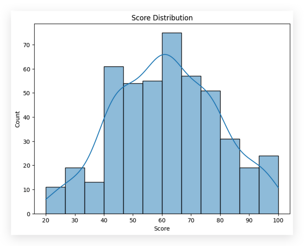
When faced with issues, analyze the error message, research, and review the code. In this case, we have data distribution between 20 and 100, with most values around 60, which aligns with the mean, correct?
One observation here: in nearly all phenomena, values tend to concentrate around the mean. Reviewing these three graphs, we see values clustering near the mean with slight variations, but overall, they suggest no major anomalies for these variables. This is a good sign.
So far, we’ve identified missing values and a negative salary value, and we don’t seem to have other issues. This is the core of exploratory analysis: examining data, identifying issues, and checking for anomalies. It’s also essential to understand the business area. In this case, we’re dealing with employee data. Does it make sense for an employee to be one year old? No. But if this were daycare data, would it make sense? Possibly, if the data reflected children’s ages in a daycare.
Do you see how business context is crucial? Knowing the data source is key to evaluating if the information makes sense.
Visualizing Categorical Variables
Now, we’ll visualize the distribution of the qualitative, or categorical, variables. To do this, I’ll use a count plot to display the distribution of our two categorical variables: Gender and Education_Level.
For the second graph, I’ll use the order parameter to show you that it’s possible to set the order in which categories appear in the chart. Since these are categorical variables, they have defined categories. We know there are three categories in each of the two variables, Gender and Education_Level.
I can specify the order in which I want these categories to appear in the chart. If you don’t set the order parameter, as I’m demonstrating above, Seaborn will decide the order for you. But if you want to control it, just add the order parameter and define a list with the category names in the sequence you want to display.
Let’s go ahead and create a count plot for the Gender variable.
# 14. Gender Distribution
plt.figure(figsize=(8, 6))
sns.countplot(data=df, x='Gender')
plt.title('Gender Distribution')
plt.xlabel('Gender')
plt.ylabel('Count')
plt.show()
And there it is
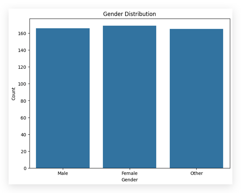
What do we have here? The count of employees by gender: male, female, and other. We know there are three categories in this variable. Observing the chart, what do you notice? The gender proportion is very similar, isn’t it? We see nearly the same proportion of employees across male, female, and other genders, with a slight increase in the female column.
We had already noticed this earlier, remember? This demonstrates the value of analyzing data from multiple perspectives. If you scroll up a bit, you’ll see that for Gender, we previously noted there were 50 rows, three unique values, and that the top category was female. This is the gender that appears most frequently, with a count of 69, just slightly higher. You can also observe this in the middle column. The female gender shows up a bit more often than the others.
Here, I don’t see any issues or anomalies. The proportion could be higher or lower depending on the company, correct? Based on the nature of the business, it may employ more male, female, or other gender identities. This balanced proportion across genders doesn’t suggest any issues.
Let’s move on to the Education_Level.
# 15. Distribution of Education Level
plt.figure(figsize=(8, 6))
sns.countplot(data=df, x='Education_Level', order=['Elementary', 'High School', 'Higher Education'])
plt.title('Education Level Distribution')
plt.xlabel('Education Level')
plt.ylabel('Count')
plt.show()
Countplot Again, but Defining the Order
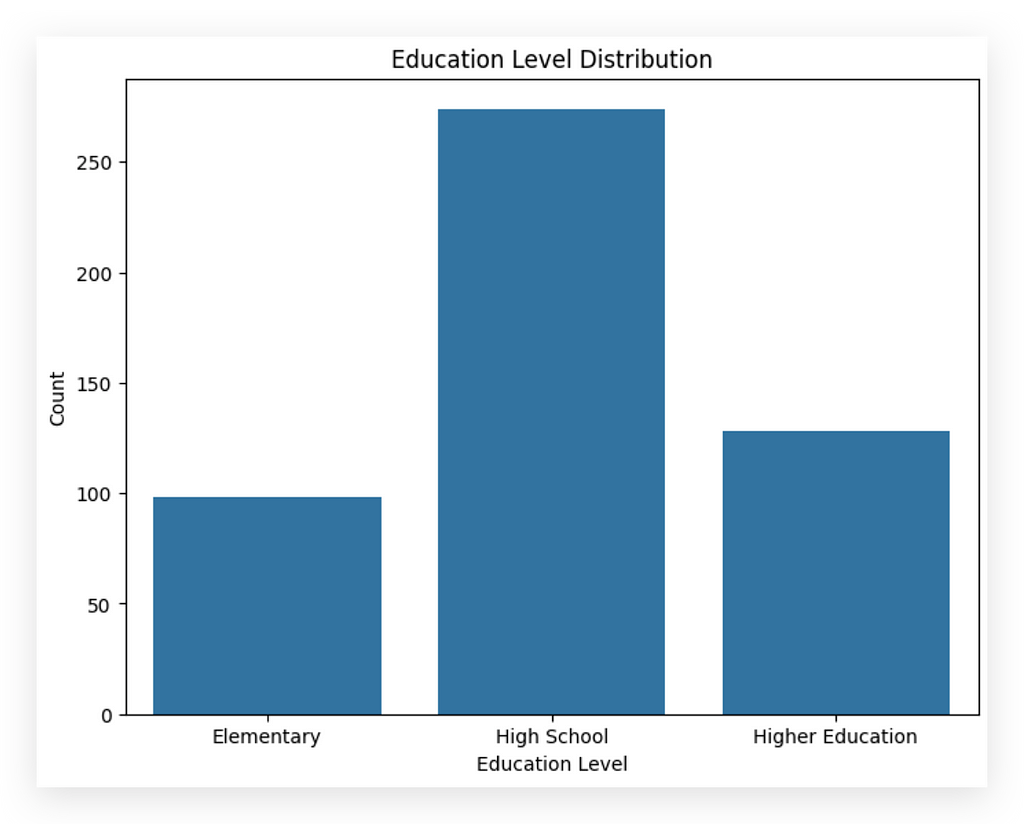
Now, we’re creating another count plot, this time with a specific order. This is interesting because, unlike the first plot, we’re dealing with a variable where hierarchy matters. In the initial plot, was there a hierarchy? Is one gender better than another, like male being superior to female or vice versa? No, there’s no hierarchy here.
But in this case, hierarchy is significant. Those with a high school education level have acquired more knowledge than those with only elementary education. Similarly, those with higher education studied longer than those with only high school or elementary education. So here, I’m specifying that hierarchy directly in the chart.
Interpretation
After executing, what do we observe? The majority of this company’s employees have a high school education level. Then comes higher education, and elementary education appears least frequently. Notice how these two variables, although both categorical, exhibit distinctly different behaviors. Yet, these behaviors align with the information within each variable.
This exercise is part of what we’ll be doing throughout the course: identifying and interpreting these differences. You must become skilled in this type of analysis. At first glance, it may seem obvious, but the obvious sometimes needs to be pointed out. Many overlook this step without realizing what’s happening.
Applying Analytical Thinking
In a real-world context, imagine you’re analyzing employee data. Is it accurate that most employees have a high school education? If yes, great — no issues. However, if most employees had only elementary education, you’d need to ask whether this aligns with the company’s requirements. Is elementary education sufficient, or does the business demand higher levels of education?
This analytical mindset doesn’t mean you’re being critical to create issues. It’s about assessing whether the data aligns with business expectations. Imagine you’re examining a company managing billion-dollar investment funds — a highly specialized field, right? Would it make sense if most employees only had an elementary education? Unlikely, although possible. For investment fund management, you’d expect most employees to have higher education due to the complex cognitive demands of the role.
This critical sense is essential for data analysis. I’m working on cultivating this with you and will continue to do so in future projects. Always look at the data and question: does this make sense? Are there any red flags here? In this example, we’re using fictitious data, but in real-world scenarios, this habit of questioning will serve you well.
Correlation Matrix of Quantitative Variables
Let’s continue our analysis by examining the relationships between variables. I want to explore how they interact with one another. At this stage, it’s crucial to distinguish between quantitative and qualitative variables, as the analysis method varies accordingly.
- For quantitative variables, we use correlation.
- For qualitative variables, we study association.
Now, I can already anticipate your question: What if I want to study the relationship between a quantitative and a qualitative variable? In that case, you can use methods like ANOVA (Analysis of Variance), which I’ll demonstrate shortly. There’s a lot more to cover, so stay with me.
We’ll begin by focusing on the quantitative variables: age, salary, and psychometric exam score. These represent measurable quantities:
- age is the amount of time someone has been alive.
- salary represents the amount of money a person earns.
- psychometric exam score indicates the score obtained on a particular test.
Since these are quantitative variables, we can proceed by calculating their correlation as follows.
# 16. Calculando a matriz de correlação apenas para variáveis quantitativas
correlation_matrix = df[['Age', 'Salary', 'Psychometric_Exam_Score']].corr()
You start with your DataFrame and specify the columns you want to include, treating them as a list. Note that this list is being used as an index within Pandas, which essentially points to specific variables in a Python data structure. Using this list as an index allows us to select only the variables we're interested in for the correlation.
From here, you can calculate the correlation, resulting in a set of numerical values. Next, you take these values and display them in a heatmap to visualize the correlation matrix between the variables. This heatmap will highlight the relationships between variables, providing insights into their interactions.
# 17. Visualizing the correlation matrix with a heatmap
plt.figure(figsize=(8, 8))
sns.heatmap(correlation_matrix, annot=True, cmap='coolwarm', vmin=-1, vmax=1)
plt.title('Correlation between Quantitative Variables')
plt.show()
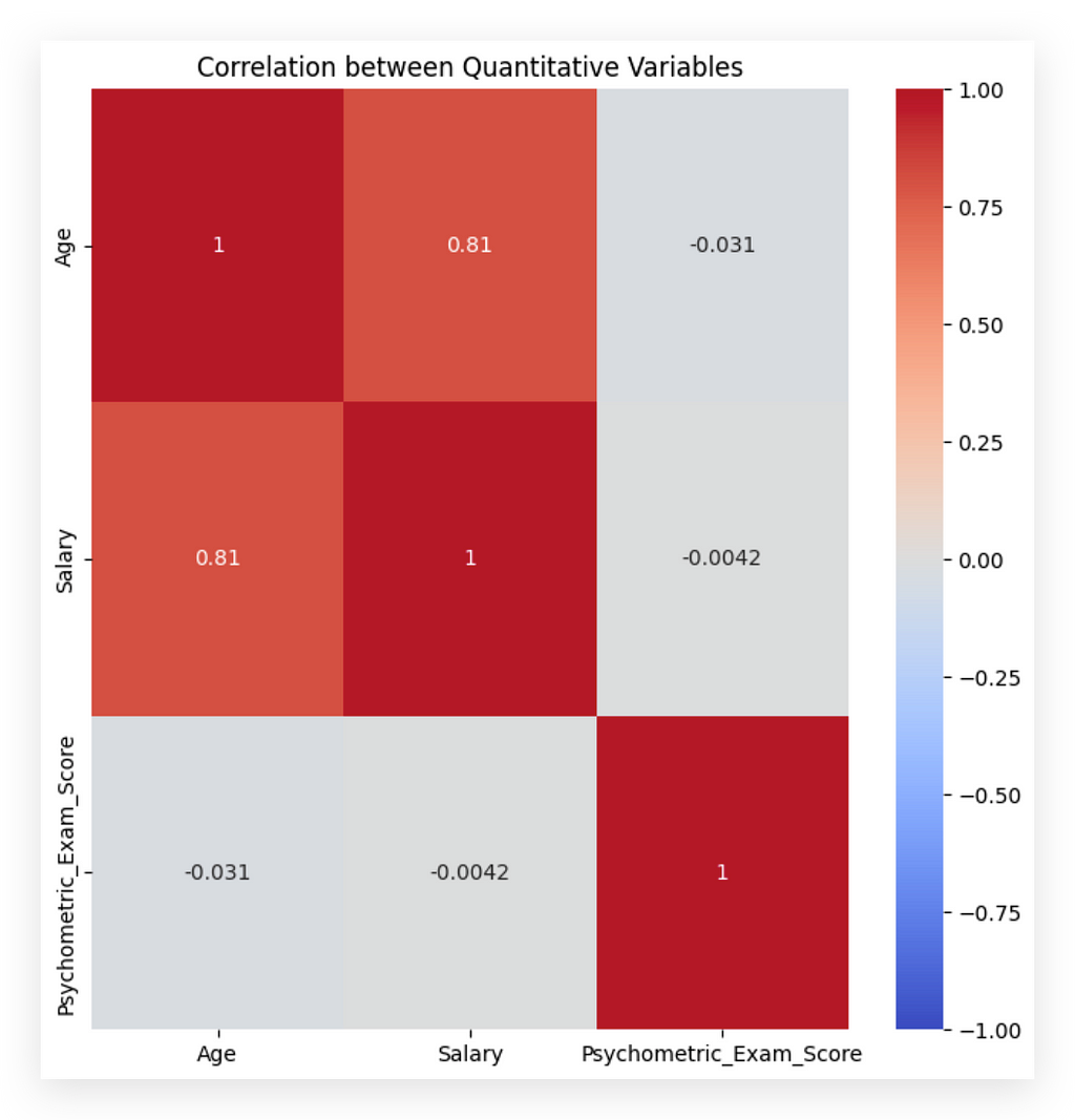
What do we analyze from here? The red diagonal, marked with a “1,” represents the correlation of each variable with itself, which naturally yields the highest possible correlation. Next, we look at the other quadrants.
For instance, the 0.81 at the top indicates a strong correlation between the variables age and salary. Because this is a positive correlation, it suggests that, within this dataset, as age increases, so does salary. It's crucial to remember that this correlation applies only to this particular dataset and shouldn't be inferred as a universal rule.
Now, regarding age and score, we see -0.03, which is close to zero, indicating no apparent correlation between age and the psychometric exam score. I say "apparent" because we're only examining numerical values here. A more detailed causal analysis would be required to claim any true cause-and-effect relationship. In this dataset, however, there seems to be no correlation between age and exam score, meaning age doesn't predictably affect exam performance.
This approach is essential: evaluate each variable pair to identify patterns. Toward the end of the project, I’ll transform age into a categorical variable to show how to analyze relationships between categorical and quantitative variables, like age categories and salary.
For now, since age remains a quantitative variable, your task is to spot any anomalies or odd patterns. These insights will inform your preprocessing decisions shortly.
Association Between Qualitative Variables — Contingency Table
To analyze relationships between qualitative variables, you cannot use Pearson correlation — which is the standard method for quantitative variables and what we used previously. This approach is unsuitable for qualitative variables.
Instead, for qualitative variables, we use a contingency table to assess associations by observing frequency distributions across categories.
# 16. Calculando a matriz de correlação apenas para variáveis quantitativas
correlation_matrix = df[['Age', 'Salary', 'Psychometric_Exam_Score']].corr()
Many people out there don’t fully understand what they’re doing and simply apply correlation to both qualitative and quantitative variables, mix everything together, then draw conclusions, thinking they’re conducting an analysis. But that’s not how it works, ok? This is why, from the beginning, I’ve emphasized the importance of distinguishing between quantitative and qualitative variables. You need to examine each variable and determine the type of information it represents.
For quantitative variables, we use Pearson correlation. There are also other types of correlation, like Spearman, but Pearson is the most commonly used for this type of analysis. For qualitative variables, it’s a different story. I’ll introduce three methods to you.
Here’s the process: we’re analyzing data, exploring, and first examined relationships between quantitative variables. Now, we’ll look at the relationships between qualitative variables, applying an appropriate approach. We’ll interpret the results after applying the strategy, and later, you’ll understand what these statistical tests entail.
I’ll start with a contingency table, which is not yet a statistical test but one of the quickest and simplest ways to study relationships between qualitative variables. It’s essentially a crosstab — a table that shows the frequency, or count, of observations within each category for two variables.
# 18. Contingency Table
contingency_table = pd.crosstab(df['Gender'], df['Education_Level'])
Here’s what I’ll do: I’ll call Pandas and ask it to calculate the contingency table between the two qualitative variables, Gender and Education_Level. I’ll store this result in a Python variable and print it out for you.

So here we have 31 people in the dataset identified as female with a primary education level. We see 90 individuals of female gender with a high school education and 48 employees identified as female with a higher education level.
Aren’t we examining the relationship between these two variables? From this, we could calculate percentages, create summaries, or even dive into more detailed analyses to see which combination has the highest count. However, there’s an even better way to analyze this contingency table: by applying the Chi-squared test.
With the contingency table, we’re precisely exploring the relationship between categories within one variable and those within another. The Gender variable has three categories, and Education_Level also has three. For each category combination, we calculate a frequency count, which forms the contingency table.
This approach provides a preliminary way to study the relationship between qualitative variables. We can further apply a statistical test to this contingency table for a more rigorous analysis, aligning with the same methodology you’d find, for instance, in Excel.
Association Between Qualitative Variables — Chi-Squared Test
I’ve shown you the contingency table, which allows us to calculate the values representing combinations between the categories of one qualitative variable and the categories of another qualitative variable.

Association Between Qualitative Variables — Chi-Squared Test
In the contingency table, you might notice that it doesn’t provide highly meaningful insights — just raw counts. For example, we know there are 90 female employees with a high school education, which is a higher count than the other education levels. This is a basic analysis.
To conduct a more complex analysis, we can take this contingency table and apply a Chi-Squared test. This test is used to check for independence between two categorical variables, which is essentially examining the relationship. Are these variables independent, meaning that the occurrence of one does not affect the other? Or is there some dependency between them? That’s what the Chi-Squared test aims to uncover.
The Chi-Squared test is a statistical test, requiring us to define two hypotheses:
- H₀ (Null Hypothesis): There is no significant association between the two categorical variables in the dataset. In simpler terms, the variables are independent.
- H₁ (Alternative Hypothesis): The opposite of the null hypothesis, suggesting that there is a significant association between the variables, meaning they are not independent.
The purpose of the test is to validate a hypothesis, removing any guesswork. In data analysis, conclusions should be based on statistical testing, not assumptions. By applying a statistical test, we can draw objective, data-driven conclusions.
In this case, we’ll use the p-value from the test result to interpret our findings:
- If the p-value is less than the significance level (commonly 0.05), we can reject H₀, suggesting that the variables are not independent (considering H₁ instead).
- If the p-value is greater than the significance level, we cannot reject H₀, meaning the data does not support a significant association between the variables.
For this test, I’ll use the chi2_contingency function from the stats package in SciPy.
# 19. Load the chi2_contingency function
from scipy.stats import chi2_contingency
And here’s what I’ll do next: I’ll apply the function, specifying the contingency table I just generated above as the parameter. This table serves as the input for the chi2_contingency function, allowing us to analyze the association between the categories of the two qualitative variables.
# 20. Apply the chi2_contingency function
chi2, p, _, _ = chi2_contingency(contingency_table)
Instead of analyzing the table item by item — which is indeed possible — I prefer to apply a statistical test directly to this table. This test returns four values. However, I only need two: the chi2 statistic (the actual chi-squared value) and the p-value. The other values returned by the function are unnecessary for this specific test, so I’ll ignore them by assigning an underscore.
Let’s apply the test..
# 21. Print the p-value from the Chi-square test
print(f"P-value from Chi-square test: {p:.4f}")

Let’s print the p-value. We get a p-value of 0.83. Based on the rule mentioned above, in this case, we fail to reject H₀. This likely suggests that the two variables are independent of each other. In other words, there’s no dependent relationship between an employee’s gender and their level of education.
This conclusion makes sense upon reflection; the gender of a person should not affect their level of education. At least in this dataset, this is what we observe.
We’ll apply more statistical tests throughout this project.
Association Between Qualitative Variables — Cramer’s V Test
Let me show you another approach to studying relationships between qualitative variables: Cramer’s V coefficient, often represented by the letter V. What is this coefficient for? It measures the strength of association between two nominal variables, with values ranging from 0 (no association) to 1 (perfect association). It’s based on the chi² value, which is why I’ve introduced these three methods together: the contingency table, the chi² test, and Cramer’s V coefficient. They are all closely connected.
If you review Cramer’s V definition, it measures the association strength between two variables, which is similar in concept to the correlation coefficient that measures the strength of correlation between quantitative variables. You would use the correlation coefficient when the variables are quantitative and Cramer’s V when they’re qualitative. And if you want to study the relationship between quantitative and qualitative variables, there’s another technique I’ll show you shortly.
Does this make sense? I hope so. Let’s move forward.
First, let’s check the sum of values in the contingency table.
# 22. Calculating Cramér's Contingency Coefficient
n = contingency_table.sum().sum()
phi2 = chi2 / n
r, k = contingency_table.shape
cramers_v = np.sqrt(phi2 / min(r-1, k-1))
print(f"Cramér's Coefficient V: {cramers_v:.4f}")
I’ll then divide chi² by N. Where does this chi² come from? Not from thin air! It came from the chi² test result we calculated earlier. So, I took exactly that test statistic and divided it by N, which is the sum of the contingency table. Everything ties together, right?
This calculation gives us phi². Then, I obtained the shape of the contingency table and simply applied the mathematical formula for Cramer’s V coefficient. This will give us the V value, representing the association coefficient.
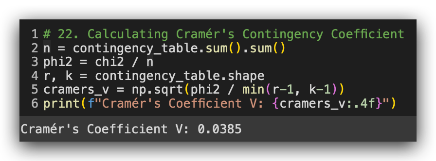
Execute, and there it is: 0.034 if you round it. What does this mean? A value close to zero indicates no association. In other words, it confirms what we observed in the chi² test — there’s no relationship between gender and education levelin this dataset.
However, we did see a strong correlation between age and salary.
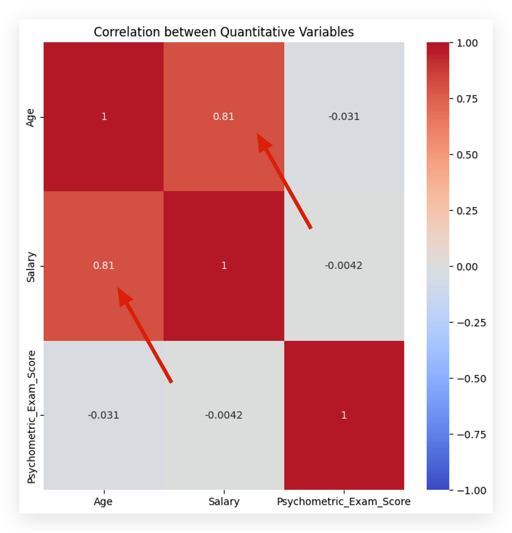
There isn’t a strong correlation between age and score, nor between salary and score. These are the conclusions of our work so far, considering both correlation and association. Why is this important? Because these insights will guide your decisions during the preprocessing phase.
With this, we have a complete project context — we need to carry out the entire process from start to finish. You need to load the data, explore the data, and perform this correlation and association analysis. Then, you’ll make preprocessing decisions and move forward with the analysis. We’ll repeat this process in various scenarios, with different data and techniques, because this is the optimal approach to mastering data analysis.
Data Preprocessing Techniques — Duplicate Values
You’ve probably noticed that we haven’t processed any data so far, right? Up to this point, we’ve explored, understood, and checked the data for potential problems and anomalies. We performed both correlation and association analysis. Now, we’re ready to make decisions about processing the data.
At the beginning, any processing strategy I might have chosen would have been risky because I didn’t yet understand the data. Now, with a clear understanding of the data structure, things will be easier. I’ll introduce you to a series of data processing techniques, each with a clear justification for my choices. This is the approach you should take in your day-to-day work: don’t apply a technique simply because I say so — apply it because you understand the need for it and can justify your decision.
So far, we’ve analyzed and explored the data, and now we’re using the insights from that work to decide on the type of processing required. We’ll begin with handling missing values, duplicates, and negative values. There’s no single order, but here are a few guidelines.
Let’s start with the simplest of all: duplicate values. Duplicate data is indeed an issue, but be careful. What exactly constitutes a duplicate value?
Duplicate Values Detection
When we talk about duplicate values, we’re referring to what is known as a complete case. A complete case occurs when two rows are identical across all columns. Can a category repeat itself? Absolutely. For instance, we might have one employee who is male and another who is also male, and so on. This is not a problem; in fact, it’s expected since we anticipate distributed categories.
What we can’t have are two rows that are identical in every single column. How can we check for this using pandas?
We use the duplicated method. Assign the result to a Python variable and use this variable as an index to search within your DataFrame.
# 23. Using the duplicated() method to create a series of boolean values indicating duplicates
duplicates = df.duplicated()

# 24. Displaying the duplicated rows
df[duplicates]

No duplicate values? Great, one less problem to tackle. But be cautious. During the preprocessing phase, you may inadvertently introduce duplicates or even missing values. Whenever you apply a preprocessing step and have any doubts, it’s wise to double-check for duplicates.
In fact, a final check is advisable to ensure there are no duplicate values. Duplicate values are problematic and must be identified and handled. The most common approach is to remove at least one of the duplicates: if there are two identical rows, remove one; if there are three, remove two, and so forth.
In this case, there are no duplicate values, so we’re clear here. In other projects, we’ll revisit this topic, possibly encountering duplicates. I’ll be alternating between different perspectives so you can see this issue from various angles.
Data Preprocessing Techniques — Negative Values
Let’s now check for negative values, which we already know are present in the data. In our exploratory analysis, we used the describe method for a statistical summary, and we spotted the negative value there. Feel free to run describe again if you like, but the information is in our notebook above. We know one of the variables contains a negative value, which demonstrates why exploratory analysis is crucial—it helps us identify such issues early on.
Now, I want to view these values. Specifically, I want to see the rows where salary is negative.
# 25. Checking for negative values in the Salary column
df[df['Salary'] < 0]
In this case, the index will be the result of this expression. Wherever the salary column has values less than zero, it will mark those entries as true. I’ll use this as a filter for the df dataframe itself.
Now, let’s execute the filter to see the rows with negative salary values.
And there we go.
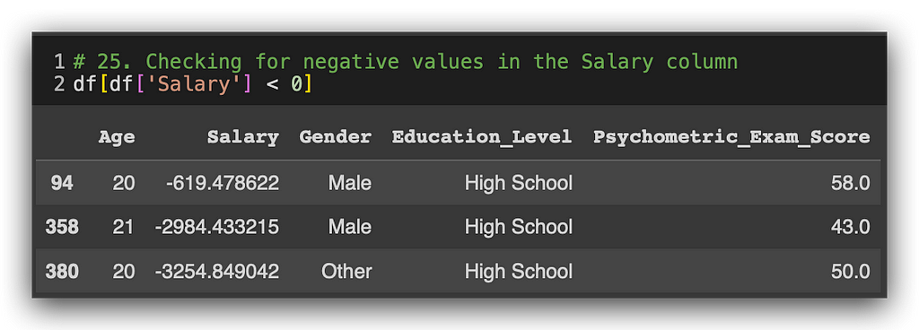
Three negative values in the salary column. We see an employee aged 20, another 21, and again 20. And they all have negative salaries. This is a complex issue that’s not easily resolved by a simple mathematical expression. Why? Are there negative salary values? Probably not.
But what if, for instance, the employee took out a loan from the company? Many companies offer this option, and they might deduct the loan amount from the salary, thus resulting in a negative value in this column. Could it also be a data entry error? That’s a possibility too. Regardless of the source, we likely have an issue here. So, how do we address it?
Leaving the negative values here will impact the salary mean, which is not ideal. The best option, in my opinion, is to go to the data source. Speak to the decision-maker, HR, or whoever is responsible and ask: Is this negative value correct? Was there a collection error? This verification is the ideal approach.
However, here, without an HR contact, we have to make a decision ourselves. Suppose we’re unable to verify the data source or speak to someone in charge. In that case, my chosen strategy is as follows:
- Convert negative salary values into missing values and then treat them accordingly. We can’t simply change the negatives to zero, as zero salary is also unrealistic. Alternatively, we could replace the negative values with the mean of other employee salaries. While technically simple, this replacement could completely alter the information.
- Treating them as missing values seems the most reasonable. We can handle the imputation later, but for now, we’ll set these values to empty, mimicking missing data for those three columns.
- Another safer option is deleting these three records if verification or alternative techniques aren’t available. Here, three records won’t make a big difference, though deleting thousands would warrant reconsideration.
Thus, for this case, I’ll change the negative values to NaN without losing any records, allowing analysis for all employees’ data. If you feel more comfortable, simply delete the three rows. Both are viable options.
Here’s how to replace the negative values with NaN.
# 26. Replace negative values with NaN (missing values)
df['Salary'] = df['Salary'].apply(lambda x: x if x >= 0 else None)
Take the df dataset and apply a function using lambda, which will enable this transformation inline. Here’s the logic:
- For each value X in the salary column, if the value is greater than or equal to zero (even though we don’t have zeros here, we still need a rule), we keep the value as is.
- Otherwise (i.e., for values less than zero), we set it to None to represent a missing value.
This keeps the data clean and ready for imputation later on. We save the transformed data in the original variable. Check the results to confirm.
Here’s the code:
# 27. Check for negative values in the Salary column
df[df['Salary'] < 0]

There are no more negative values. Consequently, the salary variable now has an increased number of missing values. It already had some missing entries, and now there are three additional ones. I'll handle all these missing values together at once.
Techniques for Data Preprocessing — Missing Values Map
Does a data analyst influence the outcome of the analysis? I’m sure you’d agree with this statement. In the end, it’s not just about using Python as if the language were doing everything automatically. We are constantly making decisions, which is why experience in this field is valued by companies. It’s reasonable, isn’t it? Consider what we’ve done so far: addressing negative values first made a difference. If we had delayed handling the negative values, what would have happened?
I would have dealt with missing values first, without modifying the negative salary values. We’d think we were done handling missing values—excellent. But then, if I followed the same strategy for negative values, three additional missing values would appear, requiring us to address missing values again. So, depending on the identified issues, the order of operations can reduce your workload.
It wouldn’t be a major problem to go back and handle missing values afterward, but the chosen sequence can either streamline or complicate your work. I’ll try to present the ideal order for each scenario here. Let’s start by creating our missing values map, using that same package loaded earlier. We’ll call the Matrix method, input the updated dataset, and specify that we don’t need Sparkline, only columns.
# 28. Missing Values Map
msno.matrix(df, figsize=(10, 6), sparkline=False)
plt.show()
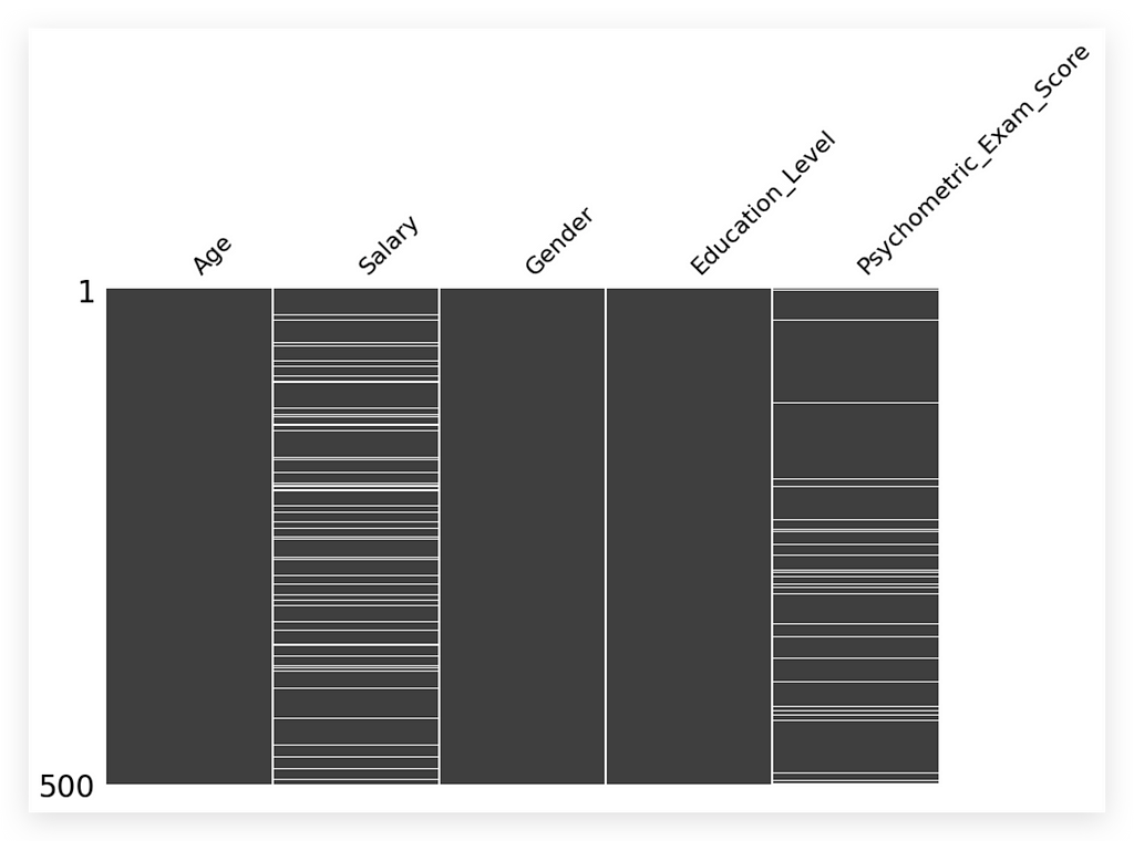
Here it is for you. This is our missing values map.
Looking at the map, what do you notice? Three columns — Age, Gender, Education Level — have no missing values and are fully filled in gray. However, the Salary and Psychometric Exam Score variables display white spaces, indicating missing values that need addressing.
Missing values are a problem and must be handled. This visualization is particularly helpful for documentation, presenting to stakeholders, or simply gaining an overview.
If you prefer, you can also use this approach:
# 29. Using the isna() method to check for missing values in each column
missing_values = df.isna().sum()

print(missing_values)
Call the DataFrame and ask if there are any NA values using isna(). If there are, perform a sum for each column. Execute the code, and here it is:
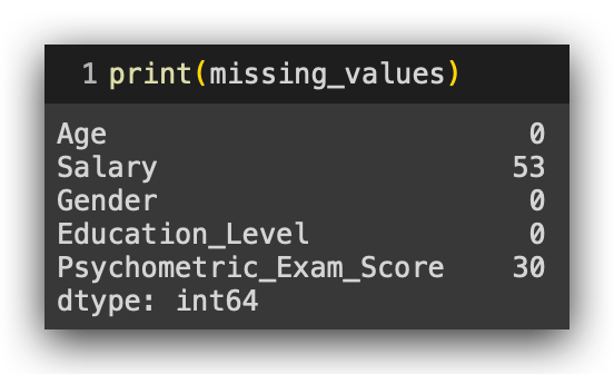
We have 53 missing values in the Salary column and 30 in Psychometric_Exam_Score. Now, is 53 considered a high or low number? Analyzing the raw count alone isn’t ideal.
We should examine the proportion of missing values instead, as the significance of 53 depends on the dataset's overall size. Calculating the percentage of missing values gives a clearer context.
To calculate this percentage, divide the missing count of each column by the total row count, then multiply by 100:
# 30. Calculating the percentage of missing values in each column
missing_percentage = (df.isna().mean() * 100).round(2)

# 31. Displaying the percentage of missing values
print(missing_percentage)
It’s essentially the same: calculate the mean of the missing values and multiply it by 100, rounding to two decimal places.
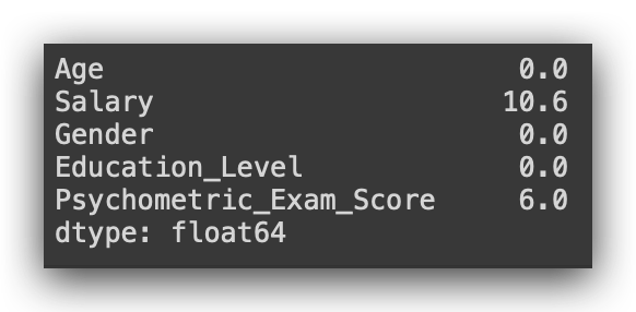
Now it makes more sense, right? We’re looking at the proportion. We have 10.6% missing values in the Salary column and 6% in Psychometric_Exam_Score.
Here’s a general rule that’s widely used: if you have 50% or more missing values in a variable, it’s better to discard it. Why? Because any technique applied here probably won’t be reliable. Think about it — 50% means half the variable is empty, so any imputation is effectively creating data that didn’t exist.
For missing values between 30% and 50%, and especially below 30%, we have some additional strategies I’ll discuss next.
Strategies for Handling Missing Values
There are various strategies for handling missing values, and choosing the right one is essential as it directly impacts analysis outcomes. As a data analyst, your chosen strategy can enhance the results, create minor biases, or sometimes have minimal effect. Here, I’ll cover four main options, though there are more.
- Row Removal:
The simplest and usually lowest-risk approach, as it involves removing records without adding new data. However, if the missing data percentage is high, you end up with a smaller dataset, which could also affect analysis quality. Generally, row removal is suitable if less than 0.02% of values are missing. - Default Value Imputation:
Here, you fill in missing values using the mean, median, or mode. This is the option I’ll demonstrate. Note that using the mean requires checking the variable’s distribution, potentially through a statistical test. The median, a central value, can be simpler to use, though it carries less detailed information than the mean. - Conditional Imputation Based on Other Variables:
This method lets you fill missing values by referencing other variables, creating specific rules. For example, calculate the mean salary for those over 50 and use this to fill in missing values for others in the same age bracket. Although this method requires more effort, it can yield more tailored results. - Machine Learning Models:
The most advanced and labor-intensive option involves training a machine learning model to predict missing values. While robust, this approach needs a cost-benefit analysis, especially since time is limited in real projects.
I’ll demonstrate default value imputation using the mean, but first, we need to verify if this method is appropriate through a statistical test.
Statistical Tests for Choosing a Missing Value Strategy
Let’s apply a statistical test, specifically a normality test, to determine the appropriate strategy for handling missing values. Since I plan to use imputation, there are options: filling in the missing values with the mean, median, or mode.
- The mean typically provides more information, as it incorporates all values in a distribution.
- The median is simply the middle value and carries less statistical information, but can be useful if data is skewed.
In most cases, the mean is preferable. However, using the mean has a prerequisite: the variable’s distribution should follow a normal distribution. We previously examined this in the exploratory analysis.
Now, let’s verify normality before deciding on the imputation strategy.
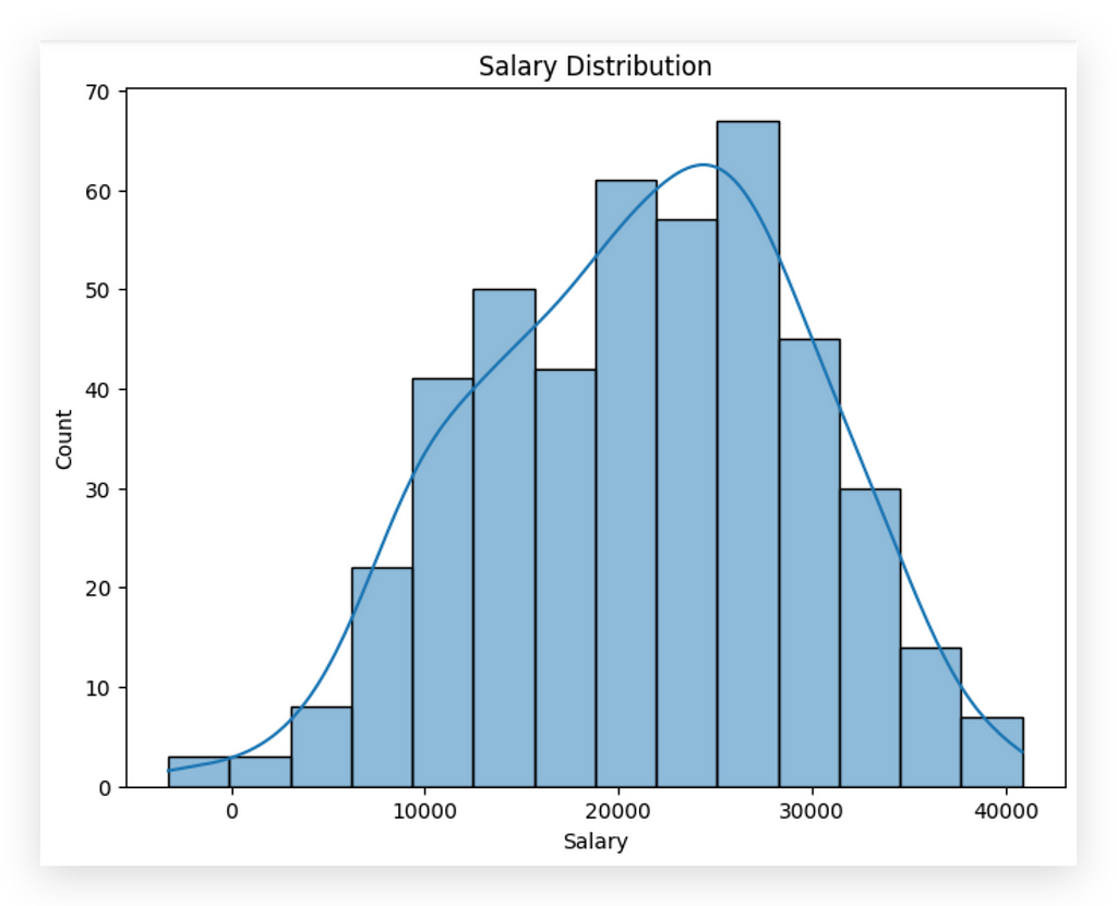
Here it is: Salary Variable
Observe that Salary appears to follow a normal distribution based on the graph. But what would I tell my boss? “Well, boss, I looked at the chart, it seems to follow a normal distribution, so I used the mean. Trust me, it's all good.” Of course, you wouldn’t say that. Instead, you'd professionally apply a statistical test to justify your decision.
The graph offers a general sense, but a statistical test provides the confidence needed to select the appropriate statistic for imputation.
Let’s apply the normality test now. For now, don’t worry too much about the underlying statistics or the tool applied at this stage of the process. Our focus is on the procedure.
I’ll import the SciPy statistical package and extract the Salaryvariable from the DataFrame, creating a copy to isolate it as a separate series. Then, I’ll apply the Shapiro-Wilk test—a test for normality. This test checks whether the variable follows a normal distribution.
As with any statistical test, it involves hypotheses (H₀ and H₁). In this case, no need to define them explicitly since they are inherent to the test itself. What matters here is interpreting the result at the end.
from scipy import stats

# 32a. Extract the "Salary" column into a series, forçando os valores para serem constantes (opcional)
salary = pd.Series([10000] * len(df))  # Força valores constantes na série para garantir p-value de 1.0

# 32b. Apply the Shapiro-Wilk test
stat, p_value = stats.shapiro(salary)

# 32c. Print the test result
print(f"Test Statistic: {stat}")
print(f"P-value: {p_value}")

# 32d. Check the null hypothesis based on the p-value
alpha = 0.05  # Significance level
if p_value > alpha:
    print("There is no evidence to reject the null hypothesis (data appears to follow a normal distribution).")
else:
    print("The null hypothesis is rejected (data does not follow a normal distribution).")
And there you have it: Line of code 32b applies the statistical test, returning both the test statistic (standard for any test) and the p-value. Notice that this p-value is key—it shows up repeatedly and is central to interpretation.
Next, I’ll print out the test statistic and p-value, followed by defining alpha as the significance level, typically set at 0.05in industry. There’s a full theoretical explanation behind all of this, though it isn’t the focus of this tutorial. For now, understand that 0.05 is the industry standard; using it means you're in line with market expectations.
Then, I’ll compare the p-value with alpha:
- If p-value > alpha, there is not enough evidence to reject H₀.
- If p-value < alpha, we reject H₀.
This comparison provides a clear basis for decision-making.

See the result we obtained: there is no evidence to reject the null hypothesis. The data seems to follow a normal distribution. It’s essential to phrase it this way — the data seems to follow a normal distribution.
To assert this with complete certainty, we’d need further tests. Why? Because we’re working with a sample dataset here. Statistical tests are designed to validate populations. I don’t have the entire population at my disposal; I’m working with a sample. Any analysis based on a sample has a standard error rate, meaning we can’t declare with 100% certainty that a variable follows a normal distribution.
So, the correct interpretation is: the data seems to follow a normal distribution or probably follows a normal distribution. This conclusion is sufficient for making our decision. Since the variable appears to be normally distributed, we can use the mean for imputation.
If it didn’t follow a normal distribution, we would have to use the median instead. Is that clear?
In this case, we are now able to use the mean to perform the imputation, effectively handling the missing values by filling them in with the average salary of the variable.
Imputation for Handling Missing Values
Let’s proceed with imputation for one of the variables. Remember, each variable must be treated individually. We’ll address the score variable’s missing values shortly.
First, let’s calculate the mean for the salary variable.
# 33. We calculate the mean of the "Salary" variable (ignoring missing values)
mean_salary = df['Salary'].mean()
When calculating the mean this way, missing values are not included. I’ll calculate the mean without considering the entries with missing values. Then, I’ll execute the cell and apply the fillna method.
# 34. We fill the missing values in "Salary" with the mean
df['Salary'].fillna(mean_salary, inplace=True)
In this case, I’ll call the Salary column and instruct it to perform fillna, filling in the missing values with the average salary. Once this is done, I’ll save the result in the original DataFrame by setting inplace=True. Without inplace=True, the fillna would create a copy in memory, leaving the original DataFrame unchanged, which is not what we want here.
Using inplace=True works like a "save," updating the original DataFrame. After this, I’ll simply verify if there are still any missing values in the Salary variable.
# 35. Usamos o método isna() para verificar valores ausentes em cada coluna
missing_values = df.isna().sum()
print(missing_values)

I still have missing values in the Psychometric_Exam_Score column, which I’d also like to fill using the mean. To use the mean, I must first confirm that the variable follows a normal distribution. How do we check this? By applying the Shapiro-Wilk statistical test.
Following the same steps as before, I’ll repeat the process now for the Psychometric_Exam_Score variable.
# 36. Extract the "Psychometric_Exam_Score" column into a series
psychometric_exam_score = df['Psychometric_Exam_Score']

# Apply the Shapiro-Wilk test
stat, p_value = stats.shapiro(psychometric_exam_score)

# Print the test result
print(f"Test statistic: {stat}")
print(f"P-value: {p_value}")

# Check the null hypothesis based on the p-value
alpha = 0.05  # Significance level
if p_value > alpha:
    print("There is no evidence to reject the null hypothesis (the data appears to follow a normal distribution).")
else:
    print("The null hypothesis is rejected (the data does not follow a normal distribution).")
The interpretation remains the same. Execute the test. There is no evidence to reject the null hypothesis — the data appears to follow a normal distribution. Great! I’ll also use the mean for this column.
Now, I’ll repeat the procedure by calculating the mean for Psychometric_Exam_Score.
# 37. Calculate the mean of the "psychotechnical_exam_score" variable (ignoring missing values)
mean_score = df['Psychometric_Exam_Score'].mean()
I’ll use fillna to fill in the missing values.
# 38. Fill missing values in "psychotechnical_exam_score" with the mean
df['Psychometric_Exam_Score'].fillna(mean_score, inplace=True)
Missing values resolved and handled.
# 39. Use the isna() method to check for missing values in each column
missing_values = df.isna().sum()
print(missing_values)
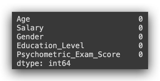
There are no more missing values in our dataset.
The techniques, strategies, and decisions I made were based specifically on this dataset. If given a different dataset, I might opt for alternative techniques, procedures, and decisions — because it all depends on the data context. That’s why it’s essential to know as many techniques as possible. Covering all techniques at once would be overwhelming and counterproductive; simply presenting code is ineffective if not contextualized. Each strategy here aligns with the specific data and conditions we have.
Are we done with our work? Not yet. Consider the following question:
We observed a correlation between Age and Salary—confirmed during exploratory analysis. But what if we transformed Age into age ranges? Would this correlation still hold?
To find out, we must analyze the data from this new perspective.
Converting Data without Losing Information
We observed a strong correlation of 0.81 between Age and Salary in the correlation matrix—indicating a high positive relationship, where an increase in age aligns with an increase in salary, and vice versa. However, Age as an individual value isn’t typically formatted this way in datasets. More often, Age is categorized by ranges, as individual age data is highly specific to each client, employee, or person, making it less common for general analysis.
Exploring this correlation from another perspective, by transforming Age into age ranges, would provide insights from a broader angle. This kind of detail comes with experience, highlighting the importance of working on multiple projects, checking and revisiting data, delivering results, and getting feedback. With time, certain patterns will emerge, often repeatable from project to project.
To proceed, I’ll show you how to convert Age into ranges and apply another statistical test since Age will change from a quantitative to a qualitative variable, while Salary remains quantitative. Consequently, we’ll need a different approach to analyze this relationship.
First, I’ll define the age ranges I plan to work with. These are my chosen limits, though it’s possible to adjust them as needed.
# 38. Define the desired age ranges in ascending order
age_ranges = [0, 25, 35, 45, 55, float('inf')]
I’ll now define the names of the age ranges. Since these are text labels, they need to be enclosed in quotation marks.
# 39. Define labels for the age ranges
age_labels = ["Under 25", "25-34", "35-44", "45-54", "55 and above"]
So, I’ll create the age groups: under 25 years, 25 to 34, 35 to 44, 45 to 54, and 55 or older. Of course, you can change these age ranges if you want. Now, let’s create the Age_Group column. How do we do that?
# 40. Use the pd.cut() function to create the age range variable
df['Age_Range'] = pd.cut(df['Age'], bins = age_ranges, labels = age_labels)
Using the cut method, Python will look at the Age variable and apply the bins, which define the age ranges, and the labels, which are the assigned labels for each range. This will create the new column called Age_Group. cut handles this conversion automatically.
Why am I creating the Age_Group column? Because analyzing age as an individual value is uncommon, and I want to examine its relationship with Salary from a different perspective—this is the key point here.
Once I’ve decided to analyze age categorically, I implement the technical solution, which, in Python, is done with a single line of code. Whether in Python or R, converting a quantitative variable into a qualitative one based on custom ranges is very straightforward. Other tools would likely make this more complicated, but here it’s quick and efficient. Let’s run this.

Look at that! Now we have Age_Group. The information remains the same, but the data presentation has changed. Previously, the value was 58; now it’s represented as 55 or older.
Is the information still the same? Yes, it is. Whether we display 58 or 55 or older, it still indicates the age of the person—either as an exact number or as a range. We modified the data without altering the information, which is perfectly acceptable.
Now, I can analyze this information from a different perspective. By transforming the data, I can perform an analysis using a new format. Let’s check the info to confirm that the new Age_Group variable is now classified as categorical.
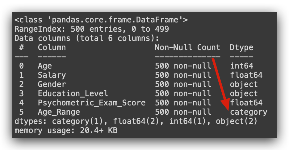
It’s now a qualitative variable, no longer quantitative. I’ll drop the Age variable. Dropping it isn’t mandatory; I’m just taking this opportunity to show you how to do it.
# 41. Use the drop() method to remove the "Age" variable
df.drop('Age', axis = 1, inplace = True)
Now I have the Age Range. You don’t need to keep two variables with the same information in your dataset unless you plan to conduct analysis both by individual age and by age range. In that case, of course, keep both. But if you only need one, there’s no need to maintain two columns.
So, what’s next? I’ll make an adjustment to the dataset here. You might notice that some values have many decimal places. I’ll round them just to improve presentation.
# 42. Round the "Salary" and "Psychometric_Test_Score" columns to integers
df['Salary'] = df['Salary'].round().astype(int)
df['Psychometric_Exam_Score'] = df['Psychometric_Exam_Score'].round().astype(int)
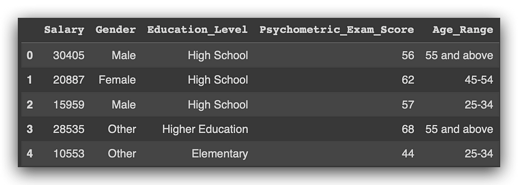
I’ve converted everything to integers. Let’s check the describe() function to view the statistical summary.
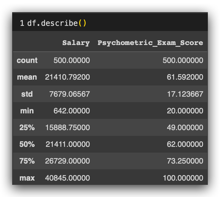
Remember that when I used describe() before, the variable age appeared because it was quantitative.
Does age_rangeappear now? No, because it is now qualitative.
Statistical Tests for Relationship Between Quantitative and Qualitative Variables
We’ve already converted the variable, keeping the information intact. Before applying the statistical test, I want to be more confident in interpreting it.
Here’s what I’ll do: I’ll use a GroupBy operation on our dataset, df, grouping it by the age_range column. For each age range, I'll calculate the average salary.
To do this, I enclose salary in brackets to specify what to calculate the mean of, while age_range remains in parentheses, as it’s part of the GroupBy function. I’ll then compute and print the averages.
# 43. Average salary by age group
average_salary_by_age_group = df.groupby('Age_Range')['Salary'].mean()
average_salary_by_age_group
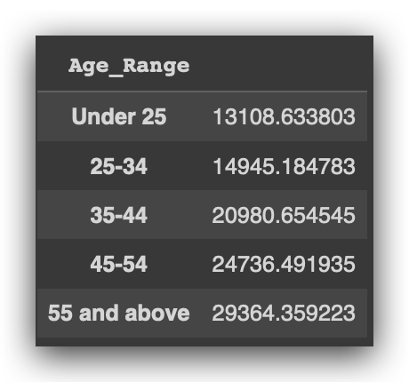
As the ages increase across the age ranges, what happens to the average salary? Age in the ranges is rising, right? And what’s happening with the salary average? It’s increasing. Interesting.
This suggests there indeed seems to be a relationship between age and salary, regardless of perspective. In other words, no matter how I look at it, there appears to be a link between age and salary.
However, I can’t just tell my boss, “It seems like there’s a relationship,” right? I need to apply a test to truly validate whether this relationship exists. Let’s examine the median salary for each age range.
# 44. Median salary by age group
median_salary_by_age_group = df.groupby('Age_Range')['Salary'].median()
median_salary_by_age_group
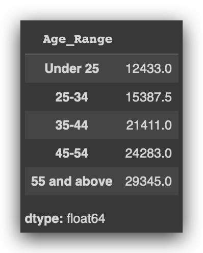
Since the mean can be influenced by other factors, the median provides an additional perspective.
What’s happening to the median as the age range increases? It’s also increasing. This is yet another indication that there seems to be a relationship.
Now, let’s visualize age range and salary using a box plot.
# 45. Boxplots for Salary by Age Group
sns.boxplot(x = 'Age_Range', y = 'Salary', data = df)
plt.xticks(rotation = 45)
plt.show()
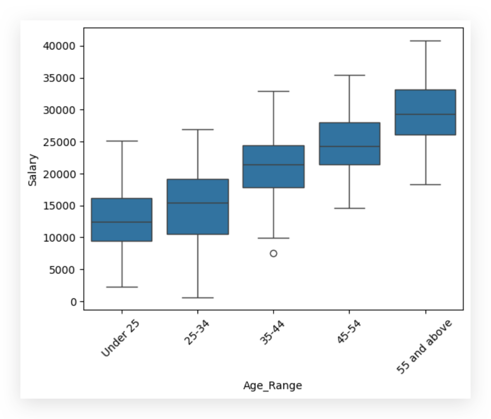
And look at what’s happening: as the age range on the X-axis increases, the salary also rises. What are we analyzing here in the box plot?
- The line in the middle of the box represents the median.
- The line marking the top of the box is the third quartile, and the bottom line is the first quartile.
- The whiskers show the range, while any points detached from the whiskers are outliers, representing extreme values.
What’s happening to the median? It increases as the age range goes up, suggesting a positive relationship.
I’m now confident enough to proceed with the statistical test. I don’t expect the test to predict outcomes directly, but logically, everything we’ve observed suggests there’s likely a relationship between age and salary, regardless of how we analyze it.
Let’s apply the ANOVA test.
# 46. ANOVA Test for Salary Differences Among Age Groups

# Import ANOVA function from SciPy
import scipy.stats as stats

# Perform the ANOVA test to check for mean differences across age groups
anova_result = stats.f_oneway(*[group['Salary'] for name, group in df.groupby('Age_Range')])

# Check the test result
if anova_result.pvalue < 0.05:
    print("There is evidence of significant differences in mean salaries across age groups.")
else:
    print("There is no evidence of significant differences in mean salaries across age groups.")

ANOVA stands for Analysis of Variance, and it’s the recommended test when studying the association between a qualitative variable and a quantitative variable. Typically, what we’re examining here is the difference in means across age groups.
By looking at the salary means across these age brackets, we can draw a conclusion through yet another statistical test — ANOVA. And, once again, this brings us back to the familiar p-value, a constant presence in our analyses.
In this phase, I’m comparing the p-value from the statistical output against our 0.05 significance level. I’m using a loop here to iterate over each age group and retrieve the salary means to input into the statistical test.
The test will then determine whether there are significant differences in the average salaries across age groups. No more guesswork here. Earlier, when I simply observed the data, it seemed logical to conclude that salary rises with age range, but that was still speculative.
Now, we can convey the result of our analysis with a higher level of confidence, fully grounded in statistical testing. Based on this analysis, the conclusion is clear: there is a relationship between age and salary.
Delivering Analysis Results to Decision Makers
Here’s a summary of our work, essentially the final report that would be presented to decision makers:
- Salary Variable: We observed negative values in the Salary variable. Without additional information, we chose to convert these negative values to missing values.
- Missing Values: Both Salary and Psychometric_Exam_Score had missing data, which we handled through mean imputation, as both variables follow a normal distribution.
- Variable Independence: There is no association between Gender and Education_Level, indicating these variables are independent.
- Age and Salary Correlation: We identified a positive relationship between Age and Salary, consistent across both individual age values and age ranges.
Our findings and decisions were backed by statistical testing throughout the analysis.
That’s it — present the findings to the decision maker. Project complete, and a satisfied client. On to the next project! This journey demonstrates a structured process we’ll follow in every chapter, with a gradual increase in complexity. You might wonder, “Isn’t this complex enough?” Actually, this is just the introduction!
I encourage you to review everything, read all comments, and feel free to make small changes or try out different strategies. You can also apply this process to new datasets to see how different contexts might lead to different decisions. Use this as a foundation for building your own projects and portfolio.
See you soon, and best of luck on your data journey! 🐼❤️
All images, content, and text are created and authored by Leonardo Anello
Practical Guide to Data Analysis and Preprocessing: Techniques for Quality Data was originally published in Towards Data Science on Medium, where people are continuing the conversation by highlighting and responding to this story.
from Datascience in Towards Data Science on Medium https://ift.tt/NOH7xrv
via IFTTT


