
Running visibility analysis in QGIS
Running Visibility Analysis in QGIS
Learn how to easily run visibility analysis with free GIS software and data, and use the results to create stunning visualizations
One of my all-time favourite types of spatial analysis is visibility analysis. It’s a really simple concept, allowing you to work out — theoretically — where something can be seen from. There are two main forms of visibility analysis — also know as viewshed analysis or ZTVs (Zones of Theoretical Visibility). These are:
- The “standard” viewshed: where can I see from this location? E.g. if I’m stood on top of a mountain, what will my view be?
- The “reverse” viewshed: where can see a location? E.g. if I’m stood on top of a mountain, who can see me?
It works by taking a set of observer points and a relief model, then calculating the line of sight between every part of that relief model and the observer points. Sounds like it would be a slow process, right? It can be. But the results are amazing, and indispensible for some applications.
One of the most common applications is to help people to understand where a new development — such as a wind farm, solar panel site or highway — will be visible from. Analysts can then model different scenarios based on their findings, such as what happens to visibility if they plant a line of trees in this exact location? Visibility analysis can also be used to drive pricing strategies for billboards or help sell penthouse apartments.
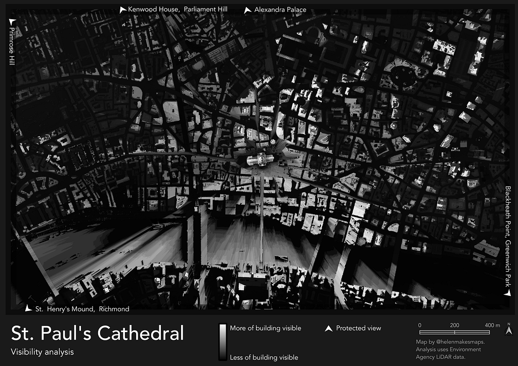
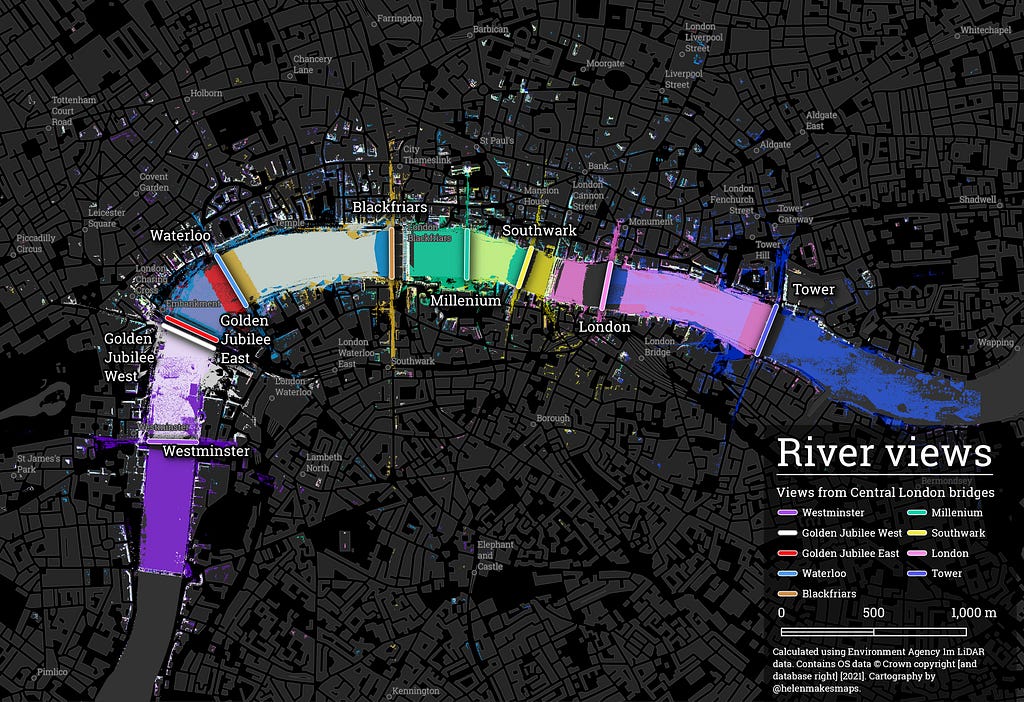
In this article, I’ll be sharing how you can easily run visibility analysis with QGIS — an open-source, free GIS software. But first, here are some examples of the end result…
Want to try?
You will need…
Software:
- QGIS downloaded and installed, which you can do from here
- The QGIS plugin Visibility Analysis installed. To do this, open QGIS and go to the Plugins drop-down. Select Manage and Install plugins… and search for Visibility Analysis, then click Install.
Data:
- A Digital Surface Model — an elevation model which includes surface features like buildings and trees. You can find some great free resources for this type of data in my guide to free GIS data sources. You should choose a model which is relevant for both the extent you’ll be looking at and the level of detail and accuracy you require.
- A point layer which you want to assess the visibility of.
In this tutorial, we’ll be evaluating where you can see London’s Houses of Parliament from. In the first section, we’ll be sourcing the two above datasets for this analysis — so if you already have your data sourced, keep reading!
Section 1: Data sourcing
#1 Digital Surface Model
Our analysis will be a super localized look at views of the Houses of Parliament, so we want our data to be as detailed as possible — and that means LiDAR data! LiDAR — which stands for Light Detection And Ranging (love a really forced acronym!) — is hyper-local, hyper-accurate 3D data — which is often hyper-expensive as a result. However, there are some great free sources available, which I’ve detailed in this blog. In England, the Environment Agency publishes free LiDAR data for about 60% of the country. This is typically in areas which are flood-prone, which luckily (well, I suppose not) our study area is.
To source the data:
- Head to the Defra Survey Data Download platform. This data is made available via the Open Government Licence. This data can be freely used for any purpose (including commercial) with the license: © Environment Agency copyright and/or database right 2024. All rights reserved.
- Draw your area of interest — make sure you draw a bigger area than you think you need.
- Select Get available tiles. Choose the product to download— we want LiDAR Composite First Return DSM, which will include the canopy height of vegetation (as opposed to last return, which will have the underlying terrain height). You can also select the year and resolution — generally the coarser the resolution, the better the coverage; I’m using a 2m resolution.
- Download all tiles, and unzip them all in your downloads folder.
- Head to QGIS. Click Add Raster Layer and add all of your raster files to the project.
- If you have any small gaps in your data, you can estimate these by using the Fill nodata… tool in the Raster menu under Analysis.
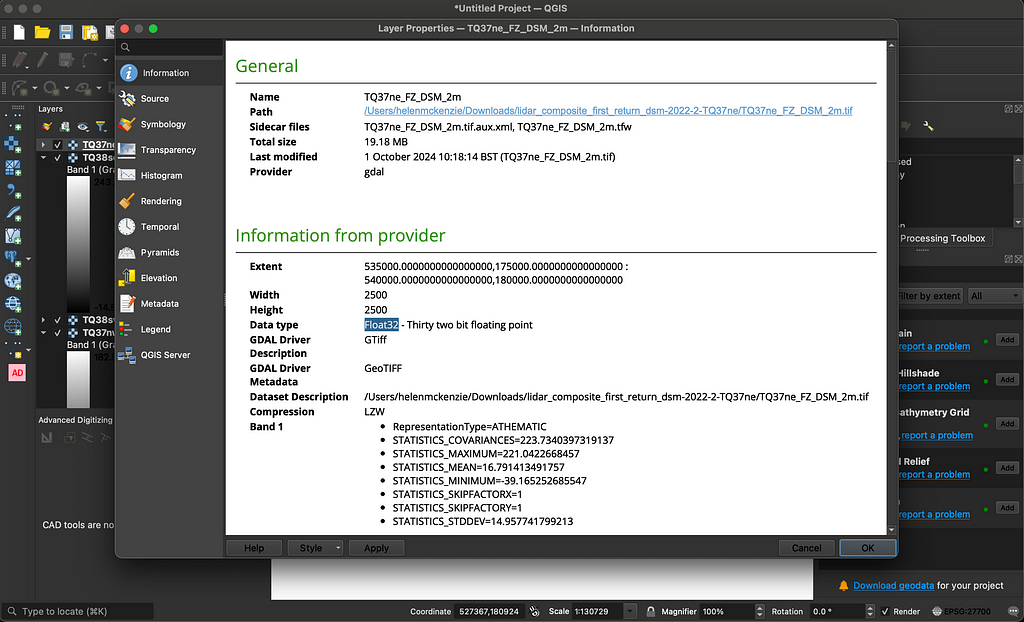
- Now, we need to merge our tiles into one large file. First, we need to know the type of raster data we are using; double click on any of the layers in the Layer panel to bring up its properties. In the Information tab under Information from Provider, note the data type; mine is Float32.
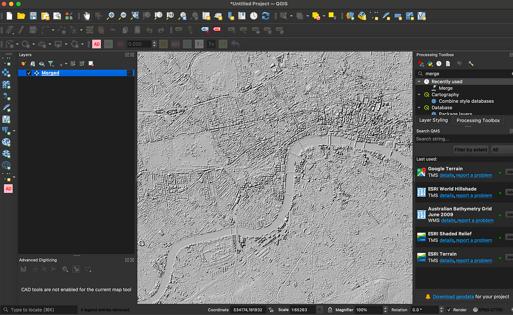
8. Now, open the Merge… tool from the Raster menu under Miscellaneous. Select all of the raster tiles to merge, ensure the output data type is correct for your inputs (mine is Float32) and set the output path for your merged raster — and run!
Here’s our merged layer! I’ve changed the symbology to hillshade to understand more about the shape of the data.
#2 Visibility points
Now I need a point grid which I’ll run the visibility analysis for, which covers the Tower of London.
- First, I need a polygon to build my point grid from. I’ve taken the Tower of London building outline from Ordnance Survey’s Zoomstack, but you can use anything — or build your own.
- Now head to Vector > Research > Create Grid, setting the grid extent to your polygon layer. The more detailed your grid resolution, the more accurate and detailed your visibility analysis will be — but there will be a trade-off with processing time. I’m going to use a resolution of 5m. Run!
- Now, delete all of the points which do not fall inside your polygon. You can do this manually, with a Select by Location or just by using the Clip tool.
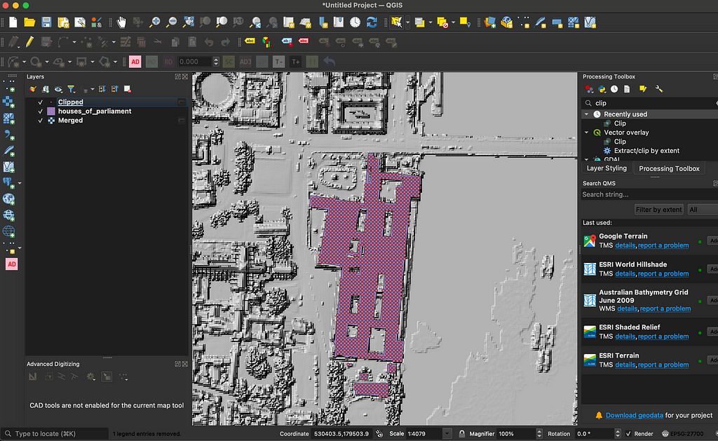
And that’s our two layers sorted — now on to the visibility analysis!
Section 2: Visibility analysis
- First, we need to create some parameters for our analysis. Open the Create Viewpoints tool. You can just search for this in the Processing Toolbox.
- Set the Observer locations as your clipped points and your digital elevation model as the merged raster layer.
- The default radius is set to 5000 metres which is fine for this use case, but you may wish to change it based on your requirements.
- What we’re running here is a reverse viewshed; we don’t want to know what can be seen from the points, but where can see the points. So, change the Observer height to 0, and the Target height to 1.6 (this is the standard “human eye” height used in visibility analysis). Run this — if you open the attribute table of the layer that has been created, you will see the parameters you have set have been added as attributes.
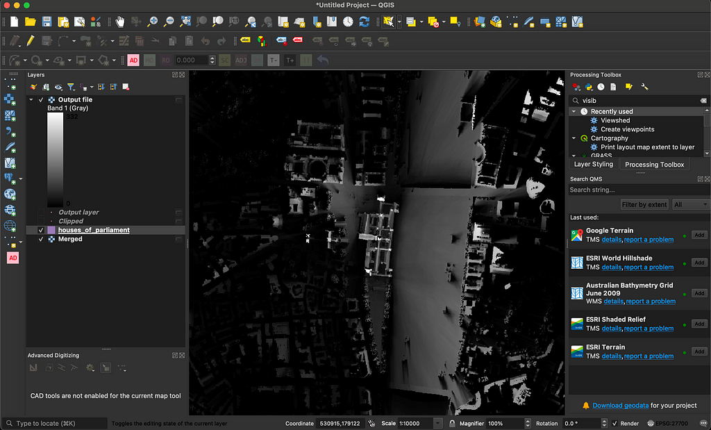
- From the Processing Toolbox, open the Viewshed tool which is where we’ll be running our visibility analysis from! Set the analysis type as binary, the Observer locations to those we created in step 4, the Digital elevation model to our merged raster, and make sure the “Combining multiple outputs” parameter is set to addition.
- Run! This can be quite a slow processing depending on your computer, the number of points, DSM extent and resolution — so go and pop the kettle on.
And when it’s finished, it should look a little something like…
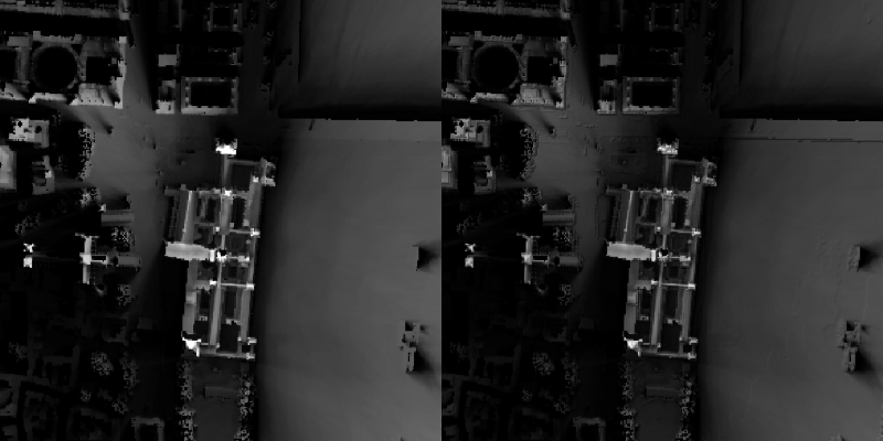
And that’s our visibility analysis done! You can see the lighter areas are where more of the Houses of Parliament are visible from, and the darker areas are where it can’t be seen at all. I love the way the source of the analysis is rendered like a light source, casting shadows where it can’t be seen.
One final step you may want to take here is to remove surface features from the viewshed results. As you can see from this analysis, some of the visible locations are actually on top of nearby buildings or trees— where it’s unlikely someone is going to actually be stood. I’m skipping this step because I know Central London consists of a lot of rooftop gardens and penthouse views, so this isn’t so much of a false positive in this area.
To do this you would need to:
- Download a Digital Terrain Model (DTM) for your study area— this is the equivalent to your DSM, but with all surface features from the DSM (e.g. buildings, trees) removed.
- Use the expression below in the Raster Calculator. This calculates the difference between the DTM and DSM, to obtain only surface feature heights. Then, where the surface height feature exceeds zero, the value of the viewshed is set to 0.
(@viewshed) * (("(@dsm" - "@dtm") <= 0)
Finally, the output!
Section 3: The final output
Depending on your use case, there are lot of different ways of visualizing this output.
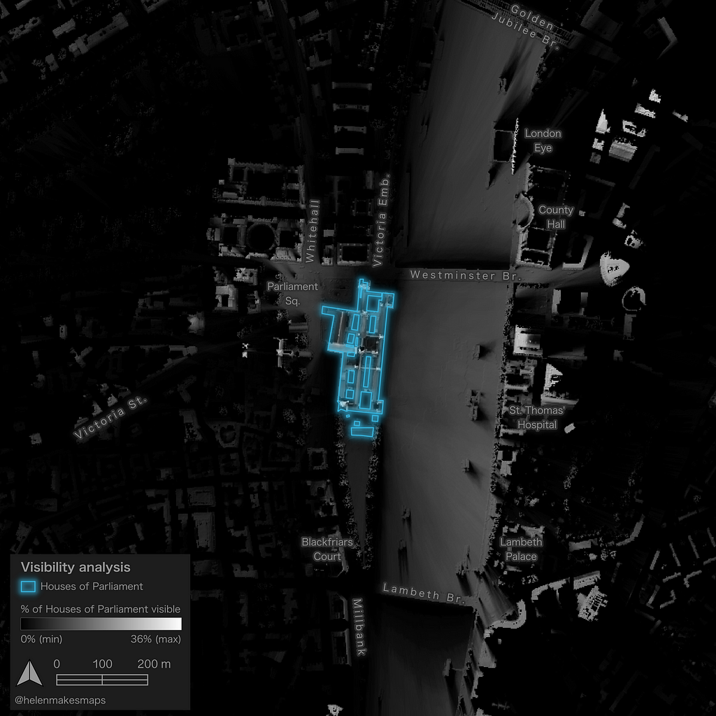
My use case is just “I want to make a damn sexy map” and — honestly — the results of the analysis have this kind of spooky, shadowy effect that for me does 90% of the job.
All I’m going to do is:
- Layer my original DSM on top of the viewshed, set the symbology type to hillshade and the blending mode to multiply. This gives quite a subtle contouring (the make-up style, not the GIS line type!) to the results which helps give the analysis some shape and context. You can see the difference below without hillshade (left) and with (right).
2. I’ve added a “firefly” effect to the footprint of the Houses of Parliament. This type of cartographic style really helps features stand out against a darker basemap. Is it wildly misleading to show the UK’s governmental buildings in a fun neon vibe? Yes. Does it look good so I’m going to do it anyway? Also yes. You can learn how to use firefly style cartography in QGIS here.
3. Finally, I’ve just added on a few contextual labels and a minimalist legend. I really want the analysis to be the star of the show here, so I’ve kept everything super subtle and light touch.
And here’s the result…
Conclusion
I hope you enjoyed this tutorial! Whether you’re using it as part of a visual impacts assessment, environmental study or just — like me — to make some really funky maps, hopefully you’ve seen how easy it is to run such a powerful form of analysis — with entirely free and open tools and software! The biggest challenge often isn’t the analysis itself — which is fairly straightforward — but learning to balance detail and extent with processing time, and that will come as you familiarise yourself with the process.
If you’ve followed along, please do find me on X and LinkedIn and share what you’ve produced — I’d love to see!
Running visibility analysis in QGIS was originally published in Towards Data Science on Medium, where people are continuing the conversation by highlighting and responding to this story.
from Datascience in Towards Data Science on Medium https://ift.tt/c4PD3Fv
via IFTTT


