
Statistical Analysis on Scoring Bias
In the 2024 Argentine Tango World Championship
TL;DR
- Proportionality Testing for Bias between judging panels is statistically significant
- Data Visualizations show highly skewed distributions
- Testing for Relative Mean Bias between Judges and Panels shows that Panel 1 is negatively biased (lower scores are given) and Panel 2 is positively biased (higher scores are given)
- Testing for Mean Bias between Panels doesn’t provide evidence for statistically significant difference in panel means, but statistical power of test is low.
Tango de Mundial is the annual Argentine Tango competition held in Buenos Aires, Argentina. Dancers from around the world travel to Buenos Aires to compete for the title of World Champion.
In 2024 around 500 dance couples (1000 dancers) competed in the preliminary round. A very small portion of dancers made it to the semi-final round and only about 40 couples make it the final round. Simply making it the final round in 2024 puts you above the 95th percentile of world wide competitors.
Many finalist use this platform to advance their professional careers while the title of World Champion cements your face in tango history and all but guarantees that you’ll work as a professional dancer for as long as you desire. Therefore, for a lot of dancers, their fate lies in what the judges think of their dancing.
In this article we will perform several statistical analyses on the scoring bias of two judging panels each comprising of 10 judges. Each judge has their own answer to the question “What is tango?” Each judge has their own opinion of what counts for quality for various judging criteria: technique, musicality, embrace, dance vocabulary, stage presence (i.e. do you look the part), and more. As you can already tell these evaluations are highly subjective and will unsurprisingly result in a lot of bias between judges.
Note: Unless explicitly stated otherwise, all data visualizations (i.e. plots, charts, screen shots of data frames) are the original work of the author.
Code
You can find all code used for this analysis in my GitHub Portfolio.
my_portfolio/Argentine_Tango_Mundial at main · Alexander-Barriga/my_portfolio
Data Limitation
Before we dive into the analysis let’s address some limitation we have with the data. You can directly access the preliminary round competition scores in this PDF file.
Ranking-Clasificatoria-Tango-de-Pista-Mundial-de-tango-2024.pdf
- Judges don’t represent the world. While the dance competitors represent the world wide tango dancing population fairly well, the judges do not — they are all exclusively Argentine. This has led some to question the legitimacy of the competition. At a minimum, declaring the name “Munidal de Tango” to be a misnomer.
- Scoring dancers to the 100th decimal place is absurd. Some judges will score couples in the 100th decimal place (i.e. 7.75 vs 7.7) This has led to ask “what is the quality of the dance that leads to a 0.05 difference?” At a minimum, this highlights the highly subjective nature of scoring. Clearly, this is not a laboratory physics experiment using highly reliable and precise measuring equipment.
- Corruption and Politics. It is no secrete in the dance community that if you take classes with an instructor on the judging panel that you are likely to receive a positive bias (consciously or subconsciously) from them since you represent their school of thought which gives them a vested interest in your success and represents a conflict of interest.
- Only Dancer Scores are available. Unfortunately, other than the dancer’s name and scores, the festival organizers do not release additional data such as years of experience, age, or country of origin, greatly limiting a more comprehensive analysis.
- Art is Highly Subjective. There are as many different schools of thought in tango as their are dancers with opinions. Each dancer has their own tango philosophy which defines what good technique is or what a good embrace feels like.
- Specialized Knowledge. We are not talking about movie or food reviews here. It takes years of highly dedicated training for a dancer to develop their own taste and informed opinions of argentine tango. It is difficult for the uninitiated to map the data to a dancer’s performance on stage.
Despite these issues with the data, the data from Tango Munidal is the largest and most representative dataset of world wide argentine tango dancers that we have available.
Trust Me — My Qualifications
In addition to being a data scientist, I am a competitive argentine tango dancer. While I didn’t compete in the 2024 Munidal de Tango, I have been diligently training in this dance for many years (in addition to other dances and martial arts). I am a dancer, a martial artist, a performer, and caretaker of tango.
While my opinion represents only a single, subjective voice on argentine tango, it is a genuine and informed one.
Statistical Analysis of Bias in Dance Scores
We will know perform several statistical test to asses if and where scoring bias is present. The outline of the analysis is as follows:
- Proportionality Testing for Bias between Panels
- Data Visualizations & Comparing Judge’s Representations of different Mean biases
- Testing for Relative Mean Bias between Judges
- Testing for Mean Bias between Panels
1. Proportionality Testing for Bias
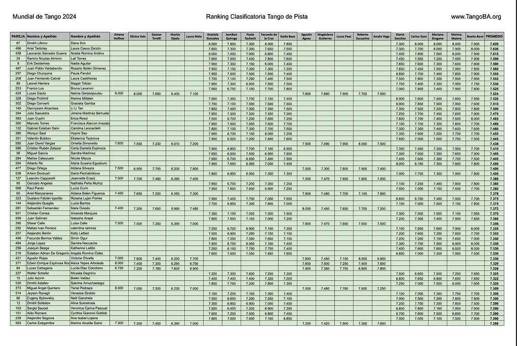
Take another look at the top performing dance couples from page 1 of the score data table again:
Reading the column names from left to right that represent the judge’s names between Jimena Hoffner and Noelia Barsel you’ll see that:
- 1st-5th and 11th-15th judges belong to what we will denote as panel 1.
- The 6th-10th judges and 16th-20th judges belong to what we will denote as panel 2.
Notice anything? Notice how dancers that were judged by panel 2 show up in much larger proportion and dancers that were judge by panel 1. If you scroll through the PDF of this data table you’ll see that this proportional difference holds up throughout the competitors that scored well enough to advance to the semi-final round.
Note: The dancers shaded in GREEN advanced to the semi-final round. While dancers NOT shaded in Green didn’t advance to the semi-final round.
So this begs the question, is this proportional difference real or is it due to random sampling, random assignment of dancers to one panel over the other? Well, there’s a statistical test we can use to answer this question.
Two-Tailed Test for Equality between Two Population Proportions
We are going to use the two-tailed z-test to test if there is a significant difference between the two proportions in either direction. We are interested in whether one proportion is significantly different from the other, regardless of whether it is larger or smaller.
Statistical Test Assumptions
- Random Sampling: The samples must be independently and randomly drawn from their respective populations.
- Large Sample Size: The sample sizes must be large enough for the sampling distribution of the difference in sample proportions to be approximately normal. This approximation comes from the Central Limit Theorem.
- Expected Number of Successes and Failures: To ensure the normal approximation holds, the number of expected successes and failures in each group should be at least 5.
Our dataset mets all these assumptions.
Conduct the Test
- Define our Hypotheses
Null Hypothesis: The proportions from each distribution are the same.
Alt. Hypothesis: The proportions from each distribution are the NOT the same.
2. Pick a Statistical Significance level
The default value for alpha is 0.05 (5%). We don’t have a reason to relax this value (i.e. 10%) or to make it more stringent (i.e. 1%). So we’ll use the default value. Alpha represents our tolerance for falsely rejecting the Null Hyp. in favor of the Alt. Hyp due to random sampling (i.e. Type 1 Error).
Next, we carry out the test using the Python code provided below.
def plot_two_tailed_test(z_value):
    # Generate a range of x values
    x = np.linspace(-4, 4, 1000)
    # Get the standard normal distribution values for these x values
    y = stats.norm.pdf(x)

    # Create the plot
    plt.figure(figsize=(10, 6))
    plt.plot(x, y, label='Standard Normal Distribution', color='black')

    # Shade the areas in both tails with red
    plt.fill_between(x, y, where=(x >= z_value), color='red', alpha=0.5, label='Right Tail Area')
    plt.fill_between(x, y, where=(x <= -z_value), color='red', alpha=0.5, label='Left Tail Area')

    # Define critical values for alpha = 0.05
    alpha = 0.05
    critical_value = stats.norm.ppf(1 - alpha / 2)

    # Add vertical dashed blue lines for critical values
    plt.axvline(critical_value, color='blue', linestyle='dashed', linewidth=1, label=f'Critical Value: {critical_value:.2f}')
    plt.axvline(-critical_value, color='blue', linestyle='dashed', linewidth=1, label=f'Critical Value: {-critical_value:.2f}')

    # Mark the z-value
    plt.axvline(z_value, color='red', linestyle='dashed', linewidth=1, label=f'Z-Value: {z_value:.2f}')

    # Add labels and title
    plt.title('Two-Tailed Z-Test Visualization')
    plt.xlabel('Z-Score')
    plt.ylabel('Probability Density')
    plt.legend()
    plt.grid(True)

    # Show plot
    plt.savefig(f'../images/p-value_location_in_z_dist_z_test_proportionality.png')
    plt.show()


def two_proportion_z_test(successes1, total1, successes2, total2):
    """
    Perform a two-proportion z-test to check if two population proportions are significantly different.

    Parameters:
    - successes1: Number of successes in the first sample
    - total1: Total number of observations in the first sample
    - successes2: Number of successes in the second sample
    - total2: Total number of observations in the second sample

    Returns:
    - z_value: The z-statistic
    - p_value: The p-value of the test
    """
    # Calculate sample proportions
    p1 = successes1 / total1
    p2 = successes2 / total2

    # Combined proportion
    p_combined = (successes1 + successes2) / (total1 + total2)

    # Standard error
    se = np.sqrt(p_combined * (1 - p_combined) * (1/total1 + 1/total2))

    # Z-value
    z_value = (p1 - p2) / se

    # P-value for two-tailed test
    p_value = 2 * (1 - stats.norm.cdf(np.abs(z_value)))

    return z_value, p_value


min_score_for_semi_finals = 7.040
is_semi_finalist = df.PROMEDIO >= min_score_for_semi_finals

# Number of couples scored by panel 1 advancing to semi-finals
successes_1 = df[is_semi_finalist][panel_1].dropna(axis=0).shape[0]
# Number of couples scored by panel 2 advancing to semi-finals
successes_2 = df[is_semi_finalist][panel_2].dropna(axis=0).shape[0]

# Total number of couples that where scored by panel 1
n1 = df[panel_1].dropna(axis=0).shape[0]
# Total sample of couples that where scored by panel 2
n2 = df[panel_2].dropna(axis=0).shape[0]


# Perform the test
z_value, p_value = two_proportion_z_test(successes_1, n1, successes_2, n2)

# Print the results
print(f"Z-Value: {z_value:.4f}")
print(f"P-Value: {p_value:.4f}")

# Check significance at alpha = 0.05
alpha = 0.05
if p_value < alpha:
    print("The difference between the two proportions is statistically significant.")
else:
    print("The difference between the two proportions is not statistically significant.")

# Generate the plot
# P-Value: 0.0000
plot_two_tailed_test(z_value)
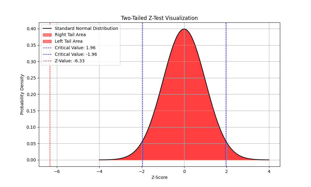
The plot shows that the Z-value calculated exists far outside the range of z-values that we’d expect to see if the null hypothesis is true. Thus resulting in a p-value of 0.0 indicating that we must reject the null hypothesis in favor of the alternative.
This means that the differences in proportions is real and not due to random sampling.
- 17% of dance coupes judged by panel 1 advanced to the semi-finals
- 42% of dance couples judged by panel 2 advanced to the semi-finals
Our first statistical test for bias has provided evidence that there is a positive bias in scores for dancers judged by panel 2, representing a nearly 2x boost.
Next we dive into the scoring distributions of each individual judge and see how their individual biases affect their panel’s overall bias.
2. Data Visualizations
In this section we will analyze the individual score distributions and biases of each judge. The following 20 histograms represent the scores that each judge gave a dancer. Remember that each dancer was scored by all 10 judges in panel 1 or panel 2. The judge’s histograms are laid out randomly, i.e. column one doesn’t represent judges from panel 1.
Note: Judges score on a scale between 1 and 10.
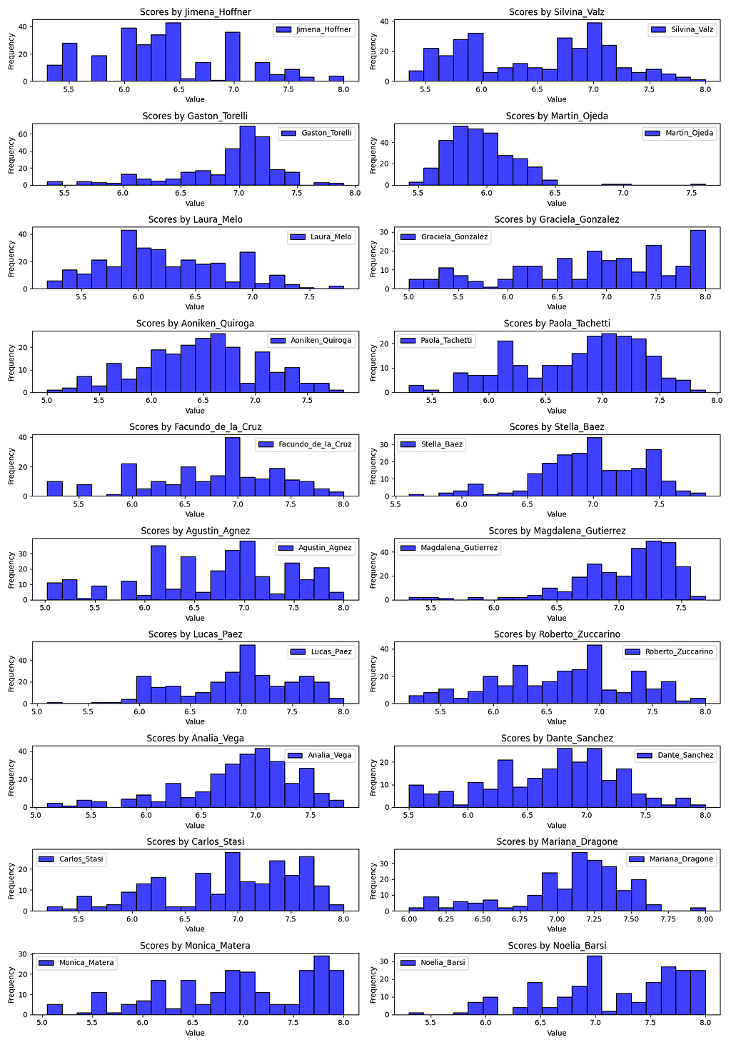
Notice how some judges score much more harshly than other judges. This begs the questions:
- What is the distribution of bias between the judges? In other words, which judges score harsher and which score more lenient?
- Do the scoring biases of judges get canceled out by their peers on the their panel? If not, is there a statistical difference between their means?
We will answer question 1 in section 3.
We will answer question 2 in section 4.
As we saw in the histograms above, judge Martin Ojeda is the harshest dance judge. Let’s look at his QQ-Plot.
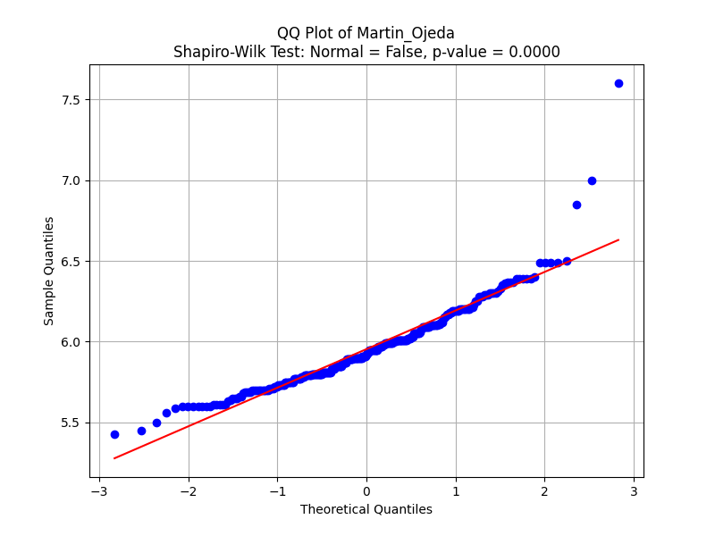
Lower-left deviation (under -2 on the x-axis): In the lower quantile region (far-left), the data points actually deviate above the red line. This indicates higher-than-expected scores for the weakest performances. Martin could be sympathetically scoring dance couples slightly higher than he feels they deserve. A potential reason could be that Martín wishes to avoid hurting the lowest-performing competitors with extremely poor scores, thus giving slightly higher ones.
- Martín is slightly overrating weaker competitors, which could suggest a mild positive bias toward performances that might otherwise deserve lower scores.
Dilution of Score Differences: If weaker performances are overrated, it can compress the scoring range between weaker and mid-tier competitors. This might make the differences between strong, moderate, and weak performances less clear.
- For example, if a weak performance receives a higher score (say, 5.5 or 6.0) instead of a 4.0 or 4.5, and a mid-tier performance gets a score of 6.5, the gap between a weak and moderate competitor is artificially reduced. This undermines the competitive fairness by making the scores less reflective of performance quality.
Balance between low and high scores: Although Martín overrates weaker performers, notice that in the mid-range (6.0–7.0), the scores closely follow a normal pattern, showing more neutral behavior. However, this is counterbalanced by his generous scoring at the top end (positive bias for top performers), suggesting that Martín tends to “pull up” both ends of the performance spectrum.
- Overall, this combination of overrating both the weakest and strongest competitors compresses the scores in the middle. Competitors in the mid-range may be the most disadvantaged by this, as they are sandwiched between overrated weaker performances and generously rated stronger performances.
In this next section, we will identify Martin’s outlier score for what he considers the best performing dance couple assgined to his panel. We will give the dance couple’s score more context when comparing it with scores from other judges on the panel.
There are 19 other QQ-Plots in the Jupyter Notebook which we will not be going over in this article as it would be make this article unbearably long. However feel free to take a look yourself.
3. Testing for Relative Mean Bias between Judges
In this section we will answer the first question that was asked in the previous section. This section will analyze the bias in scoring of individual judges. The next section will look at the bias in scoring between panels.
What is the distribution of bias between the judges? In other words, which judges score harsher and which score more lenient?
We are going to perform iterative T-test to check if a judge’s mean score is statistically different from the mean of the mean scores all of their 19 peers; i.e. take the mean of the other 19 judges’ mean scores.
# Calculate mean and standard deviation of the distribution of mean scores
distribution_mean = np.mean(judge_means)
distribution_std = np.std(judge_means, ddof=1)

# Function to perform T-test
def t_test(score, mean, std_dev, n):
    """Perform a T-test to check if a score is significantly different from the mean."""
    t_value = (score - mean) / (std_dev / np.sqrt(n))
    # Degrees of freedom for the T-test
    df = n - 1
    # Two-tailed test
    p_value = 2 * (1 - stats.t.cdf(np.abs(t_value), df))
    return t_value, p_value

# Number of samples in the distribution
n = len(judge_means)

# Dictionary to store the test results
results = {}

# Iterate through each judge's mean score and perform T-test
for judge, score in zip(judge_features, judge_means):
    t_value, p_value = t_test(score, distribution_mean, distribution_std, n)

    # Store results in the dictionary
    results[judge] = {
        'mean_score': score,
        'T-Value': t_value,
        'P-Value': p_value,
        'Significant': p_value < 0.05
    }

# Convert results to DataFrame and process
df_judge_means_test = pd.DataFrame(results).T
df_judge_means_test.mean_score = df_judge_means_test.mean_score.astype(float)
df_judge_means_test.sort_values('mean_score')
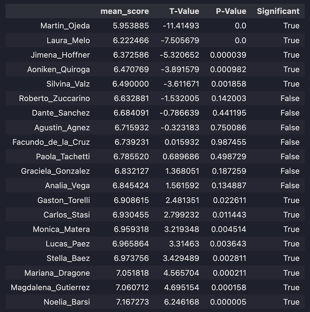
Here we have all 20 judges: their mean scores, their t statistics, p-values, and if the different between the individual judge’s mean score and the mean of the distribution of the other 19 judge’s means is statistically significant.
We have 3 groups of judges: those that score very harshly (statistically below average), those that typically give average scores (statistically within average), and those that score favorably (statistically above average).
Let’s focus on 3 representative judges: Martin Ojeda, Facundo do la Cruz, and Noelia Barsi.
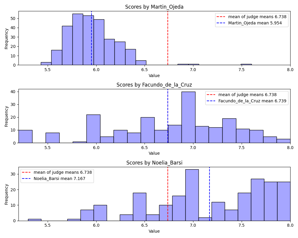
Notice that Martin Ojeda’s score distribution and mean (blue line) is shifted towards lower values as compared to the mean of the mean scores of all judges (red line). But we also see that his distribution is approximately normally distributed with the exception of a few outliers. We will return to the couple that scored 7.5 shortly. Almost any dance couple that gets judged by Martin will see their overall average score take a hit.
Facundo de la Cruz has an approximately normal distribution with a large variance. He represents the least biased judge relative to his peers. Almost any dance couple that gets judged by Facundo can expect a score that is typical of all the judges, so they don’t have to worry about negative bias but they are also unlikely to receive a high score boosting their overall average.
Noelia Baris represents the judge that tends to give more dancers a favorable score as compared to her peers. All dance couples should hope that Noelia gets assigned to their judge panel.
Now let’s return to Martin’s outlier couple. In Martin’s mind, Lucas Cartagena & Lucila Diaz Colodrero dance like outliers.
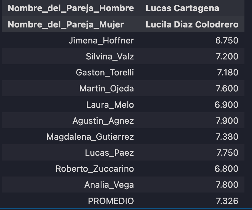
- Martin Ojeda gave the 4th highest score (7.600) that this couple received from the panel and his score is above the average (Promedio) of 7.326
- While Martin Ojeda's score is an outlier when compered to his distribution of scores it isn't as high the other scores that this couple received. This implies two things:
- Martin Ojeda is an overall conservative scorer (as we saw in the previous section)
- Martin Ojeda outlier score actually makes sense when compared with the scores of the other judges indicating that this dance couple are indeed high performers
Here they are performing to a sub-category of tango music called Milonga, which is usually danced very differently than the other music categories, Tango and Waltz, and typically doesn’t include any spinning and instead includes small, quick steps that greatly emphasize musicality. I can tell you that they do perform well in this video and I think most dancers would agree with that assessment.
Enjoy the performance.
4. Testing for Mean Bias between Panels
In this section we test for bias between Panel 1 and Panel 2 by answering the following questions:
Do the scoring biases of judges get canceled out by their peers on the their panel? If not, is there a statistical difference between their means?
We will test for panel bias in two ways
- Rank-Based Panel Biases
- Two-Tail T-test between panel 1 and panel 2 distributions
Rank-Based Panel Biases
Here we will rank and standardize the judge mean scores and calculate a bias for each panel. This is one way in which we can measure any potential biases that exist between judge panels.
panel_1 = judge_features[:5] + judge_features[10:15]
panel_2 = judge_features[5:10] + judge_features[15:]

df_judge_means = df_judge_means_test.sort_values('mean_score').mean_score

# Calculate ranks
ranks = df_judge_means.rank()

# Calculate mean and std of ranks
means_ranks = ranks.mean()
stds_ranks = ranks.std()

# Standardize ranks
df_judge_ranks = (ranks - means_ranks) / stds_ranks
df_judge_ranks
# these are the same judges sorted in the same way as before based on their mean scores
# except here we have converted mean values into rankings and standardized the rankings
# Now we want to see how these 20 judges are distributed between the two panels
# do the biases for each judge get canceled out by their peers on the same panel?
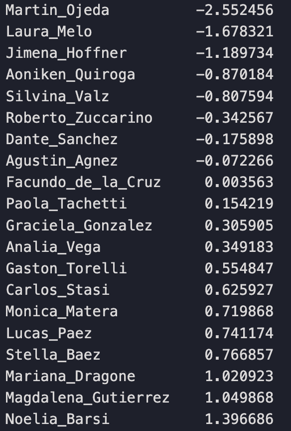
We’ll simply replace each judge’s mean score value with a ranking relative to their position to their peers. Martin is still the harshest, most negatively biased judge. Noelia is still the most positively biased judge.
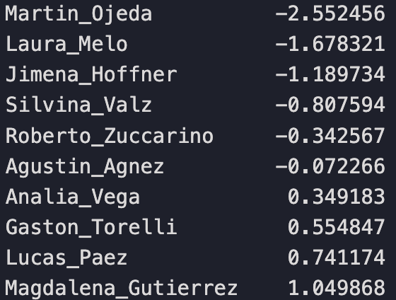
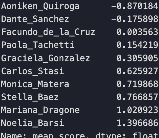
Notice that most judges in Panel 1 are negatively biased and only 4 are positive. While most judges on Panel 2 are positively biased with only 2 judges negatively biased and Facundo being approximately neutral.
Now if the intra-panel biases cancel out than the individual judge biases effectively don’t matter; any dance couple would be scored statistically fairly. But if the intra-panel biases don’t cancel, then there might be an unfair advantage present.
Panel 1 mean ranking value: -0.39478
Panel 2 mean ranking value: 0.39478
We find that the mean panel rankings reveal that the intra-panel biases do not cancel out, providing evidence that there is an advantage for a dance couple to be scored by Panel 2.
Two-Tail T-test between Panel 1 and Panel 2 distributions
Next we following up on the previous results with an additional test for panel bias. The plot below shows two distributions. In blue we have the distribution of mean scores given by judges assigned to Panel 1. In orange we have the distribution of mean scores given by judges assigned to Panel 2.
In the plot you’ll see the mean of the mean scores for each panel. Panel 1 has a mean panel score of 6.62 and Panel 2 has a mean panel score of 6.86.
While a panel mean difference of 0.24 might seem small, know that the difference between advancing to the semi-final round is determined by a difference of 0.013
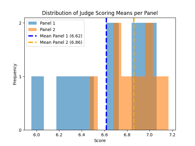
After performing a two sample T-test we find that the difference between the panel means is NOT statistically different. This test fails to provide additional evidence that there is a statistical difference in the bias between Panel 1 and Panel 2.
The P-value for this test is 0.0808 which isn’t too far off from 0.05, our default alpha value.
Law of Large Numbers
We know from The Law of Large Numbers that in small sample distributions (both panels have 10 data points) we commonly find a larger variance than the variance in its corresponding population distribution. However as the number of samples in the sample distributions increases, its parameters approach the value of the population distribution parameters (i.e mean and variance). This might be why the T-test fails to provide evidence that the panel biases are different, i.e. due to high variance.
Statistical Power
Another way to understand why we see the results that we see is due to Statistical Power. Statistical power refers to the probability that a test will correctly reject a false null hypothesis. Statistical power is influence by several factors
- Sample size
- Effect size (the true difference or relationship you’re trying to detect)
- Significance level (e.g., α=0.05)
- Variability in the data (standard deviation)
The most reliable way to increase our test’s statistical power is to collect more data points, however that is not possible here.
Conclusion
In this article we explore the preliminary round data from the 2024 Mundial de Tango Championship competition held in Buenos Aires. We analyze judge and panel scoring bias in 4 ways:
- Proportionality Testing for Bias between Panels
- Data Visualizations
- Testing for Relative Mean Bias between Judges
- Testing for Mean Bias between Panels
Evidence for Bias
- We found that there was a statistically significant higher proportion of dancers advancing to the semi-final round that were scored by judges on Panel 2.
- Individual judges’ score distributions varied wildly: some skewing high, others skewing low. We saw that Martin Ojeda was positively biased towards the worst and best performing dance couples by “pulling up” their scores and compressing mid-range dancers. Overall, his score distribution was far lower than all other judges. There were examples of judges that gave more typical scores and those that gave very generous scores (when compared to their peers).
- There was a clear difference between relative mean bias between panels. Most judges on Panel 1 ranked as providing negative bias in scoring and most judges on Panel 2 ranked as providing positive bias in scoring. Consequently, Panel 1 had an overall negative bias and Panel 2 had an overall positive bias in scoring dance competitors.
No Evidence of Bias
- The difference in means between Panel 1 and Panel 2 were found to not be statistically significant. The small sample size of the distributions leads to low statistical power. So this test is not as reliable as the others.
My conclusion is that there is sufficient evidence of bias at the individual judge and at the panel level. Dancers that got assigned to Panel 2 did have a competitive edge. As such there is advice to give prospective competitive dancers looking for an extra edge in winning their competitions.
How to Win Dance Competitions
There are both non-machiavellian and machiavellian ways to increase your chances of winning. The results of this article inform (and background knowledge gained from experience) add credence to the machiavellian approaches.
Non-machiavellian
- Train. There will never be a substitute for the putting in your 10,000 hours of practice to obtain mastery.
Machiavellian
- Take classes and build relationships with instructors that you know will be on your judging panel. You’re success means the validation of the judge’s dance style and the promotion of their business. If your resources are limited, focus on judges that that score harshly to help bring up your average score.
- If there are multiple judging panels, find a way to get assigned to the panel that collectively judges more favorably to increase your chances to advancing to the next round.
Final Thoughts
I personally believe that, while useful, playing power games in dance competitions is silly. There is no substitute for raw, undeniable talent. This analysis is, ultimately, a fun passion project and opportunity to apply some statistical concepts on a topic that I greatly cherish.
About the Author
Alexander Barriga is a data scientist and competitive Argentine Tango dancer. He currently lives in Los Angeles, California. If you’ve made it this far, please consider leaving feedback, sharing his article, or even reaching out to him directly with a job opportunity — he is actively looking for his next data science role!

Statistical Analysis on Scoring Bias was originally published in Towards Data Science on Medium, where people are continuing the conversation by highlighting and responding to this story.
from Datascience in Towards Data Science on Medium https://ift.tt/B2SX9Y5
via IFTTT


