
Time Series — ARIMA vs. SARIMA vs. LSTM: Hands-On Tutorial
Time Series — ARIMA vs. SARIMA vs. LSTM: Hands-On Tutorial
Let’s forecast the future step by step

In this post, we are going to take a dive into the world of time series forecasting. The value of forecasting a future time is valuable to various businesses. For example, demand forecasting can be quite helpful to online retailers preparing for end-of-year sales to ensure enough inventory is available for the upcoming shopping demand. In the financial world, stock traders rely on sophisticated forecasting models to decide what securities to buy or sell. And in more basic situations, we rely on weather forecasts to decide whether to pack an umbrella or our rain jackets or not, when leaving home for work each day. These are all examples of systems where time series forecasting plays an important role in our lives.
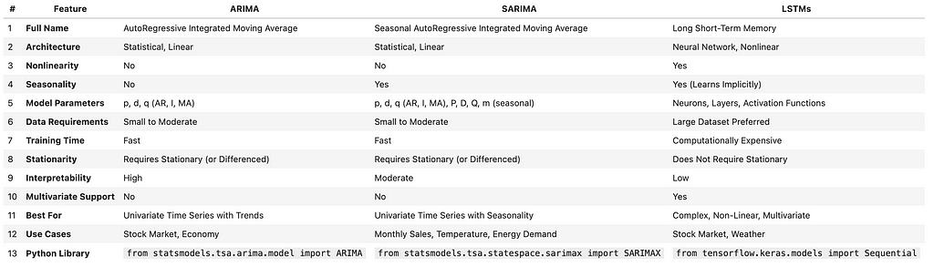
In this post, we will talk about three of the most common time series forecasting models used in this space:
- AutoRegressive Integrated Moving Average or ARIMA
- Seasonal AutoRegressive Integrated Moving Average or SARIMA
- Long Short-Term Memory or LSTM.
We will learn about each forecasting model through hands-on implementation to train the model and generate forecasts using each of the trained models. Then we will look at the metrics that are commonly used for evaluation of sequential data, such as time series, and finally visualize the results.
Before jumping into the details, I am going to include a table of how these three approaches compare against each other that you can use as a reference in the future. Do not worry if you do not recognize the terminology in this table yet. By the time we go through this post, you will be much more fluent in the time series forecasting jargon!
With that out of the way, let’s get started!
1. Data Set
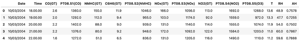
In order to implement our examples, we will use the open source Air Quality data set from UC Irvine Machine Learning Depository, available under a CC BY 4.0 license. The data set includes hourly air quality levels for a period of time, which makes it ideal for a forecasting exercise over time. The idea would be see how well we can forecast some of the air quality levels, based on the past data.
Let’s get start by importing the necessary libraries, loading the data and looking at the top 5 rows.
# import libraries
import pandas as pd
import numpy as np

# load the dataset
# https://archive.ics.uci.edu/dataset/360/air+quality
air_quality = pd.read_csv("AirQualityUCI.csv", sep=';', decimal=',')

air_quality.head()
Results
Now let’s clean up the data by replacing missing values and dropping some of the columns.
# replace missing values and drop unnecessary columns
air_quality.replace(-200, np.nan, inplace=True)
air_quality.dropna(axis=1, how='all', inplace=True)
air_quality.dropna(inplace=True)

# replace periods with colons in the 'Time' column
air_quality['Time'] = air_quality['Time'].str.replace('.', ':', regex=False)

# combine date and time into a single datetime column
air_quality['DateTime'] = pd.to_datetime(air_quality['Date'] + ' ' + air_quality['Time'], dayfirst=True)

# set 'DateTime' as the index
air_quality.set_index('DateTime', inplace=True)
air_quality.sort_index(inplace=True)

# select target variable (e.g., 'NOx(GT)')
data = air_quality['NOx(GT)']

# drop any remaining missing values in the target variable
data.dropna(inplace=True)
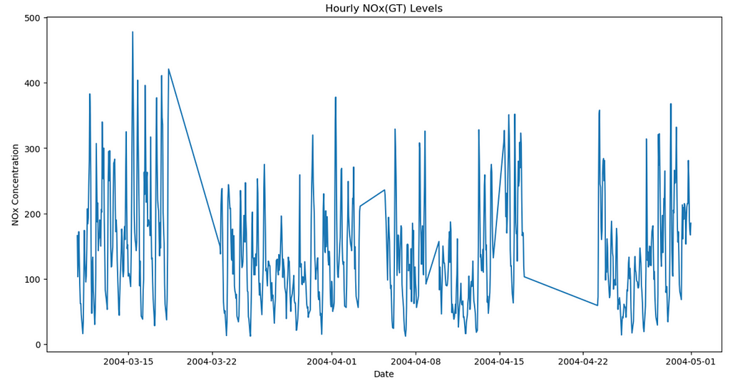
Next, let’s just plot the data and look at it, before starting our forecasting journey.
# import libraries
import matplotlib.pyplot as plt
%matplotlib inline

# visualize
plt.figure(figsize=(14, 7))
plt.plot(data.index, data.values)
plt.title('Hourly NOx(GT) Levels')
plt.xlabel('Date')
plt.ylabel('NOx Concentration')
plt.show()
Results:
Lastly, we will split the data into train and test sets, just like we would for any machine learning task. The training data will be use by the forecasting models to “learn” the data and then we will use the unseen test set to evaluate the performance of the trained models.
# break into train (80%) and test
train_size = int(len(data) * 0.8)
train, test = data.iloc[:train_size], data.iloc[train_size:]

print(f'Training set size: {len(train)}')
print(f'Testing set size: {len(test)}')
Results:

Now that we know more about the data, we can move on to the forecasting tasks. We will talk about the data patterns later so no need to worry about that for now.
2. Forecast Modeling
In this section, we will start modeling with ARIMA, SARIMA and LSTM. We will explain each one in a separate section to make it easier to follow along. Let’s start with ARIMA!
2.1. ARIMA
AutoRegressive Integrated Moving Average (ARIMA) is a popular time series forecasting method, thanks to the realm of statistics! It is quite helpful in simpler data sets but can also be useful for forecasting non-stationary (defined below) time series, which gets us into some of the concepts we need to define. Let’s start with what Stationary data is.
- Stationary: Properties such as mean, variance and autocorrelation do not change over time. For example, it means that average (or mean), spread (variance) and the relationship between values at different times (autocorrelation) of the time series remain the same. For example, in my house I set the thermostat at 70 degrees Fahrenheit. The air conditioner will keep on and turn off based on the room temperature, trying to keep it around 70 degrees so we would expect a series showing my room temparature during the day to fluctuate around 70 and keeping the average around that temperature. It is fair to assume this time series would be a stationary one (we forced it to be using our air conditioner).
- Non-Stationary: As we can expect from the definition above, the same properties (mean, variance and autocorrelation) change over time for a non-stationary time series. There can be multiple patterns in a non-stationary time series so let’s define those:
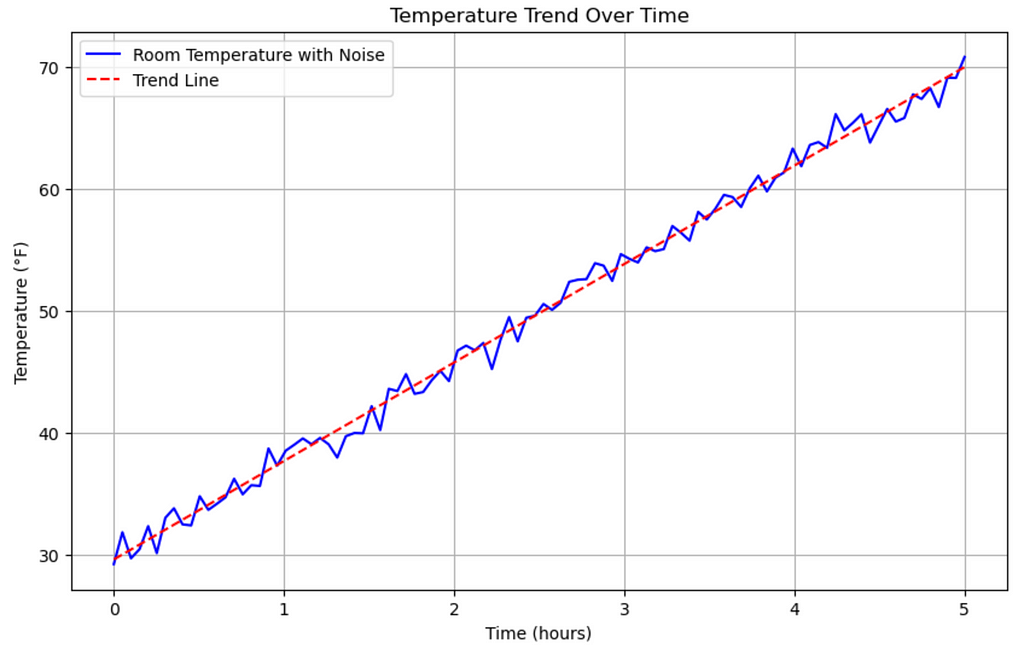
- Trends: The data can have an upward or downward trajectory (or direction) over time. Imagine if I get home during a winter day when the inside room temperature is 30 degrees and then I set the thermostat to 70 degrees. Let’s further assume that it takes 5 hours for the room to get to 70 degrees and then we look at the temperature over those 5 hours. We will see that the temperature has an upward trend or direction, starting from 30 and ending at around 70 degrees. Let’s visualize this!
# import libraries
import numpy as np
import matplotlib.pyplot as plt
from sklearn.linear_model import LinearRegression

# Parameters
start_temp = 30
end_temp = 70
hours = 5
time = np.linspace(0, hours, num=100)  # 100 time points over 5 hours

# Simulate temperature change with a linear upward trend
temperature = np.linspace(start_temp, end_temp, num=100)

# add random noise to simulate slight fluctuations in the temperature
noise = np.random.normal(0, 1, temperature.shape)  # mean=0, standard deviation=1
temperature_with_noise = temperature + noise  # add noise to the temperature trend

# linear regression for the trend line
time_reshaped = time.reshape(-1, 1)
model = LinearRegression().fit(time_reshaped, temperature_with_noise)
trend_line = model.predict(time_reshaped)

# visualize
plt.figure(figsize=(10, 6))
plt.plot(time, temperature_with_noise, label='Room Temperature with Noise', color='b')
plt.plot(time, trend_line, label='Trend Line', color='r', linestyle='--')
plt.title("Temperature Trend Over Time")
plt.xlabel("Time (hours)")
plt.ylabel("Temperature (°F)")
plt.grid(True)
plt.legend()
plt.show()
Results:
- Seasonality: Implies repeated patterns that occur at (almost) regular intervals. For example, let’s say an online retailer has a pretty steady sales during the first three quarters of the year but the sales tend to spike in the fourth quarter. Then such a spike that repeats on an annual basis represents a seasonality in the time series of data.
- Variance: As the name suggests, it describes a case where the spread or variance of the data changes over time.
As you can guess from the explanations above, forecasting stationary data is easier than non-stationary data. Underlying patterns of a non-stationary time series keep changing and therefore we need to identify them and then further “transform” them to increase the performance of our forecasting models. One methodology used for transforming non-stationary data into a stationary one is called “differencing”. So let’s define that more formally.
Differencing simply means that we subtract the previous data point (or observation) from the current one, which presumably removes non-stationary components such as trends, etc. In order to determine whether differencing is required in a time series, various tests can be used, one of them is called the Augmented Dickey-Fuller (ADF) test. For the purposes of this post, we do not need to understand the mathematics behind that but if this test shows a p-value that is greater than 5%, it indicates that data is non-stationary and therefore it needs differencing.
Now that we are more familiar with stationary and non-stationary data and how to transform the latter to the former, we can start implementing:
# import libraries
from statsmodels.tsa.stattools import adfuller

# ADF test
result = adfuller(train)
print('ADF Statistic:', result[0])
print('p-value:', result[1])

# if p-value > 0.05, the series is non-stationary and needs differencing
if result[1] > 0.05:
    print("needs differencing")
else:
    print("time series is stationary")
Results:

As we can see above, the p-value is larger than 5% and therefore the data is non-stationary, which we expected, judging by the graph we created earlier of our data set. We will use a first-order differencing to transform the non-stationary data to a stationary one and then will verify to ensure it is stationary.
# first-order differencing
train_diff = train.diff().dropna()

# review stationarity again
result_diff = adfuller(train_diff)
print('Differenced ADF Statistic:', result_diff[0])
print('Differenced p-value:', result_diff[1])

# if p-value > 0.05, the series is non-stationary and needs differencing
if result[1] > 0.05:
    print("needs differencing")
else:
    print("time series is stationary")
Results:

The p-value is still larger than 5% so we can move on to a second-order differencing and continue until we get to the stationary state. I wanted to implement this so that we can see and understand how differencing works but in reality, we can use libraries that automatically implement ARIMA and find the best parameters, including the order of differencing. So let me define what variables are considered in the ARIMA model and then we will implement the automatic approach. ARIMA model has the following parameters:
- p represents the number of autoregressive terms (“AR” portion of ARIMA). For example, when AR=1, current value depends on the immediate previous value.
- d represents the number of differences needed to make the series stationary (“integrated” or “I” portion of ARIMA). So, if d=1, then only a first-order differencing is required.
- q represents the number of moving average term (“MA” portion of ARIMA). If MA=1, the current value depends only on the error in the previous step.
This all sounds pretty manual to optimize so let’s hand it off to an automatic optimizer:
# import libraries
import pmdarima as pm

# create the optimization model instance
model = pm.auto_arima(train,
                      start_p=1, start_q=1,
                      max_p=5, max_q=5,
                      m=1,            # frequency of series (set to 1 for non-seasonal data)
                      d=None,         # let the model determine 'd'
                      seasonal=False, # assuming no seasonality
                      test='adf',     # use ADF test to find 'd'
                      trace=True,
                      error_action='ignore',
                      suppress_warnings=True,
                      stepwise=True)

print(model.summary())
Results:
Interestingly enough, the optimizer decided that no differencing is a good enough option. Regardless of whether that is the best approach, let’s implement it and then we will compare the performance against our other approaches, such as SARIMA and LSTM.
# import libraries
from statsmodels.tsa.arima.model import ARIMA

# fit ARIMA model
arima_order = (2, 0, 0)
arima_model = ARIMA(train, order=arima_order, trend='c')
arima_result = arima_model.fit()

# forecast
arima_forecast = arima_result.forecast(steps=len(test))
We will visualize all results together at the end so let’s move on to SARIMA.
2.2. SARIMA
Seasonal AutoRegressive Integrated Moving Average is an extension of ARIMA, which is designed to better handle seasonal time series data. We are already familiar with seasonality and most of the concepts defined under ARIMA are still relevant here. The only difference here is that for implementation, there are new parameters for the seasonality but those are also pretty straight forward. We defined ARIMA parameters as “ARIMA(p, d, q)”. Similarly, we define “SARIMA(p, d, q, P, D, Q, m)”, where p, d and q are the same as before and represent the non-stationary parts of the model, while P, D and Q control the seasonality and m represents the number of time steps for a full seasonal cycle — for example, for a monthly data, m=12 would represent yearly seasonality.
Let’s break down the data to see if there are any seasonalities in there.
# import libraries
from statsmodels.tsa.seasonal import seasonal_decompose

# decompose the data
decomposition = seasonal_decompose(train, model='additive', period=24)  # 24 hours in a day
decomposition.plot()
plt.show()
Results:
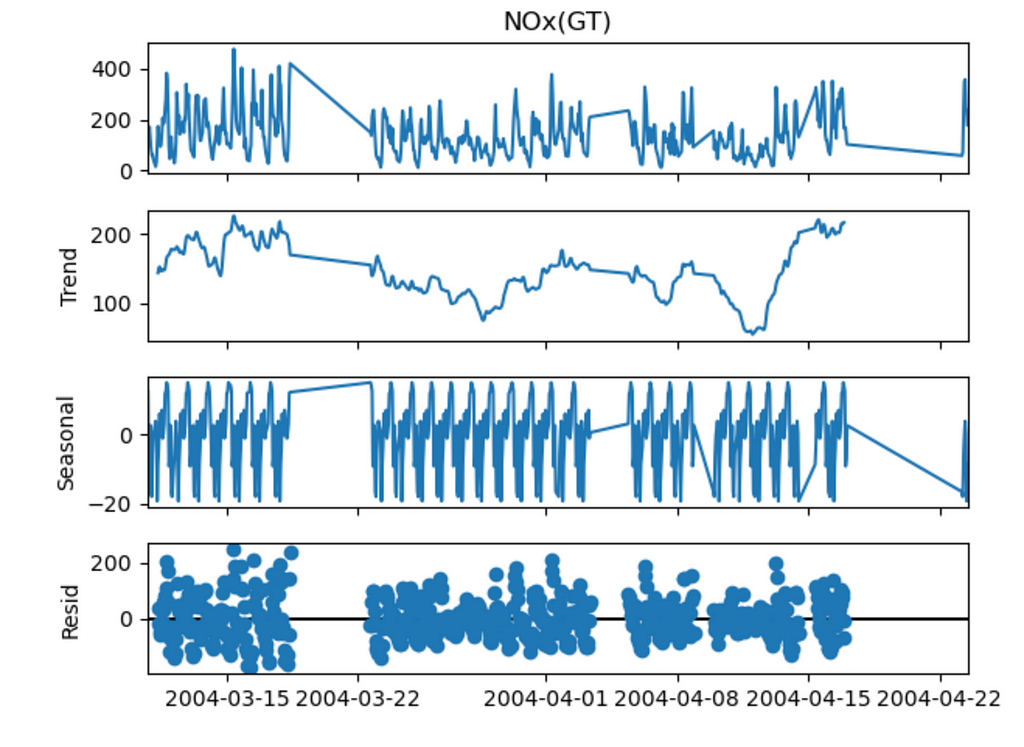
We can see some seasonality so maybe using SARIMA would result in better forecasting. Let’s implement.
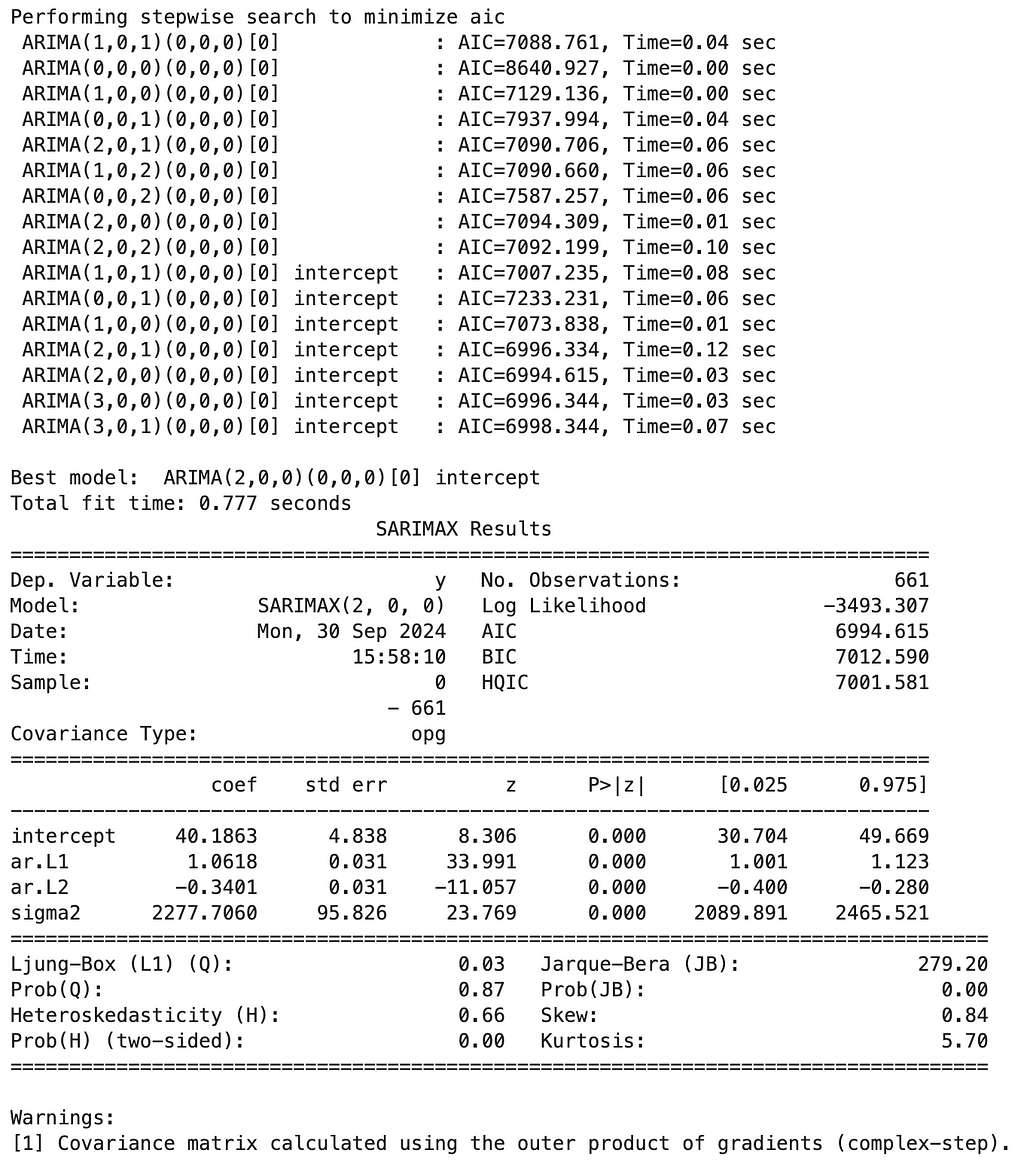
from statsmodels.tsa.statespace.sarimax import SARIMAX

# fit SARIMA model
sarima_order = (2, 0, 0) # this is what we had in our ARIMA model
seasonal_order = (1, 1, 1, 24)  # daily seasonality
sarima_model = SARIMAX(train, order=sarima_order, seasonal_order=seasonal_order)
sarima_result = sarima_model.fit(disp=False)

# Forecast
sarima_forecast = sarima_result.forecast(steps=len(test))
As the next step, we will forecast using LSTM and then compare forecasting results overall.
2.3. LSTM
As the third method, we are going to look at the Long Short-Term Memory (LSTM) networks, which are a type of Recurrent Neural Networks (RNNs). These LSTMs are quite interesting in that they can remember information about sequences of data, which can be very useful in time sries. More traditional approaches of RNNs could not remember much about the past due to the way gradients during back propagation work (this is called the vanishing gradient problem), resulting in those networks being more forgetfull but we do not need to get into those details. All we need to know is that when it comes to time series, LSTMs can be quite powerful forecasting tools. The downside is that LSTMs are more computationally expensive, which is an important consideration in larger projects but is not an issue in our small problem.
Let’s implement LSTMs for our example (I have added comments in the code to make it easier to follow) and then finally look at the results to compare these three approaches.
# import libraries
from sklearn.preprocessing import MinMaxScaler

# scale data to improve performance
scaler = MinMaxScaler(feature_range=(0, 1))
scaled_data = scaler.fit_transform(data.values.reshape(-1, 1))

# train and testing data splits
scaled_train = scaled_data[:train_size]
scaled_test = scaled_data[train_size:]
# function to create sequences for lstm (takes in data and returns x and y numpy array sequences)
def create_sequences(data, seq_length):
    x = []
    y = []
    for i in range(len(data) - seq_length):
        x.append(data[i:i + seq_length])
        y.append(data[i + seq_length])
    return np.array(x), np.array(y)

seq_length = 24  # use past 24 hours to predict the next hour
X_train, y_train = create_sequences(scaled_train, seq_length)
X_test, y_test = create_sequences(scaled_test, seq_length)
# import libraries
from tensorflow.keras.models import Sequential
from tensorflow.keras.layers import LSTM, Dense, Dropout

# reshape input data to 3-dimensional that lstm expects (samples, timesteps, features)
X_train = X_train.reshape((X_train.shape[0], X_train.shape[1], 1))
X_test = X_test.reshape((X_test.shape[0], X_test.shape[1], 1))

# build lstm model
model = Sequential()
model.add(LSTM(50, activation='relu', input_shape=(seq_length, 1)))
model.add(Dropout(0.2))
model.add(Dense(1))

# compile the model
model.compile(optimizer='adam', loss='mean_squared_error')

# train the model
history = model.fit(X_train, y_train, epochs=50, batch_size=32, validation_data=(X_test, y_test))
# predict
lstm_predictions = model.predict(X_test)
lstm_predictions = scaler.inverse_transform(lstm_predictions)

# adjust test values to align with predictions
adjusted_test_values = data.values[train_size + seq_length:]
3. Performance Comparison
At this point, we have all the forecasts ready! Without much more delay, let’s visualize the forecasts and discuss.
# visualize
plt.figure(figsize=(14, 7))

# actuals
plt.plot(test.index, test.values, label='Actual', color='black')

# ARIMA predictions
plt.plot(test.index, arima_forecast, label='ARIMA Forecast', color='blue')

# SARIMA predictions
plt.plot(test.index, sarima_forecast, label='SARIMA Forecast', color='green')

# LSTM predictions
plt.plot(test.index[seq_length:], lstm_predictions, label='LSTM Forecast', color='red')

plt.title('Actual vs. Predicted')
plt.xlabel('Date')
plt.ylabel('NOx Concentration')
plt.legend()
plt.show()
Results:
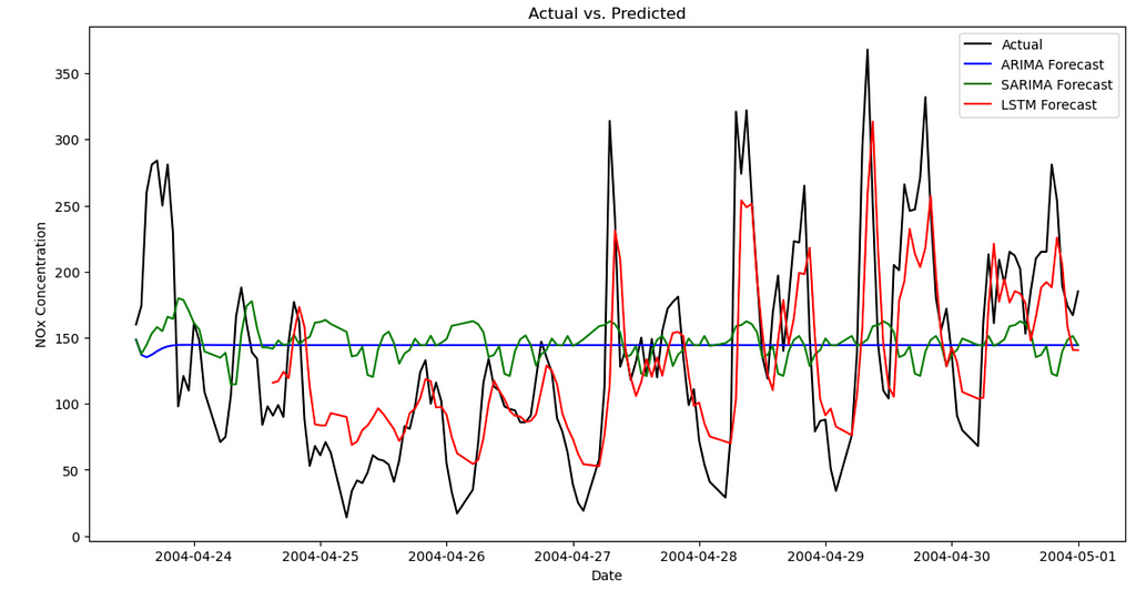
We can see the “Actuals” are in black so the closer the forecasts to the black line are, the better those forecasts are. As we can see, ARIMA is demonstrating poor forecasting in this case, followed by some improvements in SARIMA, while LSTM shows the best fit to the actuals. It is always a good idea to visually inspect these but it would be even better if we can define some metrics and measure them quantitatively. In order to do so, we can look at the following metrics:
- Mean Absolute Error (MAE): Measures the average magnitude of the errors between the predicted and actual values, without considering their direction. Since we use absolute values in the calculation, then direction is not considered and lower values indicate better model performance. It can be described as follows:

- Root Mean Squared Error (RMSE): This is very similar to MAE but gives a higher weight to larger errors. It calculates as the square root of the average of the squared distances between actuals and the predictions (it is easier to understand after we see the formula). Since the differences between actuals and forecasts are squared, it is more sensitive to outliers compared to MAE. Similar to MAE, lower values are better.

- Mean Absolute Percentage Error (MAPE): Is calculated as the average absolute percentage difference between the predicted and actual values. Since it is another way of measuring the distance between the actuals and forecast, lower percentages are better.

- Coefficient of Determination (R-squared): Indicates how well the model explains the variability of the target variable, through the mathematical representation below. In short, it calculates the sum of squared residuals, which is a measure of the distance between actuals and forecasts and then divides that by the total sum of squares, which is the total variance of the actuals. Values range from negative infinity to 1.0. A value closer to 1.0 indicates a better fit.

Now that we understand the metrics, let’s calculate these metrics for our three forecasting models and analyze the results.
# import libraries
from sklearn.metrics import mean_absolute_error, mean_squared_error, r2_score

# a function to evaluate our forecast models using mae, rmse, mape and r^2
def evaluate_model(test, forecast):
    mae = mean_absolute_error(test, forecast)
    rmse = np.sqrt(mean_squared_error(test, forecast))
    mape = np.mean(np.abs((test - forecast) / test)) * 100
    r2 = r2_score(test, forecast)
    return mae, rmse, mape, r2

# evaluate our models
arima_mae, arima_rmse, arima_mape, arima_r2 = evaluate_model(test.values, arima_forecast.values)
sarima_mae, sarima_rmse, sarima_mape, sarima_r2 = evaluate_model(test.values, sarima_forecast.values)
lstm_mae, lstm_rmse, lstm_mape, lstm_r2 = evaluate_model(adjusted_test_values, lstm_predictions.flatten())
# results data frame
results = pd.DataFrame({
    'Model': ['ARIMA', 'SARIMA', 'LSTM'],
    'MAE': [arima_mae, sarima_mae, lstm_mae],
    'RMSE': [arima_rmse, sarima_rmse, lstm_rmse],
    'MAPE': [arima_mape, sarima_mape, lstm_mape],
    'R-squared': [arima_r2, sarima_r2, lstm_r2]
})

results
Results:
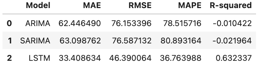
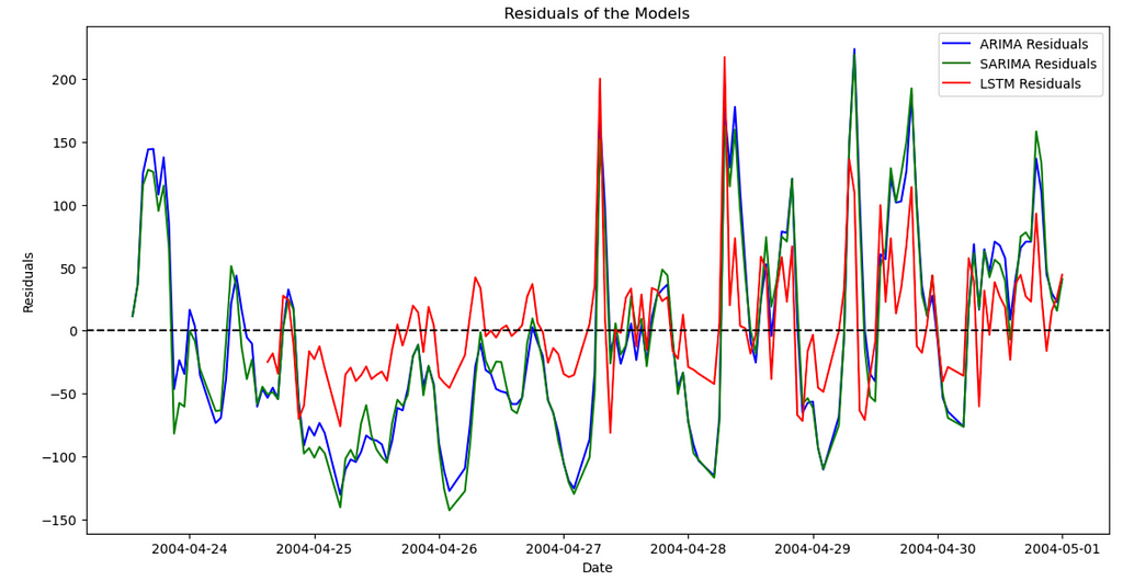
Now we can compare the models. Across the board and as expected from the graph we had earlier, LSTM does a much better job, compared to ARIMA and SARIMA. Finally, let’s visualize the residuals, which is the distance between actuals and forecasted data points along the time series. As the name suggests, we want the residuals to be as close to zero as possible, which would mean a closer forecast compared to the actuals.
# calculate residuals
arima_residuals = test.values - arima_forecast.values
sarima_residuals = test.values - sarima_forecast.values
lstm_residuals = adjusted_test_values - lstm_predictions.flatten()

# visualize
plt.figure(figsize=(14, 7))
plt.plot(test.index, arima_residuals, label='ARIMA Residuals', color='blue')
plt.plot(test.index, sarima_residuals, label='SARIMA Residuals', color='green')
plt.plot(test.index[seq_length:], lstm_residuals, label='LSTM Residuals', color='red')
plt.axhline(y=0, color='black', linestyle='--')
plt.title('Residuals of the Models')
plt.xlabel('Date')
plt.ylabel('Residuals')
plt.legend()
plt.show()
Results:
4. Conclusion
In this post, we introduced forecasting across time using three popular models of ARIMA, SARIMA and LSTM. While walking through a step-by-step implementation of these models, we talked about relevant time series concepts, such as trends, seasonality, stationary data, etc. We then used these models to forecast over the test set and compared the results using relevant metrics and visually.
Thanks For Reading!
If you found this post helpful, please follow me on Medium and subscribe to receive my latest posts!
(All images, unless otherwise noted, are by the author.)
Time Series — ARIMA vs. SARIMA vs. LSTM: Hands-On Tutorial was originally published in Towards Data Science on Medium, where people are continuing the conversation by highlighting and responding to this story.
from Datascience in Towards Data Science on Medium https://ift.tt/rOA7pkg
via IFTTT


