
Who Really Owns the Airbnbs You’re Booking? — Marketing Perception vs Data Analytics Reality
Who Really Owns the Airbnbs You’re Booking? — Marketing Perception vs Data Analytics Reality
Over the last 20 years, Airbnb has spent billions on brand building as the authentic, novel and community-led alternative to hotels. But, are they really?
In this article, I will use data from InsideAirbnb to reveal Airbnb’s ownership patterns. Then, I’ll walk you through how I came to my conclusions so you can do the same for your city.
Inside Airbnb is a mission driven project that provides data and advocacy about Airbnb’s impact on residential communities. All data is licensed under a Creative Commons Attribution 4.0 International License.
I am sure you’ve seen the Airbnb ads featuring over-smiling hosts greeting guests in vibrant tourist-loving neighbourhoods. If you haven’t, check this one out:
I’ve personally been on Airbnb for over 5 years and even though I’ve stayed in very quirky and authentic places (my favourite has to be a Shepherd's Hut with a horse outside the door) I’ve recently realised that my recent experiences don’t live up to the expectations of Airbnb’s marketing.
Last week I stayed at an Airbnb for a weekend. I did a little treasure hunt involving unlocking many padlocks to find the keys. And I opened the door to a spotless flat which looked exactly like the pictures. But I was surprised to see no books or candles. It was completely empty, like no one had ever really lived there. The next day I didn’t meet any neighbours. I didn’t receive any restaurant recommendations from my host. And on the last day I left, leaving the keys inside, no one to wave me goodbye. I thought, have I just stayed in a hotel? Is this what Airbnb has turned into?
What Airbnb Wants You to Think
Airbnb’s focus on experiencing life as a local, or as they call it: “the feeling of truly belonging”, is reflected in many of their advertising campaigns:
Live there, because when you live in Paris, you have your own home
This beautifully curated ad perfectly exemplifies Airbnb’s value proposition: live like a local and ditch that essenceless, standardised hotel reservation. Following a romantised local experience, Airbnb’s marketing paints an image of a trustful and wholehearted connection between hosts and guests.
It’s no surprise then, that a part of me felt deceived during my last trip. I had missed out on the entire Airbnb experience. That motivated me to research Airbnb’s listing data to answer my mind-racing questions:
- Has our Airbnb experience become standard and optimised for maximum profit?
- Is the Airbnb community essence gone?
The Reality
Multi-property ownership marks a turning point in whether we guests truly experience the “Airbnb Experience”.
Why?
Because, when booking accommodation from a “real estate investor” or host with a large portfolio of listings, we’ll likely be staying in a hotel-like business which has bought flats around the city to rent out. In that case, our host’s motivations will be primarily financial. Our stay will have been optimised for profit rather than the personal, local touch that Airbnb promised through its marketing. Essentially, the only real difference from a hotel stay will be access to a kitchen.
To analyse different levels of multi-property ownership, I classified hosts with 1–2 listings as likely individuals, while those with over 3 listings as professionals.
To make my point that the Airbnb experience might be just a perception, I accessed datasets from 15 cities in Europe and performed a Data Analysis to capture the prevalence of professional hosts vs individual hosts (all details and code in the next section). Here are the results:
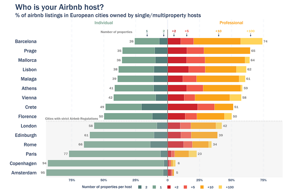
Each of the bars corresponds to a different city and the visualisation is split into two sides: left (green colours) for the % of listings owned by individuals and right ( bright colours) for the % of listings owned by professional hosts. The number of properties per host has been classified into 1, 2, +2, +5, +10 and +100. Some of the cities that I selected have strict lodging regulations in place that limit the maximum number of days a year that can be rented out (Florence, London, Edinburgh, Rome, Paris, Copenhagen and Amsterdam). Finally, the graph order is from highest to lowest professional ownership share.
What we can see from the graph:
- The majority of Airbnb’s in my analysis are owned by professionals.
- Barcelona has the highest share of professional ownership at 74%, compared to 26% for individuals.
- Amsterdam has the lowest share of professional ownership at just 5%, with 95% of listings owned by individuals, likely due to strict government regulations limiting rentals to a maximum of 30 days per year.
- Cities with lax Airbnb Regulations allow for professional hosts to dominate the market.
- Cities with strict Airbnb Regulations tend to push Airbnb professional hosts out of the picture.
- There doesn’t seem to be a set limit on the maximum amount of listings per host.
According to Airbnb, our experience with them is supposed to be authentic. However, by looking at the data, we’ve uncovered that 3 out of 5 listings are hotel-like flats owned by rental investors (except when rentals are regulated). This disconnect between marketing perception and reality highlights, not only the influence of branding in our views, but the importance of initiatives such as InsideAirbnb.
I now know what to expect for my next stay — how about you? Will you get the full padlock treasure hunt experience? Dive into the coding if you’re curious!
How to Replicate My Study for Your City?
I’ve written a guide on how to perform this data analysis and generate the graph in the previous section. I am using the dataset from the city of Barcelona to illustrate the different data analysis steps.
After downloading the listings.csv.gz files from InsideAirbnb I opened them in Python without decompressing. I am using Polars for this project just to become familiar with the commands (you can use Pandas if you wish):
import polars as pl
df=pl.read_csv('listings.csv.gz')
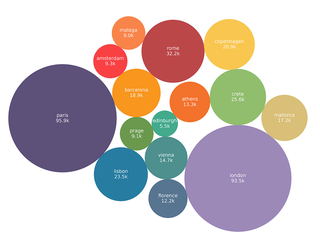
Here are the cities that I used for the analysis and the number of listings in each dataset:
If you like this packed bubble plot, make sure to check my last article:
I found a hidden gem in Matplotlib’s library: Packed Bubble Charts in Python
First look into the dataset and this is what it looks like:
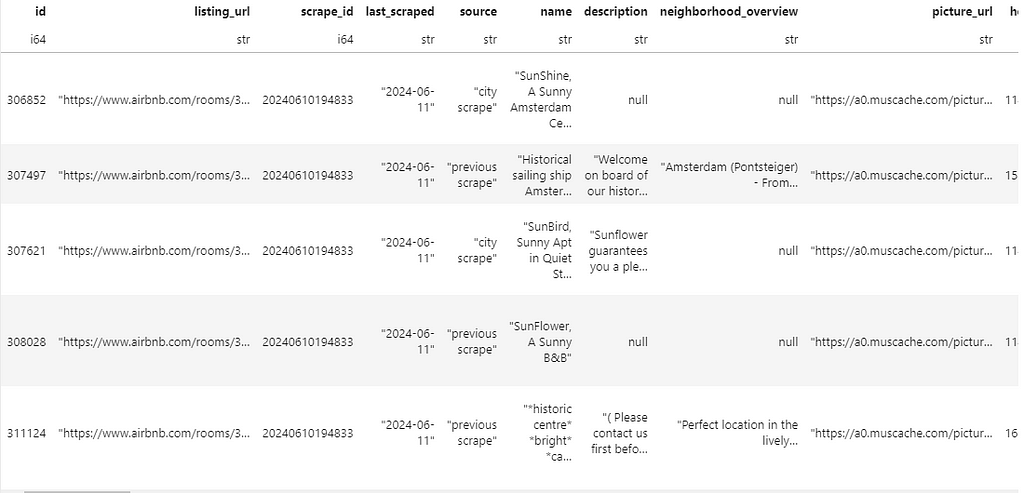
The content is based on available data in each listing URL, and it contains rows for each listing and 75 columns that detail from description, neighbourhood, and number of bedrooms, to ratings, minimum number of nights and price.
As mentioned earlier, even though this dataset has endless potential, I will focus solely on multi-property ownership.
- Data analysis
After downloading the data, there’s little data cleaning to do:
1- Filtering “property_type” to only “Entire rental units” to filter out room listings.
2- Filtering “has_availability” to “t”(True) to remove non-active listings.
import polars as pl
#I renamed the listings.csv.gz file to cityname_listings.csv.gz.
df=pl.read_csv('barcelona_listings.csv.gz')
df=df.filter((pl.col('property_type')=="Entire rental unit")&(pl.col('has_availability')=="t"))
For data processing, I transformed the original data into a different structure that would allow me to quantify how many listings in the dataset are owned by the same host. Or, rephrased, what percentage of the city listings are owned by multi-property hosts. This is how I approached it:
- Performed a value_counts on the “host_id” column to count how many listings are owned by the same host id.
- Created 5 different bins to quantify multi-property levels: 1 property, 2 properties, +2 properties, +5 properties, +10 properties and +100 properties.
- Performed a polars.cut to bin the count of listings per host_id (continuous value) into my discrete categories (bins)
host_count=df['host_id'].value_counts().sort('count')
breaks = [1,2,5,10,100]
labels = ['1','2','+2','+5','+10','+100']
host_count = host_count.with_columns(
    pl.col("count").cut(breaks=breaks, labels=labels, left_closed=False).alias("binned_counts")
)
host_count
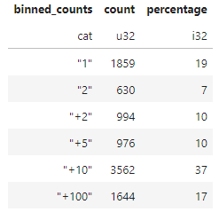
This is the result. Host_id, number of listings, and bin category. Data shown corresponds to the city of Barcelona.
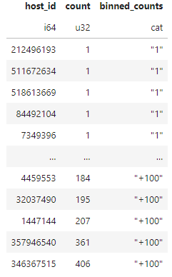
Please take a second to realise that host id 346367515 (last on the list) owns 406 listings? Is the airbnb community feeling starting to feel like an illusion at this point?
To get a city general view, independent of the host_id, I joined the host_count dataframe with the original df to match each listing to the correct multi-property label. Afterwards, all that is left is a simple value_counts() on each property label to get the total number of listings that fall under that category.
I also added a percentage column to quantify the weight of each label
df=df.join(host_count,on='host_id',how='left')

graph_data=df['binned_counts'].value_counts().sort('binned_counts')
total_sum=graph_data['count'].sum()
graph_data=graph_data.with_columns(((pl.col('count')/total_sum)*100).round().cast(pl.Int32).alias('percentage'))
Don’t worry, I am a visual person too, here’s the graph representation of the table:
import plotly.express as px

palette=["#537c78","#7ba591","#cc222b","#f15b4c","#faa41b","#ffd45b"]

# I wrote the text_annotation manually cause I like modifying the x position
text_annotation=['19%','7%','10%','10%','37%','17%']
text_annotation_xpos=[17,5,8,8,35,15]
text_annotation_ypos=[5,4,3,2,1,0]
annotations_text=[
    dict(x=x,y=y,text=text,showarrow=False,font=dict(color="white",weight='bold',size=20))
    for x,y,text in zip(text_annotation_xpos,text_annotation_ypos,text_annotation)

]

fig = px.bar(graph_data, x="percentage",y='binned_counts',orientation='h',color='binned_counts',
             color_discrete_sequence=palette,
            category_orders={"binned_counts": ["1", "2", "+2","+5","+10","+100"]}
            )
fig.update_layout(
    height=700,
    width=1100,
    template='plotly_white',
    annotations=annotations_text,
    xaxis_title="% of listings",
    yaxis_title="Number of listings owned by the same host",
    title=dict(text="Prevalence of multi-property in Barcelona's airbnb listings<br><sup>% of airbnb listings in Barcelona owned by multiproperty hosts</sup>",font=dict(size=30)),
    font=dict(
        family="Franklin Gothic"),
    legend=dict(
        orientation='h',
        x=0.5,
        y=-0.125,
        xanchor='center',
        yanchor='bottom',
        title="Number of properties per host"
    ))

fig.update_yaxes(anchor='free',shift=-10,
                tickfont=dict(size=18,weight='normal'))

fig.show()
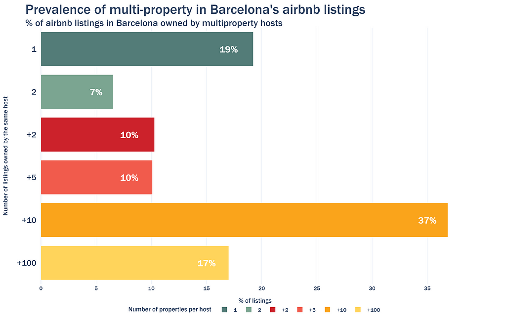
Back to the question at the beginning: how can I conclude that the Airbnb essence is lost in Barcelona?
- Most listings (64%) are owned by hosts with more than 5 properties. A significant 17% of listings are managed by hosts who own more than 100 properties
- Only 26% of listings belong to hosts with just 1 or 2 properties.
If you wish to analyse more than one city at the same time, you can use a function that performs all cleaning and processing at once:
import polars as pl

def airbnb_per_host(file,ptype,neighbourhood):
    df=pl.read_csv(file)
    if neighbourhood:
        df=df.filter((pl.col('property_type')==ptype)&(pl.col('neighbourhood_group_cleansed')==neighbourhood)&
                    (pl.col('has_availability')=="t"))
    else:
        df=df.filter((pl.col('property_type')==ptype)&(pl.col('has_availability')=="t"))

    host_count=df['host_id'].value_counts().sort('count')
    breaks=[1,2,5,10,100]
    labels=['1','2','+2','+5','+10','+100']
    host_count = host_count.with_columns(
    pl.col("count").cut(breaks=breaks, labels=labels, left_closed=False).alias("binned_counts"))

    df=df.join(host_count,on='host_id',how='left')

    graph_data=df['binned_counts'].value_counts().sort('binned_counts')
    total_sum=graph_data['count'].sum()
    graph_data=graph_data.with_columns(((pl.col('count')/total_sum)*100).alias('percentage'))

    return graph_data
And then run it for every city in your folder:
import os
import glob

# please remember that I renamed my files to : cityname_listings.csv.gz
df_combined = pl.DataFrame({
        "binned_counts": pl.Series(dtype=pl.Categorical),
        "count": pl.Series(dtype=pl.UInt32),
        "percentage": pl.Series(dtype=pl.Float64),
        "city":pl.Series(dtype=pl.String)
    })

city_files =glob.glob("*.csv.gz")

for file in city_files:
    file_name=os.path.basename(file)
    city=file_name.split('_')[0]
    print('Scanning started for --->',city)

    data=airbnb_per_host(file,'Entire rental unit',None)

    data=data.with_columns(pl.lit(city.capitalize()).alias("city"))

    df_combined = pl.concat([df_combined, data], how="vertical")

print('Finished scanning of ' +str(len(city_files)) +' cities')
Check out my GitHub repository for the code to build this graph since it’s a bit too long to attach here:
GitHub - gopean-art/Airbnb-analysis: airbnb article
And that’s it!
Let me know your thoughts in the comments and, in the meantime, I wish you a very fulfilling and authentic Airbnb experience in your next stay 😉
All images and code in this article are by the author
Who Really Owns the Airbnbs You’re Booking? — Marketing Perception vs Data Analytics Reality was originally published in Towards Data Science on Medium, where people are continuing the conversation by highlighting and responding to this story.
from Datascience in Towards Data Science on Medium https://ift.tt/wnYLC9r
via IFTTT


