Awesome Plotly with Code Series (Part 4): Grouping Bars vs Multi-Coloured Bars
Do technicolour bars really help make a story clear?

Welcome to the fourth post in my “Plotly with code” series! If you missed the first one, you can check it out in the link below, or browse through my “one post to rule them all” to follow along with the entire series or other topics I have previously written about.
- Awesome Plotly with Code Series (Part 1): Alternatives to Bar Charts
- All my written articles in one place
A short summary on why I am writing this series
My go-to tool for creating visualisations is Plotly. It’s incredibly intuitive, from layering traces to adding interactivity. However, whilst Plotly excels at functionality, it doesn’t come with a “data journalism” template that offers polished charts right out of the box.
That’s where this series comes in — I’ll be sharing how to transform Plotly’s charts into sleek, professional-grade charts that meet data journalism standards.
Categorical colouring that will break your charts
Ever tried to cram three dimensions into a bar chart and found yourself frustrated with the results? Today, we’ll tackle a challenge that’s both subtle and powerful: using colours to represent subcategories within your bar charts. Using colours to differentiate an extra layer of information is a common solution. For example, in a bar chart, you can easily represent 2 dimensions, but you don’t have a 3rd axis for the 3rd dimension. This is where colours can help. But, without careful planning, colours can quickly clutter your chart and muddy your message.
What will we cover in this blog?
- You will an example when indiscriminate colouring hurts your story.
- You will also see that, even with the same indiscriminate colours, you can still re-design the bar chart to make it more legible.
- There will also be an example where the use of colours makes a lot of sense, for example, red-amber-green to represent project progress. But, the ordering of the bars matters.
- Finally, you will see my take on removing colours from the charts but still representing this 3rd (and even 4th!) dimension.
PS: As always, code and links to my GitHub repository will be provided along the way. Let’s get started!
Colouring that hurts my brain because of ordering!
Imagine you work for a health organisation and want to run a survey on smoking rates at the country level. To begin you storytelling you want to be able to:
- Represent in descending order, the countries with the highest smoking rates.
- In addition, you want to show the relevant continent.
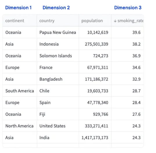
Let’s begin with our first implementation. We start with plotly.express and get this chart. The colour combination is horrendous!!
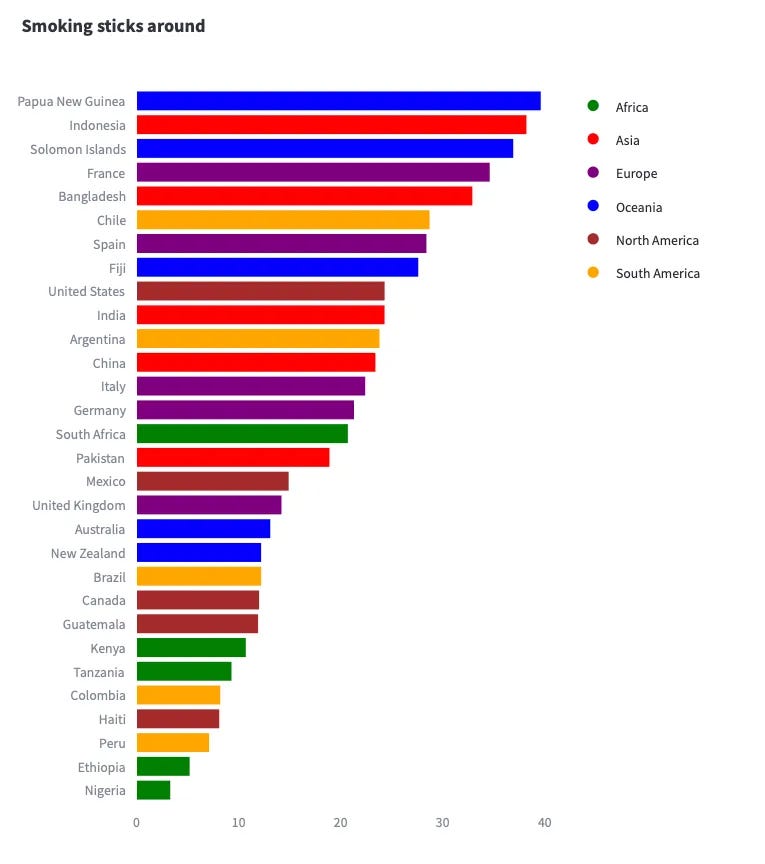
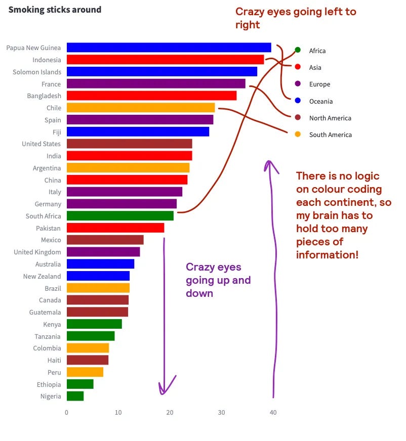
Where do I think this plot has issues?
- The most important issue is the fact that ordering on one dimension without considering the other makes thing so complicated!
- For every single bar, I have to decode the colour coding by looking at the legend.
- If I wanted to understand which African country had the highest smoking rate, it is going to take me some decent scanning time to know it is South Africa.
- Because of the brain bomb, I can really only process the top and bottom of the chart and can only quickly figure out smoking rates of Papua New Guinea, Indonesia, Ethiopia and Nigeria.
- Given the height of the bar, the actual smoking rate values for the top bars are really difficult to infer. I know that Papua New Guinea and Indonesia have a high smoking rate, but I can’t tell you their exact smoking rate.
A step in the right direction: first sort, then colour.
We mentioned that ordering on one dimension without considering the other makes things complicated. One solution to the previous chart is to always sort first. The idea is the following:
- If your colour codes represent continents, then ensure that the y-axis is sorted first by continent.
- Then within each continent, you can then decide to sort by smoking rate.
- If you now apply colour, each set of countries can be much easier identified with a continent.
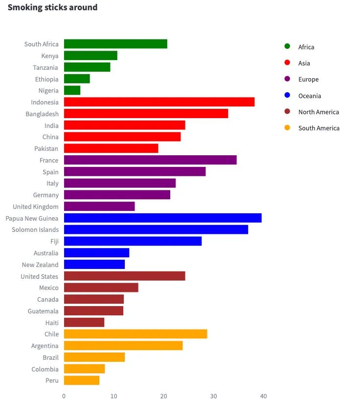
Whilst some of the issues in the first plot still persist, this little change has made a massive difference in being able to digest the chart.
Levelling to pro
Main issue 1: Colours might have meaning
I have an issue with using colours for categories: our brains might sometimes provide meaning to these colours. For example, should we interpret the colour red as something negative? Is there a reason why Africa is coloured in green?
Solution. Unless you really need colour to convey message, just use grey as a starting point.
Main issue 2: But how do I represent a 3rd dimension without colour?
Well, here is where we need to think on how the human brain works. Why would you want the reader to scroll from a bar to a colour code legend (and viceversa) to figure out which continent does a country belong to? Why not simply, write the continent next to the country?
Solution. Work with double deep axis to create parent-child level categories
Incorporating these 2 ideas, we could have a plot like the following.
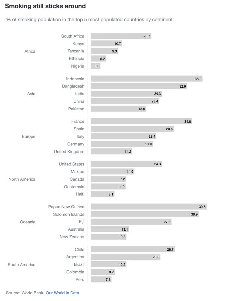
Why do I think this plot is better?
- Continents are way easier to identify, so no brain power is used in decoding any colour legends.
- It is easy to answer what are the top smoking countries by continent by having sorted the countries by continent.
- Even if using 1 colour is boring, I have done so intentionally to not over-represented any specific country. If you did want to highlight a few (let’s say the top 5 smoking countries), choose another colour as we have done in previous posts.
- Given how tall the charts where, by adding the actual data labels, there is no need to scroll your eyes from the x-axis to each individual bar and decipher where the bars ended.
- Clearer title and subtitle.
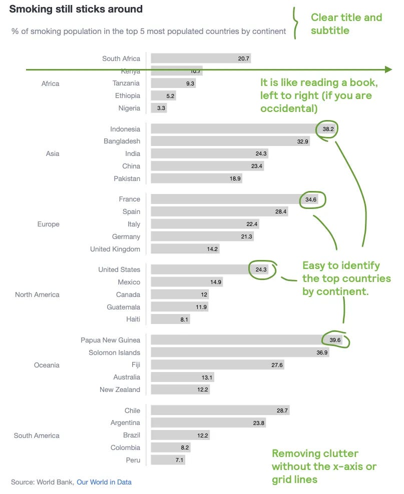
Tips on how to create this plot
How to create a double y-axis?
- 1st, give the chart a large left margin space. This means that the chart will begin with a massive white space at the left.
fig.update_layout(margin=dict(l=250))
- 2nd, we are going to create a chart based on subplots. The main idea is to create a bar chart for each continent and then stack them together.
fig = make_subplots(
        rows=len(continents),
        cols=1,
        shared_xaxes=True,
        vertical_spacing=0.02
    )
- 3rd, to ensure that each country is plotted per continent, add a trace per continent through a loop and append it to each row.
for i, continent in enumerate(continents):
   continent_df = df[df['continent'] == continent]
   fig.add_trace(
         go.Bar(
          x=continent_df['smoking_rate'],
          y=continent_df['country'],
          orientation='h',
          text=continent_df['smoking_rate'],
          textposition='inside',
          textangle=0,
          textfont=dict(color='black'),
          marker_color='lightgrey',
        ),
    row=i + 1,
    col=1
)
- 4th, in order to write the continent name in the middle of each of these continent traces, we need to use annotations.
- yref → We are telling plotly to taking as the starting point, the y{i+1} trace. For example, if i=0, then plotly would look at the first continent.
- x and y → These reference the coordinate position you want to write your text.
- For x it is easy, -0.45 from the starting point of the chart (which remember has been added a left margin).
- For y, we find the middle point of each continent. In this case, because each continent_df has only 5 records, then the middle point is 3. Therefore, it will look for the country in the 3rd position for each continent and write the text next to it.
for i, continent in enumerate(continents):
    continent_df = df[df['continent'] == continent]
    fig.add_annotation(
      xref='paper',
      yref='y' + str(i + 1),
      xanchor='right',
      x=-0.45,
      y=continent_df['country'].iloc[len(continent_df) // 2],
      text=continent,
      showarrow=False,
      font=dict(size=12)
    )
- 5th, if you want that fancy line delineating the countries, you just need to adjust the y_axes for each subplot.
for i in range(len(continents)):
   fig.update_yaxes(
       showline=True,
       linecolor='lightgrey',
       linewidth=1,
       ticklabelposition='outside',
       ticklen=7,
       tickcolor='white',
       row=i + 1,
       col=1
   )
RAG colours for status updates
Many stakeholders are used to Red-Amber-Green when talking about progress updates. I feel sorry for those of you who are colour-blind, as differentiating these 3 colours is really tough. But the reality is that even traffic lights are using these colours, and this is why, for a lot of people, a RAG colour selection instantly clicks in their brains.
Imagine that you are faced having to present a progress status update. The data you have looks like the one below. See how your goal is to present 4 dimensions! Not 3 like for the smoking rate plot above, but 4!
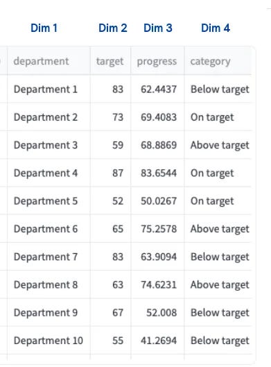
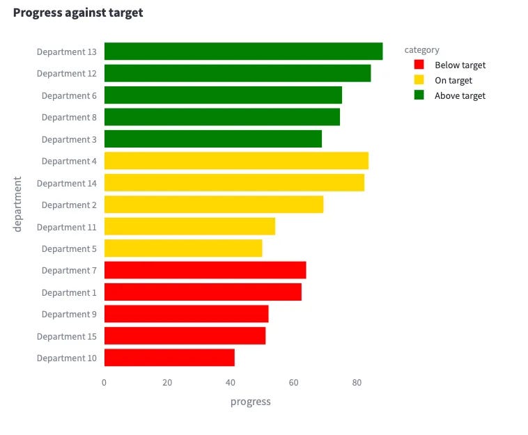
Indiscriminate RAG colouring still hurts
Remember the country plot sorted by smoking rate? You might argue… “well, of course that chart hurt the brain… you were forcing me to map a continent to a colour, and that was non-intuitive. I can perfectly handle 3 RAG colours!”
Well, here you go.
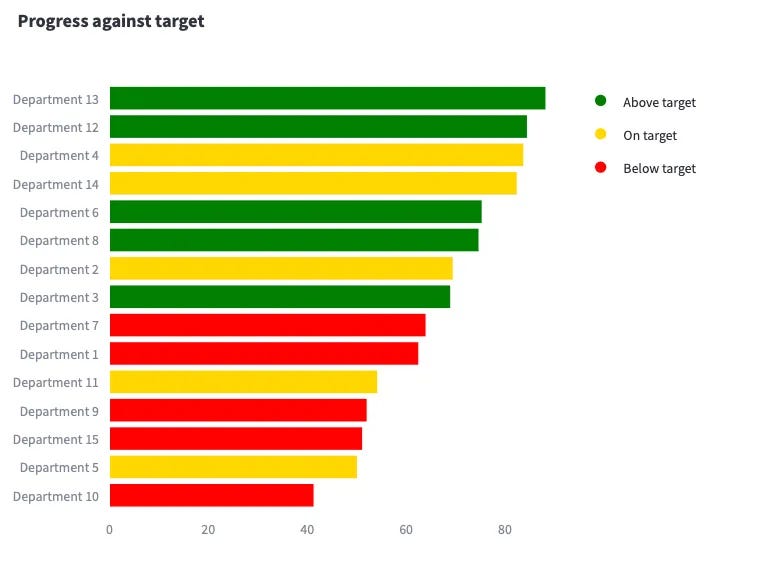
Where do I think this plot has issues?
- Similarly to the country-continent plot, this progress-target plot gets a bit complicated to digest because we are ordering only 1 dimension (progress), without considering the colour coded dimension (target).
- As a stakeholder, what I really want to see is the cluster of departments which are performing above, on or below target. This way it is easy to detect where to help.
- One might be very confused as why do we have “green” status for department 3, which only has ~63% progress against target. This is because we are missing the 4th dimension to be added to the plot.
- As a stakeholder I also want to see the exact progress against target. In the current chart, we have to decipher the numbers.
A small change helps, but doesn’t fully cover all the issues
As before, and for completion, check again an example where we do order by both dimensions. The plot is much more readable, but the issues mentioned above still persist.
Adding a 4th dimension without creating additional clutter
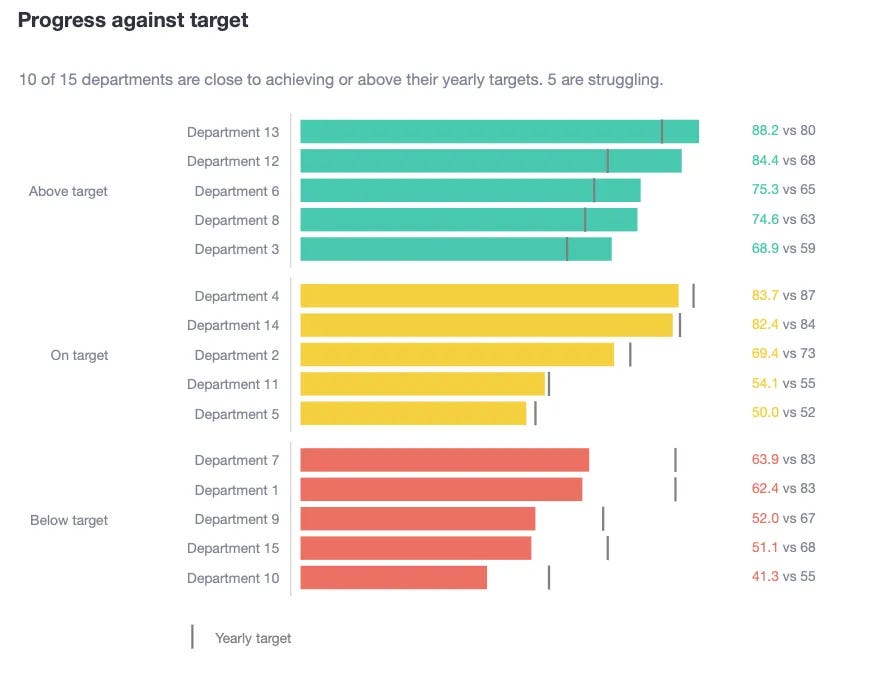
Main issue 1: As a stakeholder, I would like to see the each department’s target.
Because each department’s target is dynamic, we need to figure out a way to show the progress data points, without incorporating extra clutter. In addition, if this progress can be presented next to each progress, it will massively help bring a dimension of “closeness” between progress vs target.
Solution. I suggest adding a marker for each progress. In this case, I chose a vertical line.
Main issue 2: As a stakeholder, I would like to see the specific progress and target numbers.
One solution would be to plot the numbers inside the bars as we have done in the smoking rate plots. But, given that sometimes the target line is really close to the end of the bars, the text would overlap and make it difficult to read.
Solution. I suggest adding the progress and target “text”, aligned vertically to the right of the plot.
Why do I think this plot is better?
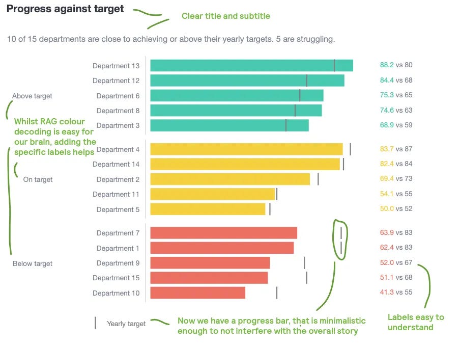
- Departments are clustered against their targets, so it is really easy to see who is performing above or below expectations.
- Whilst RAG colours would be mentally mapped to performance, I have added the actual labels against each department.
- It is easy to compare now target vs progress using the “lines” vs the “bars”.
- In addition, by adding actual numbers aligned to the right, one can easily read specific progress and targets. No need to decipher what the value would be using the x-axis as a reference.
- Clear title and subtitle
Tips on how to create this plot
How to add the vertical line markers in the bar chart?
- 1st, create a scatter plot where you define the shape of the marker. In this case, I chose a vertical line. In addition, name the trace so that we show it in the legend.
fig.add_trace(
   go.Scatter(
      x=category_df['target'],
      y=category_df['department'],
      mode='markers',
      marker=dict(line_color='grey', line_width=2,
                  symbol='line-ns', size=15,),
      showlegend=True if i == 0 else False,
      name='Yearly target',
    ),
    row=i + 1,
    col=1
)
- 2nd, show the legend horizontally
fig.update_layout(
    ...,
    legend=dict(
            orientation='h',
            x=0,
            y=-0.05,
            xanchor='right',
            yanchor='top',
            font=dict(color='grey')
        ),
)
How to add the text numbers to the right of the plot?
- 1st, ensure that you have enough space at the right of the plot. I have done this by forcing the x-axis to be wider than needed. For example, I have forced the x-axis to go all the way to 140 (even though the progress dimension only goes up to 88.2)
fig.update_xaxes(
   showticklabels=False,
   showline=False,
   zeroline=False,
   range=[0, 140], # <-----
   row=i + 1,
   col=1
)
- 2nd, create a concatenated text column. You can actually colour part of the text in this column by using HTML code
category_df['text'] = category_df.apply(
  lambda x: f"<span style='color: {color_};'>{x['progress']}</span> vs {x['target']}",
  axis=1
)
- 3rd, create a “dummy” scatter plot, where you hide the markers and only show the text. I have told Plotly to show the text at a fixed x-axis value.
fig.add_trace(
   go.Scatter(
      x=[100] * len(category_df),
      y=category_df['department'],
      mode='text',
      text=category_df['text'],
      textposition='middle right',
      showlegend=False,
   ),
   row=i + 1,
   col=1
)
Summary
In this post, we have covered how colouring shouldn’t be the default way of showing multiple categories. Colour can induce to unexpected meanings. In addition, if the colour is splattered across the chart, it looks like weird rainbow.
- The primary presented solution was the idea of sorting over 2 dimensions. First, the dimension that you intended to colour code. And then, the dimension that you intended to show an ascending/descending order.
- The second solution supporting this sorting was the use text in a neatly aligned way. This is how humans really understand things when reading, so make the most out of it!
- Finally, we also saw how a 4th dimension could be appended to the chart via an extra marker. We were lucky here as the 4th dimension was also a direct representation of the x-axis, so we managed to present it with the vertical lines. If the 4th dimension was completely unrelated, we would need to change our approach (we will cover that in another post).
Where can you find the code?
In my repo and the live Streamlit app:
Acknowledgements
- World bank, Our world in data (CC BY 4.0)
- How To Use Color Blind Friendly Palettes in Your Design (article)
Further reading
Thanks for reading the article! If you are interested in more of my written content, here is an article capturing all of my other blogs posts organised by themes: Data Science team and project management, Data storytelling, Marketing & bidding science and Machine Learning & modelling.
All my written articles in one place
Stay tuned!
If you want to get notified when I release new written content, feel free to follow me on Medium or subscribe to my Substack newsletter. In addition, I would be very happy to chat on Linkedin!
- Get notified with my latest written content about Data Science!
- Jose's Substack | Jose Parreño Garcia | Substack
Originally published at https://joseparreogarcia.substack.com.
Awesome Plotly with Code Series (Part 4): Grouping Bars vs Multi-Coloured Bars was originally published in Towards Data Science on Medium, where people are continuing the conversation by highlighting and responding to this story.
from Datascience in Towards Data Science on Medium https://ift.tt/dDtecRM
via IFTTT

