Demystifying the Correlation Matrix in Data Science
Understanding the Connections Between Variables: A Comprehensive Guide to Correlation Matrices and Their Applications

Data analysis is primarily used to identify and quantify correlations and patterns between variables so that they can be used for future predictions and corresponding models can be trained. The correlation matrix is a crucial method that helps to graphically represent the correlation, i.e. the dependency, between two variables in a dataset.
In this article, we take an in-depth look at the concept of correlation and how the correlation matrix helps to show the dependencies between variables. This includes, for example, looking at the calculation and interpretation of the correlation matrix in detail and explaining how such a matrix can be created in Python. A comprehensive picture also includes showing the limitations of this method so that its use and significance can be correctly assessed.
What is a Correlation Matrix?
The correlation matrix is a statistical method for quantifying and comparing the relationships between different variables in a dataset. The pairwise correlations between all combinations of two variables are shown in a tabular structure. Each cell in the matrix contains the so-called correlation coefficient between the two variables defined in the column and the row.
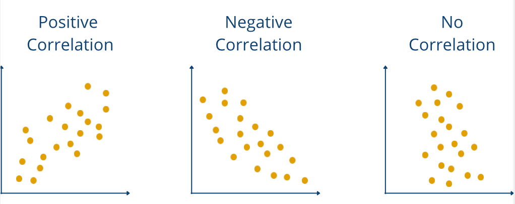
This value can be between -1 and 1 and provides information on how the two variables relate to each other. A positive value indicates a positive correlation, meaning that an increase in one variable leads to an increase in the other variable. The exact value of the correlation coefficient provides information on how strongly the variables move about each other. With a negative correlation coefficient, the variables move in opposite directions, meaning that an increase in one variable leads to a decrease in the other variable. Finally, a coefficient of 0 indicates that there is no correlation.
A correlation matrix therefore fulfills the purpose of presenting the correlations in a dataset in a quick and easy-to-understand way and thus forms the basis for subsequent steps, such as model selection. This makes it possible, for example, to recognize multicollinearity, which can cause problems with regression models, as the parameters to be learned are distorted.
What is a Correlation?
Correlation refers to the relationship between two statistical variables and evaluates the strength and direction of the linear or non-linear relationship between the two variables. It therefore quantifies how the change in one variable affects the other.
A positive correlation between two variables means that an increase in A also leads to an increase in B. The dependency is non-directional. The dependency is undirected. The reverse is also true and an increase in variable B also increases A.
In general, there are two ways in which the correlation can be assessed:
- Linear or non-linear: The dependencies are linear if the changes in variable A always trigger a change with a constant factor in variable B. If this is not the case, the correlation is said to be linear. If this is not the case, it is referred to as a non-linear dependency. For example, there is a linear correlation between height and body weight. For every centimeter of height you gain, you will most likely also gain a fixed amount of body weight, as long as your stature does not change. In contrast, there is a non-linear relationship between the development of turnover and the development of a company’s share price. If turnover increases by 30 %, the share price may rise by 10 %, but if turnover increases by the following 30 %, the share price may only rise by 5 %.
- Positive or negative: If the increase in variable A leads to an increase in variable B, then there is a positive correlation. If, on the other hand, the increase in A leads to a decrease in B, then the correlation is negative. Finally, if a change in A leads to no change in B, then there is no correlation and the correlation coefficient is 0.

The so-called correlation coefficient is used to calculate specific values for the correlation. Various coefficients should be selected depending on the dataset and the type of correlation.
What Correlation Coefficients are there?
Correlation is a fundamental concept in statistics that measures and quantifies the relationship between two variables. It not only shows the direction of the relationship but also determines the factor of how strongly the change in one variable leads to a change in the other variable. Depending on the relationship between the variables, there are various ways of calculating the specific correlation coefficient. In this section, we will take a closer look at the three widely used methods for calculating the correlation.
Pearson correlation
The Pearson correlation is most commonly used to quantify the strength of the linear relationship between two variables. However, it can only be used if it is assumed that the two variables are linearly dependent on each other and are also metrically scaled, i.e. have numerical values.
If these assumptions are made, the Pearson correlation can be calculated using this formula:

Here, Xi and Yi are the values of the two variables X̅ and Y̅are the mean values of the variables. In addition, this formula can also be rewritten so that it uses the standard deviation in the denominator:

The resulting values are then between -1 and 1, with positive values indicating a positive correlation and negative values indicating a negative correlation.
Spearman correlation
The Spearman correlation extends the assumptions of the Pearson correlation and generally examines the monotonic relationship between two variables without assuming a linear relationship. More generally, it examines whether a change in one variable leads to a change in the other variable, even if this relationship does not have to be linear. This makes it suitable not only for datasets with non-linear dependencies, but also so-called ordinal data, i.e. datasets in which only the order of the data points plays an important role, but not the exact distance.
The formula for the Spearman correlation is also largely based on this ranking. The datasets are first sorted according to the first variable and then according to the second variable. For both rankings, the ranks are numbered consecutively starting with 1 for the lowest value. The difference between the rank for the first variable and the rank for the second variable is then calculated for each data point:

The Spearman correlation coefficient is then calculated using the following formula, where d is the declared sum for each data point and n is the number of data points in the dataset.

Kendall-Tau correlation
The Kendall tau correlation is another method for determining a correlation coefficient. Similar to the Spearman correlation, it can quantify non-linear relationships between the data and works on the ordinal relationships between the data. Compared to the Spearman correlation, it is particularly suitable for smaller datasets and captures the strength of the relationship somewhat more accurately.
The Kendall tau correlation always looks at pairs of data points and distinguishes between concordant and discordant pairs. A concordant pair of data points is given if a pair of observations (xᵢ, yᵢ) and (x_j, y_j) match in the ranking of both variables. It must therefore apply that if x_i > y_i, then x_j > y_j also applies. If, on the other hand, the ranking does not match, the pair is considered discordant.
The formula for calculating the Kendall-Tau correlation is then obtained using the following formula:

Correlation vs. Causality
Correlation refers to the relationship between two statistical variables and evaluates the strength and direction of the linear or non-linear relationship between the two variables. It therefore quantifies how the change in one variable affects the other.
Causality, on the other hand, describes a cause-and-effect relationship between two variables. Causality between A and B therefore means that the increase in A is also the cause of the increase in B.
The difference quickly becomes clear with a simple example. A study could very likely find a positive correlation between a person’s risk of skin cancer and the number of visits to the outdoor pool. So if a person frequently visits the outdoor pool, their risk of developing skin cancer also increases. A clear positive correlation. But is there also a causal relationship between visits to the outdoor pool and skin cancer? Probably not, because that would mean that outdoor pool visits alone are the cause of the increased risk of skin cancer.
People who spend more time in outdoor pools are exposed to significantly more sunlight. If they do not take sufficient precautions with sun cream or similar, this can lead to more sunburns and increase the risk of skin cancer. It is clear to see that the correlation between visits to outdoor swimming pools and the risk of skin cancer is not a causal relationship.
A large number of curious correlations, which very probably do not show causality, can be found on tylervigen.com.
How do you calculate a Correlation Matrix?
The correlation matrix is a tabular structure in which the pairwise correlations between different variables in a dataset are mapped. Each cell in this matrix describes how strongly these two variables from the row and column index are related to each other. This relationship is quantified using the correlation coefficient rᵢⱼ, which measures the relationship between the variable Xᵢ and Xⱼ.
The general structure of the matrix is then as follows

Here are:
- K is the desired correlation matrix.
- rᵢⱼ is the correlation coefficient for the variables Xᵢ and Xⱼ.
- n is the number of variables in the dataset.
For example, the various methods presented in the previous section can be used for the correlation coefficient. Various programs can be used to create this matrix so that it does not have to be filled in manually:
- In Excel, there is an integrated correlation function in the data analysis section.
- Python offers various calculation options. In Pandas, for example, you can create the correlation matrix directly from a DataFrame. A similar option is also available in NumPy.
- In the R programming language, the whole thing can be achieved using the cor() function.
- Matlab also offers the functionality to create a correlation matrix.
Before creating the matrix, it is also important that the dataset has been sufficiently cleaned of missing values and outliers, as these can otherwise hurt the correlation results.
How do you interpret a correlation matrix?
The correlation matrix is a compact representation to illustrate the dependencies between different variables in a dataset. Each number in the matrix indicates the correlation coefficient between two variables. Various characteristic values provide information about the underlying correlations.
The direction of the correlation
The direction of the correlation indicates how the variables relate to each other. A positive correlation, for example, rᵢⱼ = 0.8), means that the two variables are positively correlated. This means that an increase in one variable also leads to an increase in the other variable and vice versa. For example, there could be a positive correlation between the number of sales employees and the turnover of a company, meaning that an increase in the number of sales employees also leads to an increase in turnover.
A negative correlation, for example, rᵢⱼ = 0.7, exists if the increase in one variable leads to a decrease in the other variable. For example, there is a negative correlation between unemployment and economic growth. If unemployment rises, economic growth usually falls, and vice versa.
Strength of the correlation
In addition to the sign of the correlation coefficient, the absolute value also provides important information about the correlation. Values close to the endpoints -1 and 1 indicate a strong correlation between the variables, while values close to 0 indicate no or only a very weak correlation.
Symmetry of the matrix
An important property of the correlation matrix is its symmetry. This means that all elements above the so-called main diagonal are identical to the values below the main diagonal. This simplifies the interpretation of the matrix, as only half of the values need to be examined.
Simply put, the symmetry of the correlation matrix results from the property that the correlation coefficient between Xᵢ and Xⱼ) is identical to the correlation coefficient between Xⱼ and Xᵢ, i.e. rᵢⱼ = rⱼᵢ.
Pattern
When looking at the matrix, you should also pay attention to whether patterns can be recognized that help to further simplify the dataset. For example, you should examine whether several variables have a high correlation with one variable. These can be grouped into a cluster, as they measure similar characteristics. For example, the variables “Physical activity in hours per week” and “Maximum number of push-ups” could both have a high correlation with low body weight, as both variables can be grouped as physical fitness.
Multicollinearity
When interpreting the correlation matrix, it is important to take a closer look at the values with high correlations. These can indicate so-called multicollinearity, which means that two or more variables correlate strongly with each other. This property is problematic in various statistical models, such as regressions, and should be eliminated before model training. If this is not done, it can lead to distorted results in parameter estimation.
What options are there for visualizing the Correlation Matrix?
The visualization of a correlation matrix should help to get a quick and easy overview of the correlations between variables. This is particularly important for large datasets to obtain a rough overview. In this section, we present various methods that can be used for this purpose.
Heatmaps
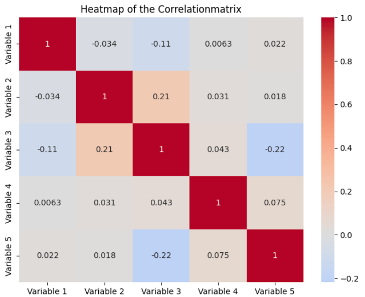
A heat map is most commonly used to visualize the values of a correlation matrix. All variables in the dataset are displayed as a row and column. The background color of the individual fields is then determined by the correlation between the variable in the row and the variable in the column. Normally, the stronger the correlation, the darker the values, and the lighter the values, the weaker the correlation between the variables.

In addition to the colors, the actual values are also displayed. On the main diagonal of the matrix, all values are one, as these are the fields where the row and column variables are identical. By combining values and colors, heat maps offer a simple way to make correlations quickly understandable, making it easier to identify patterns and anomalies.
Cluster Analysis
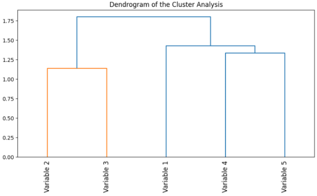
Cluster analysis can be used to group highly correlated variables. Variables with similar correlations can be grouped in clusters and visualized. This makes it easier to identify variables with similar behavior and recognize correlations.

Cluster analysis offers an additional visualization option, especially for larger and more complex datasets, if simple heat maps are not sufficient.
Scatterplot
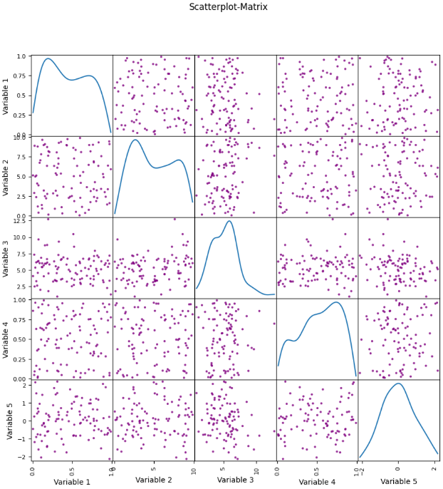
In addition to the correlation matrix, scatterplots can also be used to visualize the dependencies between two variables. This allows you to see how the two values move about each other and to find out whether the relationship is linear or non-linear. By combining different scatterplots, these dependencies can also be visualized for a complete dataset.

How can a Correlation Matrix be visualized in Python?
In Python, a correlation matrix can be easily calculated using Pandas and then visualized as a heatmap using Seaborn. To illustrate this, we randomly generate data using NumPy and store it in a DataFrame. As soon as the data is stored in a DataFrame, the correlation matrix can be created using the corr() function.
If no parameters are defined within the function, the Pearson coefficient is used by default to calculate the correlation matrix. Otherwise, you can also define a different correlation coefficient using the method parameter.
Finally, the heatmap is visualized using seaborn. To do this, the heatmap() function is called and the correlation matrix is passed. Among other things, the parameters can be used to determine whether the labels should be added and the color palette can be specified. The diagram is then displayed with the help of matplolib.
What are the limits of the Correlation Matrix?
The correlation matrix is a very useful tool for identifying and visualizing relationships and correlations between variables in a dataset. However, this method also has its limitations and the following points should be considered when interpreting the results:
- Causality vs. correlation: As we highlighted in a previous section, a correlation is merely an indicator of possible causality. A high correlation simply means that two variables are related. To prove causality, however, complex experiments must be carried out and their results examined.
- Outlier & non-linear relationships: For the results of the correlation matrix to be meaningful, the choice of correlation coefficient must be carefully considered. The standard Pearson coefficient is susceptible to outliers and can therefore be easily distorted. It also assumes linear relationships between the variables and can therefore greatly distort the correlation in the case of non-linear relationships between the variables.
- Data scaling: You should also be careful when working with data that operates on different scales or is measured in different units. In such cases, the calculation of the correlation may be impaired. You should therefore standardize or normalize the data so that all data is on a comparable scale. For example, the MinMax scaler can be used for this or the z-score can be calculated.
- Multicollinearity: Another challenge when dealing with the correlation matrix is the problem of multicollinearity. This occurs when two or more variables correlate with each other in a multivariate analysis. This can lead to distorted parameter estimates in regression analyses, for example.
The correlation matrix is a powerful tool in data analysis. However, you should be aware of the limitations and weaknesses of this method to use it correctly and obtain reliable results.
This is what you should take with you
- The correlation matrix is used in data analysis to visualize correlations between the variables in a dataset.
- The correlation is calculated pairwise between the variables and then mapped in a square matrix.
- In addition to the Pearson coefficient, other correlation coefficients can also be used, which are better suited to non-linear relationships, for example.
- In most cases, the results of the matrix are displayed using a heat map. Darker fields often indicate a higher correlation and lighter fields indicate a weaker correlation.
- In Python, the correlation matrix can be easily calculated from a DataFrame and visualized using seaborn.
- Despite the strengths of the correlation matrix, you should be aware of the limitations of this method. These include, for example, the sensitivity to outliers or the problems associated with different scales.
Demystifying the Correlation Matrix in Data Science was originally published in Towards Data Science on Medium, where people are continuing the conversation by highlighting and responding to this story.
from Datascience in Towards Data Science on Medium https://ift.tt/txwGpWS
via IFTTT

