How I Created a Data Science Project Following a CRISP-DM Lifecycle
An end-to-end project using the CRISP-DM framework
Introduction
CRISP-DM stands for Cross-Industry Standard Process for Data Mining, a data mining framework open to anyone who wants to use it.
Its first version was created by IBM as Analytics Solutions Unified Method for Data Mining (ASUM-DM). Then, a group of companies developed and evolved it to CRISP-DM, which nowadays is one of the most known and adopted frameworks in data science.
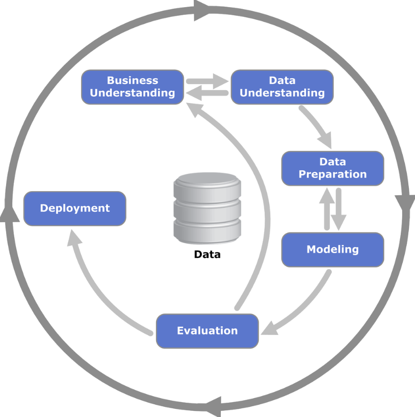
The process consists of 6 phases, and it is flexible. It is more like a living organism where you can (and probably should) go back and forth between the phases, iterating and enhancing the results.
The phases are:
Business Understanding
Data Understanding
Data Preparation
Modeling
Evaluation
Deployment
The small arrows show a natural path from Business Understanding to Deployment—where the interactions occur directly—while the circle denotes a cyclic relationship between the phases. This means that the project does not end with Deployment but can be restarted due to new business questions triggered by the project or adjustments potentially needed.
In this post, we will follow a project throughout its lifecycle using CRISP-DM steps. Our main objective is to show how using this framework is beneficial to the data scientist and to the company.
Let’s dive in.
Project
Let’s go over a project following the CRISP-DM framework.
In summary, our project is to create a classification model to estimate the probability of a customer submit a term direct deposit in our client’s institution, a bank.
Here is the GitHub Repository with the code, if you want to code along or follow it while reading the article.
Business Understanding
Understanding the business is crucial for any project, not just data science projects. We must know things like:
- What is the business?
- What is its product
- What are we selling/ offering?
- What is expected for that project?
- What is the definition of success?
- Metrics
In this project, we are working with a Bank, therefore we are talking about the Finance Industry. Our client sells financial solutions for people to easily receive, save, and invest their money in a secure environment.
The client reached us to discuss some direct marketing campaigns based on phone calls aiming to convert a financial product (term deposit). However, they feel like wasting time and effort from their managers to get the expected results, so the client wants to increase/ optimize the conversions by focusing effort on customers with a higher probability of conversion.
Certainly, business is a complex subject. Several factors can impact the result of the campaigns, but for the sake of simplicity, we will go straight to this solution:
- Create a predictive model that would give the managers a probability that the customer will convert or not.
Having that in hand, managers would be equipped with a tool to make a better selection of calls with a higher probability of success versus those customers that would need more work along the way.
Ergo, the definition of success for this project is estimating the probability of conversion, and the metric for the model will be F1-score. For the business, the metric could be the conversion rate, which would be compared in a Before and After comparative study.
Next, we need to start touching the data.
Data Understanding
The data we will use is the dataset Bank Marketing, available in the UCI Data Science Repository. It is open source under the Creative Commons 4.0 license.
The modules installed and imported in this project can be found on the project’s GitHub page.
!pip install ucimlrepo --quiet
from ucimlrepo import fetch_ucirepo

# fetch dataset
bank_marketing = fetch_ucirepo(id=222)

# data (as pandas dataframes)
df = pd.concat([bank_marketing.data.features, bank_marketing.data.targets],
               axis=1)
df = df.rename(columns={'day_of_week':'day'})

# View
df.sample(3)

Before starting working on the data, we will go ahead and split it into train and test, so we keep it safe of data leakage.
# Split in train and test sets
X_train, X_test, y_train, y_test = train_test_split(df.drop('y', axis=1),
                                                    df['y'],
                                                    test_size=0.2,
                                                    stratify=df['y'],
                                                    random_state=42)

# train
df_train = pd.concat([X_train, y_train], axis=1)

# test
df_test = pd.concat([X_test, y_test], axis=1)
Great. Now we are ready to move on and understand the data. This is also known as Exploratory Data Analysis (EDA).
Exploratory Data Analysis
The first step in an EDA is to describe the data statistically. This will already bring insights up to start understanding the data, such as spotting variables with potential errors or outliers, having a sense of the distributions and averages, as well learning which categories are the most frequent for categorical variables.
# Statistical description
df_train.describe(include='all').T
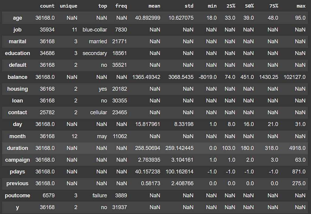
This simple one line command allows us to get the following insights:
- Age of the customers is 40 years old on average. Distribution skewed to the right.
- More than 20% of the customers are blue-collar workers.
- Most of the customers are married, with secondary level education, own a house loan.
- Only ~2% had payment default.
- Conversion Rate ~ 11.7%
- The data is highly unbalanced towards the negative class.
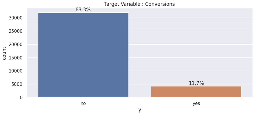
Once we know the distribution of the target variable, it is time to understand how the predictor variables interact with the target, trying to figure out which ones could be better for modeling the target variable’s behavior.
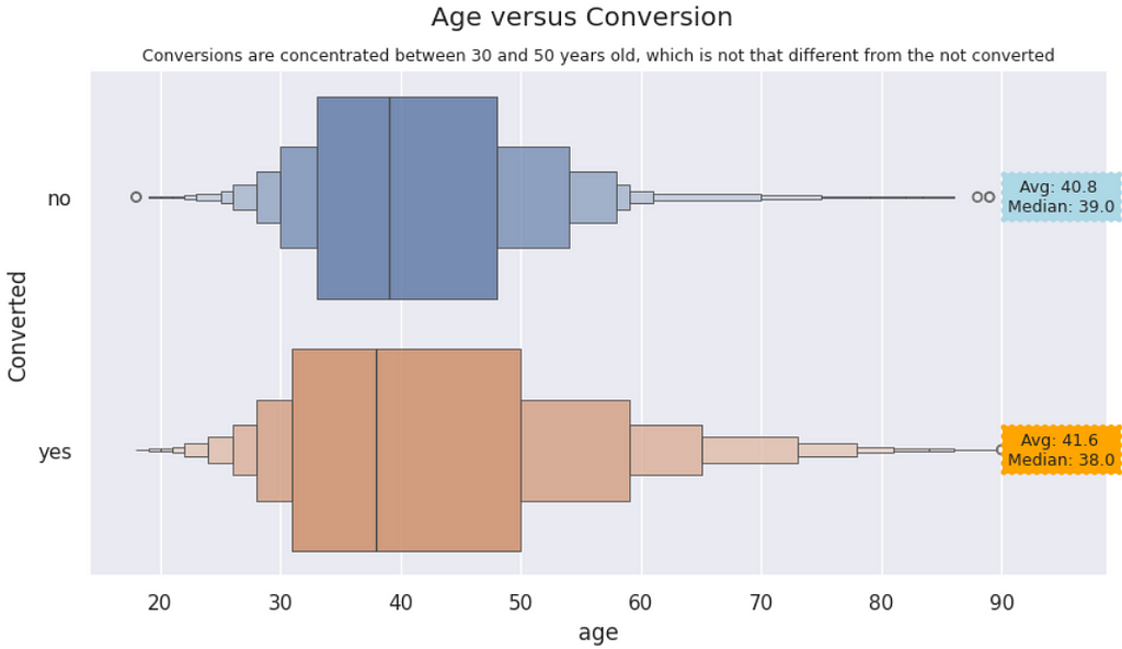
Age versus Conversions | Customers who converted to the campaigns are slightly younger than those who did not. However, both distributions are visually similar, even though the KS Test shows they are statistically different.
#Sample 1 - Age of the converted customers
converted = df_train.query('y == "yes"')['age']

#Sample 2 - Age of the not converted customers
not_converted = df_train.query('y == "no"')['age']

# Kolmogorov-Smirnov Test
# The null hypothesis is that the two distributions are identical
from scipy.stats import ks_2samp
statistic, p = ks_2samp(converted, not_converted)

if p > 0.05:
    print("The distributions are identical.")
else:
    print("The distributions are not identical: p-value ==", round(p,10))

----------
[OUT]:
The distributions are not identical: p-value == 0.0
# Age versus Conversion
plt.figure( figsize=(10,5))
ax = sns.boxenplot(data=df_train, x='age', y='y', hue='y', alpha=0.8)
plt.suptitle('Age versus Conversion')
plt.ylabel('Converted')
plt.title('Conversions are concentrated between 30 and 50 years old, which is not that different from the not converted', size=9)

# Annotation
# Medians and Averages
median_converted = df_train.query('y == "yes"')['age'].median()
median_not_converted = df_train.query('y == "no"')['age'].median()
avg_converted = df_train.query('y == "yes"')['age'].mean()
avg_not_converted = df_train.query('y == "no"')['age'].mean()
# Annotation - Insert text with Average and Median for each category
plt.text(95, 0, f"Avg: {round(avg_not_converted,1)} \nMedian: {median_not_converted}",
         ha="center", va="center", rotation=0,
         size=9, bbox=dict(boxstyle="roundtooth, pad=0.5", fc="lightblue",
         ec="r", lw=0))
plt.text(95, 1, f"Avg: {round(avg_converted,1)} \nMedian: {median_converted}",
         ha="center", va="center", rotation=0,
         size=9, bbox=dict(boxstyle="roundtooth, pad=0.5", fc="orange",
         ec="r", lw=0));
The previous code yields this visualization.
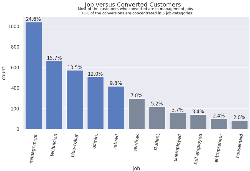
Job vs. Converions | Customers who hold management roles in their jobs are converting more, followed by technicians, blue-collars, admin and retired.
# job versus Conversions == "YES"
converted = df_train.query('y == "yes"')
plt.figure( figsize=(10,5))
# order of the bars from highest to lowest
order = df_train.query('y == "yes"')['job'].value_counts().index
# Plot and title
ax = sns.countplot(data=converted,
                   x='job',
                   order=order,
                   palette= 5*["#4978d0"] + 6*["#7886a0"])
plt.suptitle('Job versus Converted Customers')
plt.title('Most of the customers who converted are in management jobs. \n75% of the conversions are concentrated in 5 job-categories', size=9);
# X label rotation
plt.xticks(rotation=80);
#add % on top of each bar
for pct in ax.patches:
    ax.annotate(f'{round(pct.get_height()/converted.shape[0]*100,1)}%',
                (pct.get_x() + pct.get_width() / 2, pct.get_height()),
                ha='center', va='bottom')
Well, it does not make much sense to keep repeating code here for the visualizations, so I will go ahead and present only the graphics and the analysis from now on. Again, it is all available in this GitHub repository.
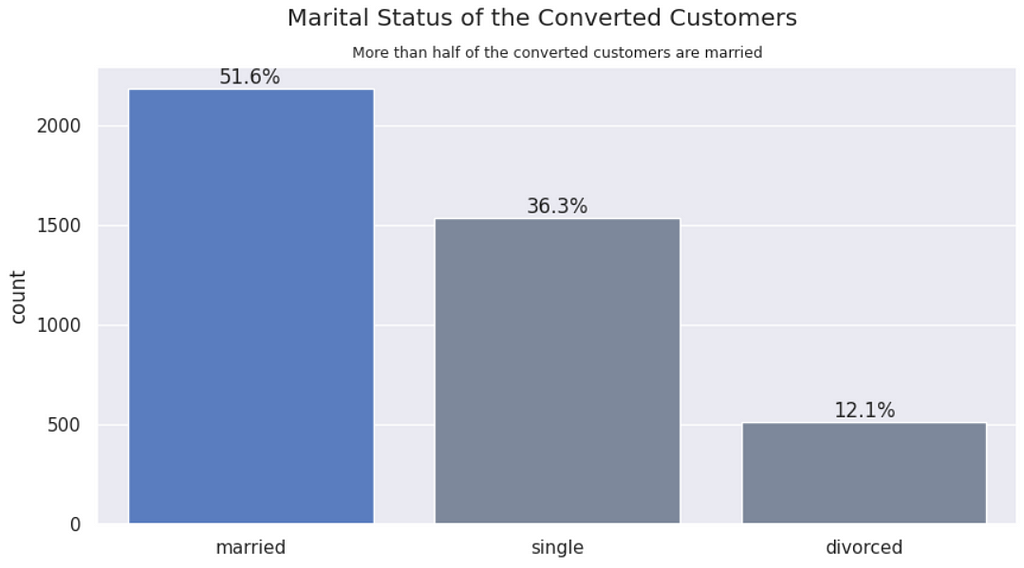
Marital status vs. Conversions | Married customers convert more to the term deposit.
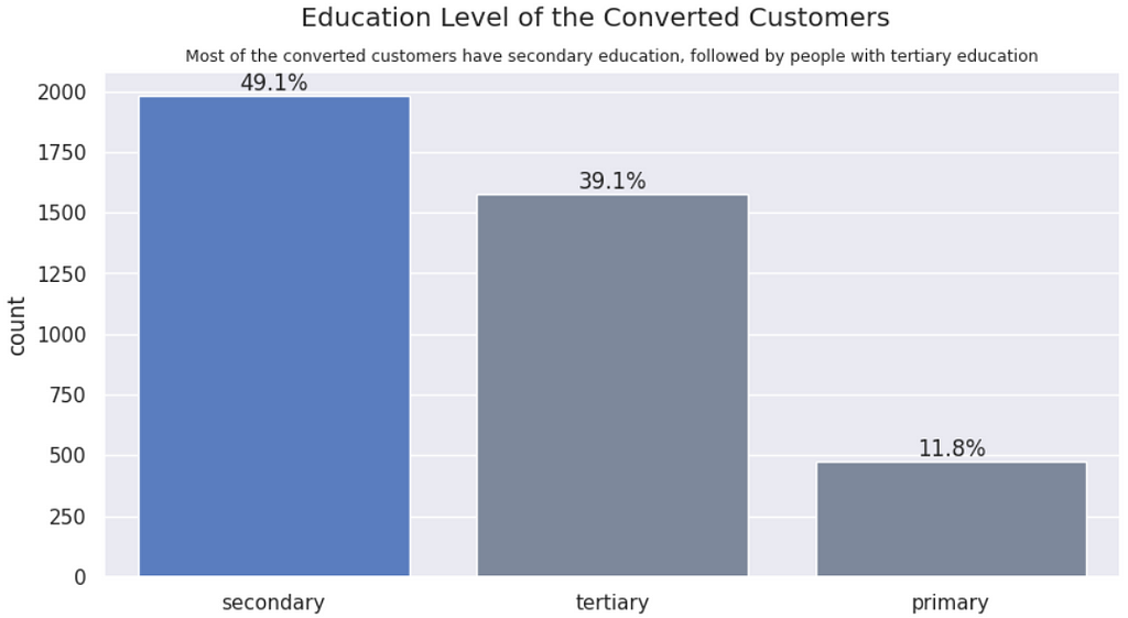
Education vs. Conversion | More educated people convert more to a financial product. However, the converted distribution follows the dataset distribution, so this variable will probably not differentiate conversions from not conversions.
Balance vs. Conversion | Customers with a higher balance on their account are converting more. We tested the statistical significance of the samples and there is a difference.
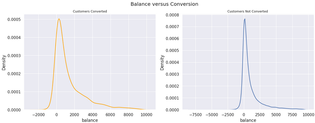
In the previous plot, we arbitrarily removed the data points over the 98th percentile, so the visualization was better. We can see that the converted customers have higher balances, in general, but we can’t tell if there is a statistical difference between both groups. Let’s test that. Given that the distributions are heavily skewed to the right, we will use a non-parametric test, the Kolmogorov-Smirnov Test.
#Sample 1 - Balance of the converted customers
converted = df_train.query('y == "yes"')['balance']

#Sample 2 - Balance of the not converted customers
not_converted = df_train.query('y == "no"')['balance']

# Kolmogorov-Smirnov Test
# The null hypothesis is that the two distributions are identical
from scipy.stats import ks_2samp
statistic, p = ks_2samp(converted, not_converted)

if p > 0.05:
    print("The distributions are identical.")
else:
    print("The distributions are not identical: p-value ==", round(p,4))

---------
[OUT]:
The distributions are not identical: p-value == 0.0
Are there people with negative balance converting to a term deposit? Common sense says that, in order to be able to deposit something, you must have money available. Therefore, if the customer is negative, they should not be able to convert to a deposit. However, we will see that it happens.
neg_converted = df_train.query('y == "yes" & balance < 0').y.count()
pct = round(neg_converted/df_train.query('y == "yes"').y.count()*100,1)
print(f'There are {neg_converted} conversions from people with negative acct balance. \nThis represents {pct}% of the total count of customers converted.')

---------
[OUT]:
There are 161 conversions from people with negative acct balance.
This represents 3.8% of the total count of customers converted.
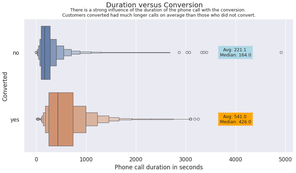
Duration vs. Conversions | In this plot, we can visually notice the impact of the duration of the phone calls on the conversions. Customers who converted stayed twice or more time in the call than the other customers.
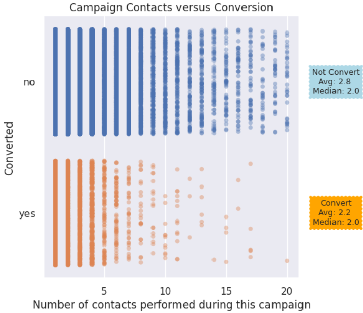
Campaign contacts vs. Conversions | People who converted received between 2 to 4 contacts, in general. After the 5th contact, the points for converted start to become sparse. For Not converted, the points are more consistent through 13 contacts or so.
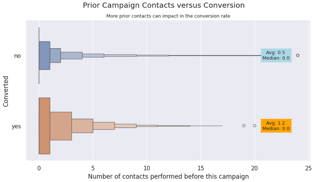
Previous Contacts vs. Converted | It appears that more previous contacts can influence the customer to convert. We notice in the graphic that the converted customers received a couple more calls than the not converted.
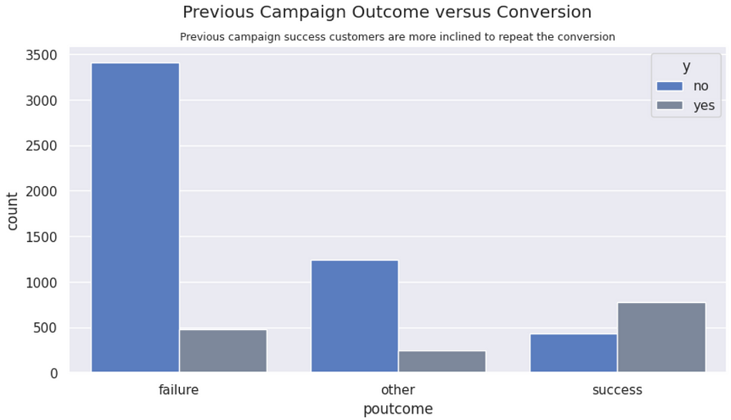
Previous campaign outcome vs. Conversions | Customers who converted in the past are more inclined to convert again. Likewise, customers with past failures tend to repeat the failure.
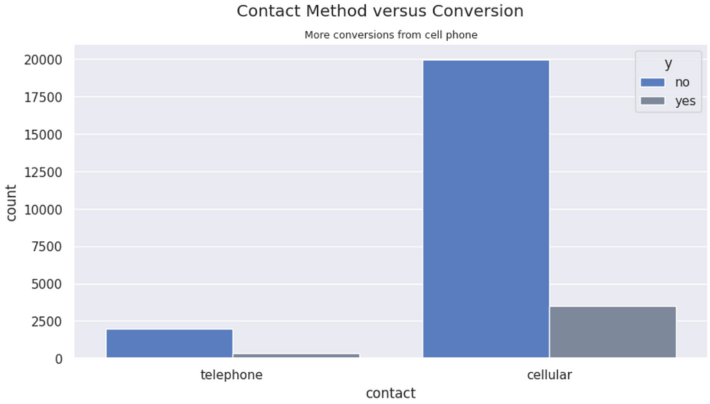
Contact Method vs. Conversions | Despite there being more conversions from customers contacted via cell phone, it just shows that there are less landlines. The proportions of conversion are similar from both types of contact.
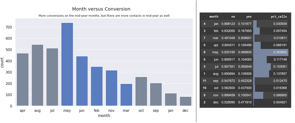
Month vs. Conversions | There are more conversions on the mid-year months, however, ~76% of the calls were made on those months. Possibly the campaign ran more heavily during those months.
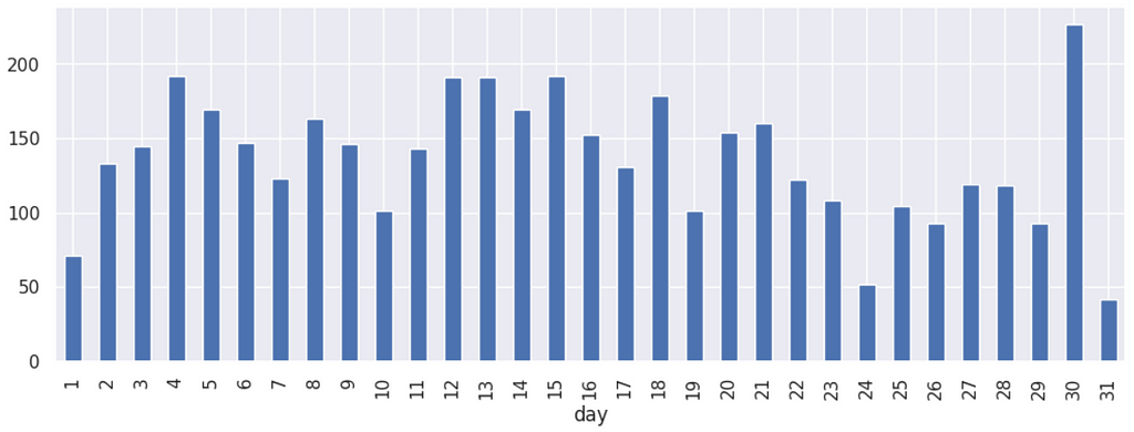
Day vs. Conversions | The conversions happen more around the most probable payment days 5, 15 and 30. We can notice higher peaks around these dates.
Days since last contact vs. Conversions | Most of the conversions happened for customers contacted within the past 100 days from a previous campaign.

Most conversions (64%) are made in the first contact.
# The impact of the recency of the contact over conversions
total = df_train.query('y == "yes"').y.count()
print('First contact:', round( df_train.query('y == "yes" & pdays == -1').y.count()/total*100, 0 ), '%')
print('Up to 180 days:', round( df_train.query('y == "yes" & pdays > 0 & pdays <= 180').y.count()/total*100, 0 ), '%')
print('More than 180 days:', round( df_train.query('y == "yes" & pdays > 180').y.count()/total*100, 0 ), '%')

-------
[OUT]:
First contact: 64.0 %
Up to 180 days: 18.0 %
More than 180 days: 18.0 %
However, this is not different from the majority of the data. The non-converting customers with just the first contact are even higher in proportion (84%).
# The impact of the recency of the contact over Not converted
total = df_train.query('y == "no"').y.count()
print('First contact:', round( df_train.query('y == "no" & pdays == -1').y.count()/total*100, 0 ), '%')
print('Up to 180 days:', round( df_train.query('y == "no" & pdays > 0 & pdays <= 180').y.count()/total*100, 0 ), '%')
print('More than 180 days:', round( df_train.query('y == "no" & pdays > 180').y.count()/total*100, 0 ), '%')

-------
[OUT]:
First contact: 84.0 %
Up to 180 days: 6.0 %
More than 180 days: 10.0 %
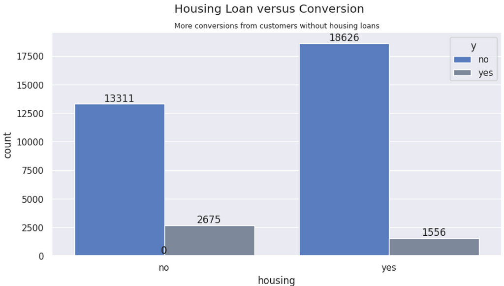
Housing vs. Conversions | There are more conversions from people wihtout house loan — 1.7 times more conversions.
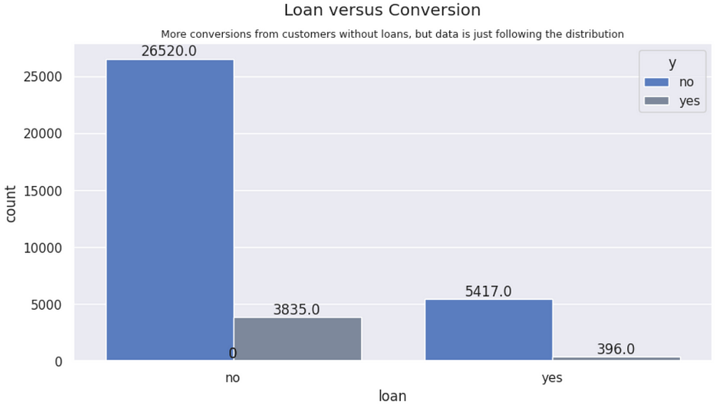
Personal Loan vs. Conversions | There are more conversions from people without peprsonal loans. Although it follows the overall distribution, people without loan are proportionally higher conversions.
Default vs. Conversions | Conversions are almost entirely from people without payment defaults, what makes sense, as those with default are probably without money.
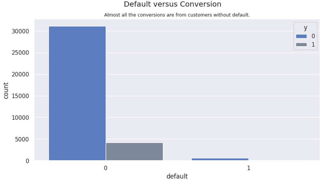
People without default is converting twice more (12%) as those with default (6%).
Next, we are ready to write the summary of findings.
Exploration Summary
After thorough exploration of the data, we can summarize it as follows:
- The converter profile is a 38 to 41 year old person, working on a management role, married, with a refined education of at least secondary level, holding a positive balance on their account without housing or personal loan, thus with less debt.
- Most conversions happened on the first contact.
- Customers not converted on the first contact received something between 2 to 4 contacts before conversion.
- The more contacts from this current campaign, the lower the probability of a customer have converted.
- Customers never contacted before need more contacts on average than existing customers
- There are more chances of conversion for people contacted up to 10 times for previous campaign.
- Contacts from previous campaigns can impact on the conversion of the current campaign, possibly indicating that relationship over time matters.
- Customers that converted in previous campaigns are more likely to repeat conversion, while failure to convert also show a tendency to not convert again.
- The longer the contacts, the higher the chance of converting. People who converted stayed connected to the call up to 4 times more seconds. However, we can’t use the duration of the call as a predictor.
Looking at the graphics after exploration, the variables duration, job, marital, balance, previous, campaign, default, housing and loan are interesting for modeling, as they impact more directly on the target variable. However, duration cannot be used, as it is not possible to know the duration of a phone call until it ends. The variable poutcome also looks promising, but it has too many NAs, so it needs further treatment to be considered.
Data Preparation
Understanding the data is very important for a better modeling. After the initial insights, we have an idea of what could drive more separation of the classes.
The next step is to prepare this dataset for modeling, transforming variables into categories or numbers, since many data science algorithms require only numbers as input.
Let’s get to work.
Dealing with Missing Data
Missing data can ruin our model, so we must treat them by removing or inputting data for those observations.
Here is what we have of missing data points.
# Checking for missing data
df_train.isna().sum()[df_train.isna().sum() > 0]

-------
[OUT]:

job 234
education 1482
contact 10386
poutcome 29589
Starting with job, out of those 234 NAs, we see that there are 28 converted customers that would be lost (0.6%) if we drop those NAs.
# NAs in job
 (df_train #data
 .query('job != job') # only NAs
 .groupby('y') #group by target var
 ['y']
 .count() #count values
 )

-------
[OUT]:


y
no 206
yes 28
There would be three options in this case:
- Drop the NAs: only 0.6% may not make a difference
- Use Random Forest to predict what is the job.
- Add the most frequent job, which is blue collar.
We will move on with drop, at this time, as we consider the number too small to be worth it to predict a job.
# Check the impact of NAs for the job variable in the conversions
df_train.query('job != job').groupby('y')['y'].value_counts()

# Drop NAs.
df_train_clean = df_train.dropna(subset='job')
Next, looking at education missing values. There are 1482 missing entries and 196 of those are Yes, which represents 4.6% of the converted customers. In this case, it is a considerable amount of converted observations to be dropped.
In this case, we are going to use the CategoricalImputer from feature_engineinput the most frequent category for the education of these NAs.
# Check the impact of NAs for the job variable in the conversions
df_train.query('education != education').groupby('y')['y'].value_counts()

# Simple Imputer
imputer = CategoricalImputer(
    variables=['education'],
    imputation_method="frequent"
)

# Fit and Transform
imputer.fit(df_train_clean)
df_train_clean = imputer.transform(df_train_clean)
For outcome, we must come up with a new category. So this variable shows what is the result of a previous marketing campaign. According to our insight in the exploration phase, customers that converted in the past are more likely to convert again. So this variable becomes interesting to the model. However, there are a lot of missing values that will need to go to a separate category, so we won't bias our model with inputation of the vast majority of the data. We will input “unknown” for the NAs.
# Input "unknown" for NAs.
df_train_clean['poutcome'] = df_train_clean['poutcome'].fillna('unknown')
For contact we will add “unknown” to the NAs, just like the data documentation says.
# Fill NAs with "unknown"
df_train_clean['contact'] = df_train_clean['contact'].fillna('unknown')

Next, we need other transformations in this dataset.
Categorical Transformation
Many models don’t deal well with categorical data. Therefore, we need to transform the data to numbers using an encoding type. Here is the strategy to be used for this project:
- education, contact, balance, marital, job, and poutcome: For these variables, One Hot Encoding can be ideal.
- default, housing, loan, and y are binary variables that will be mapped to no: 0 and yes: 1.
# Binarizing default, housing, loan, and y
df_train_clean = df_train_clean.replace({'no': 0, 'yes': 1})
There is a previous binning to be done on balance prior to One Hot Encoding.
# Balance in 3 categories: <0 = 'negative, 0-median = 'avg', >median = 'over avg'
df_train_clean = (
    df_train_clean
    .assign(balance = lambda x: np.where(x.balance < 0,
                                          'negative',
                                          np.where(x.balance < x.balance.median(),
                                                   'avg',
                                                   'over avg')
                                          )
    )
)


# One Hot Encoding for 'marital', 'poutcome', 'education', 'contact', 'job', 'balance'
from feature_engine.encoding import OneHotEncoder

# Instance
ohe = OneHotEncoder(variables=['marital', 'poutcome', 'education', 'contact', 'job', 'balance'], drop_last=True)

# Fit
ohe.fit(df_train_clean)

# Transform
df_train_clean = ohe.transform(df_train_clean)

# Move y to the first column
df_train_clean.insert(0, 'y', df_train_clean.pop('y'))
Next, month to numerical variable.
# Month to numbers
df_train_clean['month'] = df_train_clean['month'].map({ 'jan':1, 'feb':2, 'mar':3, 'apr':4, 'may':5, 'jun':6, 'jul':7, 'aug':8, 'sep':9, 'oct':10, 'nov':11, 'dec':12})
And other numerical variables will be categorized (bins) to reduce the number of single values, what can help classification models to find patterns.
# Function to replace the variable data with the new categorized bins
def variable_to_category(data, variable, k):
  return pd.cut(data[variable], bins=k).astype(str)

# Transforming variable Age into bins
# Using Sturges rule, where number of bins k = 1 + 3.3*log10(n)
k = int( 1 + 3.3*np.log10(len(df_train_clean)) )

# Categorize age, balance, duration, previous, pdays
for var in str.split('age,pdays,previous', sep=','):
  df_train_clean[var] = variable_to_category(df_train_clean, var, k=k)

# CatBoost Encoding the dataset
df_train_clean = ce.CatBoostEncoder().fit_transform(df_train_clean, df_train_clean['y'])

# View of the final dataset for modeling
df_train_clean.sample(5)
Next, you can see a partial view of the final data to be used for modeling.

Modeling comes in sequence.
Modeling
Once the data is prepared and transformed, we can start modeling. For this modeling, we are going to start testing many algorithms to see which one performs best. Knowing that the data has a huge unbalance with 88% of the observations classified as no, we will use weights for the classes.
For this initial test, let’s get a sample of 10k observations randomly selected, so it runs faster.
# X and y sample for testing models
df_sample = df_train_clean.sample(10_000)
X = df_sample.drop(['y'], axis=1)
y = df_sample['y']
And the code for the test is very extensive, but it can be seen in the GitHub repo.
# Example of using the function with your dataset
results = test_classifiers(X, y)
print(results)

-------
[OUT]:
               Classifier  F1 Score  Cross-Validated F1 Score
0                Catboost  0.863289                  0.863447
1             Extra Trees  0.870542                  0.862850
2       Gradient Boosting  0.868414                  0.861208
3                 XGBoost  0.858113                  0.858268
4           Random Forest  0.857215                  0.855420
5                AdaBoost  0.858410                  0.851967
6     K-Nearest Neighbors  0.852051                  0.849515
7           Decision Tree  0.831266                  0.833809
8  Support Vector Machine  0.753743                  0.768772
9     Logistic Regression  0.747108                  0.762013
The best performing models for this problem were the Boosting ones. CatBoost was the top estimator, so we will work with it from now on.
Let’s move on with a new split and test, now for the whole cleaned training set.
# Split X and y
X = df_train_clean.drop(['y', 'duration'], axis=1)
y = df_train_clean['y']

# Split Train and Validation
X_train, X_val, y_train, y_val = train_test_split(X, y, test_size=0.2, random_state=42)
Let us begin with a base model with all the columns to try to tune it from that starting point.
model = CatBoostClassifier(verbose=False)
# train the model
model.fit(X_train, y_train)

prediction = model.predict(X_val)

# confusion matrix
cm = pd.DataFrame(confusion_matrix(y_val, prediction)  )
print ("Confusion Matrix : \n")
display(cm)

# Evaluate the weighted model
print('Base Model:')
print(classification_report(y_val, prediction))
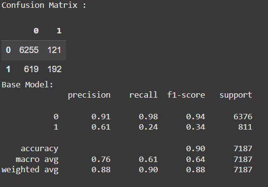
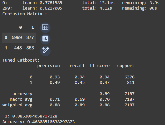
As expected, the model does really well for the negative class, since there is a huge unbalance towards it. The precision of the positive class is not bad, but the recall is terrible. Let’s tune this model.
For that, I ran a GridSearchCV and tested a few values of learning_rate, depth, class_weights, border_count, and l2_leaf_reg. The hyperparameters:
- border_count: Controls the number of binning thresholds for numeric features. Lower values (e.g., 32 or 64) can reduce overfitting, which may help the model generalize better on imbalanced data.
- l2_leaf_reg: Adds L2 regularization to the model. Higher values (e.g., 5 or 7) can penalize the model, reducing its complexity and potentially preventing it from being overly biased toward the majority class.
- depth: Controls how deep the decision tree should go for classification.
- learning_rate: how large is the step of the learning for each iteration when adjusting the weights of the algorithm.
- class_weights: good for unbalanced data, we can give a higher weight for the minority class.
The Gird Search returned this to me:
Best Parameters: {‘border_count’: 64, ‘class_weights’: [1, 3], ‘depth’: 4, ‘l2_leaf_reg’: 5, ‘learning_rate’: 0.1}
Here, I am considering that a False Positive (1 when the truth is 0) is worse than a False Negative (true 1 is classified as 0). That is because, thinking as a manager, if I see a customer with higher probability of converting, I wouldn't like to spend energy on that call if that is a false positive. On the other hand, if I call a person with lower probability, but that person converts, I made my sale.
So, a few other tweaks manually made by me with that in mind, and I came up with this code snippet.
# Tuning the estimator
model2 = CatBoostClassifier(iterations=300,
                            depth=5,
                            learning_rate=0.1,
                            loss_function='Logloss',
                            eval_metric='F1',
                            class_weights={0: 1, 1: 3},
                            border_count= 64,
                            l2_leaf_reg= 13,
                            early_stopping_rounds=50,
                            verbose=1000)

# train the model
model2.fit(X_train, y_train)

prediction2 = model2.predict(X_val)

# confusion matrix
cm = pd.DataFrame(confusion_matrix(y_val, prediction2)  )
print ("Confusion Matrix : \n")
display(cm)

# # Evaluate the weighted model
print('Tuned Catboost:')
print(classification_report(y_val, prediction2))
print('F1:', accuracy_score(y_val, prediction2))
print('Accuracy:', f1_score(y_val, prediction2))
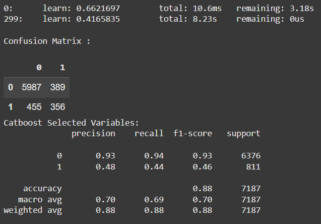
Now, we can still run a Recursive Feature Elimination to select less variables and try to make this model simpler.
df_train_selected = df_train_clean[['age',  'job_admin.', 'job_services', 'job_management', 'job_blue-collar', 'job_unemployed', 'job_student', 'job_technician',
                                    'contact_cellular', 'contact_telephone', 'job_retired', 'poutcome_failure', 'poutcome_other', 'marital_single', 'marital_divorced',
                                    'previous', 'pdays', 'campaign', 'month', 'day', 'loan', 'housing', 'default', 'poutcome_unknown', 'y']]
The results are as follows.
Despite being a good separator for the classes, the variable duration cannot be used, as it is not possible to know the duration of a phone call until it ends. But if we could, these are the results.
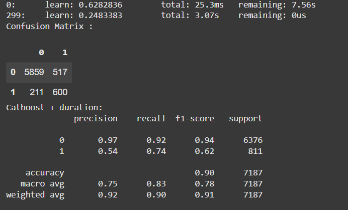
Look how we improve considerably the F1-score!
I have also tried some ensemble models, such as a VotingClassifier and a StackingClassifier. The results are presented next.
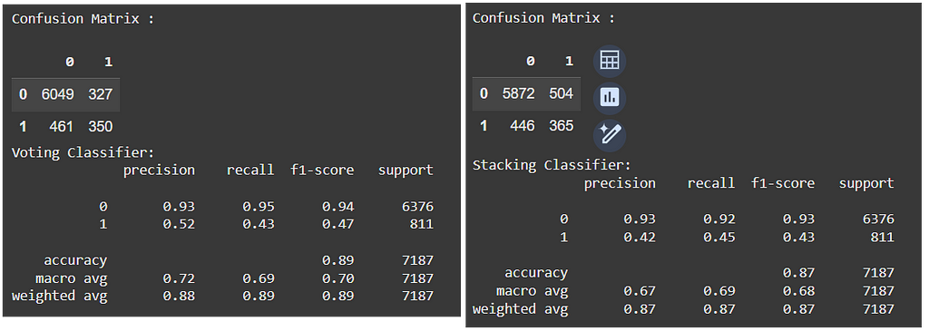
Having trained enough models, it is time to evaluate the results and potentially iterate to adjust the best model.
Evaluation
I like to create a table to display the results of the models. It makes it easier to compare them all together.
pd.DataFrame({
    'Model':['Catboost Base', 'Catboost Tuned', 'Catboost Selected Variables', 'Voting Classifier', 'Voting Classifier + SMOTE', 'Catboost + duration', 'Stacking Classifier'],
    'F1 Score': [f1_score(y_val, prediction), f1_score(y_val, prediction2), f1_score(ys_val, prediction3), f1_score(y_val, y_pred), f1_score(y_val, y_pred2), f1_score(y_vald, prediction4), f1_score(y_val, y_pred3)],
    'Accuracy': [accuracy_score(y_val, prediction), accuracy_score(y_val, prediction2), accuracy_score(ys_val, prediction3), accuracy_score(y_val, y_pred), accuracy_score(y_val, y_pred2), accuracy_score(y_vald, prediction4), accuracy_score(y_val, y_pred3)]
}).sort_values('F1 Score', ascending=False)
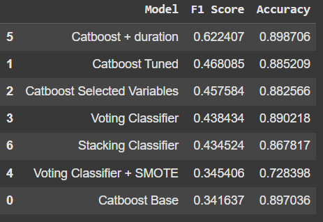
The Catboost model with the variable duration was by far the best one, however we cannot use that extra variable, since this data will not be available for the managers until the call ends, making no sense to have that for prediction.
So, the next best models were the Catboost Tuned and the model with the selected variables. Let’s take the tuned model and analyse the errors it is presenting. One way I like to do that is by creating some histograms or density plots, so we can see where the errors are concentrating for each variable.
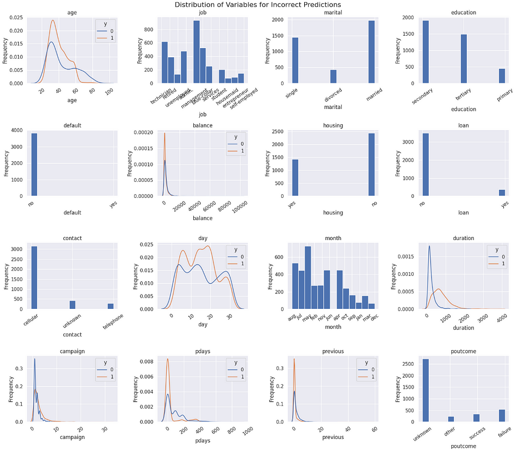
Concluding this study, it is clear that the variables presented cannot provide a solid separation of classes.
The imbalance is heavy, but the techniques to correct it — such as class weights and SMOTE — were not sufficient to improve class separation. This causes a problem for the model to find a pattern to properly classify the minority class 1 (converting customers) and perform better.
Given that there are too many observations where the customers did not convert, the variability of combinations that are labeled 0 is too large, overlaying and hiding the class 1 within it. Thus, the observations falling in this “common place” have similar probabilities for both sides, and that is where the model will fail. The observations are wrongly classified due to the imbalance, since the negative class has more strenght and creates more bias.
Predictions
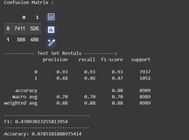
To predict the results, the input data must be the same as the input provided during the training. So, I have created a function to take care of that. Once again, it’s available in GitHub.
# Preparing data for predictions
X_test, y_test = prepare_data(df_test)

# Predict
test_prediction = model3.predict(X_test)

# confusion matrix
cm = pd.DataFrame(confusion_matrix(y_test, test_prediction)  )
print ("Confusion Matrix : \n")
display(cm)

# Evaluate the model
print('----------- Test Set Restuls -----------:')

print(classification_report(y_test, test_prediction))
print('-------------------------------')
print('F1:', f1_score(y_test, test_prediction))
print('-------------------------------')
print('Accuracy:', accuracy_score(y_test, test_prediction))
The results were within the expected, i.e. aligned with the results we have been seeing in training. The False Positives are slightly smaller than the False Negatives, which is better for our case. This prevents managers from erroneously going after customers who will not convert.
Finally, I also created a function to predict a single observation at a time, already thinking about the deployment application. The code that follows predicts one observation.
obs = {'age': 37,
       'job': 'management',
       'marital': 'single',
       'education': 'tertiary',
       'default': 'no', #
       'balance': 100,
       'housing': 'yes', #
       'loan': 'no', #
       'contact': 'cellular', #
       'day': 2, #
       'month': 'aug', #
       'duration': np.nan,
       'campaign': 2, #
       'pdays': 272, #
       'previous': 10,
       'poutcome': 'success',
       'y':99}

# Prediction
predict_single_entry(obs)

----------
[OUT]:
array([[0.59514531, 0.40485469]])
As a result, 59% probability that this customer will not convert. And this exercise was interesting because as I changed each of the variables at a time, it was possible to see which ones had a larger influence on the model. It turns out that the variables default, housing, loan, day, contact_cellular, contact_telephone, month, campaign, pdays were changing more drastically the probabilities when changed.
So, I decided to create an even simpler model with those variables. And here is the true value of the CRISP-DM framework. I was almost done with the modeling when I noticed something new and went back to the beginning for another iteration.
This is the result.
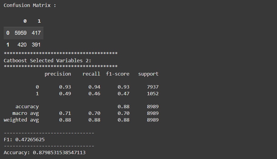
This model is not only simpler, but it presents a better performance. The gain is very small, but when the results are similar, the simpler model is better, because it requires less data, computation power, and training time. It is a cheaper model overall.
Well, this is a wrap. Let’s go to the final considerations now.
Deployment
CRISP-DM has a Deployment step, but we won’t cover that in this post. It is way too long already.
The deployment will be presented in a future post, with a Streamlit application. Stay tuned in my blog.
Before You Go
In this post, the intention was to go over a whole data science project following the CRISP-DM lifecycle framework.
CRISP-DM is one of the most used lifecycle frameworks for data science, as it is intuitive and complete. The framework preaches that we should not only follow a sequence of steps. In fact, we can go back and forth whenever needed, as new concerns or discoveries are learned.
I loved creating this project and writing this article. I learned a lot, truly. There were many times when I was on the modeling and I learned something that could change the results. So I went back to exploration, understanding to incorporate the new knowledge into the model until I got to the final result, which is the best model I could create with the information and variables from this dataset.
This is a framework that I recommend. It can make you a better Data Scientist and your projects more complete.
Learn More
I intend to create a mini-course out of this content. So, if you like it, follow me for more and mark this post for future reference. I will update it with a link to the course once it’s completed.
Find me on Linkedin.
Code Repository
References
Moro, S., Rita, P., & Cortez, P. (2014). Bank Marketing [Dataset]. UCI Machine Learning Repository. https://doi.org/10.24432/C5K306.
- UCI Machine Learning Repository
- CatBoostClassifier |
- Cross-industry standard process for data mining - Wikipedia
- CRISP-DM Help Overview
- Leakage (machine learning) - Wikipedia
How I Created a Data Science Project Following a CRISP-DM Lifecycle was originally published in Towards Data Science on Medium, where people are continuing the conversation by highlighting and responding to this story.
from Datascience in Towards Data Science on Medium https://ift.tt/IlVz8pJ
via IFTTT

