Techniques for Exploratory Data Analysis and Interpretation of Statistical Graphs
Practical Approaches for Uncovering Insights and Patterns in Statistical Visualizations
Overview
In this project, we’ll explore techniques for exploratory data analysis and dive into the interpretation of statistical graphs. Do you know how to interpret histograms or boxplots?
Can you spot how outliers or missing values impact these visualizations? Are you able to assess data cleaning needs to make these interpretations precise?
This project addresses these questions and more. Set within a business-relevant context in accounting, it presents challenges commonly faced in real-world data analysis.
Using fictitious data that mirrors actual accounting scenarios, this project will guide you through key steps in analyzing and preparing data for meaningful insights.
GitHub - Anello92/EDA-Techniques-and-Graph-Interpretation
You can access the full project code and dataset on my GitHub repository, making it easy to follow along and experiment on your own.
Let’s get started!
Table of Contents
- Data Dictionary
- Python Packages Used in the Project
- Data Understanding and Loading
- Exploratory Analysis Before Data Cleaning
- Handling Missing Values for Numerical Variables
- Handling Missing Values for Categorical Variables
- Handling Missing Values with Special Characters
- Outlier Treatment
- Exploratory Analysis After Data Cleaning
- Univariate Exploratory Analysis
- Interpreting Histograms — Skewness
- Interpreting Histograms — Additional Elements
- Interpreting Boxplots — Quartiles and Interquartile Range
- Analyzing and Interpreting Boxplots — Additional Elements
- Multivariate Exploratory Analysis
- Interpreting Correlation Maps
- Scatter Plots — Non-Trivial Patterns
Data Dictionary
This is the data dictionary for the dataset we will use in the project. The data is fictional, but the variables represent real-world problems.
- id: Unique identifier for each entry.
- entry_date: Date the accounting entry is made.
- debit_account: Accounting account to be debited.
- credit_account: Accounting account to be credited.
- amount: Monetary value of the entry.
- document: Supporting documentation for the transaction.
- transaction_nature: Description of the accounting event.
- cost_center: Department responsible for the transaction.
- taxes: Taxes and duties involved, if applicable.
- currency: Currency used in the transaction, if applicable.
- exchange_rate: Conversion rate to the national currency, if applicable.
Python Packages Used in the Project
To start, we’ll import the essential packages for data manipulation and visualization: pandas and NumPy for data processing, and Matplotlib and Seaborn for creating visualizations.
This combination of libraries will enable us to perform robust transformations and visualizations throughout the project.
We’ll also configure the Jupyter Notebook to ignore any warnings that might appear, keeping the workspace clean and focused. Lastly, we’ll load the Watermark package to add a watermark, which is useful for documenting the library versions in use.
In summary, these four main Python packages — Pandas, NumPy, Matplotlib, and Seaborn — will form the foundation of this data analysis project. Let’s go ahead and load them.
# 1. Importing Required Libraries
import pandas as pd
import numpy as np
import matplotlib.pyplot as plt
import seaborn as sns
import warnings

# Configure to ignore warnings
warnings.filterwarnings("ignore")
Understanding and Loading the Data
Let’s start by understanding the data before we proceed with the loading process. The dataset here consists of fictional data, which is perfectly fine — there’s no need to work with real data for our purposes.
This fictional dataset includes variables that you would commonly encounter in projects within the field of Accounting.
If you later have permission from your company, you could even consider using actual data from your accounting team, replacing these values for a more specific analysis, provided you have the necessary authorization.
In this dataset, we’ve intentionally introduced a few issues to make things more interesting and bring you closer to real-world scenarios.
In other words, this data has problems, and our task will be to detect and resolve them. This process will involve exploring the data, interpreting statistical graphs, and more — simulating exactly what you’ll face in a real-world work environment.
# 3. Load dataset
df = pd.read_csv("dataset.csv")
We’ll load the CSV file into a DataFrame, df. Data loaded successfully. Let’s check its shape.
# 4. Dataset shape
df.shape
The dataset contains 1,200 rows and 11 columns. Now, let’s take a look at a sample.
# 5. Dataset sample
df.head(0
Here are the first few records. Notice that we have columns such as ID, posting date, debit account, credit account, value, document, nature, operation.

You may already spot an issue with missing values (NaN)—in this case, missing information. We also have columns like cost center, tax, currency, and conversion rate.
Some issues, like missing values, are obvious, while others are more subtle. We’ll need additional steps to detect these hidden problems. This project will guide you through identifying and resolving them. Next, let's look at the column list.
# 6. Columns
df.columns

Here they are. Data loaded successfully. Let’s proceed with an exploratory analysis before cleaning.
Exploratory Analysis Before Data Cleaning
There’s often a debate: should exploratory analysis be done before or after data cleaning? Ideally, both stages are useful.
Performing an initial analysis on uncleaned data helps to identify potential issues, while reanalyzing after cleaning ensures accurate insights.
If you’re already familiar with the dataset, you might skip the initial exploration and start directly with cleaning. However, for unfamiliar data, it’s best to conduct an initial analysis to guide cleaning decisions.
Keep in mind that exploring uncleaned data can affect interpretations, as charts may reflect anomalies that cleaning will address.
I’ll create some initial charts, noting that they may change after data cleaning. While this approach requires more effort, it provides greater confidence in the results.
Let’s start by checking the dataset’s info:
# 7. Info
df.info()
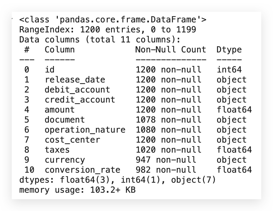
Here we have the variables, and you’ll notice that they all allow non-null values. However, there’s an issue: although the dataset shows 1,200 rows, some columns contain fewer than 1,200 rows, indicating missing values across multiple columns.
For example:
- The document column is an object type (categorical) and has missing entries.
- The conversion_rate column is of float type (numerical) and also has missing values.
This indicates a missing data issue across different types. Therefore, I’ll apply a specific strategy for quantitative variables and a different one for categorical variables.
From the start, it’s clear that this dataset requires additional data cleaning. It’s also useful to confirm that Python has classified each data type correctly. Now, I’ll check for missing values directly with the following command:
# 8. Are there missing values?
df.isna().any()
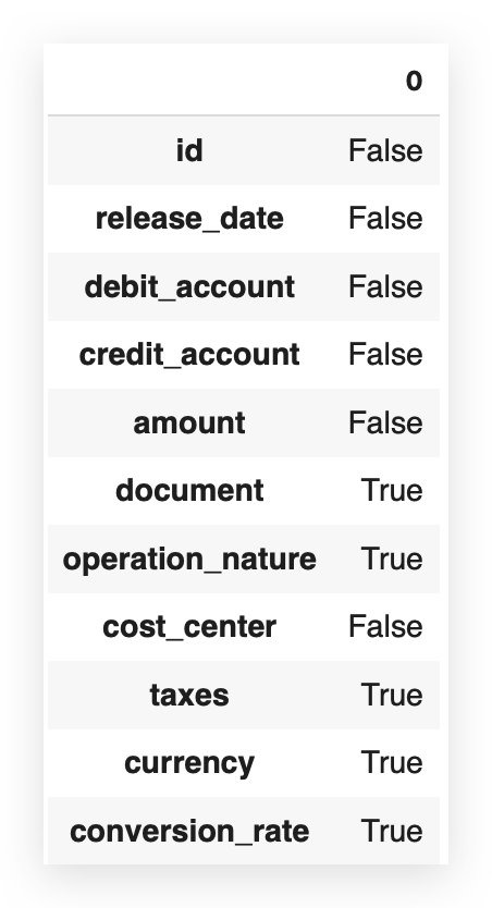
False indicates that there are no missing values, meaning there is no missing value issue.
And True signifies, of course, that the issue exists. So, when you use isna().any(), the answer is simply yes or no, True or False. But I can also do it like this:
# 9. Are there missing values? How many?
df.isna().sum()
Are there missing values? Once again, using isna, but now, instead of just True or False, I want to know how many. I want to quantify exactly the number of missing values.
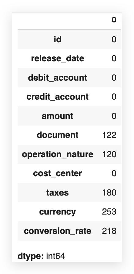
Now we can get a clearer idea. Since the dataset has 1,200 rows, the difference in columns with missing values corresponds exactly to the quantity we see here.
So, I already know there’s a missing value issue that I’ll need to address soon. To decide how to handle missing values, it’s best to consider the percentage. Absolute values don’t tell the full story.
For example, is 122 missing values a lot or a little? Ideally, you should look at the proportion. Out of 1,200 rows, 122 are missing.
What’s the proportion of that in relation to the total?
Let’s calculate this proportion:
# 10. Sum of missing values per column
missing_values = df.isna().sum()

# 11. Total number of rows
total_rows = len(df)

# 12. Proportion of missing values per column
missing_value_proportion = missing_values / total_rows

# Displaying the proportion of missing values
print(missing_value_proportion)
I’ll take this confirmatory result and store it in a Python variable. I’ll calculate the total number of rows in my dataset.
Then, I’ll compute the proportion by dividing the missing values by the total rows. Finally, I’ll print this proportion for you.
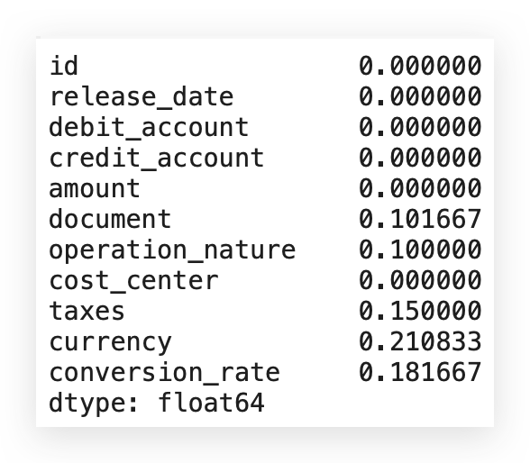
Notice that the currency variable, for example, has 21% missing values. If the missing rate were over 30%, a different approach might be necessary.
Generally, for up to 30% missing data, it’s best to directly address the gaps. If missing values exceed 50%, it may be advisable to discard the variable. In this case, since all variables with missing data have rates below 30%, each should be treated individually.
An important point: the percentages and counts here are based on cells containing NaN values—empty cells with no data. If we look closely, we might find characters like ? within the dataset. Although NaN values are counted, symbols like ?aren’t included, as they don’t register as missing values.
When encountering special characters or irregular entries like ?, they won’t show up in the NaN count, making them harder to detect. While NaN values are simple to address through counting and imputation using built-in pandas functions, unusual characters add complexity.
Take ? for instance: although it’s a character, it still represents missing data because there’s no meaningful information. For instance, if debit_account or credit_account contains a ? instead of valid data, this reflects missing information, even if it’s not technically blank.
In cases like these, missing data extends beyond empty cells to include entries without true information content. I’ll soon demonstrate an automated way to detect and handle these hidden issues.
# 13. Plot 1: Distribution of Transaction Values
plt.figure(figsize=(10, 5))
sns.histplot(df['amount'], kde=True, bins=30)
plt.title('Distribution of Transaction Values')
plt.xlabel('Amount')
plt.ylabel('Frequency')
plt.show()
Basically, I create the figure, generate a listplot with the valor column, and specify that I want the KDE line.
The number of bins for this histogram will be 30. The rest involves setting the title, labels, and then visualizing the plot.
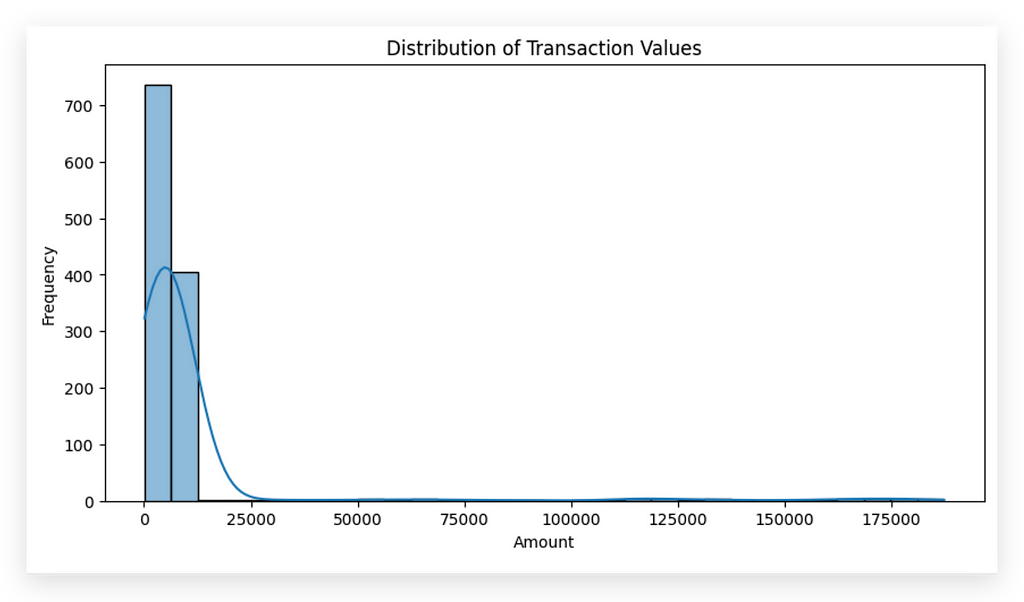
In this histogram, we observe a high concentration of values near zero, with frequency peaking at this point. As values increase, the occurrences decrease significantly, suggesting the presence of outliers or extreme values.
For instance, while most transaction values lie between 0 and 20,000, we see that the line extends up to approximately 175,000, an extreme value outside the main distribution.
This illustrates a key risk of conducting exploratory analysis before cleaning: outliers can distort interpretations. An experienced analyst will identify these as outliers and recognize that removing or adjusting them is necessary before drawing conclusions.
At this point, it’s clear that data near zero is prevalent, with few values beyond 25,000, but more analysis is needed to decide if and how these outliers should be treated.
Analyzing Transaction Values Over Time
To explore patterns in transaction values over time, we need a time-based column. Here, the column release_datewould serve this purpose, but there’s an issue: release_date is currently classified as an object type, meaning Python interprets it as a string.
To proceed with time-based analysis, this column must be converted to a datetime type. I’ll handle this conversion now, enabling time-based visualizations and insights into patterns over time.
# 14. Plot 2: Transaction Values Over Time
plt.figure(figsize=(12, 5))
df['release_date'] = pd.to_datetime(df['release_date'])
sns.lineplot(x='release_date', y='amount', data=df)
plt.title('Transaction Values Over Time')
plt.xlabel('Release Date')
plt.ylabel('Amount')
plt.xticks(rotation=45)
plt.show()
So, I’ll call to_datetime to convert the column to DateTime—the time type, right? Then, I’ll save this conversion directly in the same column within the DataFrame. This effectively modifies the variable in place.
Next, I’ll create a LinePlot. This line chart will have release_date on the X-axis and amount on the Y-axis because I want to see how the amount changes over time.
The rest is just formatting after pulling the data.
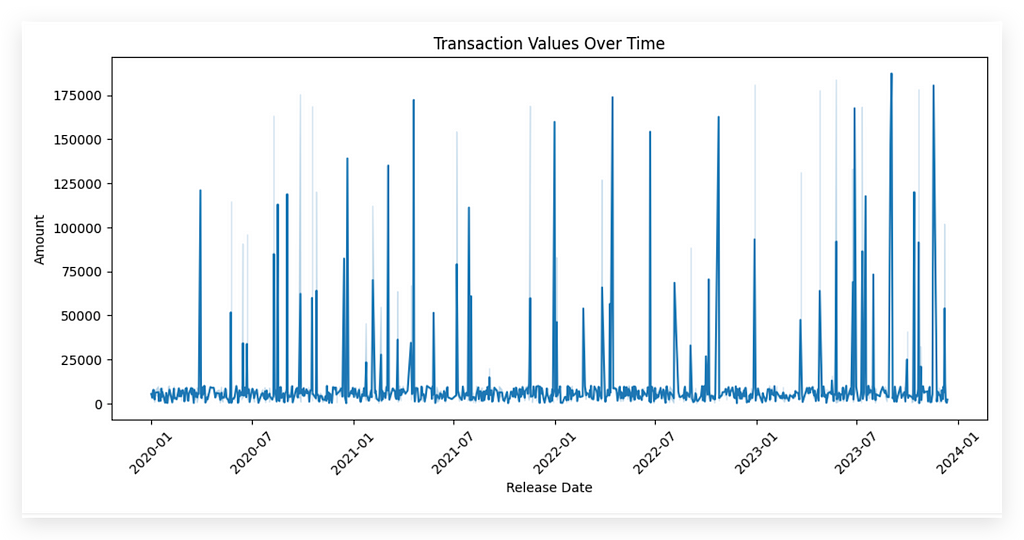
This process will create a line chart for you, showing the trend of amount over time. Be cautious, though. Whenever you load data that includes a date column, in most cases, the Python interpreter doesn’t recognize it as the appropriate type. So, for any time-based analysis, it’s crucial to convert it to the correct type, as I demonstrated.
I’ll leave the interpretation of statistical charts for after we complete the data cleaning, because the charts you create before cleaning serve primarily to identify issues. At this point, the data is still messy, so when I create and examine charts, I’m simply looking for potential problems or inconsistencies.
Charts act as a support tool. You use them to spot issues, apply the cleaning, then recreate the charts to perform a more precise analysis. Attempting to interpret charts at this stage can be risky — you can’t draw conclusions yet. Instead, look at the chart and note any issues you see, document them, and address them during the cleaning process. After that, recreate the chart to proceed with the analysis and interpretation.
Let’s go ahead and create two more charts before cleaning. I’ll create a boxplot for taxes, one of the columns in the dataset.
# 15. Plot 3: Tax Boxplot
plt.figure(figsize=(8, 5))
sns.boxplot(x=df['taxes'])
plt.title('Tax Boxplot')
plt.xlabel('Taxes')
plt.show()
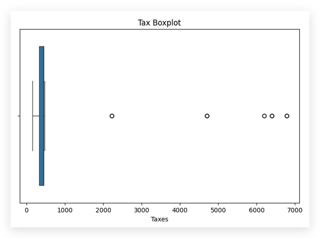
I’ve already spotted an issue — or at least a point of interest. Clearly, we have outliers, right? You can see a concentration of values roughly between 0 and 1000, heavily skewed, as the outliers are quite distant from the center of the distribution.
This raises another question: Is the outlier a problem? I’m not sure; it requires further analysis. Outliers may not always be problematic. For instance, could there be a month where the company paid a large amount in taxes? Yes, that’s possible. However, it does deviate from the usual pattern, so it might also indicate an error — maybe a typo, a mistake during data loading, or it could indeed be a valid value.
Now, let’s look at the count of operations by currency. I'll create a bar chart using a countplot. Why a countplot, you ask? Good question. Why a countplot? Because it’s a frequency chart used specifically for categorical variables.
The other charts I’ve shown you — the histogram, line chart, and boxplot — are typically used for quantitative variables, representing measurable amounts.
# 16. Plot 4: Count of Transactions by Currency
plt.figure(figsize=(6, 4))
sns.countplot(x='currency', data=df)
plt.title('Count of Transactions by Currency')
plt.xlabel('Currency')
plt.ylabel('Count')
plt.show()
When I have a categorical variable, like currency—which represents the type of currency for each transaction—I need to use the appropriate chart.
In this case, a countplot is suitable for creating a count chart, which is essentially a bar chart.
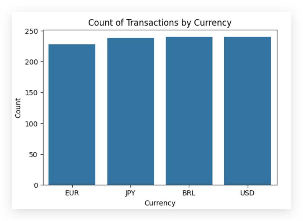
This chart shows a notable balance in transaction counts across USD, BRL, and JPY, with a slightly lower count for EUR. At first glance, the data appears balanced across currencies.
However, this chart has limitations due to outliers and missing values. The countplot only includes valid entries, meaning that rows with missing currency values (21% of the dataset) are excluded. Consequently, this chart does not fully represent the dataset.
If we choose to retain these rows and instead apply a missing value treatment, the distribution will shift significantly, increasing the count in one or more categories and altering the chart. This highlights the importance of exercising caution when interpreting pre-cleaned charts: their purpose is to help identify issues, not to draw conclusions.
We now have a clearer picture of the potential issues in this dataset. Next, we’ll proceed with a full round of data cleaning and treatment before revisiting the exploratory analysis. With the cleaned data, we can then interpret the statistical charts accurately.
This is a preliminary analysis, so I encourage exploring all other variables in the dataset.
Handling Missing Values for Numeric Variables
Let’s move on to a comprehensive round of missing value treatment. We’ll start with handling missing values for numeric variables. In this case, we have at least two variables: amount and taxes.
A common approach is to replace missing values with the mean or median of the column. The choice between mean or median generally depends on the data distribution.
Let’s begin by asking: do we have missing values?
# 17. Are there missing values?
df['taxes'].isna().sum()
We have 180 missing values in the taxes column. Let's create a plot to show the distribution of this variable.
For the next steps, we can use a histogram to observe the distribution and understand if any patterns or anomalies emerge.
This can help us decide whether to fill missing values with the mean or median, or if another strategy might be more suitable.
# 18. Distribution of Tax Values
plt.figure(figsize=(10, 5))
sns.histplot(df['taxes'], kde=True, bins=30)
plt.title('Distribution of Tax Values')
plt.xlabel('Value')
plt.ylabel('Frequency')
plt.show()
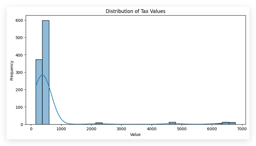
You notice that most values are between 0 and 1,000, right? This clearly indicates that the distribution is skewed, meaning that the values are clustered close to a specific range rather than being centralized across the distribution.
This skewness will impact the decision we make regarding handling these values. To demonstrate this, I’ll calculate both the mean and the median of this variable.
This comparison will help us determine the most appropriate method to handle the missing values based on the distribution’s characteristics.
# 19. Mean
df['taxes'].mean()

# 604.264545965864

# 20. Median
df['taxes'].median()

# 430.1553391717098
To handle missing values effectively, deletion is a quick solution, but it results in data loss. Instead, I’ll apply imputation to retain as much data as possible.
For numeric variables, we have two primary options:
- Mean: Ideal when there’s no outlier influence, as it represents the central tendency but can be skewed by extreme values.
- Median: Less impacted by outliers, making it a safer choice when extreme values are present.
Here, mean and median differ notably, indicating outliers are likely affecting the mean. I haven’t yet removed outliers to highlight this distinction — outliers don’t always need removal, as they can hold valuable insights.
Because outliers amplify the mean and risk skewing the analysis, median is a safer imputation choice here. Justifying each choice is critical; document the reasoning, make a choice, and proceed. If needed, adjustments can always be made later, as flexibility is a vital part of data analysis.
# 21. Replacing missing values in 'taxes' with the median
df['taxes'].fillna(df['taxes'].median(), inplace=True)
Now, let’s proceed with the fillna method to fill in the missing values. In this case, I’ll calculate the median and use it to fill the missing values in the taxes column. I’ll set inplace=True to save the changes directly to the DataFrame. Execute, check the sum, and there—first problem solved.
But what about the amount column? Won’t it require treatment as well? No, because it doesn’t have any missing values. Take a look here.

Does the amount column have any missing values? No, zero, so there’s nothing to be done in this case. However, for the taxes column, we indeed had missing values. We analyzed the distribution, noticed it’s skewed, and observed the difference between the mean and median.
Using the mean would be too risky, as it would amplify the skewness, so we opted for the median — a safer choice. First problem solved. We’ll continue in the next segment.
Missing Values for Categorical Variables
Handling missing values for numerical variables tends to be more complex. Why? For numerical variables, it’s essential to examine the data distribution closely. This is crucial because the distribution dictates the statistical measure you should use if you opt for imputation.
Imputation is just one method for handling missing numerical values, but it’s widely used and heavily dependent on data distribution. For instance, if a variable follows a normal distribution or something close, using the mean is generally safer.
However, when the distribution is skewed — as we observed here — you can’t rely on the mean; the median becomes the better choice.
Now, let’s move on to categorical variables. I’ll start by checking the total count of missing values across the entire dataset.
# 23. Are there missing values? How many?
df.isna().sum()
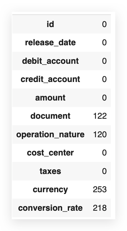
Now, let’s address the variables currency and conversion_rate. I'll start by asking: are there any missing values in the currency variable?
# 24. Are there missing values in 'currency'?
df['currency'].isna().sum()

# 253
We have 253 missing values for the variable currency. I’ll proceed by calculating the mode.
# 25. Calculate the mode
df['currency'].mode()[0]

# BRL
The mode represents the most frequently occurring value within a variable, particularly useful for categorical variables where data is represented by frequency rather than distribution. In our dataset, BRL (Brazilian Real) appears most frequently, making it the mode.
To handle missing values in categorical data, using the mode is common practice, as it fills in missing entries with the most probable category based on frequency. However, we should note that this doesn’t guarantee that the missing valuesgenuinely belong to BRL — we simply aim to fill them based on probability.
Alternatives to Mode Imputation
If BRL feels uncertain, alternatives like “no currency” or “unknown” can also indicate missing data without assuming it fits the most common category. In this case, however, we’ll use mode imputation as it provides a straightforward way to fill missing entries with a plausible category, addressing the data gap effectively.
Let’s proceed by imputing BRL for the missing currency entries.
# 26. Replacing missing values in 'currency' with the mode
df['currency'].fillna(df['currency'].mode()[0], inplace=True)
I’ll proceed with fillna, calculate the mode, and save it directly in the DataFrame. Then, I'll check again: Are there still any missing values?
# 27. Are there missing values in 'currency'?
df['currency'].isna().sum()

# 0
Let’s now work on the conversion_rate. In this case, I'll proceed as follows:
I’ll calculate the sum of missing values for each column, determine the total number of rows, calculate the proportion of missing values, and then display this proportion.
# 28. Calculating the sum of missing values per column
missing_values = df.isna().sum()

# 29. Calculating the total number of rows
total_rows = len(df)

# 30. Calculating the proportion of missing values per column
missing_value_proportion = missing_values / total_rows

# Displaying the proportion of missing values
print(missing_value_proportion)
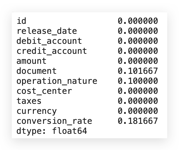
Let’s make a decision on what to do. Notice that, in conversion_rate, we have 18% of missing values. Right? So, what now? Which rate should I use? What value should I choose? Should I go with the mode? Or not use it at all? What’s the best course of action here?
# 31. Filling missing values in 'conversion_rate' with the category 'Other'
df['conversion_rate'].fillna('Other', inplace=True)
I can use fillna to populate with "Other." Here, "Other" represents anything outside the existing conversion_ratevalues. Later, if "Other" appears, it indicates missing data. I didn't use the mode here—why?
There’s a reason: the currency variable is generic. It serves as a label (e.g., dollar, euro), which doesn’t significantly affect reports. Mode works here since conversions can be applied as needed, so using the mode isn’t an issue.
conversion_rate, however, is different. It carries specific information used in calculations, so using the mode could impact future analyses. Although categorical, conversion_rate might support calculations. This difference means a generic fill could be risky.
This isn’t just about technique — it’s about real-world coherence. For variables like conversion_rate, “Other” is more suitable than mode.
# 31. Filling missing values in 'conversion_rate' with the category 'Other'
df['conversion_rate'].fillna('Other', inplace=True)
If I choose to fill with Mode, I’m completely changing the information level. In this case, it would be more coherent to fill it with another category, hence the choice of this technique.
The same logic applies to the document variable, which also has missing values.
# 32. Filling missing values in 'document' with the category 'Other'
df['document'].fillna('Other', inplace=True)
The document variable is linked to specific processing or accounting codes. I can't just create a document value because missing data implies the absence of actual information.
Using the mode here would imply, "This row has that document code," which might not be accurate. Since document carries important information, using mode doesn’t make sense. Instead, I’d classify it as "Other," indicating unknown information that can be reviewed later.
This choice depends on context; there’s no single correct approach. Just make a decision, justify it, and adjust as needed. Here, I’ll apply the “Other” strategy for document to preserve its specific meaning.
# 32. Filling missing values in 'document' with the category 'Other'
df['document'].fillna('Other', inplace=True)
For the operation_nature variable, I’m using bfill, which stands for Backward Fill.
# 33. Filling missing values in 'operation_nature' with bfill
# This method fills each missing value with the next valid value in the same column (backward fill)
df['operation_nature'].fillna(method='bfill', inplace=True)
In other words, I’m filling in values backwards. Why? Imagine I have a sequence of transactions, right?
There’s transaction A, then B, C, D, and so on. This is exactly what’s reflected in the dataset itself.
Let me provide you with a sample here to clarify this concept even further.
df.head()

Operation Nature Column
I am using backfill (bfill), which means filling values from the back to the front. Why? Imagine I have a sequence of transactions: Transaction A, B, C, D, and so on. This sequence is reflected in the dataset. To make this concept clearer, here’s a sample layout:
Relevance of Operation Nature
The operation_nature is a code related to the operation, with a chance that there’s a sequence in these operations. This characteristic is intrinsic to this column. I consulted with the business area and asked if two consecutive transactions could indeed share the same operation nature. They confirmed it’s possible.
This validation justifies the use of bfill or ffill (forward fill) to handle missing values. This way, if a value is missing, we can logically fill it with the preceding or following entry in the sequence.
Valid Options Recap
The three options I demonstrated are all valid:
- Fill with the mode for generic values.
- Fill with an alternative category to indicate missingness.
- Fill with preceding/following values (bfill/ffill), when logical based on data sequence.
The choice is yours, but always provide justification. If a choice turns out to be less effective, you can revisit and adjust. This completes our categorical variable treatment.
Handling Missing Values That Don’t Appear Missing
Now, let’s talk about a trickier type of missing value — the sneaky kind, which is the hardest to handle. This happens when you’re dealing with values that don’t look like they’re missing.
What does this mean? If a value is missing, it’s typically empty; there’s no data, nothing at all. But sometimes you encounter a special character or word — something that has data, but no real information. This makes it harder to detect.
For example, there’s also the case where a column is filled with zeros. Be cautious with these. Imagine a column named sales_value. You see values like 100,000, 200,000, 150,000, 130,000 — and then suddenly a zero. Is that zero correct? Zero could indicate missing data, so it needs investigation.
Remember, your job is analysis. A zero in a numeric column could be a valid value, but it could also mean the data is absent. When in doubt, ask questions. Go to the data source; if you can’t resolve it, consider discarding those rows. Including a zero as data might lead to incorrect calculations and analysis. If it wasn’t supposed to be zero, treating it as such could compromise your entire work.
To detect such cases, do a sweep of unique values in each column. This helps you spot special characters, odd categories, or placeholders.
# 34. Checking for the '?' character in the 'credit_account' column (Method 1)
has_question_mark = df['credit_account'].isin(['?']).any()
print(has_question_mark)

# True
Since I already know there’s a question mark (?), I’m checking the credit_account column with the command isin(['?']). In other words, does this column contain a question mark?
If it does, I want to know, not specifically by row, but just to confirm if it’s there or not. After executing the command, we get a True response, meaning this character is indeed present.
Now, let me ask you: is a question mark a valid credit account entry? Most likely not, but we can’t declare this with complete certainty. There could be a company out there with a credit account labeled with a question mark — unlikely, but not impossible. So, avoid categorical assumptions.
Think about it: does it make sense for credit_account — an account number or value — to have a question mark? If unsure, check with the business team.
It’s always better to clarify than to risk mistakes. If no one is available to verify, here’s an approach I use: if I believe the question mark shouldn’t be there, I clean it out but keep a record.
I note that a question mark was detected and removed from the dataset. If questioned later, I can explain that I couldn’t verify at the time, so I made a judgment call. If it turns out I was wrong, I can simply redo the analysis.
As a next step, I’ll count the frequency of this character. This is the first method:
# 34. Checking for the '?' character in the 'credit_account' column (Method 1)
has_question_mark = df['credit_account'].isin(['?']).any()
print(has_question_mark)
Here’s the second method:
# 35. Counting the frequency of each value in the 'credit_account' column (Method 2)
value_counts = df['credit_account'].value_counts()

# 35a. Checking if '?' is in the counts and getting its number of occurrences
question_mark_count = value_counts.get('?', 0)

# Print the number of occurrences of '?'
print(question_mark_count)
One way to check for issues in the data is by running a value_counts on the credit_account column and inspecting for the presence of question marks. I’ll include a condition to check if any rows contain this symbol in #35a. Here, I'm showing you how to apply the GET method.
Upon execution, we find four instances of question marks. This suggests that four rows in the credit_account columncontain this symbol. It's unlikely that this represents a valid credit account. In cases of doubt, examine the data directly—look at the credit_account column in the dataset. Does it make sense to consider a question mark as a valid value? Likely not.
Alright, let’s move on. Now, let me show you the third method to detect this.
# 36. Identifying categorical columns (Method 3)
categorical_columns = df.select_dtypes(include=['object', 'category']).columns

# Check for the presence of '?' in each categorical column
for column in categorical_columns:
    has_question_mark = df[column].isin(['?']).any()
    print(f"Does the column '{column}' contain '?'? {has_question_mark}")
In this case, I’ll identify categorical columns. Why? Because if a column is numeric, it won’t accept a question mark. This issue with question marks only arises in categorical columns.
So, I’ll retrieve all categorical columns, and for each one, I’ll check if a question mark is present. Finally, I’ll print the results for you.
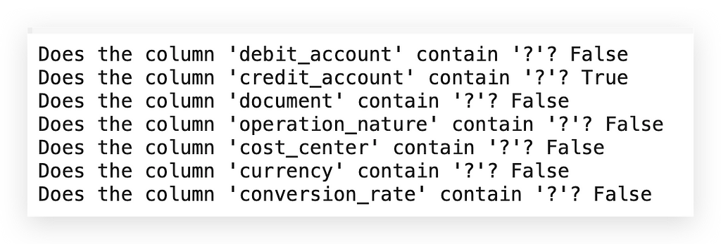
Alright, so here we have false, then true, followed by more false values… Only one column has this issue. Now, I’m in a position to address the problem. In this case, I’ll replace it with a missing value.
What does that mean? You’re handling a missing value by actually setting it as missing? How can that be? What’s going on here?
# 37. Replacing '?' with NaN and then filling missing values
df['credit_account'].replace('?', np.nan, inplace=True)

# 37a. This method fills each missing value with the previous valid value in the same column (forward fill)
df['credit_account'].fillna(method='ffill', inplace=True)
To solve this, I’ll apply a Replace operation to turn any question marks into NaN, effectively removing the question mark and marking it as Not a Number. Yes, this creates a missing value — but intentionally so.
Why? Because Python provides various functions specifically to handle missing values, not valid characters.
The question mark here isn’t empty; it’s a valid character, so standard functions don’t apply. It’s up to the analyst to identify invalid information.
A practical strategy is replacing special characters or anomalies with NaN, enabling the use of functions like fillna with any method, such as #37a.
Could we replace the question mark directly with a chosen value? Yes, but that would require explicitly defining the replacement in replace.
By setting it to NaN, we can leverage fillna, which simplifies the process. Here, I chose ffill to carry the previous value forward, similar to how we handled operation_nature.
# 38. Are there missing values in 'credit_account'?
df['credit_account'].isna().sum()

# 0
Are there still missing values here? No. Do any missing values remain across the entire dataset?
# 39. Are there missing values?
df.isna().sum()
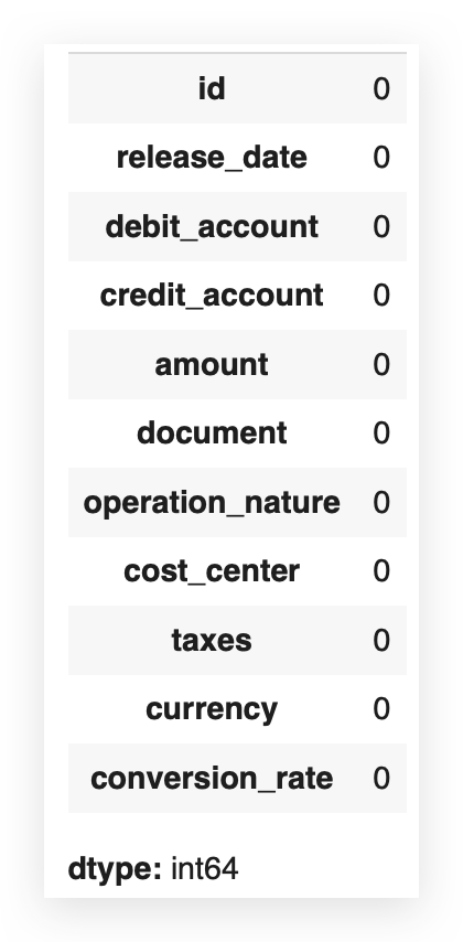
If there are, send them over, and we’ll handle it — Nope. It’s done. Phew! Missing value treatment successfully completed.
Outlier Treatment
Now we’ll address outliers, which is always challenging and sometimes controversial, as an outlier isn’t necessarily a problem, flaw, or error. However, it will affect our analysis regardless.
In other words, even if the outlier is valid data, keeping it impacts the dataset, and removing it also has consequences. There’s no way around this — you have to make a choice.
I’ll make mine here, mainly to demonstrate treatment strategies, and remember: always justify your approach and collaborate with the business team. They can provide deeper insights into whether a particular value truly represents an anomaly or not.
For instance, let’s take a closer look at the variable amount.
# 40. Boxplot of Transaction Values
plt.figure(figsize=(8, 5))
sns.boxplot(x=df['amount'])
plt.title('Boxplot of Values')
plt.xlabel('Values')
plt.show()
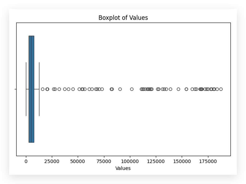
I’ll create a boxplot and soon show you in detail how to interpret it. See these distant points? These are all outliers — values that lie far from the center of the distribution.
Most data points cluster between roughly 0 and 100,000. However, we see values reaching around 175,000 or even higher.
These distant points (indicated here in black) represent potential outliers. Are they valid data points? I don’t know yet; I need to consult with the business team.
So I ask: are these values legitimate? They could be errors, anomalies, or genuine data. If they’re valid, I can retain them and adjust the scale for better analysis. If they’re problematic, I simply remove them and move on.
After consulting the business team, they confirmed these values are indeed errors — likely due to data entry mistakes. Perfect, business team; thank you. Based on this insight, I’ll proceed to remove these data points accordingly.
# 41. Outlier treatment for the 'amount' variable

# Calculating Q1 and Q3
Q1 = df['amount'].quantile(0.25)
Q3 = df['amount'].quantile(0.75)

# Calculating IQR
IQR = Q3 - Q1

# Setting limits to identify outliers
lower_limit = Q1 - 1.5 * IQR
upper_limit = Q3 + 1.5 * IQR

# Filtering out the outliers
df_filtered_1 = df[~((df['amount'] < lower_limit) | (df['amount'] > upper_limit))]
I’ll calculate Q1 and Q3. What is Q1? It’s the line on the left side of the boxplot. Q3 is the line on the right.
To make this clearer, let me execute the code and show the boxplot after the data has been cleaned.
# 42. Boxplot of Transaction Values (after filtering outliers)
plt.figure(figsize=(8, 5))
sns.boxplot(x=df_filtered_1['amount'])
plt.title('Boxplot of Values')
plt.xlabel('Values')
plt.show()
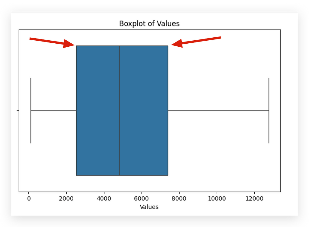
The vertical line on the left represents Q1, while the vertical line on the right represents Q3. Here, I’m calculating Q1 and Q3 — essentially the first and third quartiles. The second quartile is the median.
Next, I’ll compute the interquartile range (IQR), which is simply Q3 — Q1. I’ll then use a formula to set the bounds: if a data point falls below Q1–1.5 * IQR (lower bound) or above Q3 + 1.5 * IQR (upper bound), it will be classified as an outlier. Why?
Because it lies significantly outside the central range of the data distribution. Now, statistics are helping us to highlight the issue. I’ll apply a filter to the DataFrame accordingly.
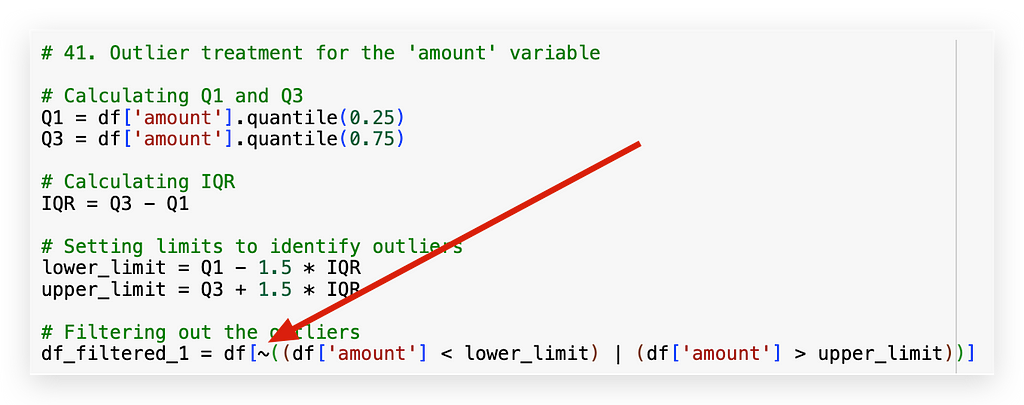
The ~ symbol here represents negation. So, I’ll filter by checking: is the value less than the lower bound or greater than the upper bound?
The vertical line | is the logical OR operator. So, if a value is below the lower bound or above the upper bound, I don’t want it—discard it.
What remains will be saved to df_filtered_1. That’s why there’s a negation with ~.
Done. We’ve now cleaned outliers from the data.
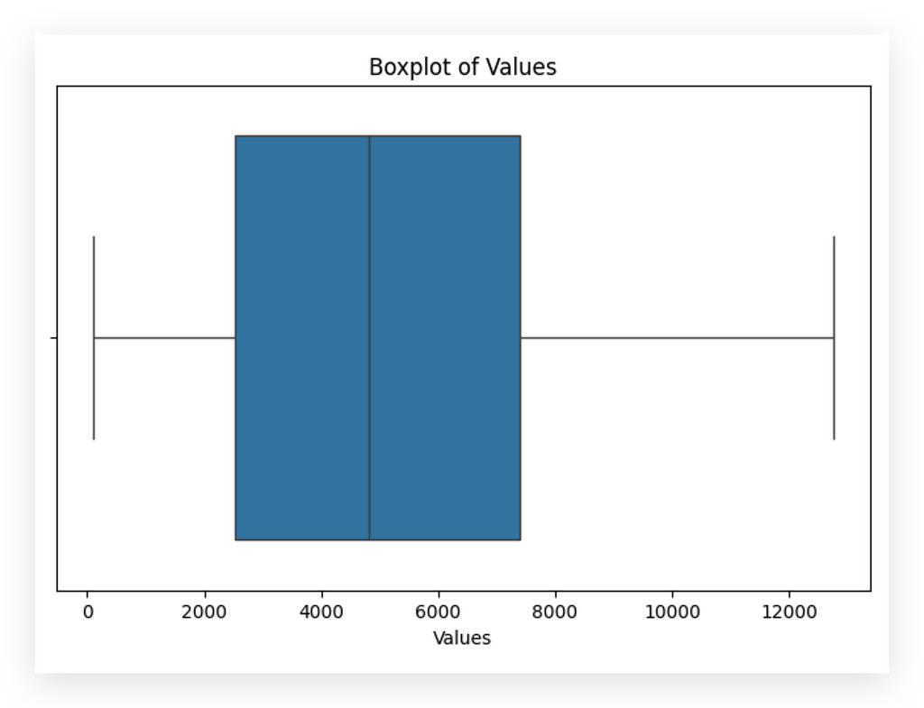
See how the data distribution changes completely, doesn’t it? But again, there’s no guarantee that an outlier is a defect or an anomaly.
We always need to check with the business area. Now, though, I can analyze the data with the majority of the data points. Why?
Outliers are typically a minority, so by removing them, I’m focusing on the main bulk of data points.
This approach provides more information than focusing on outliers. However, nothing stops you from moving outliers to a separate location or another table and conducting a separate analysis if needed.
Let’s now take a look at the Taxes column.
# 43. Boxplot of Taxes
plt.figure(figsize=(8, 5))
sns.boxplot(x=df['taxes'])
plt.title('Boxplot of Taxes')
plt.xlabel('Taxes')
plt.show()
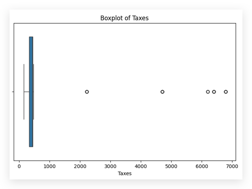
Here, I’ll create a boxplot for you. Clearly, we have outliers.
Let’s apply the same rule and strategy. This time, however, I’ll use df_filtered_1, since I've already removed outliers from the amount column.
# 44. Outlier treatment for the 'taxes' variable

# Calculating Q1 and Q3
Q1 = df['taxes'].quantile(0.25)
Q3 = df['taxes'].quantile(0.75)

# Calculating IQR
IQR = Q3 - Q1

# Setting limits to identify outliers
lower_limit = Q1 - 1.5 * IQR
upper_limit = Q3 + 1.5 * IQR

# Filtering out the outliers
df_filtered_2 = df_filtered_1[~((df_filtered_1['taxes'] < lower_limit) | (df_filtered_1['taxes'] > upper_limit))]
I apply the same rule, exactly the same, without any changes. Then, I save the result in df_filtered_2.
# 45. Boxplot of Taxes (after filtering outliers)
plt.figure(figsize=(8, 5))
sns.boxplot(x=df_filtered_2['taxes'])
plt.title('Boxplot of Taxes')
plt.xlabel('Taxes')
plt.show()

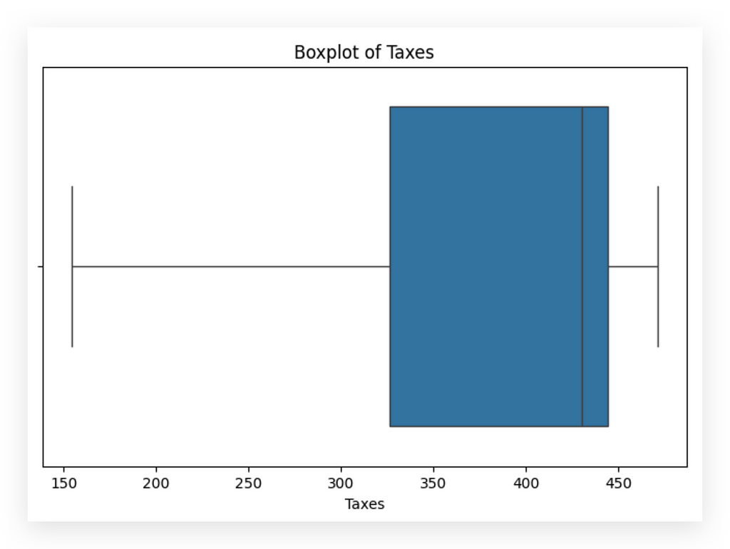
Notice the change in data distribution. Outliers are on the left for the Taxes variable.
Could this be an error? Did the company actually pay higher taxes during those periods? It might even be a data entry mistake.
Check with the business team for confirmation. Ask: “Is this truly an outlier, or is it an issue?” Here, given the limited number of points, the impact is relatively low. For values, however, the impact would be far more significant.


Remove or keep? Both choices have an impact. Choose the one that has the least impact on your analysis. Rounding things off here: always justify your choice.
Removing outliers simplifies the analysis for the majority of data points. It clarifies the pattern, which is ultimately our goal.
We applied this approach for both the values and taxes variables.
Exploratory Analysis After Data Cleaning
We’ve completed the full data cleaning process, addressing both missing values and outliers. Now, we’ll return to exploratory analysis after the data cleanup.
This helps address a common question: When should I conduct exploratory analysis? The answer is, whenever you want. More analysis only strengthens our understanding.
If you’re unfamiliar with the dataset, start with an exploratory analysis. If you’ve never worked with these data before, explore them to get an idea of their structure. If these are data you’ve already analyzed, you might go directly to cleaning and then conduct the exploratory analysis afterward. There’s no single rule here.
The truth is, cleaning affects how you’ll interpret the results, especially for visualizations. Here, the interpretation would change significantly, even if the data volume is only minimally reduced. Removing extreme points — the outliers — affects how we view and interpret the graph.
To avoid drawing premature conclusions, don’t make interpretations before cleaning. The first exploratory analysis should focus on detecting data defects and issues, while the second focuses on interpretation, which we’ll tackle next.
We’ll divide this phase into two main parts: univariate exploration, where we examine single variables, and bivariate exploration, where we analyze variable combinations.
Univariate Exploratory Analysis
What exactly is univariate exploration? In this case, we focus on analyzing a single variable at a time.
Let’s take a closer look at the variables present in our dataset.
# 46. Dataset info after cleaning
df_filtered_2.info()
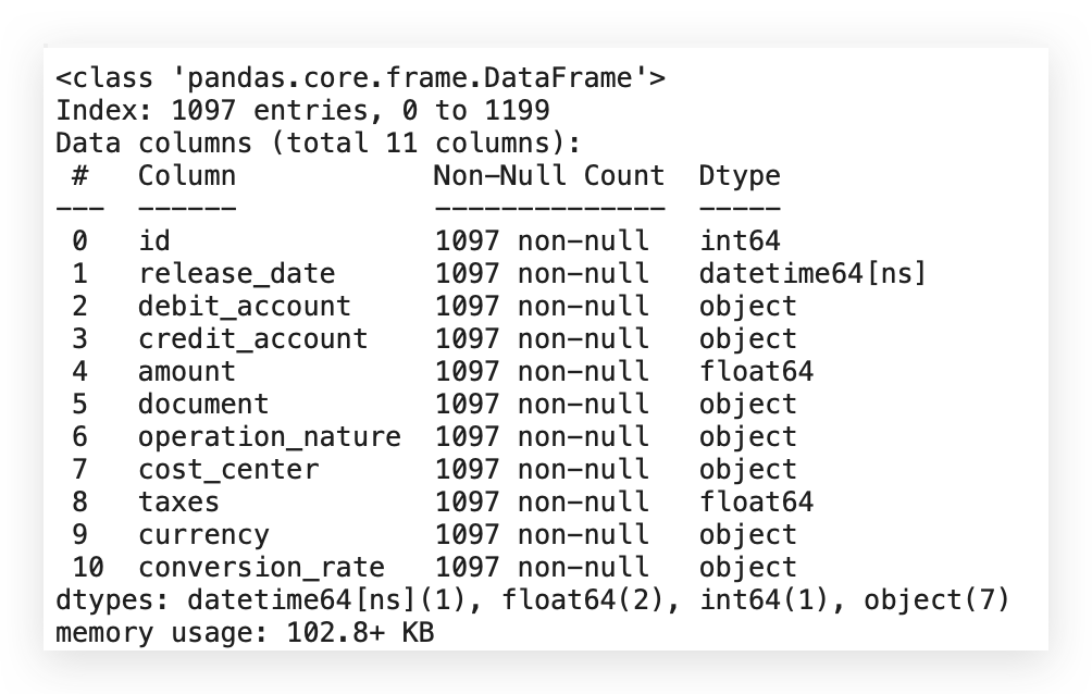
The ideal approach is to analyze each variable individually. For categorical variables, we have specific types of charts; for numerical variables, other visualizations apply. If the variable is date-based, we can examine the earliest and latest dates and check for regular or irregular intervals.
Now, I’ll focus on histograms and boxplots for numerical variables. Soon, I’ll provide examples for categorical variables too.
Is it mandatory to analyze every variable? Strictly speaking, no. But if you’re not examining each variable, what’s your analysis based on? Even a basic understanding of each variable is crucial.
Creating a chart for each variable isn’t always necessary. You might simply summarize, check category frequencies for categorical variables, or create a histogram or boxplot for numerical variables to see the distribution.
This foundational understanding is essential to our work. Univariate analysis looks at each variable individually, while bivariate analysis examines relationships between variables.
Let’s start by focusing on univariate analysis, particularly histograms. I’ll guide you through how to interpret them for effective data insights.
Analyzing and Interpreting Histograms
Let’s continue our analysis, now focusing specifically on interpreting statistical charts, beginning with the histogram.
# 47. Setting seaborn style
sns.set(style="whitegrid")

# Creating a histogram for the 'amount' column
plt.figure(figsize=(10, 6))
sns.histplot(df_filtered_2['amount'], kde=True, bins=30)
plt.title('Distribution of Transaction Values')
plt.xlabel('Values')
plt.ylabel('Frequency')
plt.show()
First, I’ll set the Seaborn style as a standard for the upcoming charts. Next, I’ll create the figure with dimensions 10x6 and plot a histplot, which represents our histogram.
This plot will use the filtered dataset in the amount column, as we've already completed the data cleaning. I'll set KDE=True to include a density line (which I'll explain shortly) and specify 30 bins—these are the intervals you’ll see in the histogram.
The remaining elements include adding a title, labels, and displaying the chart.
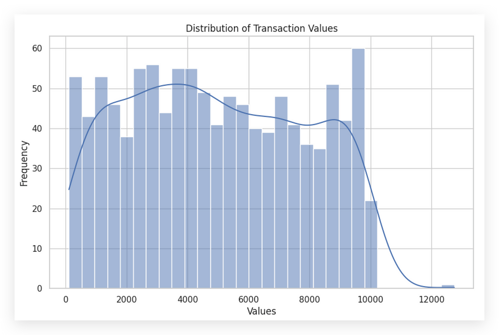
Here’s the histogram for the amount variable, which represents transaction values. The histogram consists of bars—each bar is a bin or interval. The density line (enabled by setting KDE=True) overlays the bars, representing the distribution density across these intervals.
This line shows where records are more densely clustered, rising where data points are concentrated and then dropping off where records thin out. This complements the histogram by highlighting the spread and frequency of values in a visual form.
To aid interpretation, I’ll create two histograms side-by-side, allowing for an easier comparison and deeper analysis of the distribution.
# 48. Setting seaborn style
sns.set(style="whitegrid")

# Creating a histogram for the 'taxes' column
plt.figure(figsize=(10, 6))
sns.histplot(df_filtered_2['taxes'], kde=True, bins=30)
plt.title('Distribution of Taxes')
plt.xlabel('Taxes')
plt.ylabel('Frequency')
plt.show()
Now, I’ll create the second histogram for the taxes variable. The process is identical to the first; the only difference is the variable being analyzed.
This follows a univariate analysis approach, where we examine each variable independently.
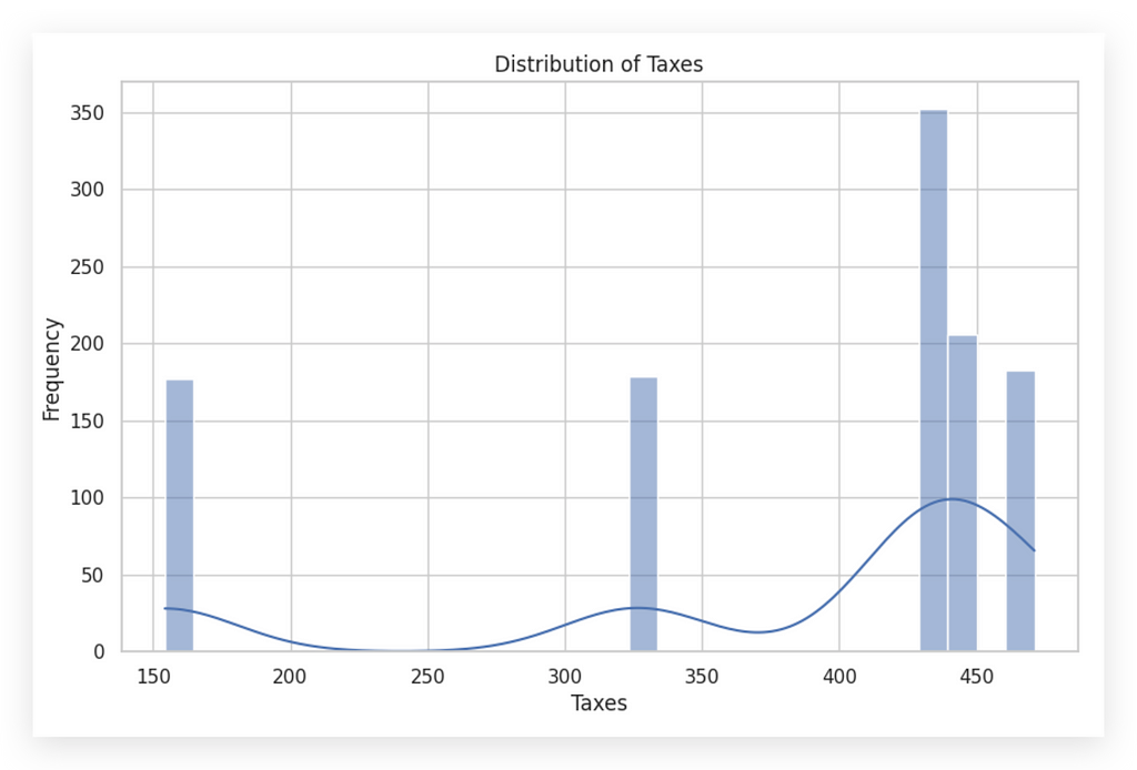
You can see that these two histograms are completely different, right? The same type of chart can look vastly different depending on the variable in focus.
In the second histogram, notice the low density line since most of the values are concentrated in a limited range. Here, there’s a dense grouping of values roughly around 400 to 450 in taxes, showing a high frequency in that specific range. Interpreting a histogram is key to understanding the distribution of data.
A histogram illustrates how often data values fall within certain intervals, or bins. It’s essential to examine the overall shape, as it can reveal much about the data’s nature. While it may seem obvious, it’s worth noting that the purpose of a histogram is not just to display a neat chart in your notebook. It’s an analysis tool — an opportunity to ask questions about what’s happening with the data.
For the amount variable, we see values distributed across multiple ranges, dropping off beyond a certain point, without any unusual behavior. Conversely, with taxes, most values cluster between 400 and 450. It would be wise to consult with the business team to confirm if this distribution reflects reality.
When interpreting:
- Symmetrical Distribution: If the chart is centered around a middle value, it suggests a normal distribution.
- Asymmetrical Distribution (Skewness): If the tail extends more to one side, this indicates skewness. Left skew is negative, and right skew is positive. The first chart doesn’t show signs of significant skewness.
This level of analysis is foundational for reliable data interpretation.


Skewness is an interesting aspect to discuss briefly. Is skewness necessarily a problem? No, but it does indicate a specific behavior in the data. Depending on the next steps, skewness can either be a concern or not.
For instance, in machine learning, data generally should not be skewed, meaning we often need to transform the data to achieve symmetry. However, if we’re simply analyzing behavior — typical in data analysis — then skewness merely reflects the behavior of the variable and isn’t necessarily problematic.
This first chart seems to lack any obvious skewness. But relying on visual inspection alone isn’t enough — we need to calculate a skewness index to determine if there’s any actual skew.
The second chart, on the other hand, clearly shows skewness to one side, indicating that the data leans in one direction. This imbalance in the distribution is what defines skewness.
However, simply eyeballing the charts isn’t reliable. Different observers might interpret the same chart in different ways. So, to avoid any subjectivity, let’s calculate skewness with a specific coefficient for accuracy.
Analyzing and Interpreting Histograms — Skewness
Now, let’s see how to calculate the skewness coefficient for the data. We’ll use the skew function from the stats module in SciPy.
# 49. Importing skew function from scipy.stats
from scipy.stats import skew
It’s not the only option, but it’s a quick and efficient choice.
Next, I’ll call the skew function, passing in my DataFrameand the specific variable for which I want to calculate the skewness coefficient.
# 50. Calculating skewness
skewness = skew(df_filtered_2['amount'])
print(f"The skewness of the distribution of values is: {skewness}")

The skewness of the data distribution for Values is 0.09. Now, let’s calculate the skewness for the Taxes variable as well.
# 51. Calculating skewness
skewness = skew(df_filtered_2['taxes'])
print(f"The skewness of the distribution of taxes is: {skewness}")

Notice the difference: the skewness for Taxes is -1.27. A skewness value of zero would indicate perfect symmetry in the distribution.
In our case, it’s clear that neither of the variables is perfectly symmetrical. They are relatively far from zero, which is expected since data rarely exhibit perfect symmetry.
When you do find perfect symmetry, it’s actually worth double-checking, as it’s rare in real-world data; naturally, data tend to show more asymmetry than perfect balance.
A positive skewness value indicates a distribution with a heavier right tail, which we see with the Values variable. Conversely, a negative skewness suggests a heavier left tail, seen in our Taxes variable.
Practical Implication: The more skewed a variable is, the more its behavior is concentrated toward one end of its range. This skewed concentration gives insight into how values are distributed and helps in understanding the underlying patterns within the data.

The Taxes variable is clearly asymmetrical, demonstrating skewness. Here, most records are concentrated on the right side, reflecting the behavior of this variable. This is precisely what we’re analyzing.
The skewness coefficient essentially indicates whether values are relatively balanced, as we see with the Values variable.

…or if the values are entirely concentrated at one of the extremes. In this case, the skewness coefficient reveals this concentration. Through both the histogram and the skewness coefficient, we get a clearer picture of data concentration within the variable.
This understanding aids us in making informed decisions, progressing in our analysis, possibly identifying outliers, and taking any necessary actions depending on the next steps in the analytical process.
Interpreting Histograms — Other Elements
When interpreting a histogram, several additional elements are essential to consider:
- Identify Peaks and Valleys: Multiple peaks in the histogram may indicate that the data contains several groups or modes. The mode represents the value that appears most frequently in the variable.
- Peaks as Modes: The highest points in the histogram are the modes, highlighting the most common values in the data. These peaks reveal concentrations of values that could reflect specific characteristics of the dataset.
- Valleys: Valleys, or gaps between peaks, might signify a separation between distinct groups within the data. For instance, in the variable taxes, you’ll notice significant valleys alongside one prominent peak. This peak is the mode, the most frequent value.
Understanding these elements enhances your ability to interpret data distributions, providing insight into grouping patterns or concentrations that may influence subsequent analysis steps.
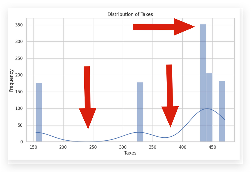
The width of the bins, or intervals, in a histogram can significantly influence its appearance. Bins that are too wide may hide critical details, while bins that are too narrow may highlight random fluctuations rather than meaningful patterns.
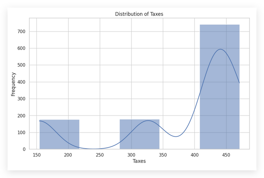
For instance, let’s take a look by reducing the bins from 30 to 5. This adjustment provides a broader overview, smoothing out some variations but potentially obscuring finer insights.
# 48. Setting seaborn style
sns.set(style="whitegrid")

# Creating a histogram for the 'taxes' column
plt.figure(figsize=(10, 6))
sns.histplot(df_filtered_2['taxes'], kde=True, bins=5)
plt.title('Distribution of Taxes')
plt.xlabel('Taxes')
plt.ylabel('Frequency')
plt.show()
# 48. Setting seaborn style
sns.set(style="whitegrid")

# Creating a histogram for the 'taxes' column
plt.figure(figsize=(10, 6))
sns.histplot(df_filtered_2['taxes'], kde=True, bins=5)
plt.title('Distribution of Taxes')
plt.xlabel('Taxes')
plt.ylabel('Frequency')
plt.show()
See how changing the bins completely shifts the graph’s appearance? This illustrates the ease with which information can be manipulated visually.
Once you develop analytical skills, you’ll find it impossible to look at media graphs the same way again. Often, graphics in news or reports are biased, designed to underscore a particular viewpoint rather than accurately reflect the data.
This is why many misinterpretations arise — people accept charts at face value without critical examination, inadvertently spreading misinformation. Today’s fast-paced information environment only amplifies this risk. Just adjusting the bins here subtly shifts the message of the graph.
So, what’s the ideal number of bins? There isn’t a single correct answer. The bins should reveal the truth in the data, not convey a particular narrative.
When a dataset includes a wide variety of values, more bins may help to highlight nuances. Conversely, with a limited range of high-frequency values, fewer bins may provide a clearer picture. For this dataset, I’ll now set the bins to 15 to illustrate further.
# 48. Setting seaborn style
sns.set(style="whitegrid")

# Creating a histogram for the 'taxes' column
plt.figure(figsize=(10, 6))
sns.histplot(df_filtered_2['taxes'], kde=True, bins=15)
plt.title('Distribution of Taxes')
plt.xlabel('Taxes')
plt.ylabel('Frequency')
plt.show()
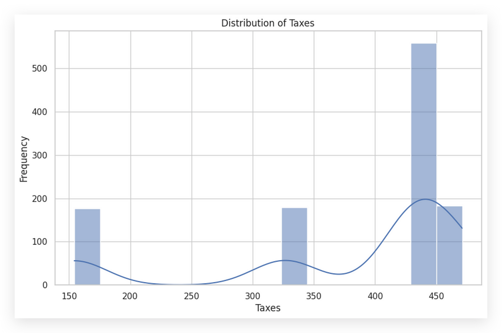
Notice that using 15 bins gives a similar pattern to before, clearly reflecting the data’s inherent distribution. I kept 30 bins for both histograms for consistency, and the result effectively conveys the same information.
When you change the number of bins, you’re adjusting the interval size, making data appear either more concentrated or spread out. Aim to choose bin sizes that best reflect the data’s natural distribution.
Additional Points to Examine:
- Outliers: Outliers often show up as isolated bars away from the main group, highlighting atypical values in the dataset.


n this first histogram on the left, you can spot a potential outlier — specifically that point at the far right. The bar is small but noticeably distant from the rest of the data, suggesting an outlier.
Contrast this with the other histogram, which doesn’t seem to have outliers. Here, it’s worth checking whether the tax values around 150, or between 300 and 350, are valid entries or random occurrences. However, the frequency of records in the first and second bars suggests there are no outliers.
When interpreting the histogram, it’s essential to analyze the X and Y axes:
- X-axis (horizontal): Shows the intervals of data values.
- Y-axis (vertical): Indicates the frequency or count of occurrences within each bin.
Histograms are powerful yet straightforward analytical tools. Always examine the histogram carefully. If you’re uncertain about the data’s representation, try adjusting the bin count.
This often reveals alternative perspectives and helps ensure your bin size reflects the data’s actual distribution. In this case, since the analysis is univariate, adjusting bins for each variable provides clarity without misrepresenting the data.
Boxplots — Quartiles and Interquartile Range
Let’s dive into understanding and interpreting boxplots, a crucial tool for visualizing data distribution.
I’ll create the boxplot using the boxplot function from Seaborn.
# 52. Boxplot of Values
plt.figure(figsize=(8, 5))
sns.boxplot(x=df_filtered_2['amount'])
plt.title('Boxplot of Values')
plt.xlabel('Values')
plt.show()
I’ll create one for the amount variable and another for the taxes variable.
# 53. Boxplot of Taxes
plt.figure(figsize=(8, 5))
sns.boxplot(x=df_filtered_2['taxes'])
plt.title('Boxplot of Taxes')
plt.xlabel('Taxes')
plt.show()
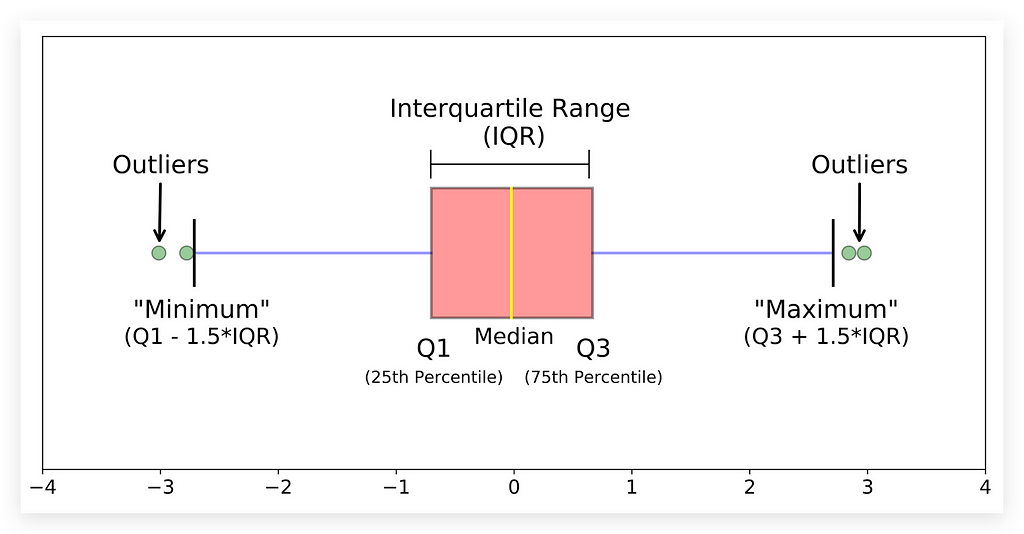
I brought an image that clearly helps explain what a histogram is and the information it contains.
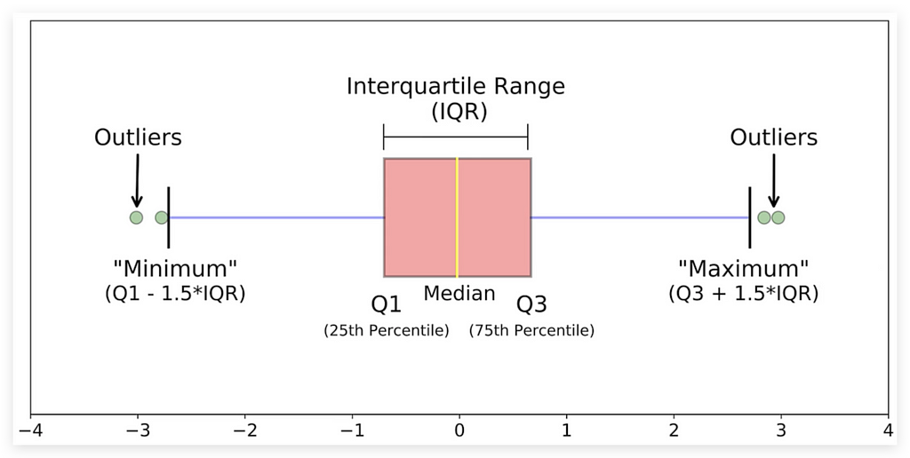
Before analyzing our charts, let me explain this image as I usually do. Examine it carefully.
First, look at the bottom. We have Q1, the 25th percentile, Q3, the 75th percentile, and the median, which is the 50th percentile.
Understanding Percentiles and Quartiles
Why use Q? Q1 and Q3 represent quartiles. Any variable can be divided into 100 equal parts, each a percentile. Some percentiles, like the 25th, are more significant. Here, the 25th percentile is Q1, or the first quartile.
The 50th percentile, also known as the second quartile, is the median. The 75th percentile is the third quartile, or Q3.
What Percentiles Mean
The 25th percentile (Q1) means that 25% of data points fall below this value. Similarly, 50% of data are below the median, dividing the data in half. Remember, median and mean are different. The mean is not shown in the boxplot — only the median, the middle value.
Median vs. Mean
The median divides the data into 50% above and 50% below. To determine if a data point is in the top half, check if it’s above the median. This helps locate its position within the distribution.
Q3 follows this same logic: it’s the value below which 75% of data points fall.
Interquartile Range (IQR) and Whiskers
The difference between Q3 and Q1 is the IQR (Interquartile Range), packed with insights. The whiskers in the boxplot extend from Q1 to Q3 to show variability beyond the central 50%.
- The upper limit is Q3 + 1.5 * IQR.
- The lower limit is Q1–1.5 * IQR.
These thresholds help identify outliers — extreme values beyond these limits.
Now, let’s look at our data.


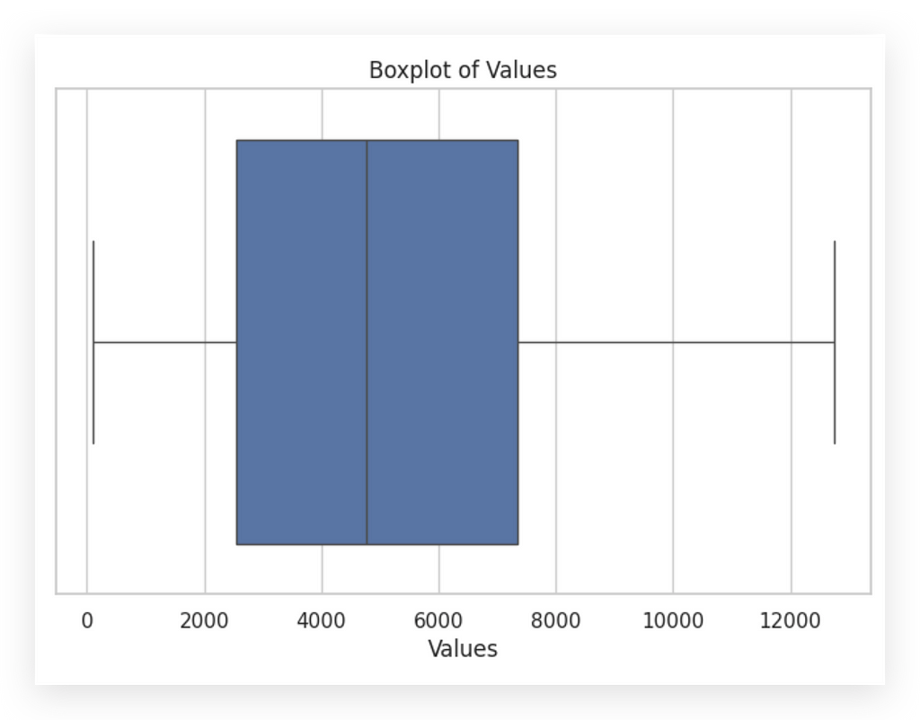
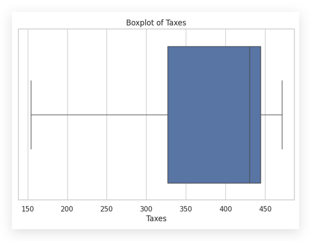
This one is for values. Notice that the box is slightly more to the left, indicating that the median is closer to zero, with most values skewed leftward. This differs from taxes, where most values are on the right side.
The boxplot offers a complementary view to the histogram. Here’s a tip: histograms and boxplots are complementarytools. Both should reflect the same behavior in the variable; if not, there may be an error in the graph setup.
With the boxplot, we can check for outliers. Are there any outliers in these variables? No. If there were, they’d appear as points outside the whiskers.
This is useful because, at a glance, the histogram may suggest an outlier. However, by boxplot standards, no outliers exist in either variable.


That’s why it’s crucial to be careful when analyzing charts, right? From the histogram alone, you might think, “Oh, there’s an outlier.” But when you check the boxplot, you realize, “Wait, there isn’t an outlier here.”
It’s simply a value that’s a bit further from the center of the distribution, but not necessarily an outlier. If it were, it would appear as a point outside the whiskers.
This illustrates the importance of using multiple charts to analyze data. Relying on just one chart for each variable carries a risk, as each chart gives a single perspective.
To truly understand a variable, you need multiple views. It’s the same as analyzing any issue: you should look from more than one angle, more than one perspective.
As the saying goes, every story has two sides, right? Many people hear just one side and take it as absolute truth. But it’s important to hear the other side, to consider other perspectives, before forming conclusions.
The charts demonstrate this point clearly. If I only looked at the histogram, I’d be seeing just one aspect of the data. Ideally, you should analyze with histograms, calculate skewness, and examine boxplots to gain a clearer picture of data distribution.
Interpreting Boxplots — Additional Elements
You’ve likely noticed that analyzing a chart isn’t as straightforward as it seems — it often requires interpretation.
For instance, take the histogram for the amount variable.

I am analyzing, and apparently, this looks like an outlier. Then another person might look and say, no, this isn’t an outlier.
Yet another person might view it and think, well, it could be an outlier. Sometimes, it’s a matter of interpretation.
This is why it’s always safer and healthier not to rely on just one chart. You might think, “But won’t that increase my workload if I need to create multiple charts?” Yes, it will. Your job isn’t simply to create charts or to code in Python; your job is to solve business problems.
The solutions you deliver might guide the company in making strategic decisions, like hiring or downsizing. Your work carries a high level of responsibility, so you can’t just look at one chart, interpret it, and consider the job done.
As you grow in data analysis, you become more rigorous and meticulous. For every data analysis project, I create multiple charts, analyze from various angles, and even seek user feedback to validate my interpretation. Why? Because I understand the responsibility that comes with this work.
This analysis will be used by someone to make decisions. So, we must exercise extreme caution in chart analysis, as it’s open to interpretation.
When we looked at the histogram, it seemed like there was an outlier. Yet, when we viewed the boxplot, it appeared there wasn’t. To be sure, I could also use calculations or filter the data, confirming before continuing with my analysis.
Let’s continue. I’ve already explained quartiles, the IQR (interquartile range), and the whiskers, which help you understand the spread of data. In boxplots, outliers are data points that fall outside the whiskers.

Look here at these green dots outside the whiskers. In our case, we don’t have these dots, which is why the chart shows no outliers based on the current rule.
I could adjust the sensitivity through calculations if needed.
Symmetry: If the median is centered within the box and the whiskers are of similar length, the data is more symmetrical.
We already know that neither of our two variables is symmetrical, right?
Let’s now take a closer look at the boxplot.


Notice how the boxplot clearly illustrates the concept of symmetry. This boxplot on the left shows a perfectly symmetrical distribution: the box is centered, the median sits in the middle of the box, and the distances to the upper and lower limits are the same.
This is what a perfectly symmetrical variable looks like. Observe our variables. Do either of them show perfect symmetry? Neither does. We already knew this from calculating the symmetry coefficient.
But, with the histogram alone, it’s harder to pinpoint symmetry. Just looking at a histogram, it’s challenging to determine if a variable is symmetrical. Calculating the coefficient helped us confirm this, and the boxplot makes it even clearer.


This is why I prefer to display the boxplot horizontally. I find it easier for interpretation this way, though it’s also possible to create it vertically. For a variable to be symmetrical, the box would ideally sit in the middle, with the median positioned centrally within the box.
This is not the case for either variable, confirming their asymmetry. If the median is closer to Q1 or Q3, or if one whisker is significantly longer than the other, the data is asymmetrical — just like in our case.
A longer tail indicates greater variability in central data, and outliers can signal extreme variations or potential data issues. This is precisely what we aim to uncover when interpreting crucial statistical tools like histograms and boxplots.
I’ve shown you two essential univariate analysis tools. Now, let’s shift focus and explore multivariate analysis.
Multivariate Exploratory Analysis
We’ve covered the interpretation of two essential univariate statistical graphs: the histogram and boxplot. Both are focused on analyzing a single variable at a time. But is it possible to analyze more than one variable simultaneously with these tools? Yes, it is. I’ll show you an example soon.
The primary purpose of the histogram and boxplot, however, remains focused on single-variable analysis. Typically, you’d create a histogram or boxplot for each variable, one by one, as we did before.
If there are 50 variables, does this mean creating a histogram and boxplot for each one? Well, that depends. If it’s necessary for the analysis, we can automate this by looping through the variables in Python to generate multiple graphs at once.
The question is, do we really need to analyze every variable this way? Sometimes, it’s useful to reduce the dataset by selecting only relevant variables before diving into visual analysis. Adapting to each project’s requirements is essential; a large number of variables may even call for dimensionality reduction techniques before performing exploratory analysis.
Generally, you’ll work with a few dozen variables at most. Get to know them thoroughly: observe patterns and understand behaviors in each one. After this, you can move on to multivariate analysis, which, as the name implies, examines multiple variables simultaneously.
In multivariate analysis, the goal is to observe the interaction between variables — how they relate and potentially influence each other. This approach shifts the perspective from individual snapshots of data to examining interrelationships, as we might see with tax-related variables in our dataset.


Or perhaps, this photo focuses on the variable representing transaction values. Now, I want a different type of snapshot. How does this variable behave alongside another? This is the question multivariate analysis seeks to answer.
Multivariate analysis is essentially an extension of univariate analysis, wouldn’t you agree? Typically, you start with univariate analysis, focusing first on the most critical variables. You observe distributions, check for issues, and only then move to the next layer: comparing one variable with another.
How do these two variables interact? This is the approach I’ll demonstrate next, analyzing and interpreting a correlation map between two variables
Interpreting Correlation Maps
Let’s explore how to analyze and interpret a correlation map, another essential graphic in the analysis process, often considered a statistical chart. First, let’s take a look at our dataset.
# 54. Display the first few rows of the filtered dataset
df_filtered_2.head()

Here we have variables such as id, release_date, debit_account, credit_account, amount, document, operation_nature, cost_center, taxes, currency, and conversion_rate.
My goal is to examine the relationship between the variable amount and the number of days since the release.
Hold on — there’s no “days since release” variable here. However, the absence of this variable doesn’t limit us; we can create it. This is where another critical aspect of analysis comes in: feature engineering. This dataset contains far more information than what’s initially visible.
To recognize this potential, practice is essential. For instance, in document, each code or character might signify a different identifier. You can check with the data source to confirm this. There might be valuable information that isn’t immediately apparent but could be revealed by splitting the release_date column or generating a new column based on calculations.
In short, don’t focus solely on the dataset as it stands. You can manipulate these variables to reveal insights from different perspectives. Let me show you an example of this.
# 56. Converting 'release_date' to datetime
df_filtered_2['release_date'] = pd.to_datetime(df_filtered_2['release_date'])
I’ll convert the release_date column to datetime.
# 57. Display information about the filtered dataset
df_filtered_2.info()
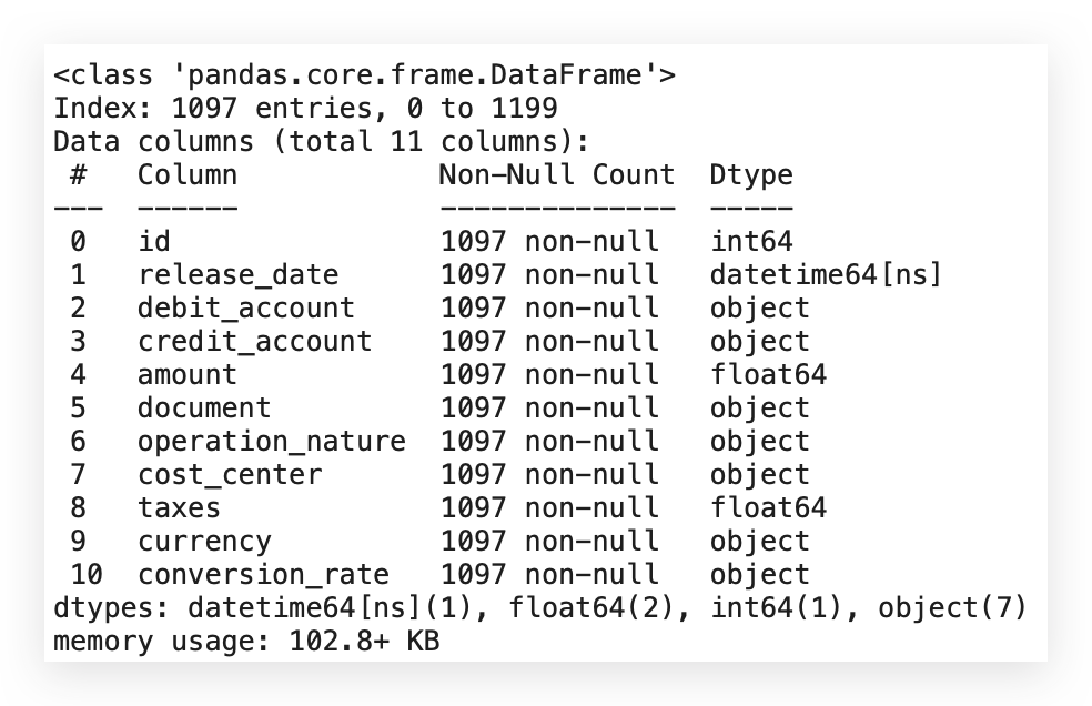
Since the release_date column is already in datetime format, let's reapply the transformation to be sure. This step is essential because the subsequent calculations depend on having the correct format for this variable.
After confirming the format, I’ll add a new column to represent the number of days since the earliest date in the dataset. Here’s how to do it:
# 57. Creating a new column representing the number of days since the earliest date
min_date = df_filtered_2['release_date'].min()
df_filtered_2['days_since_release'] = (df_filtered_2['release_date'] - min_date).dt.days
Let’s proceed with creating the days_since_release column and calculating the correlation matrix:
- Retrieve the Minimum Date: Use the min function to get the earliest date from release_date, saving it in the min_date variable.
- Create days_since_release Column: Subtract min_date from each release_date entry to get the difference in days using .dt.days, and save this in the new column days_since_release.
- Calculate the Correlation Matrix: After creating days_since_release, proceed to calculate the correlation matrix.
# 58. Display the first few rows of the filtered dataset
df_filtered_2.head()

Here’s what I have now: days_since_release. Excellent. The question now is:
Is there any relationship between this variable and the amount variable? Is the number of days somehow related to amount?
I’ll answer this by generating the correlation matrix or correlation map, also known as a heatmap.
# 59. Calculating the correlation between 'amount' and 'days_since_release'
correlation_matrix = df_filtered_2[['amount', 'days_since_release']].corr()

# 60. Creating the heatmap
plt.figure(figsize=(8, 6))
sns.heatmap(correlation_matrix, annot=True, cmap='coolwarm', fmt=".2f")
plt.title("Correlation Heatmap")
plt.show()
I’ll filter my dataset for these two variables — I only want to analyze them — and create their correlation, which will generate the correlation coefficient.
Then, I’ll create a heatmap using Seaborn with the correlation matrix. I’ll include annotations and apply the coolwarm color map.
If you don’t like the colors I chose, don’t worry; you can use any colors you prefer.
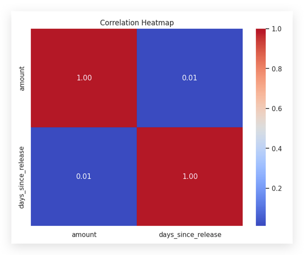
I’ll use min() to find the earliest date and store it in min_date. Then, I'll create a new column, days_since_release, by subtracting release_date from min_date. Converting release_date to datetime allows me to calculate days easily. Afterward, I'll compute the correlation matrix.
With days_since_release added, I'll now examine its relationship with amount. Is there any correlation between them? By generating a correlation matrix, I can analyze this. Filtering the dataset to focus on these two variables, I'll calculate their correlation coefficient and visualize it with a Seaborn heatmap, including annotations.
The heatmap shows correlation values between -1 and +1. A coefficient near +1 indicates strong positive correlation, while -1 shows a strong negative one. Zero implies no correlation. The red diagonal represents the self-correlation of each variable, always at 1. In this case, the coefficient between days_since_release and amount is 0.01, suggesting no correlation.
If I hadn’t prepared this data, I wouldn’t have reached this clear answer. Data preparation helps answer questions confidently, without assumptions. Even if no correlation exists, understanding this is essential.
Remember, correlation does not imply causation. Variables may move together without a direct relationship. For example, ice cream sales and shark attacks may rise together due to summer temperatures, but one doesn’t cause the other.
Always approach correlations critically. Positive correlation shows variables move together; negative correlation means they move in opposite directions. If there’s no correlation, it’s neutral. And remember: correlation itself never proves causation.
Scatter Plots — Non-Trivial Patterns
Now, I will introduce another important statistical graphic: the scatter plot.
# 61. Creating the scatter plot between 'amount' and 'taxes'
plt.figure(figsize=(10, 6))
sns.scatterplot(x='amount', y='taxes', data=df_filtered_2)
plt.title('Transaction Amount vs. Taxes')
plt.xlabel('Amount')
plt.ylabel('Taxes')
plt.show()
I will first set a figure size, then create the scatter plot, which will display the relationship between the amount and taxesvariables using the df_filtered_2 DataFrame.
I’ve prepared the data for this project in a way that the graphs are not trivial. When something is trivial, it’s easier to interpret, right? I want you to engage your mind to interpret the results with me, just as we did with the previous graphs.
You might have noticed that none of the graphs I presented were obvious; they required some analysis to understand what was happening, and this one is no different. When people look at a scatter plot, they generally search for a diagonal line. If the diagonal goes from the bottom left to the top right, it indicates a positive correlation between the variables. Conversely, if it runs from the top left to the bottom right, it indicates a negative correlation.
But how do we interpret it when the points are distributed horizontally, as they are now? This is why I didn’t provide trivial graphs; it’s meant to challenge your thinking alongside mine.
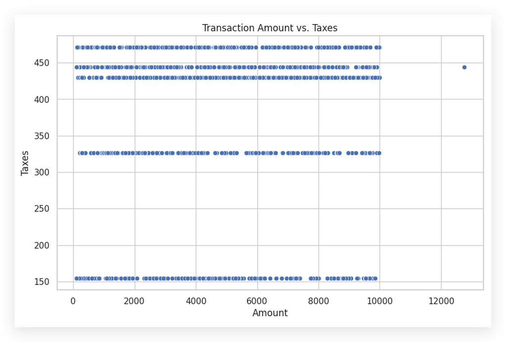
On the X-axis, we have launch values, and on the Y-axis, taxes. What do the horizontal lines mean? Notice that at a tax value around 150, it remains stable regardless of the launch value. For instance, with a launch value of 2,000, the tax might be 330, but at 2,001, it drops to 150 and stays there for 2,002 and beyond until it jumps again.
This pattern is unexpected. Typically, as launch values rise, so should tax values, but here, the tax mostly stays fixed. This prompts us to think differently. Instead of a diagonal, which suggests a straightforward increase, the tax appears unchanging.
Why does the tax stay at 150 for multiple values? There might be an unrepresented third variable influencing this—possibly transaction type, country, or document type. This is where analysis comes in: using the graph to question data coherence. If the pattern is unusual, consult the business area for insights.
In scatter plots, don’t always expect a diagonal line. When it’s absent, interpret what’s happening. Here, it’s likely a third variable affecting both values and taxes, explaining the tax's fixed nature. Interpreting non-obvious patterns like these is a key part of analysis.
EDA of Numeric vs. Categorical Data
To conclude our work on this project, I’m going to show you a graph that displays the exploratory analysis of both numeric and categorical data in the same chart. You won’t believe what type of graph it is…
# 63. Creating a boxplot to analyze the association between 'amount' and 'currency'
plt.figure(figsize=(12, 6))
sns.boxplot(x='currency', y='amount', data=df_filtered_2)
plt.title('Distribution of Amount by Currency')
plt.xlabel('Currency')
plt.ylabel('Amount')
plt.show()
Look at that! A boxplot! Is it possible? Yes, you can indeed create a boxplot, and in this case, it will show the relationship between a numeric (quantitative) variable and a categorical (qualitative) variable.
The only difference from what we did earlier is that I’m now using both the X and Y axes. Currency is a categorical variable, while amount is a quantitative variable. When we created the boxplot previously, I only used the X axis, focusing on univariate analysis.
But it’s also possible to use a boxplot for bivariate or multivariate analysis, which is what we’re doing here. In this case, I’m adding both X and Y. That’s the only difference.
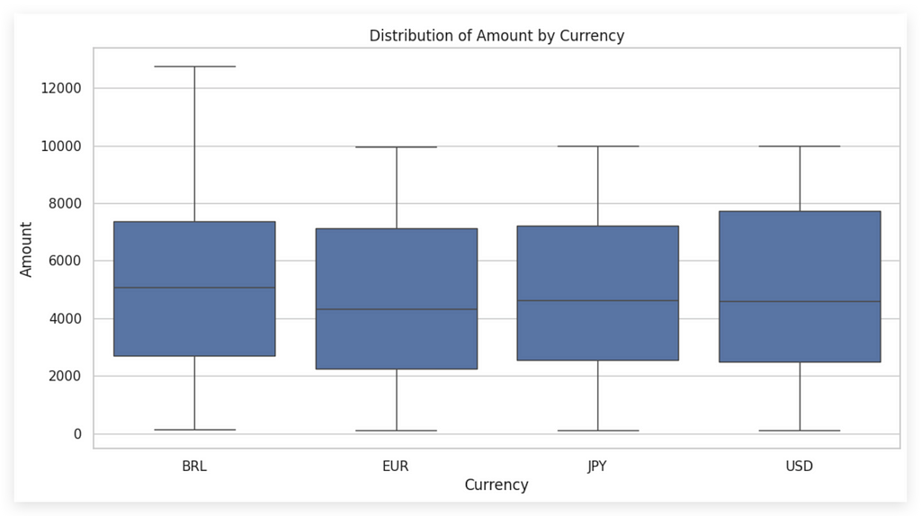
Check out the result! On the X-axis, we have currency with four categories: BRL (Brazilian Real), Euro, JPY (Japanese Yen), and USD (US Dollar). Each boxplot corresponds to a category of this variable.
On the Y-axis, we see amount, allowing us to compare values across currencies. Notice that the median for Eurotransactions is the lowest, while BRL has the highest median and the widest dispersion, as indicated by the whiskers.
This analysis requires at least two dimensions, with each category adding complexity. For presentation, consider adding labels and a legend to aid interpretation, as analysts may find this easier than general audiences.
The default color map is applied here, but you can customize it along with the boxplot sizes. Adding a grid background helps with value referencing and interpretation clarity.
All values are above zero, with the widest spread in BRL and less in other currencies. Euro has the lowest median, while BRL the highest. USD shows a greater volume above the median.
This graph effectively combines categorical and quantitative variables, aiding in data-driven decisions. This wraps up our exploratory analysis on statistical graphs. For deeper insights, continue these steps with other variables. See you in the next project!
Thank you very much. 🐼❤️
All images, content, and text are created by Leonardo Anello
Techniques for Exploratory Data Analysis and Interpretation of Statistical Graphs was originally published in Towards Data Science on Medium, where people are continuing the conversation by highlighting and responding to this story.
from Datascience in Towards Data Science on Medium https://ift.tt/VOSeiAr
via IFTTT

