Why Most Cross-Validation Visualizations Are Wrong (And How to Fix Them)
MODEL VALIDATION & OPTIMIZATION
Stop using moving boxes to explain cross-validation!
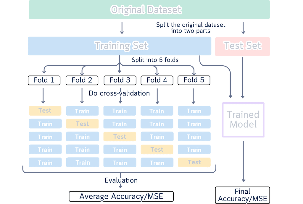
You know those cross-validation diagrams in every data science tutorial? The ones showing boxes in different colors moving around to explain how we split data for training and testing? Like this one:
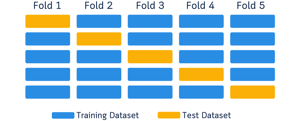
I’ve seen them too — one too many times. These diagrams are common — they’ve become the go-to way to explain cross-validation. But here’s something interesting I noticed while looking at them as both a designer and data scientist.
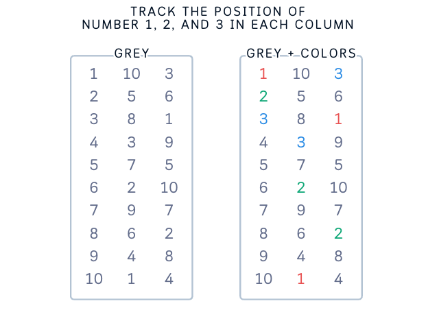
When we look at a yellow box moving to different spots, our brain automatically sees it as one box moving around.
It’s just how our brains work — when we see something similar move to a new spot, we think it’s the same thing. (This is actually why cartoons and animations work!)

But here’s the thing: In these diagrams, each box in a new position is supposed to show a different chunk of data. So while our brain naturally wants to track the boxes, we have to tell our brain, “No, no, that’s not one box moving — they’re different boxes!” It’s like we’re fighting against how our brain naturally works, just to understand what the diagram means.
Looking at this as someone who works with both design and data, I started thinking: maybe there’s a better way? What if we could show cross-validation in a way that actually works with how our brain processes information?

What’s Cross-Validation Really About?
Cross-validation is about making sure machine learning models work well in the real world. Instead of testing a model once, we test it multiple times using different parts of our data. This helps us understand how the model will perform with new, unseen data.
Here’s what happens:
- We take our data
- Divide it into groups
- Use some groups for training, others for testing
- Repeat this process with different groupings
The goal is to get a reliable understanding of our model’s performance. That’s the core idea — simple and practical.
(Note: We’ll discuss different validation techniques and their applications in another article. For now, let’s focus on understanding the basic concept and why current visualization methods need improvement.)
What’s Wrong with Current Cross-validation Diagrams?
Open up any machine learning tutorial, and you’ll probably see these types of diagrams:
- Long boxes split into different sections
- Arrows showing parts moving around
- Different colors showing training and testing data
- Multiple versions of the same diagram side by side
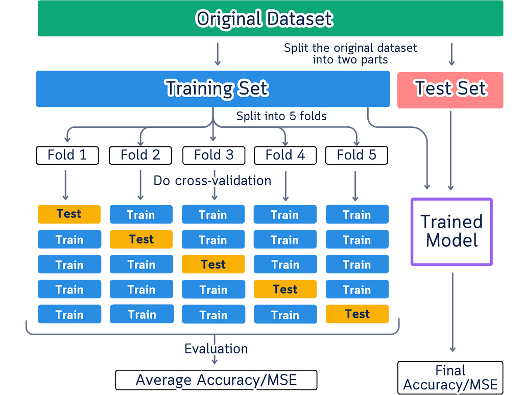
Here are the issues with such diagram:
Not Everyone Sees Colors the Same Way
Colors create practical problems when showing data splits. Some people can’t differentiate certain colors, while others may not see colors at all. The visualization fails when printed in black and white or viewed on different screens where colors vary. Using color as the primary way to distinguish data parts means some people miss important information due to their color perception.
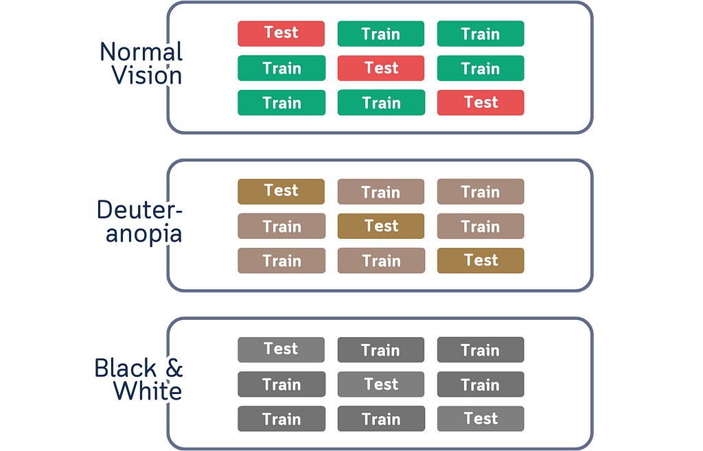
Colors Make Things Harder to Remember
Another thing about colors is that it might look like they help explain things, but they actually create extra work for our brain. When we use different colors for different parts of the data, we have to actively remember what each color represents. This becomes a memory task instead of helping us understand the actual concept. The connection between colors and data splits isn’t natural or obvious — it’s something we have to learn and keep track of while trying to understand cross-validation itself.
Our brain doesn’t naturally connect colors with data splits.

Too Much Information at Once
The current diagrams also suffer from information overload. They attempt to display the entire cross-validation process in a single visualization, which creates unnecessary complexity. Multiple arrows, extensive labeling, all competing for attention. When we try to show every aspect of the process at the same time, we make it harder to focus on understanding each individual part. Instead of clarifying the concept, this approach adds an extra layer of complexity that we need to decode first.
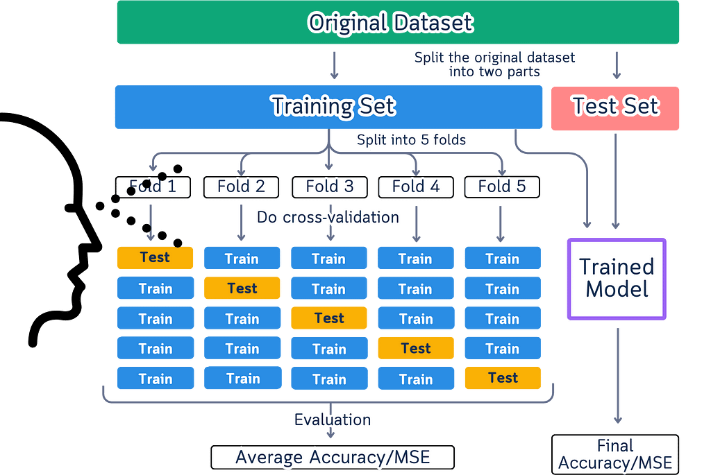
Movement That Misleads
Movement in these diagrams creates a fundamental misunderstanding of how cross-validation actually works. When we show arrows and flowing elements, we’re suggesting a sequential process that doesn’t exist in reality. Cross-validation splits don’t need to happen in any particular order — the order of splits doesn’t affect the results at all.
These diagrams also give the wrong impression that data physically moves during cross-validation. In reality, we’re simply selecting different rows from our original dataset each time. The data stays exactly where it is, and we just change which rows we use for testing in each split. When diagrams show data flowing between splits, they add unnecessary complexity to what should be a straightforward process.
What We Need Instead
We need diagrams that:
- Don’t just rely on colors to explain things
- Show information in clear, separate chunks
- Make it obvious that different test groups are independent
- Don’t use unnecessary arrows and movement
Let’s fix this. Instead of trying to make our brains work differently, why don’t we create something that feels natural to look at?
A Better Way to Visualize Cross-validation
Let’s try something different. First, this is how data looks like to most people — rows and columns of numbers with index.

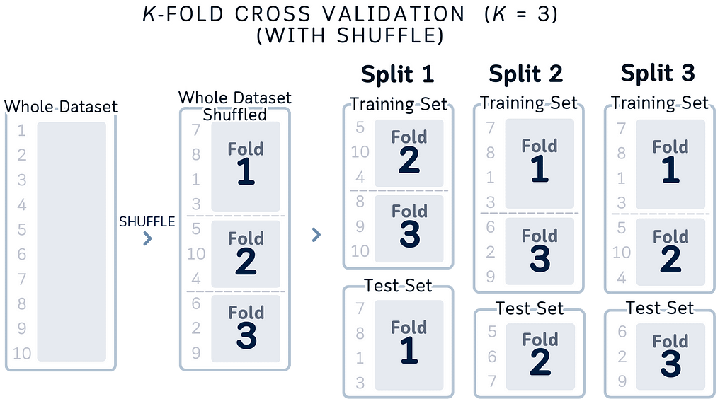
Inspired by that structure, here’s a diagram that make more sense.
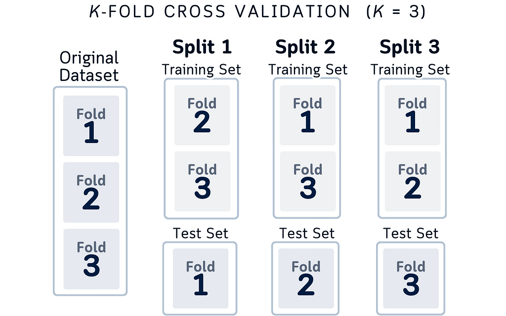
Here’s why this design makes more sense logically:
- True Data Structure: It matches how data actually works in cross-validation. In practice, we’re selecting different portions of our dataset — not moving data around. Each column shows exactly which splits we’re using for testing each time.
- Independent Splits: Each split explicitly shows it’s different data. Unlike moving boxes that might make you think “it’s the same test set moving around,” this shows that Split 2 is using completely different data from Split 1. This matches what’s actually happening in your code.
- Data Conservation: By keeping the column height the same throughout all folds, we’re showing an important rule of cross-validation: you always use your entire dataset. Some portions for testing, the rest for training. Every piece of data gets used, nothing is left out.
- Complete Coverage: Looking left to right, you can easily check an important cross-validation principle: every portion of your dataset will be used as test data exactly once.
- Three-Fold Simplicity: We specifically use 3-fold cross-validation here because:
a. It clearly demonstrates the key concepts without overwhelming detail
b. The pattern is easy to follow: three distinct folds, three test sets. Simple enough to mentally track which portions are being used for training vs testing in each fold
c. Perfect for educational purposes — adding more folds (like 5 or 10) would make the visualization more cluttered without adding conceptual value
(Note: While 5-fold or 10-fold cross-validation might be more common in practice, 3-fold serves perfectly to illustrate the core concepts of the technique.)
Adding Indices for Clarity
While the concept above is correct, thinking about actual row indices makes it even clearer:
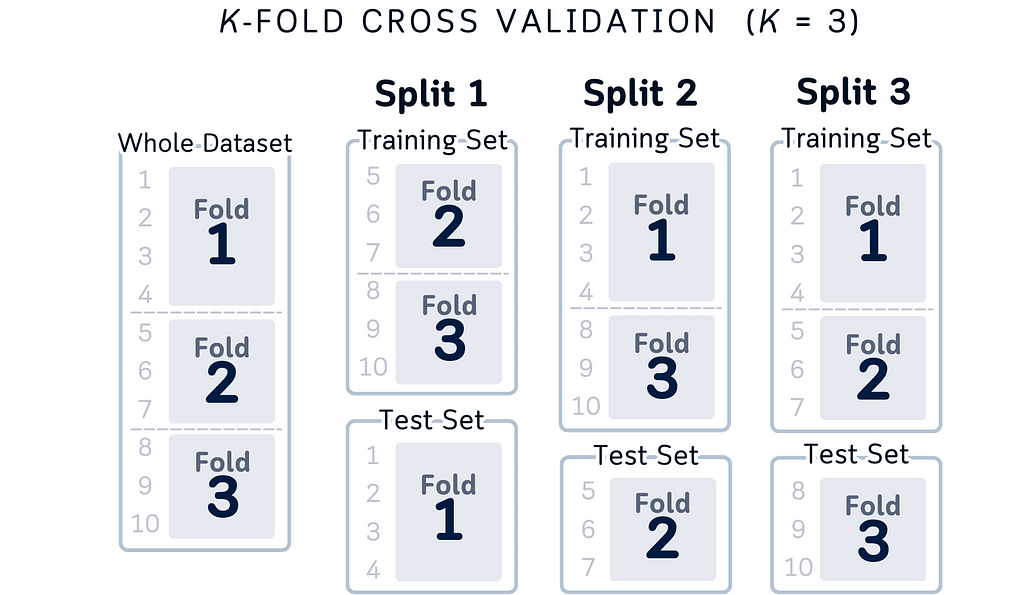
Here are some reasons of improvements of this visual:
- Instead of just “different portions,” we can see that Fold 1 tests on rows 1–4, Fold 2 on rows 5–7, and Fold 3 on rows 8–10
- “Complete coverage” becomes more concrete: rows 1–10 each appear exactly once in test sets
- Training sets are explicit: when testing on rows 1–4, we’re training on rows 5–10
- Data independence is obvious: test sets use different row ranges (1–3, 4–6, 7–10)
This index-based view doesn’t change the concepts — it just makes them more concrete and easier to implement in code. Whether you think about it as portions or specific row numbers, the key principles remain the same: independent folds, complete coverage, and using all your data.
Adding Some Colors
If you feel the black-and-white version is too plain, this is also another acceptable options:
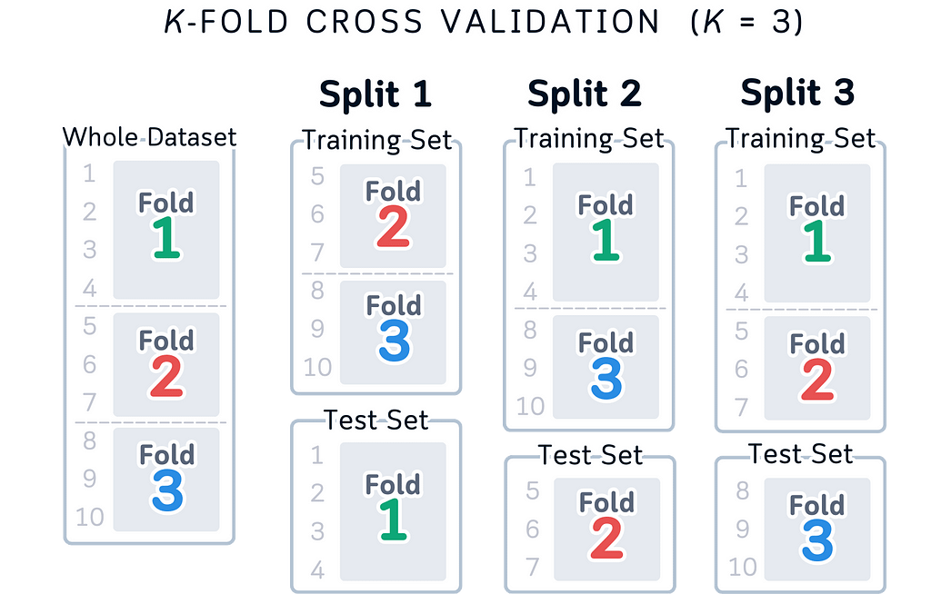
While using colors in this version might seem problematic given the issues with color blindness and memory load mentioned before, it can still work as a helpful teaching tool alongside the simpler version.
The main reason is that it doesn’t only use colors to show the information — the row numbers (1–10) and fold numbers tell you everything you need to know, with colors just being a nice extra touch.
This means that even if someone can’t see the colors properly or prints it in black and white, they can still understand everything through the numbers. And while having to remember what each color means can make things harder to learn, in this case you don’t have to remember the colors — they’re just there as an extra help for people who find them useful, but you can totally understand the diagram without them.
Just like the previous version, the row numbers also help by showing exactly how the data is being split up, making it easier to understand how cross-validation works in practice whether you pay attention to the colors or not.
The visualization remains fully functional and understandable even if you ignore the colors completely.
Why This Works Better: From Design to Data
Let’s look at why our new designs makes sense not just from a UX view, but also from a data science perspective.
Matching Mental Models: Think about how you explain cross-validation to someone. You probably say “we take these rows for testing, then these rows, then these rows.” Our visualization now matches exactly how we think and talk about the process. We’re not just making it pretty, we’re making it match reality.
Data Structure Clarity: By showing data as columns with indices, we’re revealing the actual structure of our dataset. Each row has a number, each number appears in exactly one test set. This isn’t just good design, it’s accurate to how our data is organized in code.
Focus on What Matters: Our old way of showing cross-validation had us thinking about moving parts. But that’s not what matters in cross-validation. What matters is:
- Which rows are we testing on?
- Are we using all our data?
- Is each row used for testing exactly once?
Our new design answers these questions at a glance.
Index-Based Understanding: Instead of abstract colored boxes, we’re showing actual row indices. When you write cross-validation code, you’re working with these indices. Now the visualization matches your code — Fold 1 uses rows 1–4, Fold 2 uses 5–7, and so on.
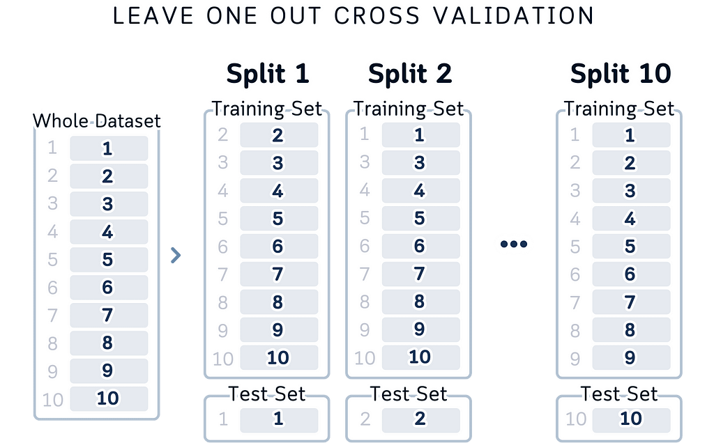
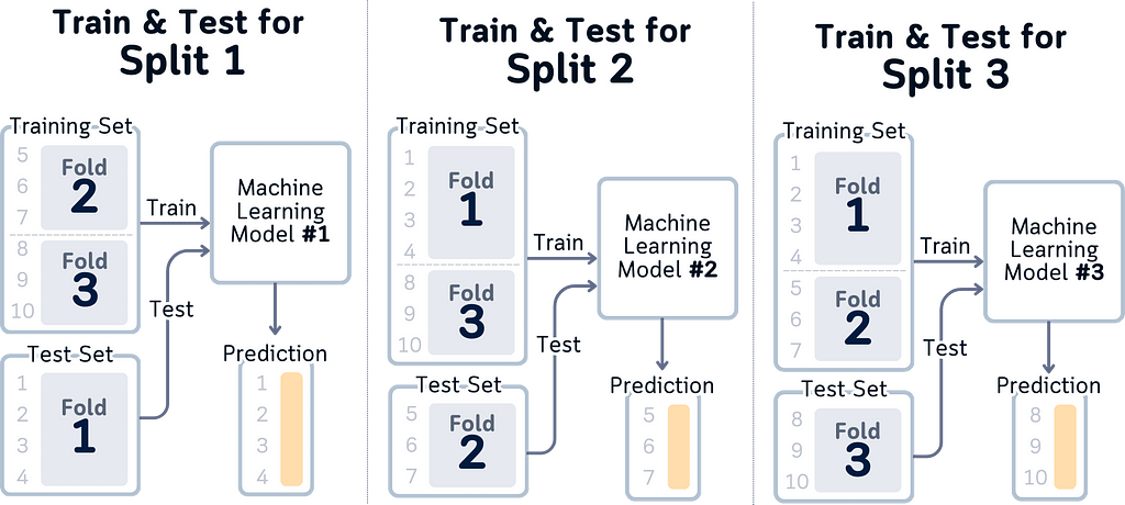
Clear Data Flow: The layout shows data flowing from left to right: here’s your dataset, here’s how it’s split, here’s what each split looks like. It matches the logical steps of cross-validation and it’s also easier to look at.
Conclusion: When Visualization Matches Your Code
Here’s what we’ve learned about the whole redrawing of the cross-validation diagram:
Match Your Code, Not Conventions: We usually stick to traditional ways of showing things just because that’s how everyone does it. But cross-validation is really about selecting different rows of data for testing, so why not show exactly that? When your visualization matches your code, understanding follows naturally.
Data Structure Matters: By showing indices and actual data splits, we’re revealing how cross-validation really works while also make a clearer picture. Each row has its place, each split has its purpose, and you can trace exactly what’s happening in each step.
Simplicity Has It Purpose: It turns out that showing less can actually explain more. By focusing on the essential parts — which rows are being used for testing, and when — we’re not just simplifying the visualization but we’re also highlighting what actually matters in cross-validation.
Looking ahead, this thinking can apply to many data science concepts. Before making another visualization, ask yourself:
- Does this show what’s actually happening in the code?
- Can someone trace the data flow?
- Are we showing structure, or just following tradition?
Good visualization isn’t about following rules — it’s about showing truth. And sometimes, the clearest truth is also the simplest.
About the Illustrations
Unless otherwise noted, all images are created by the author, incorporating licensed design elements from Canva Pro.
Why Most Cross-Validation Visualizations Are Wrong (And How to Fix Them) was originally published in Towards Data Science on Medium, where people are continuing the conversation by highlighting and responding to this story.
from Datascience in Towards Data Science on Medium https://ift.tt/kvjaKD7
via IFTTT


