Market Basket Analysis: The Complete Guide
🛒✨ How Association Rules and Market Basket Analysis uncover hidden customer behavior patterns.

Overview
Let me introduce you to a project on Association Rules and Market Basket Analysis (MBA) — and no, this has nothing to do with the management course, okay?
This is a data analysis technique, widely used in the retail sector.
If you work or plan to work in retail, sooner or later, you’re likely to be involved in projects utilizing association rules and MBA.
Now, let me tell you — this project deserves at least 50 claps from each of you. If you’re feeling lazy, just press and hold the clap button, and why not leave a comment?
It won’t waste your time, it won’t drain your energy — I’ve already poured all of mine into this. 👏👏
🍺 + Diapers: A Curious Correlation 🛒
To explain what association rules and Market Basket Analysis are, let me share a curious event that happened in the United States a few years ago.
A supermarket chain decided to apply these techniques — association rules and basket analysis — to understand customers’ purchasing patterns.
Imagine someone walking into a supermarket.
What do they buy? What do they put in their cart?
For example, if someone buys bread, they are likely to also purchase butter, coffee, or milk — items typically bought together.
Likewise, someone buying apples might also buy bananas, oranges, or tangerines, right?
The company analyzed its transactions — essentially analyzing shopping baskets — and looked for these combinations.
That’s what we call association rules.
However, during this technical analysis, the company noticed something unusual:
In many shopping carts, they found both beer and diapers.
Diapers for babies, and beer. But why?!
— Were people giving beer to babies?
— Were adults drinking so much beer they needed diapers?
What was going on?!
It turned out this happened in the U.S., where hockey is a very popular sport with games almost every day between September and June.
During this period, fathers would often stop by the supermarket to buy beer to enjoy while watching games at home.
While there, they would also pick up diapers for their babies. Interesting, isn’t it? No one anticipated this correlation before conducting the association rule and basket analysis.
So, what did the company do? They moved beer and diaper shelves closer together. To ensure that when fathers came to buy beer, they wouldn’t forget the diapers — saving them from their spouse’s frustration later!
This example perfectly illustrates the importance of applying association rules and purchase analysis to identify customer buying patterns.
If you want to explore this further with real-world data, check out the Instacart Market Basket Analysis Dataset here.
Additionally, I’ve organized the datasets for this project. You can download them from this link.
All you need to do is follow along. So, let’s dive in…
Table of Contents
3. Setting Up the Python Environment
Required Python packages, installation steps, and key libraries for the analysis.
4. Loading and Exploring the Data
Overview of datasets, exploratory analysis, handling missing values, and merging data.
5. Data Preparation for MBA
Steps for grouping data, creating transactions, and preparing datasets for the Apriori algorithm.
6. Descriptive Analysis
Key insights and visualizations, including: user order patterns, trends by day of the week and hour, most popular products, departments, and aisles.
7. Implementing the Apriori Algorithm
Running the Apriori algorithm with initial support and confidence thresholds, generating association rules.
8. Interpreting the Results
Explanation of key metrics: Support, Confidence, and Lift.
9. Business Insights
Application of findings in recommendation systems, customer behavior analysis, and department-level insights.
3. Python Packages
We will start Part 1 of the project by setting up the necessary Python packages.
The first package to install is Watermark, which generates a watermark in the notebook. This watermark displays the versions of the packages we’ll use, ensuring better version control and reproducibility.
!pip install -q -U watermark
Next, I’ll install the package efficient_apriori.
!pip install -q efficient_apriori
This is a Python package that implements the Apriori algorithm, which will enable us to create the association rulesneeded for the Market Basket Analysis (MBA).
It’s a specific Python package designed for this algorithm, and I recommend visiting its page on PyPI, the Python package repository, for more details.
PyPI · The Python Package Index
Note: This package isn’t included with Anaconda, so you must install it using pip install.
Next, let’s import the packages we’ll be using:
# 1. Imports
import numpy as np
import pandas as pd
import efficient_apriori
import matplotlib.pyplot as plt
from datetime import datetime
from itertools import combinations
from efficient_apriori import apriori
import warnings
warnings.filterwarnings('ignore')
That dynamic duo, always with us: NumPy and Pandas.
I’ll use Efficient Apriori to import the Apriori algorithm. We’ll also use matplotlib to create the graphs—of which there will be many.
Additionally:
- DateTime: To handle and adjust date types.
- itertools: To combine data, merge datasets, and iterate through data structures.
We’ll work with these tools throughout the project.
Finally, I’m filtering out any warnings to avoid cluttering the notebook.
With all these packages loaded, we’re ready to begin!
4. Loading the Data
After installing and loading the necessary packages, we’ll now load our raw material: the data.
We have five (5!) CSV files that are interrelated.
- First, we’ll load each file individually.
- Next, we’ll explore their contents.
- Finally, we’ll merge them, combining their information into a single, large dataset.
This unified dataset will be the foundation for our analysis moving forward.
# 2. Load the data
departments_data = pd.read_csv('departments.csv')
aisles_data = pd.read_csv('aisles.csv')
products_data = pd.read_csv('products.csv')
orders_data = pd.read_csv('orders.csv')
transactions_data = pd.read_csv('transactions.csv')
We’ll use read_csv to load each file into separate dataframes.
One of the files is quite large — over 3 million records. If your computer doesn’t have enough RAM, don’t panic. Use Google Colab to run the project, as I’m doing here.
Be aware that loading the file takes time — it’s over 500 MB in size. On the machine I’m using (8 GB of RAM, M2 chip), it takes a while, which is perfectly normal for a file of this size.
5. Exploratory Analysis
Now that the data is loaded, let’s explore our raw material.
I’ll start by examining the size of each dataset to understand the volume of records we’re working with.
# 3. Total number of records per dataset
record_counts = np.array([['departments_data', len(departments_data)],
                          ['aisles_data', len(aisles_data)],
                          ['products_data', len(products_data)],
                          ['orders_data', len(orders_data)],
                          ['transactions_data', len(transactions_data)]])
I’ll use the len function to determine the number of rows (length) in each DataFrame.
Next, I’ll pair this length with the corresponding DataFrame name in a single array.
This approach is equivalent to running shape for each DataFrame, but it focuses solely on the number of rows.
Now, imagine managing 50 DataFrames — manually checking each would be quite tedious, right?
Pro tip: Use your programming skills to group the data and generate summaries efficiently.
In this case, I’m calculating just the length len, but you could include additional statistics in a single command to create a comprehensive summary for multiple DataFrames.
It’s a quick and effective way to summarize your data!
# 4. Convert the array to a DataFrame
record_count_df = pd.DataFrame(record_counts, columns=['File', 'Total Records'])
Next, I’ll convert this NumPy array into a Pandas DataFrame.
I’ll add two column headers:
- File: to indicate the name of the dataset.
- Total Records: to show the number of rows in each dataset.
This summarized data will be stored in a DataFrame called record_count_df.
# 5. Print the DataFrame
print(record_count_df)
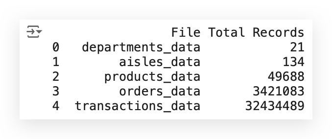
The resulting DataFrame now contains:
- One column with the name of each file.
- Another column showing the total number of records (rows) for each dataset.
With this, we always have access to the shape of each DataFrame, which provides two statistics:
- Number of rows (records).
- Number of columns (fields).
This quick summary helps us better understand the structure and size of our data.
# 6. Shape of departments_data
departments_data.shape

# (21, 2)
Let’s also use the head function to display the first few rows of the DataFrame, giving us a quick look at the data structure and its contents.
# 7. Display the first few rows of departments_data
departments_data.head()
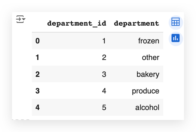
So, what do we have here?
We have a department_id and the department name. These are data related to a supermarket chain. Naturally, every supermarket is organized into departments, right?
Examples include: Frozen goods, Bakery & Alcoholic beverages, etc.
Additionally, within a supermarket, there are aisles. As you walk through, you find aisles for:
Examples include: Cleaning supplies, Cookies, Canned goods, Beverages, etc.
This hierarchical structure — departments and aisles — gives us a clear understanding of how products are organized in the store.
# 8. Shape of aisles_data
aisles_data.shape

# (134, 2)
In this case, we see that there are 134 rows in the dataset.
Let’s use head to take a closer look at the first few rows and better understand the data.
# 9. Display the first few rows of aisles_data
aisles_data.head()
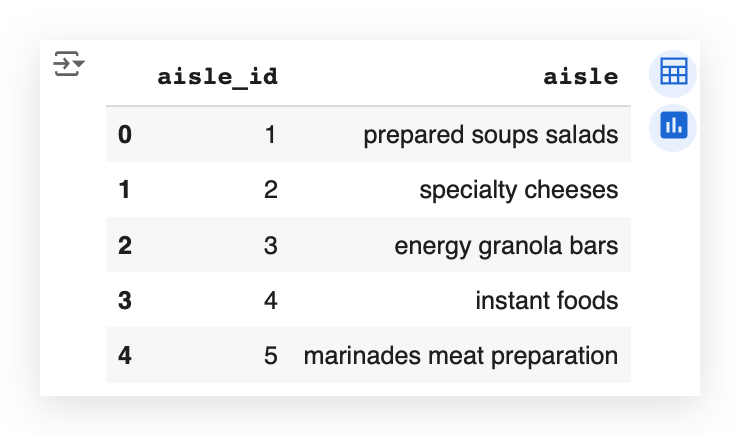
Each aisle indeed has a title. When you walk into a supermarket and look up, you’ll often see a sign indicating the name of the aisle.
What I’m doing here with you is interpreting the business problem.
Many people fail to understand that grasping the business problem requires looking closely at the process itself.
# 10. Shape of products_data
products_data.shape

# (49688, 4)
Next, let’s examine the products.
Notice that we have over 49,000 products, which is typical for a supermarket — thousands of items are usually available for purchase.
Let’s take a look at the first five rows to get a sense of the data.
# 11. Display the first few rows of products_data
products_data.head()

Here, we have the following columns:
- product_id: A unique identifier for each product.
- product_name: The product’s name.
For example, the first product is Chocolate Sandwich Cookies.
- aisle_id: Indicates that this product is located in aisle 61.
- department_id: Indicates that this product belongs to department 19.
This gives us a clue: there’s a relationship between the tables.
If such a relationship exists, we can perform a merge to combine the tables. If it doesn’t exist, we cannot fabricate it — relationships can only be established when they are inherently present.
It’s quite common for data from a source to be divided across multiple files. This happens because each dataset often represents a specific aspect of the information. When relationships exist, it’s possible to merge these datasets into a single unified table.
Next, let’s move on to the orders table and check its shape.
# 12. Shape of orders_data
orders_data.shape

# (3421083, 7)
The number of rows is increasing steadily, isn’t it?
Let’s now use head to examine the first few rows of the orders dataset. This will give us a clearer picture of its structure and contents.
orders_data.head()

In the orders dataset, we observe the following columns:
- order_id: The unique identifier for each order.
- user_id: The user who placed the order.
- eval_set: A classification that indicates whether the data is for test, training, or just visualization. While this is how it’s structured in the source data, for us, this field isn’t particularly relevant.
- order_number: The sequential number of the order placed by the user.
- order_dow: Abbreviation for day of the week.
- days_since_prior_order: Indicates the number of days since the previous order.
Key Observations:
- days_since_prior_order:
- If it’s the user’s first order, this field will be NaN (Not a Number), as no previous order exists to calculate the difference.
- NaN here doesn’t signify an error; it’s simply a missing value due to the context.
Example:
- The second record has a value of 15 in the days_since_prior_order column, meaning this order was placed 15 days after the previous one.
This dataset reflects a supermarket-like structure, often seen in online shopping platforms. Users select departments, aisles, and products, then complete their purchases.
Next, let’s examine the final dataset: transaction data.
# 13. Shape of transactions_data
transactions_data.shape

# (32434489, 4)
Here, we observe millions of records in the transactions dataset.
Next, let’s use head to examine the first few rows and understand the structure of this dataset.
# 14. Display the first few rows of transactions_data
transactions_data.head()
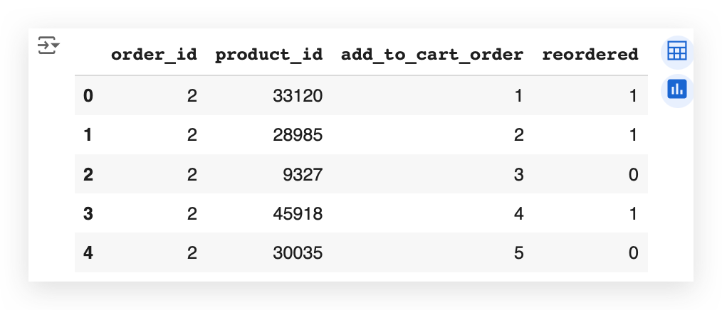
I have the order in which the product was added to the shopping cart.
Have you ever shopped online? You probably have, right? Have you used a shopping cart? How does it work?
You’re browsing on Amazon’s website. You add a product to the cart. Then you keep browsing the site. You go and add another product to the cart. Keep browsing. Another product. Satisfied? Ready to make the purchase? Then you proceed to checkout.
And there you have the order of the products in your shopping cart. Is that how it works?
So, here it’s listed the order of each product. Note that it’s the same order_id, the order in add_to_cart_order.
In this order number 2, the customer ordered all these products, adding them to the cart in this order: 1, 2, 3, 4, 5.
So, the product_id of 33120 was the first product added to the cart. 28985 was the second, 9327 the third, and so on.
I also have a column, which I’ll use shortly during the exploratory and descriptive data analysis, which is the reorderedcolumn.
What is a reorder?
See the first product here that has the number 1? This customer had already ordered this before.
The second one, with 0, is the first time they're ordering it. So, there was no previous order.
For example, imagine that on Wednesday you went to the site. You bought, say, bread, butter, and coffee. Okay? First time making the order.
Then you returned the next Wednesday, the following week. You added bread to the cart and now added coffee and milk.
The bread you're buying for the second time, right? So it's a product that's being repeated; you're buying that product again.
The milk you're buying for the first time.
This is the mapping we have in that last column.
Interesting, isn’t it? This is exactly understanding the business problem.
If you don’t understand how that process works, you can’t grasp what it represents. So you need to do some research, talk to the business area, look for documentation to understand how, for example, a site that behaves like a supermarket operates.
Where people can enter and buy products from departments, from aisles.
They can make the same order more than once.
Each order has several items, which are the purchased products.
Each product enters the cart in a specific order.
And these are the data we have in hand.
Checking for Missing Values
In the orders.csv file, we have over 3 million records.
In the transactions.csv file, there are over 32 million records.
Let’s now proceed to check for missing values in these datasets to ensure data quality.
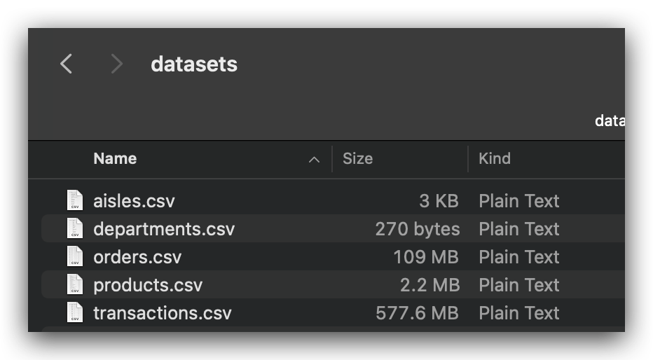
So, observe that in the orders dataset, we have over 3 million records.
# 12. Shape of orders_data
orders_data.shape

# (3421083, 7)
And here, in the transactions dataset, we have over 32 million records.
# 13. Shape of transactions_data
transactions_data.shape

# (32434489, 4)
Checking for Missing Values
To check for missing values, I will now iterate through each of the dataframes and query whether there are any NA (Not Available) values.
If there are, I will display the total count of missing values for each column.
# 15. Check for missing values in departments_data
departments_data.isna().sum()
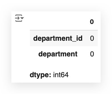
We checked the departments file and found zero missing values.
This makes our work easier for this particular dataset.
# 16. Check for missing values in aisles_data
aisles_data.isna().sum()
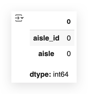
The aisles data is perfect as well — no missing values found.
# 17. Check for missing values in products_data
products_data.isna().sum()
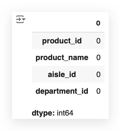
We’re in luck! Even the orders.csv file has no missing values — excellent!
# 18. Check for missing values in orders_data
orders_data.isna().sum()
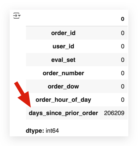
Let’s move to orders_data — oh, it was too good to be true, wasn’t it?
In the orders dataset, we have 206,209 missing values.
This dataset contains over 3 million records, but there’s an important detail: the NaN values in this case aren’t necessarily errors.
This occurs in the days_since_prior_order column.
- If it’s the first order for a customer, there’s no previous order, so this value simply doesn’t exist.
- While filling these NaN values with 0 is an option, it’s important to note that these aren’t errors; they represent the absence of prior orders for first-time customers.
The NaN values here reflect the lack of information rather than a mistake.

Depending on how we plan to use this column, whether it’s an error or not, we will need to handle the NaN values accordingly.
We’ll make a decision about this column shortly.
Now, let’s move on to the final table: the transactions table.
# 19. Check for missing values in transactions_data
transactions_data.isna().sum()
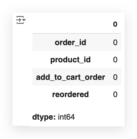
So, we only have NaN issues in one column across all the tables — at least there’s that!
Data Reorganization
Merge
It’s clear that there’s a relationship between the data across these tables.
We will perform a merge to combine all the data into a single table, which will allow us to analyze the dataset as a whole.
After that, we’ll decide how to handle any remaining missing values.
# 20. Merge
%%time
transactions_data = transactions_data.merge(orders_data, on='order_id', how='left')
transactions_data = transactions_data.merge(products_data, on='product_id', how='left')
transactions_data = transactions_data.merge(aisles_data, on='aisle_id', how='left')
transactions_data = transactions_data.merge(departments_data, on='department_id', how='left')
Observe that I am starting with the transactions data, which is the largest of all the tables, and performing a merge with each of the other four tables.
This will consolidate all the relevant information — aisles, departments, products, and the transaction data — into a single table.
To perform the merge, there must be a common column across the datasets:
- In orders_data, it’s order_id.
- In products_data, it’s product_id.
- In aisles_data, it’s aisle_id.
- In departments_data, it’s department_id.
I’m using the left join, so the table on the left side of the merge (transactions_data) remains the reference, and I save the merged result back into the same variable.
Since these tables are quite large — especially transactions and orders — I’ve included %%time to measure the execution time. It took approximately 27 seconds to complete.
Let’s now take a look at a sample from the merged dataset.
# 21. Display the first few rows of transactions_data after merging
transactions_data.head()

Take a look at what we have now — this is exciting!
For each row, we now have details such as the order_id, product_id, the order in which the product was added to the cart, and whether the product was reordered or not.
Additionally, we have the user_id, the eval_set (used for dataset identification purposes), and order_number.
Other important columns include order_dow (day of the week), order_hour_of_day, and days_since_prior_order.
Furthermore, the dataset includes the product_name, aisle_id, department_id, as well as the aisle and department names.
This consolidated table is much more comprehensive and contains all the data necessary for our analysis.
It’s important to highlight that this was only possible because of the existing relationships between the datasets.
These relationships were leveraged to merge the data effectively; however, relationships cannot be fabricated. If they exist, we use them — this is precisely what we did here.
Next, we’ll proceed to check for NA values, as expected. One of the columns previously had NA values, and they likely persist even after the merge.
# 22. Check for missing values in transactions_data after merging
transactions_data.isna().sum()
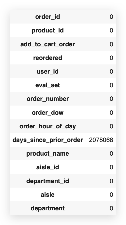
After performing the MERGE, the dataset now contains 2,078,068 missing values.
This likely happened because some entries didn’t find a match across the datasets during the merge.
As a result, the number of missing values increased significantly.
However, focusing solely on this large absolute number can be misleading.
A more meaningful approach is to consider the percentage of missing values relative to the entire dataset.
This provides a clearer view of the data quality and helps make better decisions on how to handle the missing entries.
# 23. Calculate the percentage of missing values in transactions_data
transactions_data.isnull().sum() / len(transactions_data) * 100
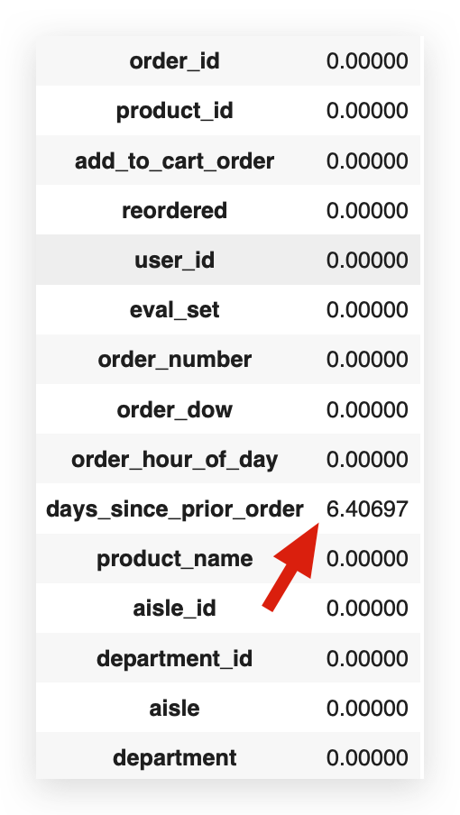
Calculating the percentage of missing values, we find that 6.4% of this column’s entries are missing. This raises a critical question:
What should we do about it?
Do we delete these entries? Handle the missing values differently? What’s the best decision?
Each choice carries implications and must be carefully considered based on the context of the analysis and the importance of this column in the dataset.
Making Decisions About Missing Values
If the decision were yours, you’re in a real-world project, facing the client, or in a selection process, and you had to decide on the missing values in this column. What would you do, and why?
Well, we have several alternatives here. Let’s discuss these options before choosing one.
The first option would be to handle the missing values. In this case, the column represents days since the last purchase.
I could, for example, replace the missing values with zero. But do you think zero would be correct? In this context, zero is an interpretable value.

Handling Missing Values in MBA Analysis
Here we have NaN values. Should we fill them with zero? No. Zero would suggest the order happened “zero days” after the last one, which isn’t true. Should we use the mean? Again, no — it would create false data.
The Alternatives:
1. Remove Rows: Deleting the rows would remove 2 million records (6.4% of the dataset) and valuable information in other columns.
2. Keep the Column: Since this column isn’t needed for MBA, we can leave it untouched and retain all rows.
The Decision:
The best choice here is to leave the column as is. It won’t impact the MBA algorithm, and we avoid losing valid data from other columns.
The Takeaway:
You don’t always need to treat missing values just because they exist. Analyze their relevance to your work. If the column isn’t needed, no action is necessary. This avoids unnecessary data loss and maintains the integrity of the analysis.
This decision fits this scenario, but in another context, your choice might differ — just make sure it’s justified.
Grouping Transactions
Now, we will perform a grouping of the data, specifically to represent transactions.
This step is essential for using the Apriori algorithm later, but I’ll prepare this grouping here so that you can use it, if necessary, to answer the 10 business questions that I will present shortly.
⚠️ Execution Time Alert: Take note that this cell took almost 3 minutes to run on my machine. Ensure you monitor its progress on your computer accordingly.
# 24. Group the data to prepare for the Apriori algorithm
%%time
grouped_df = pd.DataFrame(transactions_data.groupby('order_id')['product_id'])

# 25. Shape of the grouped DataFrame
grouped_df.shape

# (3214874, 2)
I grouped the transactions_data by order_id and product_id.
Here's the result:
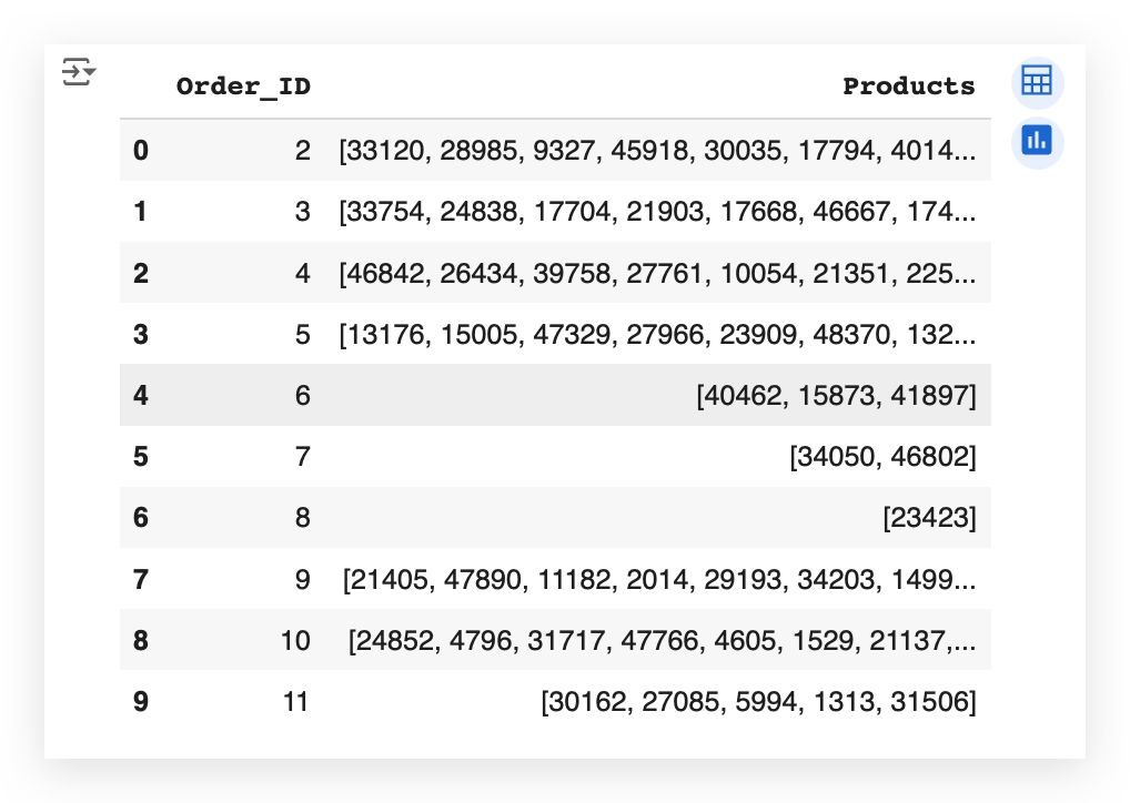
The result here shows the order_id for order number 2. Which products were in this order? A list of products.
For product number 3, which orders did it appear in? Product 7, two products. Product 8, for instance, only had one product, and so on.
The goal here was to group the data into a transaction format, which is what we need for Apriori to later apply MBA, the Market Basket Analysis.
Going back a bit, here we created a DataFrame.
# 24. Group the data to prepare for the Apriori algorithm
%%time
grouped_df = pd.DataFrame(transactions_data.groupby('order_id')['product_id'])

# 26. Display the first few rows of the grouped DataFrame
grouped_df.head()
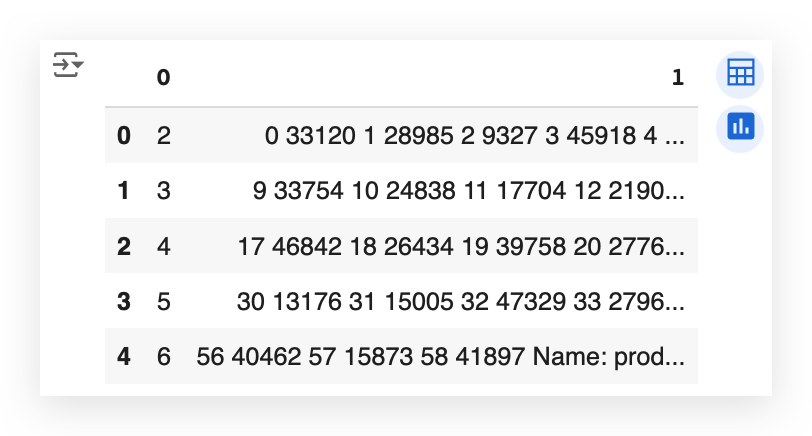
Notice that here we have the first column as 0 and the second column as 1 in the DataFrame, but it is not yet in list format.
# 27. List to store products
prod = []
So, I create an empty list, loop through the DataFrame, and then build the list of products.
# 28. Append products to the list
%%time
for i in range(len(grouped_df[0])):
    prod.append(list(grouped_df.iloc[i][1]))

# 29. Create a copy of the product list
prod_ = prod

# 30. Store the order IDs in a variable
order_ = grouped_df[0]

# 31. Prepare the DataFrame
transactions = pd.DataFrame({'Order_ID': order_, 'Products': prod_})

# 32. Display the first 10 rows of the transactions DataFrame
transactions.head(10)
Then, I take this list of products and add it to the final DataFrame, assigning it a title, such as “Product Orders.”
This becomes the DataFrame with the final result.

So now we have a mapping of each order with the products associated with that order.
Think of it as a shopping cart: whether you’re shopping online or physically in a supermarket, you add items to your cart.
An order, which represents a transaction, can include one or more products. This is exactly what we accomplished with this mapping.
Business Questions
- What is the Most Frequent Order Number Among Users?
Identify the most common number of orders placed by users. - Which Day of the Week Has the Highest Number of Orders?
Determine the day with the highest frequency of transactions. - What Hour of the Day Has the Highest Number of Orders?
Pinpoint the hour when most orders are placed. - Which Department Has the Highest Number of Orders?
Analyze the department that receives the most orders. - What Are the Top 20 Aisles by Order Frequency?
Rank aisles based on the number of orders they receive. - What Are the Top 20 Products by Order Frequency?
Identify the 20 most frequently ordered products. - Analyze New Orders Similar to Previous Orders (Reorder):
Behavior of orders repeated by users compared to new purchases. - Analyze Reorders by Department Over Time:
Explore reorder patterns for different departments across time. - Analyze Reorders and Orders:
Investigate the relationship between total orders and reorders. - Analyze Reorders by Aisle:
Examine reorder trends specific to individual aisles. - Analyze Reorders by Aisle (Total):
Evaluate the total reorders for each aisle to identify patterns.
1. What is the most frequent number of orders among users?
The first step is to interpret the question. This is where the majority struggles.
The solution to this problem can be achieved with a single line of Python code.
# 34. Group the data by user, aggregating by the highest order_number
max_order_count = orders_data.groupby("user_id")['order_number'].aggregate(np.max).reset_index()
max_order_count.head()
And here it is. This line is the solution to the problem.
So, the challenge is not programming, right? It’s just one line of code. There’s no need to write systems, applications, functions, or classes in Python. None of that. A single line of code using Pandas solves it.
But how did we arrive at this line? Let’s break the question down: What is the number of orders?
In the first step, I need to ask myself: Do I have the information about the number of orders?
Yes, I do. This information is available in the orders_data table.
# 33. Random sample of data
orders_data.sample(10)
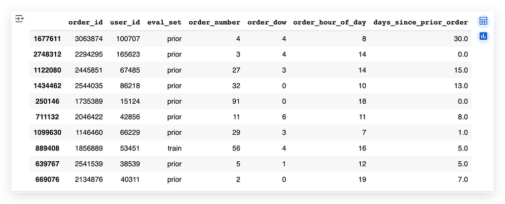
So, I’ll fetch a random sample using the sample function. Each time I execute this cell, the data will be different, but that's fine. My goal is simply to look at the data randomly.
So, what do we have here? We have user_id, which represents the user placing an order.
Wait a second — I just answered another piece of the question! When faced with a big problem, break it down into smaller problems. Solve each small problem, and before long, you’ll have a solution to the big problem.
In this table, do I have the number of orders? Yes, it’s the order_number. That's the number of orders. So, I have user_id, representing the users.
Great! A single table will be enough to solve the question.
What should I do now? Work on finding the most frequent.
I’ve broken the problem into three parts:
- Do I have the number of orders? Yes, I do. It’s in the table, and one of the columns already provides this information.
- Do I have user information? Yes, and it’s in the same table. Perfect!
Now, I need to calculate the frequency. That means I’ll count the occurrences, which is precisely the concept of frequency.
# 34. Group the data by user, aggregating by the highest order_number
max_order_count = orders_data.groupby("user_id")['order_number'].aggregate(np.max).reset_index()
max_order_count.head()
And that’s exactly what we do in this Python code. Take a look:
The data for orders is stored in the DataFrame. I'll group by user_id. This means I'll create a grouping: fetching all records for one user, all records for another user, and so on. This process is fully explained within the notebook itself.
Once the grouping is complete, I’ll use np.max. Here, np refers to NumPy, and max, as the name suggests, gives the maximum value.
So, I’ll aggregate by order_number, which represents the number of orders for each user. I'll extract the maximum value, i.e., the highest number of orders for each user.
After doing this, I’ll perform an index reset. Why? Because I’ll generate a new dataset, and the indices will get scrambled — a common issue in Pandas.
Thus, I’ll reset the indices and store this new dataset in another DataFrame called max_order_count.
And there you have it:
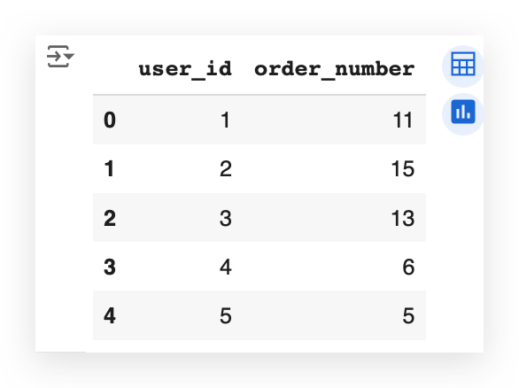
Now, I have the maximum number of orders for each user. For example:
- user_id 1 made 11 orders.
- user_id 2 made 15 orders.
- user_id 3 made 13 orders.
A user can place multiple orders… but does this answer the question yet?
Not quite, because I need the most frequent number of orders.
From these order counts, which number appears the most often?
I could take an additional calculation step, or I could simply plug this data directly into a chart and let the visualization answer the question for me.
# 37. Plot
plt.style.use('ggplot')
plt.figure(figsize=(20, 8))
plt.bar(max_order_count.index, max_order_count.values, color='green', width=0.6)
plt.xticks(max_order_count.index, rotation='vertical')
plt.ylabel('Frequency', fontsize=14, fontweight='bold')
plt.xlabel('Most Frequent Order Number Among Users', fontsize=14, fontweight='bold')
plt.show()
To help you fully understand what we’re doing, I’ll fetch the DataFrame we just created.
I’ll focus on the OrderNumber, which represents the number of orders, right?
Next, I’ll apply value_counts.
# 35. Frequency of each order number value
max_order_count = max_order_count.order_number.value_counts()
max_order_count.head()
This counts the occurrences for each number of orders.
I’ll show you the first few records.
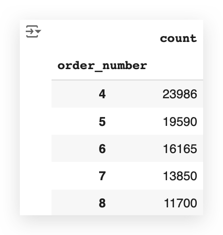
The head function shows the first few records.
Which number appears most frequently here? It’s 4.
What does this line of code do? It simply takes the order_number and calculates how many records there are—meaning, how many users placed 11 orders, how many placed 15 orders, and how many placed 13 orders.
And it shows the results:
- 4 orders: 23,986 users.
- 5 orders: 19,590 users.
- 6 orders: 16,165 users.
This DataFrame now contains both the index and the value:
- The index represents the number of orders.
- The value represents the frequency.
So, I take the index, the values, plot them on a chart, execute it, and let the chart provide the answer. Take a look:
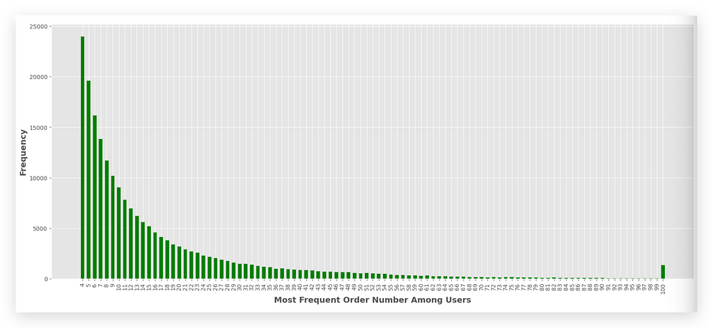
Which number of orders appears most frequently? It’s 4, right? It’s the tallest bar at the beginning of the chart.
This is the answer to question 1.
To create the chart, I used the ggplot style. ggplot2 is an excellent library in the R programming language. I can replicate the same chart style here using Python.
As an example:
- First, I set the figure size, which determines the dimensions of the entire chart.
- Then, I use plt.bar to create a bar chart. A bar chart requires two dimensions: x and y.
On the x-axis, I plot the index, which represents the number of orders (e.g., 4, 3, 2, 12, and so on).
On the y-axis, I plot the frequency, which represents the values.
In a Pandas DataFrame, the index always comes first.
The rest is just formatting:
- I set the color and width of the bars.
- I add the ticks, and in this case, I label them with the index, representing the number of orders.
As you can see, the number 4 is the most frequent. This means the majority of users placed 4 orders. After that, the most common counts are 5, then 6, and so on, gradually decreasing.
There’s even an outlier at the very end — some users placed 100 orders! These could be loyal customers, or it might indicate an error in the data.
Finally, I complete the formatting by adding labels to the x and y axes and displaying the chart.
2. Which day of the week has the highest number of orders?
This is a big problem. Let’s break it down into smaller problems.
Do I have information about the day of the week?
Yes, I do! You’ll need to explore each table and each DataFrame. Eventually, you'll discover that the orders_data table has a column called order_dow.
DOW stands for Day of the Week. By consulting the data source, you can interpret the meaning of each column.
So, I already have the information about the day of the week. Great!
If I didn’t have this data, I would need to find it in another table, check for a date field, right? But that’s not necessary here. I already have a column containing the day of the week — for each order. Perfect!
Now, let’s tackle another part of the problem.
Do I have the number of orders?
Yes, I do! It’s represented by order_number, or simply by each row in the table.
So, now I need to identify the largest value — the day of the week with the highest number of orders.
To do this, I’ll calculate the frequency count, i.e., the occurrences of each value in order_dow, which represents the day of the week.
# 39. Frequency count (occurrence) of each value of order_dow
orders_data.order_dow.value_counts()
So, I’ll take the table, select the column, and apply value_counts().
This function counts the occurrences of each element in that column, for every value it contains.
And watch the magic happen.

This column contains values ranging from 0 to 6, representing the 7 days of the week. Each number corresponds to a day: 0 for Sunday, and 6 for Saturday. From 0 to 6, all days of the week are covered.
What does the command do?
It counts the frequency of orders for each day:
- How many orders occurred on day 0 (Sunday)?
- How many on day 1, and so on.
The results are delivered in descending order. For example:
- Day 4 (Thursday) might have the fewest orders, while Day 0 (Sunday) has the most.
This command using value_counts already answers the question effectively, as it's typically used for data exploration. However, for presentation purposes, I will illustrate the results in a graphical format for the audience.
# 40. Index for the days of the week
x = [0, 1, 2, 3, 4, 5, 6]
I will do the following — I will prepare X and Y to include in a bar chart, which requires two dimensions. For X, I will include the index 0 to 6. It’s a Python list.
# 41. Frequencies of orders by index (day of the week)
y = orders_data['order_dow'].value_counts().sort_index().tolist()
For Y, I will execute the same command as above, but now I will use sort_index() to ensure the data is ordered by the index, which in this case represents the day of the week.
Without specifying sort_index(), it would sort by frequency, from highest to lowest.
However, I don’t want to display the data from highest to lowest, because that would disrupt the temporal order.
Now, I want to present it in the chart in a way that helps my audience follow the correct sequence of time, i.e., the days in the proper order.
That’s why I’m sorting by the index, which corresponds to the days of the week. Then, I convert this to a list using .tolist() and save it in Y.
# 42. Plot
plt.figure(figsize=(12, 4))
plt.bar(x, y, color='purple')
plt.xlabel('Day of the Week', fontsize=14, fontweight='bold')
plt.ylabel('Frequency', fontsize=14, fontweight='bold')
plt.xticks(x, ['Sunday', 'Monday', 'Tuesday', 'Wednesday', 'Thursday', 'Friday', 'Saturday'], rotation=45)
plt.show()
I now have two lists: one with the indices (days of the week) and another with the corresponding frequencies.
Next, I call plt.bar, passing X (the indices) and Y (the frequencies). I also set the labels for clarity. I’ll even explain the days of the week here for you:
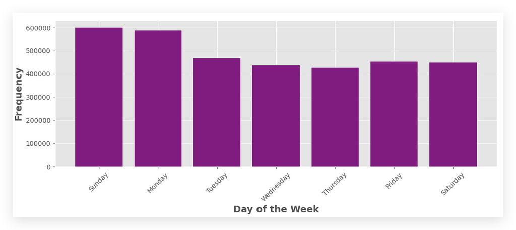
Which Day of the Week Has the Highest Number of Orders? Sunday!
3. What Hour of the Day Has the Highest Number of Orders?
This question is very similar to the previous one. The only difference is that instead of analyzing the day of the week, we’re now focusing on the hour of the day.
Why Two Solutions?
I’m providing two solutions to help you learn more effectively.
- Solution 1: Uses Python’s native resources.
- Solution 2: Leverages Pandas functionalities.
Both approaches return the same result. However, they showcase different ways to solve the problem.
Breaking the Problem into Steps
- Step 1: Check if we have the data for the hour of the day in the orders_data table.
- Step 2: Use this data to compute the most frequent order hour.
- Step 3: Implement both solutions and analyze their differences.
Let’s start by confirming if the hour of the day is available in our dataset.
# 43. Display the first few rows of orders_data
orders_data.head()

Yes, I have it. I don’t need to fetch the information from another table.
I already have a column that indicates the hour of the day for each order.
Do I already have the number of orders? Yes. I just need to count the occurrences in this table.
Once I’ve done the counting, I find the highest value.
Here’s what I’ll do in the first solution, using what I call pure Python.
# 44. Frequencies of orders by hour of the day
x1 = list(range(0, 24))
print(x1)

I’m going to create a range from 0 to 24.
The range function creates an interval of values. This interval starts from the first number (before the comma) and goes up to the number immediately before the second number.
In other words, the second number (24) is exclusive, meaning it’s not included in the list.
So, in this case, I’ll create a range of values from 0 to 23.
What are these values? They represent the hours of the day, from 0 to 23.
# 45. Frequencies of orders by hour of the day
y1 = []
for i in range(0, 24):
    y1.append(orders_data[orders_data['order_hour_of_day'] == i].shape[0])
print(y1)
After that, I’m going to extract the frequencies, which represent the occurrences of orders, and assign them to y1.
Why? Because I need to prepare X and Y to plot them on the graph, one for each axis.
I’ll take orders_data, filter it with orders_data itself (specifically, with a condition applied to its column).
What’s the condition? The order_hour_of_day must equal the value of i.
Where does this i come from? It comes from the loop we’re creating above. This loop iterates from 0 to 23 (since 24 is exclusive and isn’t part of the range). The loop will perform this process multiple times.
When the loop starts for the first time, what’s the value of i? It’s 0.
At this point, it checks whether there’s any order where the hour_of_day is 0. If it finds any, it will return all the corresponding data. The result will be a table.
From this table, I’ll retrieve its shape, which tells me the number of rows and columns.
The first element of the shape represents the number of rows.
- If it’s 0, it means no orders and returns 0.
- If there’s 1 order, it returns 1.
- If there are 8 orders, it returns 8.
And so on. I’ll repeat this process for every hour of the day.
As I go, I’ll append each result to the list I created earlier:

At hour 0, we had 22,758 order, 1 there were 12,398 orders. And so on.
You don’t want to keep analyzing this small table, list, or anything like that. It’s not very pleasant.
So, let’s plot this data on a graph.
# 46. Plot
plt.figure(figsize=(20, 5))
plt.bar(x1, y1, color='green')
plt.xticks(np.arange(0, 24, 1))
plt.xlabel('\nHour of the Day', fontsize=14, fontweight='bold')
plt.ylabel('Frequency', fontsize=14, fontweight='bold')
plt.show()
Call plt.bar. Use X1 and Y1. The rest is just formatting — then execute it.

So, what was the hour of the day with the highest number of orders?
10 a.m..It’s the tallest bar in the graph.
If you want, you can also find the highest value from the list — it’s exactly the same thing. But with the graph, it’s more visually appealing.
10 a.m. and 3 p.m. (15:00) are the largest bars as well.
This way, I deliver even more than the question asks for. I provide the total number of orders, broken down by hour of the day.
You’ll notice that during the night, there are very few orders, which is expected. People are asleep. But if someone is hungry, they place an order.
During business hours, the number of orders is much higher.
For the plt.xticks, I’m creating a range to generate a list of values from 0 to 24 (excluding 24).
The step is 1, so I get each element and use it as the X-axis label on the graph.
This is a Python-based solution, meaning I used "computer programming."
Now, I’ll use a Pandas solution — It’s actually much simpler.
That’s why everyone loves Pandas — it’s like the Excel of Python in many ways. Here’s how:
# 47. Group by hour of the day and count the orders
frequency_by_hour = orders_data.groupby('order_hour_of_day').size()
frequency_by_hour.head()
Take your table — Group it by the column and get the size.
Look at this:
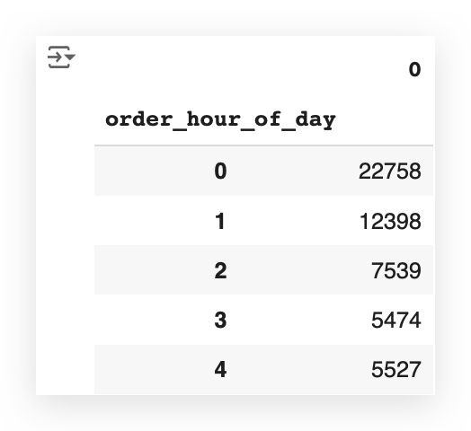
Remember, the head function only returns a sample of the data.
Now, notice that I have the exact total — the size—for each hour of the day.
If you want to see all the rows, you can set it to 24, for example:
# 48. Display the first 24 entries of frequency_by_hour
frequency_by_hour.head(24)
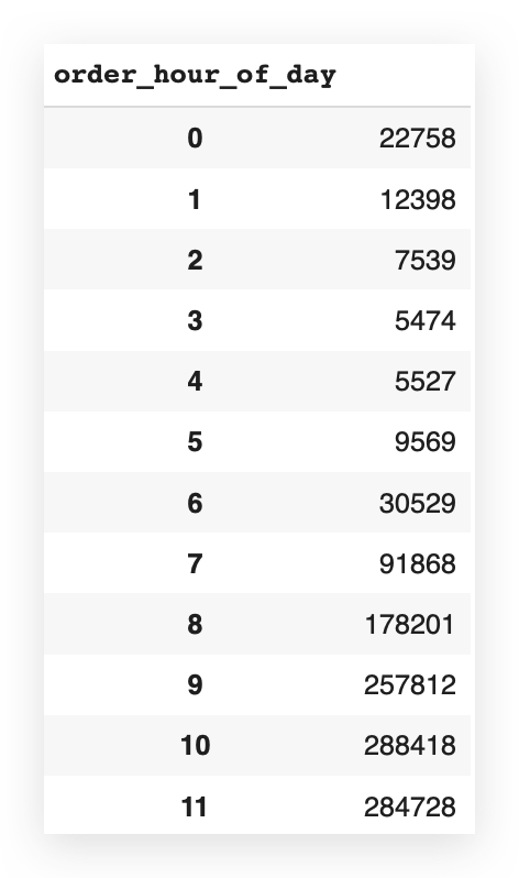
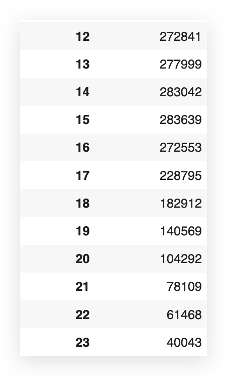
Now, I have the number of orders for each hour of the day.
But you’re not going to want to keep looking at this little table — it’s not very pleasant.
# 49. Extract hours and counts into lists x and y
x2 = frequency_by_hour.index.tolist()
y2 = frequency_by_hour.values.tolist()
So, I’m going to take the hourly frequency from my dataset — the index and the values What’s the index — The hour of the day.
And what are the values? The frequency, or the number of orders.
I’ll take these values, convert them into lists, naming x2 and y2.
# 50. Plot
plt.figure(figsize=(20, 5))
plt.bar(x2, y2, color='magenta')
plt.xticks(np.arange(0, 24, 1))
plt.xlabel('\nHour of the Day', fontsize=14, fontweight='bold')
plt.ylabel('Frequency', fontsize=14, fontweight='bold')
plt.show()

The graph now looks exactly the same as the previous one, but it’s based on the values I just extracted.
In general, the best alternative is the Pandas syntax, okay?
Pandas is optimized for this type of task. For grouping, fetching values, totals — Pandas was designed specifically for that.
If you’re working with a larger dataset, Pandas will usually provide better performance.
Besides that, the syntax is much easier. You don’t need to think about programming logic. You just need to know Pandas.
Here’s what I do:
I perform a grouping to count the total records for the elements in the column order_hour_of_day.
That’s basically SQL — The syntax in Pandas is very SQL-like.
Then, I extract one of the methods from this result, which is the size.
This method gives me the totals for each value in the column.
After that, I convert the information into lists and plot it on the graph.
So, in the vast majority of cases, the solution with Pandas will be better.
That said, solution 1 is also completely correct. Both graphs are identical, by the way. Solution 1 makes more sense if you want to customize something along the way.
However, if the goal is simply to fetch the number, then Pandas is clearly better and also easier.
4. Which department has the highest number of orders?
This is very similar to items 2 and 3—the same strategy applies.
Do I already have this department information in the orders table?
Let’s take a look.
# 51. Display the first few rows of orders_data
orders_data.head()

There’s nothing about the department here. If it’s not in this table, let’s look in the others.
Let’s check transactions_data.
# 52. Display the first few rows of transactions_data
transactions_data.head()
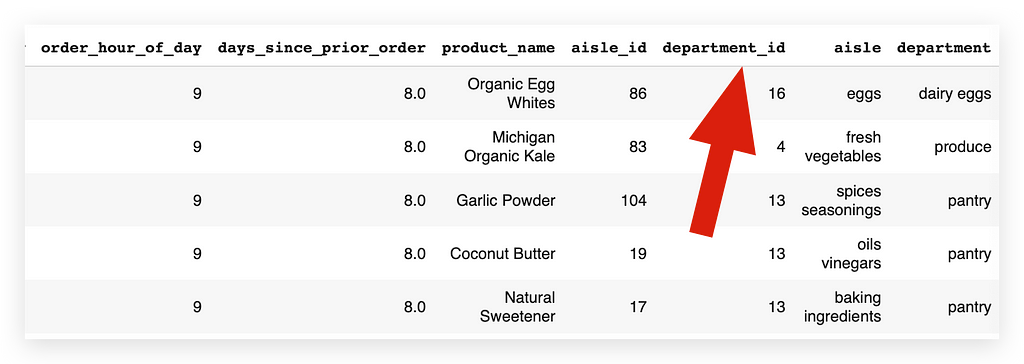
Here, I have the department information: Both department_id and the department itself — Excellent!
That’s fine. I’ll look to see if I have the information here.
# 53. Count of orders by department
department_count = transactions_data['department'].value_counts()
department_count.head()
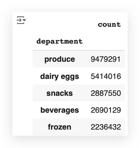
I’ll fetch the column with the department name from transactions_data.
Then, I’ll perform a count to see how many transactions — reflecting the orders — I have for each department.
I’ll save this in another DataFrame called department_count,take this data and plot it on a graph.
# 54. Plot
fig = plt.figure(figsize=(20, 10))
department_count.plot(kind="bar", color='maroon')
plt.xticks(rotation=90)
plt.xlabel('\nDepartment', fontsize=14, fontweight='bold')
plt.ylabel('\nFrequency', fontsize=14, fontweight='bold')
plt.show()
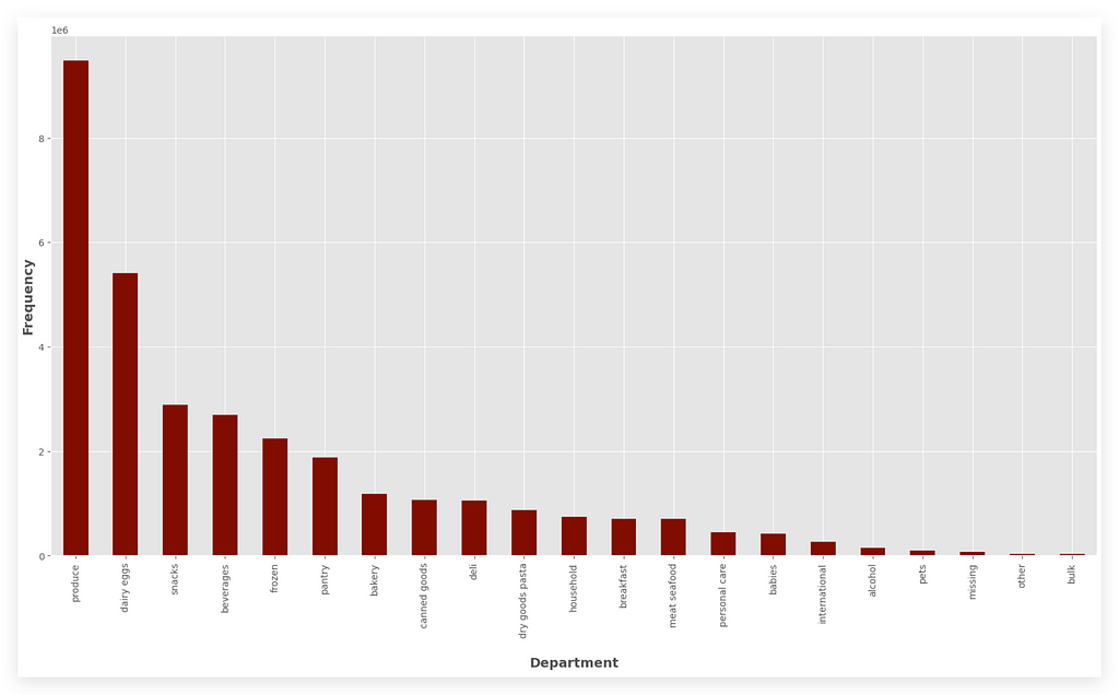
I’ll take department_count. I’ll call the plot method and create a bar chart.
I’ll set the color, and the rest is just formatting.
5. What are the top 20 aisles with the highest order frequency?
In a supermarket, you have aisles where shelves with products are located.
Alright, I want to find out which product aisles have the highest order frequency.
This can help the company improve its logistics, organization, assign employees to work more efficiently in one aisle versus another, better organize orders, and so on.
So, let’s check if this information is available in transactions_data.
# 60. Display the first few rows of transactions_data
transactions_data.head()

There’s aisle_id and the name of each aisle.
So, if I already have this information in the table, great!
What do I need to do? Simply use value_counts once again.
# 61. The top 20 aisles and their order frequency
aisle_count = transactions_data['aisle'].value_counts()
When I use value_counts, it will count the number of records—i.e., the frequency—for all the elements in that column.
In this case, for all the aisles. But do I want all of them?
No, I just want the top 20 — so, I’ll filter from 0 to 20.
# 62. Display the top 20 aisles and their order frequency
aisle_count[0:20]
You know that indexing starts at 0, so when you slice, as I’m doing here, the second value is exclusive.
This means the range goes from 0 to 19, which gives us 20 elements.
I can’t set 0 to 19 here because 19 would be excluded from the result.
So, if I want 20, I use 0 to 20, which totals 21 elements, but the last value (20) won’t be included in the final result.
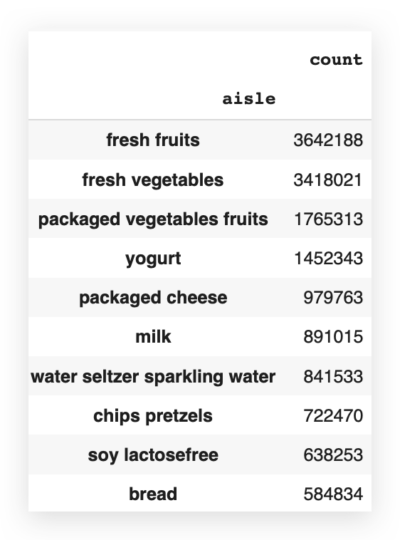
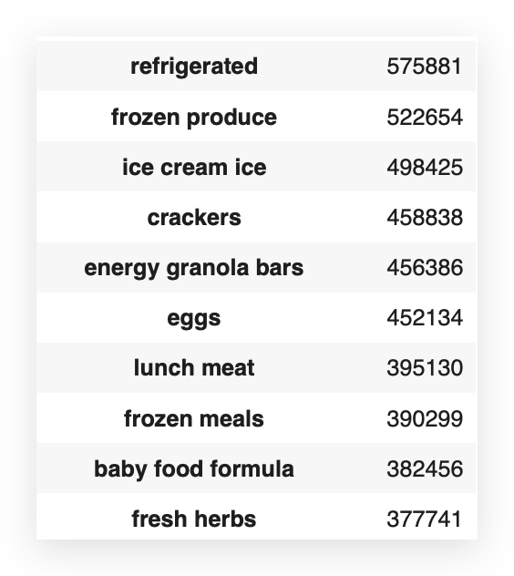
And here you have the top 20 aisles, showing the exact highest order frequencies. Now, let’s plot this data on a graph.
# 63. Plot
fig = plt.figure(figsize=(20, 10))
aisle_count[0:20].plot(kind="bar", color='darkgoldenrod')
plt.xticks(rotation=90)
plt.xlabel('Aisle', fontsize=14, fontweight='bold')
plt.ylabel('Frequency', fontsize=14, fontweight='bold')
plt.show()
So, I take the filter I just applied — this is a Pandas DataFrame.
I call the plot method, set the elements I want, add formatting, color, type, and rotate the text on the X-axis. Execute it, and there it is:
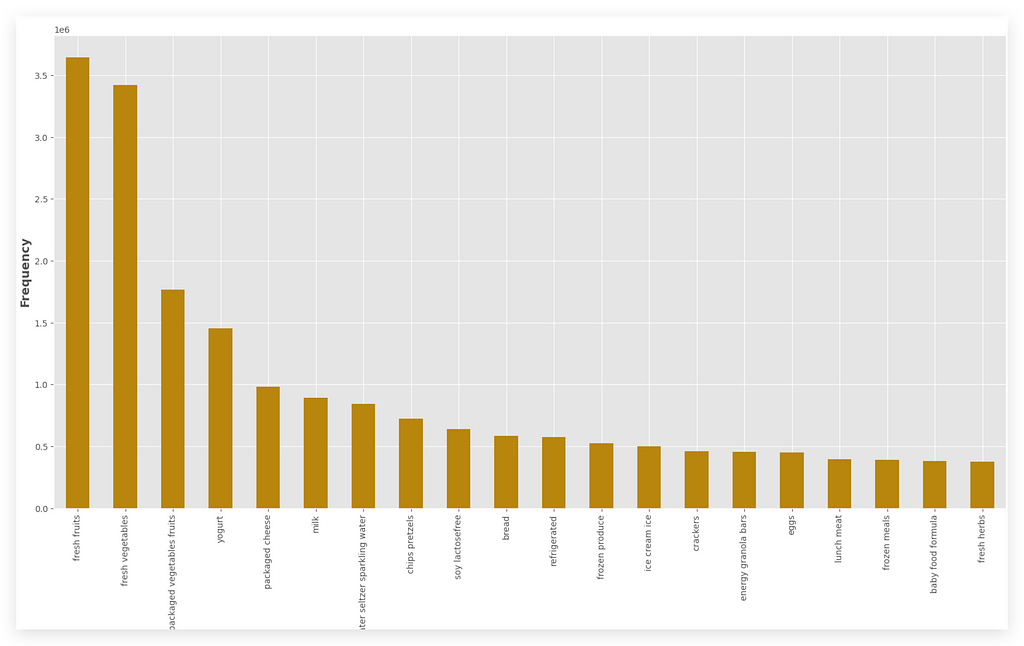
Which aisle has the highest number of orders, the highest frequency?
It’s Fresh Fruits. Next comes Fresh Vegetables, and so on.
But what if they weren’t all in the same table?
In that case, you already know — you’d need to perform a join, calculate the frequency, and then merge the results.
Here’s what it would look like if you did everything manually:
# 65. Count the frequency of each product in transactions_data
product_frequency = transactions_data['product_id'].value_counts()

# 66. Create a dictionary to map product_id to aisle_id
product_to_aisle = dict(zip(products_data['product_id'], products_data['aisle_id']))

# 67. Create a dictionary to map aisle_id to aisle name
id_to_aisle_name = dict(zip(aisles_data['aisle_id'], aisles_data['aisle']))

# 68. Calculate the frequency of each aisle
aisle_frequency = {}
for product, freq in product_frequency.items():
    aisle_id = product_to_aisle.get(product)
    if aisle_id:
        aisle_name = id_to_aisle_name.get(aisle_id, "Unknown Aisle")
        aisle_frequency[aisle_name] = aisle_frequency.get(aisle_name, 0) + freq

# 69. Sort the aisles by frequency and get the top 20
top_aisles = sorted(aisle_frequency.items(), key=lambda x: x[1], reverse=True)[:20]

# 70. Display the top 20 aisles
for aisle, freq in top_aisles:
    print(f"Aisle: {aisle}, Frequency: {freq}")
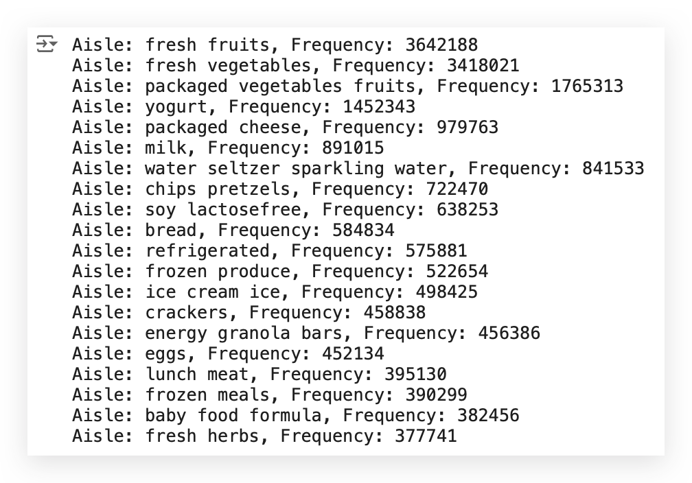
Notice that the result is exactly the same as before.
So, what did I do?
- Count the frequency of each product in transactions_data.
- Create a dictionary to map product_id to the aisle ID.
- Create another dictionary to map the aisle ID to the aisle name, assuming I didn’t already have all this information in one table.
I’m using this opportunity to share more knowledge with you.
Next, I calculate the frequency of each aisle. Then, I run a loop with a conditional to retrieve the exact frequencies.
I sort the aisles and fetch the top 20. Finally, I print each aisle and its corresponding frequency using a loop.
Having all the data in a single table makes our job easier — it’s excellent.
But if everything isn’t in the same table (and trust me, sometimes you won’t get everything in one table), then there’s no other way.
You’ll need to create some logic to handle the joins, calculate the frequencies, and then extract the result.
6. What are the top 20 products by order frequency?
The same logic as before applies. Have you noticed the pattern?
When I find a pattern, there’s a learning opportunity.
Something that repeats itself frequently is always an opportunity to learn.
Do I have product information? Do I have order information?
Can I calculate this frequency? Can I filter for the top 20?
Yes, I can do all of this from a single table, which is transactions_data.
# 71. Display the first few rows of transactions_data
transactions_data.head()

I take my table, retrieve the product_name column (which contains the product names), and perform a value count to calculate the frequency.
# 72. The top 20 products by order frequency
product_count = transactions_data['product_name'].value_counts()

# 73. Display the top products by frequency
product_count.head()
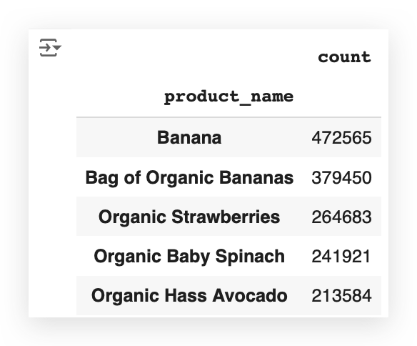
I can already see that banana is at the top of the list. So, it’s likely the product with the highest frequency.
But I don’t want to know just the first one, nor do I want to know all of them — I only want to know the top 20.
# 74. Display the top 20 products by frequency
product_count[0:20]
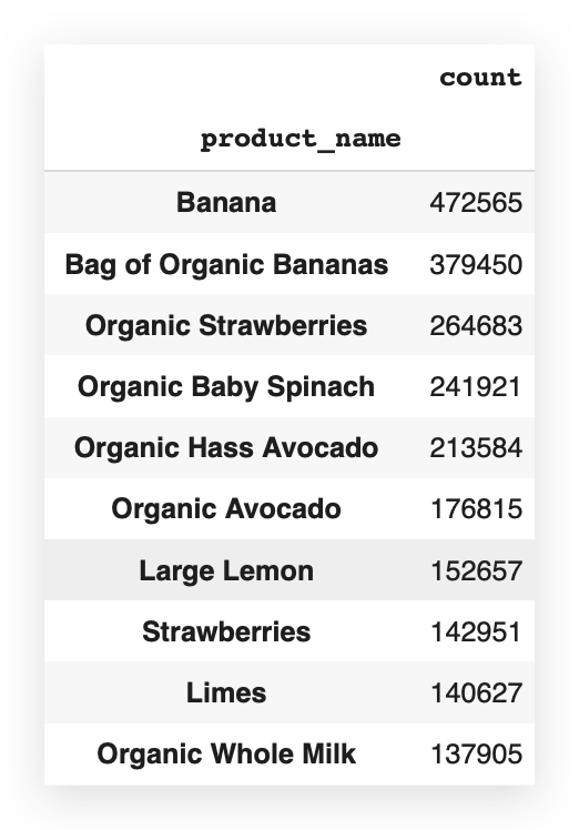
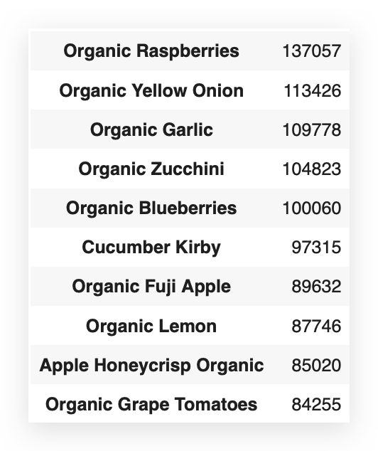
So, I’ll filter from 0 to 20, knowing that 20 is exclusive.
I apply the filter, and there it is for you. I’ll take this data and plot it.
# 75. Plot
fig = plt.figure(figsize=(20, 6))
product_count[0:20].plot(kind="bar", color='purple')
plt.xticks(rotation=85)
plt.xlabel('\nProduct', fontsize=15, fontweight='bold')
plt.ylabel('\nFrequency', fontsize=15, fontweight='bold')
plt.tight_layout()
plt.show()
I can use the exact filter I just created. This is a Pandas DataFrame.
I call the plot method. After that, it’s all about formatting. Everything here is just formatting.

Answering the question: Here are the top 20 products with the highest order frequencies.
And banana is the clear champion, located in the Fresh Fruits aisle.
Now, if you go back to one of the previous graphs, take a look at this:
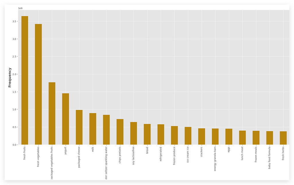
Which aisle has the highest order frequency? It’s Fresh Fruits.
So, it makes perfect sense that banana is the product with the highest order frequency. In other words, the data is entirely consistent.
This is also important — always compare information across graphs to ensure it makes sense.
You might detect an anomaly or an issue in your logic or code.
So, always keep comparing to check if things align or not.
7. Analysis of new orders similar to previous ones
Did the customer go to the supermarket and buy a banana? Then, did they return a week later and buy banana again?
In other words, did they place a new order, a reorder, or make a repeat purchase? That’s the question.
This is exactly what I want to investigate. Why?
If a customer buys an item once and then returns to buy the same item again, I can use that information in a recommendation system.
It likely means I’m offering a product that the customer likes.
This insight will help the business team develop more effective marketing strategies later.
# 76. Group the data by product_name and get count and sum
%%time
temp_df1 = transactions_data.groupby("product_name")["reordered"].agg(['count', 'sum']).rename(columns={'count': 'total', 'sum': 'reorders'})
temp_df1 = temp_df1.sort_values('total', ascending=False).reset_index()

How do we solve this?
I’ll use transactions_data.groupby to group by product_name and the column reordered, which indicates whether there was a repeat order.
In other words, it tells us if the customer bought the same product more than once. Then, I aggregate using count and sum.
I rename the columns to make the names more coherent.
Finally, I apply sort_values to sort the data in descending order and use reset_index to finalize it.
— What I just described is detailed in the notebook.
By the way, the %%time is used to measure the execution time.
You’ll see that it takes a little while, but in the end, we get temp_df1.
# 77. Prepare the lists with the top 20 records (to avoid cluttering the chart)
labels = list(temp_df1.product_name[0:20])
reorder = list(temp_df1.reorders[0:20])
total = list(temp_df1.total[0:20])
So, now let’s apply the filter, because I want the top 20 records.
You can display everything if you want, but that would make the graph too cluttered. So, I’ll filter for just the top 20.
Then, I’ll plot everything, following the same pattern as in the previous items I’ve already noted.
# 78. Plot
width = 0.35
fig, ax = plt.subplots(figsize=(20, 10))
ax.bar(labels, reorder, width, label='Reorder', color='green')
ax.bar(labels, total, width, bottom=reorder, label='Total', color='red')
ax.set_ylabel('Total Orders', fontsize=14, fontweight='bold')
ax.legend()
ax.set_title("Most Popular Products")
plt.xticks(rotation=85)
plt.show()
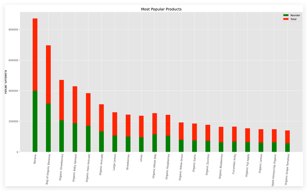
Here are the most popular products.
Notice that I have the legend on the X-axis and the total orders on the Y-axis. The green bar represents the reorder, while the red bar shows the total orders.
Looking at the data, banana stands out as the product that is most frequently reordered — meaning it’s the product people purchase more than once.
Next comes the organic bag of bananas, which is basically a bag of organic bananas. Following that is organic strawberries.
In the United States especially, people love these organic, vegan, and similar products. This explains why these products show high reorder rates.
The real challenge lies in the interpretation of the problem.
8. Analysis of reorder by department over time
The key here lies in the reordered column.
You just need to group by what you need — in this case, the department—while applying the filter on the column that indicates the reorder.
# 79. Group the data by department and reorder
df_temp2 = transactions_data.groupby(["department"])["reordered"].aggregate("mean").reset_index()
df_temp2.head()
Then, you aggregate the data, calculating the average, for example.
After that, use reset_index to create a new DataFrame, df_temp2:
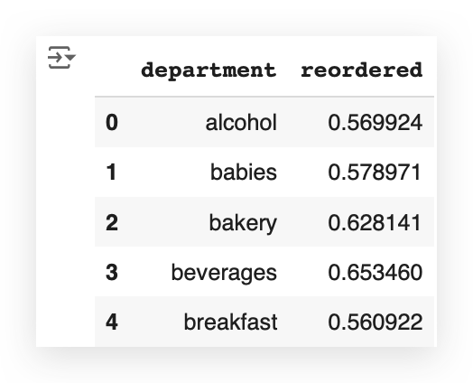
You take this table and then plug it into a graph.
# 80. Plot
plt.figure(figsize=(12, 8))
plt.plot(list(df_temp2['department']), df_temp2['reordered'].values, alpha=0.8)
plt.scatter(list(df_temp2['department']), df_temp2['reordered'].values)
plt.ylabel('Reorder Rate', fontsize=12)
plt.xlabel('\nDepartment', fontsize=12)
plt.title("Department vs Reorder Rate", fontsize=15)
plt.xticks(rotation=85)
plt.show()
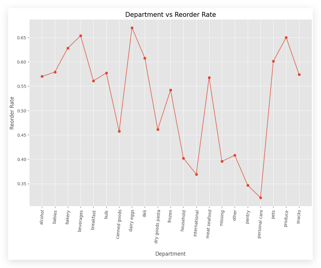
Department vs Order Rate, which means orders that are placed more than once.
On the X-axis, I have the department, and on the Y-axis, I have the reorder rate.
This isn’t something you interpret as an increase or decrease, because each column represents a department.
For example, the alcohol department — that is, alcoholic beverages — has a reorder rate of approximately 0.58.
If you want, you can also sort the X-axis to display departments from the smallest to the largest reorder rate.
# Sorting the DataFrame by the 'reordered' column value
df_temp2 = df_temp2.sort_values(by='reordered', ascending=False)

# Generating the sorted plot
plt.figure(figsize=(12, 8))
plt.plot(list(df_temp2['department']), df_temp2['reordered'].values, alpha=0.8)
plt.scatter(list(df_temp2['department']), df_temp2['reordered'].values)
plt.ylabel('Reorder Rate', fontsize=12)
plt.xlabel('\nDepartment', fontsize=12)
plt.title("Department vs Reorder Rate", fontsize=15)
plt.xticks(rotation=85)
plt.show()
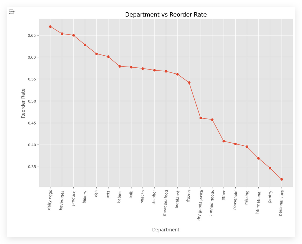
In our case, the X-axis is sorted alphabetically, which I believe makes more sense given the department names.
9. Analyze Reorders and Orders
This question is a bit more challenging. Analyze reorders and orders — but what’s the relationship between them?
Should I analyze by department, aisle, or perhaps a specific product?
In a real company setting, you might reach out to the business team, refer to the documentation, or ask your manager for guidance.
Here, the goal is for you to come out on the other side with something meaningful.
For example, you could group the data by department and reorder.
# 81. Group the data by department and reorder
%%time
df_temp3 = transactions_data.groupby("department")["reordered"].agg(['count', 'sum']).rename(columns={'count': 'total', 'sum': 'reorders'})
df_temp3 = df_temp3.sort_values('total', ascending=False).reset_index()

That was an option. This is exactly what we’re doing here — with aggregation, calculating counts and sums, very similar to item number 7.
When executed, it will generate df_temp3. Let’s take a look at the head.
# 82. Display the first few rows of the grouped DataFrame
df_temp3.head()
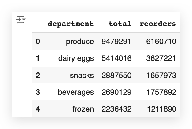
Now, I’ll also filter the top 20 records, just to avoid cluttering the graph.
# 83. Lists
labels = list(df_temp3.department[0:20])
reorder = list(df_temp3.reorders[0:20])
total = list(df_temp3.total[0:20])
And then, we create the plot.
# 84. Plot
width = 0.35
fig, ax = plt.subplots(figsize=(20, 10))
ax.bar(labels, reorder, width, label='Reorder', color='magenta')
ax.bar(labels, total, width, bottom=reorder, label='Orders', color='blue')
ax.set_ylabel('Total Orders', fontsize=14, fontweight='bold')
ax.legend()
ax.set_title("Total Orders and Reorders by Departments")
plt.xticks(rotation=85)
plt.show()
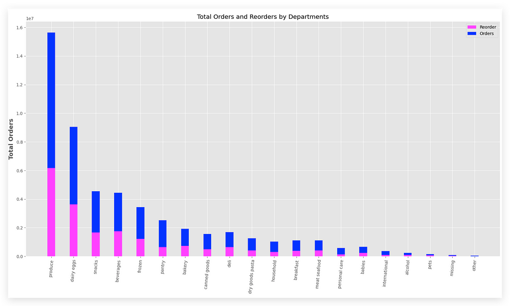
You can see here the total orders and reorders for each department.
The pink bar represents the reorders, and the blue bar represents the total orders. For example, take the Produce department.
This department has a high number of orders (blue), but also a reasonable reorder rate (pink).
Now, look at another department, like Dairy Eggs. In this case, the proportion is quite similar, isn’t it?
This means people frequently reorder these items, as represented by the second bar (pink). And so on — you can analyze the other bars for each department.
In other words, item number 9 was left open-ended so you could make a decision on how to analyze it.
If, on the other hand, you’re working in your day-to-day job and can’t produce a result because you lack sufficient information, then ask.
10. Analyze Reorders by Aisle
For this question, we’re looking at the analysis of reorders by aisle.
Notice the difference between what we’re doing here and what we did in item 9: the analysis of reorders and orders. For item 10, it’s much clearer.
We want the analysis of reorders by aisle — now there’s no doubt.
And the response is even simpler.
Here’s what we do:
I’ll use transactions_data, group it by aisle, considering the reordered column, and aggregate by calculating the average.
Then, I’ll apply reset_index to adjust the indices in the DataFrame.
# 85. Group the data by aisle and calculate the mean reorder
%%time
df_temp4 = transactions_data.groupby(["aisle"])["reordered"].aggregate("mean").reset_index()
df_temp4.head()
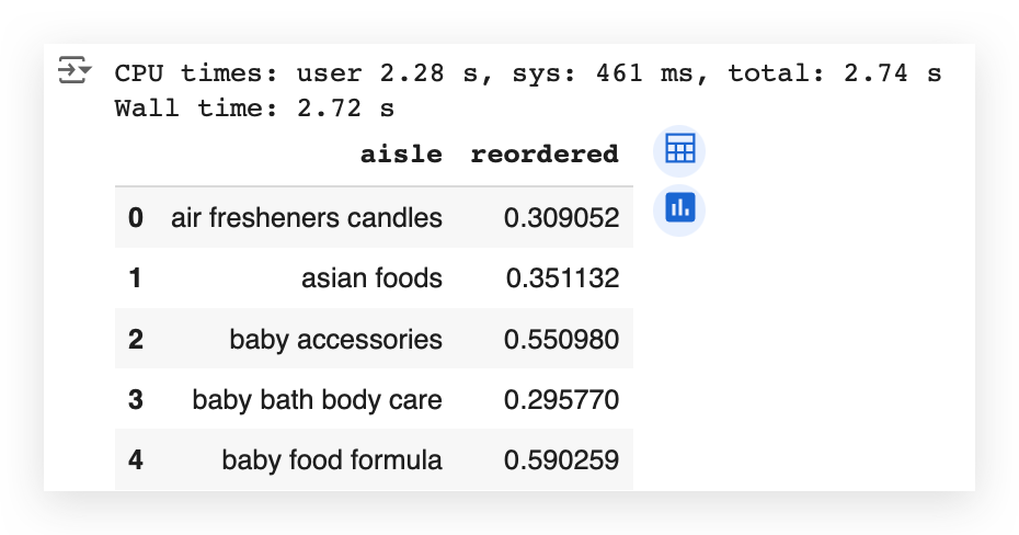
I generated df_temp4. Once again, I’ll filter the top 20.
If you don’t filter anything, your graph will become too cluttered, making it nearly useless.
# 86. List the first 20 aisles
list(df_temp4['aisle'])[0:20]
In other words, a completely cluttered graph that no one can even analyze.
So, include fewer items. You can display 10, 15, or 20 items in your graph.
And bring the full table with you for a meeting, day-to-day work, or other scenarios.
If someone questions a value, you’ll have the table available.
But for the graph, include only the top 20 items.
Notice that these are the top 20 aisles sorted alphabetically by aisle name.
If you prefer, you can change this and sort by the other column, which is the reorder rate — the rate of repeat orders.
# 87. Aisle vs Reorder Rate
plt.figure(figsize=(14, 7))
plt.plot(list(df_temp4['aisle'])[0:20], df_temp4['reordered'].values[0:20], alpha=0.8)
plt.scatter(list(df_temp4['aisle'])[0:20], df_temp4['reordered'].values[0:20])
plt.ylabel('Reorder Rate', fontsize=12)
plt.xlabel('Aisle', fontsize=12)
plt.title("Aisle vs Reorder Rate", fontsize=15)
plt.xticks(rotation='vertical')
plt.show()

And there it is: Aisle vs Reorder Rate.
10.1. Analyze Reorders by Aisle (Total)
Item 10.1 is essentially an extension of item 10. It’s the analysis of reorders by aisle but with the total orders included.
Basically, you take the DataFrame, group it by aisle, select the column you want to filter, and apply the aggregation.
# 88. Group the data by aisle and calculate count and sum
%%time
df_temp5 = transactions_data.groupby("aisle")["reordered"].agg(['count', 'sum']).rename(columns={'count': 'total', 'sum': 'reorders'})
df_temp5 = df_temp5.sort_values('total', ascending=False).reset_index()
In this case, I want two aggregation operations: count and sum.
Rename the columns to make them more coherent. After that, sort the data. And then generate the result.

Next, once again, filter the top 20 items to avoid cluttering the graph.
# 90. Lists
labels = list(df_temp5.aisle[0:20])
reorder = list(df_temp5.reorders[0:20])
total = list(df_temp5.total[0:20])
Plot everything on the graph.
# 91. Plot
width = 0.35
fig, ax = plt.subplots(figsize=(20, 10))
ax.bar(labels, reorder, width, label='Reorder', color='green')
ax.bar(labels, total, width, bottom=reorder, label='Total', color='red')
ax.set_ylabel('Total Orders', fontsize=14, fontweight='bold')
ax.legend()
ax.set_title("Total Orders and Reorders by Aisles")
plt.xticks(rotation=85)
plt.show()
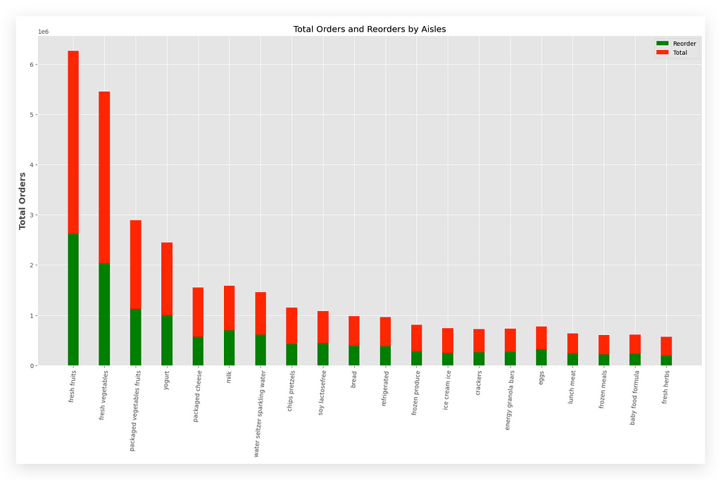
The green bar represents the reorder, while the red bar represents the total.
The Y-axis shows the total number of orders.
You can compare each bar and apply your analysis as necessary.
Since we’re here, I’ll do the following: I’ll create a copy of one of the columns.
# 92. Create a copy of one of the columns
transactions_data["add_to_cart_order_mod"] = transactions_data["add_to_cart_order"].copy()
After that, I’ll locate the transactions based on a specific criteria.
# 93. Locate the transactions
transactions_data["add_to_cart_order_mod"].loc[transactions_data["add_to_cart_order_mod"] > 70] = 70
I’ll calculate the average. Then, I’ll apply a reset_index.
And here you have the data properly grouped.
# 94. Calculate the mean and reset the index
grouped_df = transactions_data.groupby(["add_to_cart_order_mod"])["reordered"].aggregate("mean").reset_index()

# 95. Display the first 10 rows of grouped_df
grouped_df.head(10)
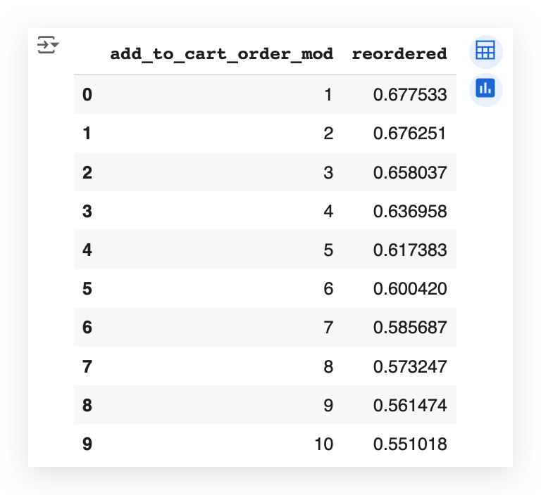
You can see here the exact relationship between the order in which a product is added to the cart and how it impacts the proportion of reorders.
This dataset comes from an online sales platform that sells grocery and supermarket products.
As the user navigates the site, they add items to their shopping cart.
Now, does the order in which items are added to the cart affect the proportion of reorders?
Yes!
If this is a necessary analysis, we already have the answer in our table.
Each number — 1, 2, 3, and so on — represents the exact order in which the product is added to the cart.
And alongside that, we have the reorder rate — the rate at which the product is purchased again.
You’ll notice it starts higher and then gradually decreases.
In other words, the product added last to the cart, when shopping online, is less relevant than the first products.
Which, if you think about it, is actually quite obvious.
When you visit the portal to shop, you go straight for the products that are most important to you.
These are likely the items you’re reordering more frequently.
The items added last are probably less relevant, so the likelihood of reordering them is lower.
Wow! What an analysis this was!
A comprehensive descriptive analysis, with an enormous amount of graphs, aggregations, filtering rules, and incredibly rich material that you can use as a reference for your day-to-day analyses.
What we’ve done here is not mandatory for the Market Basket Analysis (MBA) — It’s not a requirement.
We simply took the opportunity — since we have such a rich dataset — to let you practice your analytical skills a bit more.
Preparing Transactions for the Apriori Algorithm
We can now implement the Apriori algorithm and, subsequently, execute the Market Basket Analysis (MBA).
You can execute the Apriori algorithm with just one line of code.
So, using the algorithm itself is not the issue.
However, to get to this one line of code, it’s necessary to prepare the data, understand the data, and analyze the data — exactly everything we’ve done so far.
Many people tend to focus on the Machine Learning or specific analytical technique itself but forget that the real secretlies in our raw material: the data.
Well-processed, clean, prepared, and analyzed data is a treasure.
It significantly simplifies other processes and stages of analysis.
So, to implement Apriori, let’s adjust our dataset.
Here, I have the transactions ready to work with.
# 96. Display the first few rows of transactions DataFrame
transactions.head()
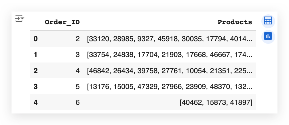
We had already organized the transactions earlier in the notebook, even before performing the descriptive analysis.
So, for each order, I have the corresponding transactions — in other words, the products that were part of that order.
What will I do now? I’ll create a tuple of the transactions.
# 97. Prepare the tuple with the transactions
transactions_tup = [tuple(row) for row in transactions['Products'].tolist()]
So, I’ll prepare the data in a format that can be directly fed into the Apriori algorithm.
For this, I’ll use a list comprehension, which is essentially a loop for creating data structures.
I’ll create a loop to populate a tuple. "Read" along with me:
For each row in the transactions, I’ll extract only the products column, convert it into a list, and then feed it into the tuple.
Execute this, and it will complete the preparation for you — done!
Basically, what we’ve done is simply adjust the data type and data structure, which will now be used in the Apriori algorithm.
Implementation of the Apriori Algorithm for Market Basket Analysis
We’ve already prepared the data for the Apriori algorithm, and now it’s time to execute it.
# 98. Run the Apriori Algorithm with support = 0.01 and confidence = 0.2
%%time
itemsets_ap, rules_ap = apriori(
transactions_tup[:500000],
min_support=0.01,
min_confidence=0.2)

You call the Apriori function, and then you pass your dataset — which we prepared earlier.
We’re dealing with a large volume of transactions.
If I try to execute the algorithm using the entire dataset, it could end up crashing my computer — and maybe yours too.
If you have a supercomputer or a powerful machine at your disposal, feel free to use the entire dataset.
In this case, however, I’m filtering for a specific number of records to avoid overloading both my machine and yours.
Additionally, I’ll set the minimum support and confidence values.
Why am I setting these values? To control exactly how the transactions will be grouped.
For now, I’m using the values 0.01 and 0.02, and later, I’ll change them to 0.05 and 0.02.
This step allows for fine-tuning, helping you define exactly how you want the transaction combinations.
If you don’t set these values, or if you use values that are too large or too small, the results will differ.
I’ll explain shortly how to interpret these results, so it will be clearer why we’re using these two filters to fine-tune the application of Market Basket Analysis (MBA).
And that’s it — that’s all we need. The algorithm will deliver two results.
I’ll also include a %%time to measure the execution time for this cell.
rules_ap
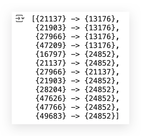
Take a look at what we have here first — the rules.
I have a number, then an arrow, and another number.
What does this mean? It means I have one product, an arrow, and another product.
Why? In our dataset, we have the values stored as text, right?
I can’t perform mathematical operations on text. Everything here boils down to mathematics, doesn’t it? Machine Learning, AI, all of this is math.
Can you do math with a product name? No.
So, we prepared the data by assigning each product a number, like a code or identification.
This result shows something like this: “Whoever bought product 21137 also bought product 13176.” — That’s what Apriori does.
Instead, I can obtain this result with a single line of code (e.g., line #98).
What I do is pass the transactions to the algorithm, including the respective products in each transaction.
The algorithm scans through the entire database and tells me, “Look, whoever bought this product also bought that one,” and it gives me a confidence score.
— We’ll interpret this in just a moment.
Now, you wouldn’t want to keep looking at these codes, I’m absolutely sure of that.
After all, how would you know what each code represents?
# 99. Let's consider some items for our analysis
item_A = [27966, 47209, 21137, 47766, 21903, 49683, 47626, 28204, 16797, 21903, 21137, 27966]
item_B = [13176, 13176, 24852, 24852, 24852, 24852, 24852, 24852, 24852, 13176, 13176, 21137]
temp = pd.DataFrame()
temp['itemA'] = item_A
temp['itemB'] = item_B
First, I’ll select some key product codes for our analysis, just a few items.
If I try to include all the items, it will clutter our results too much.
So, I’ll pick a few items and label them as Item A and Item B.
The numbers you see here represent the product codes. I’ll then prepare an empty DataFrame and set up Item A and Item B.
This is the data preparation step.
# 100. Lists for the metrics
support_A = []
support_B = []
support_AB = []
confidence_AB = []
lift_AB = []
Now, I’ll prepare a list for the metrics.
Next, I’ll calculate the three metrics: support, confidence, and lift.
# 101. Loop
for i in range(len(temp)):

    # Calculate the support of A
    support_A.append(itemsets_ap[1][tuple([temp['itemA'][i],])] / 500000)

    # Calculate the support of B
    support_B.append(itemsets_ap[1][tuple([temp['itemB'][i],])] / 500000)

    # Calculate the support of A and B
    if tuple([temp['itemA'][i], temp['itemB'][i]]) in itemsets_ap[2].keys():
        support_AB.append(itemsets_ap[2][tuple([temp['itemA'][i], temp['itemB'][i]])] / 500000)
    else:
        support_AB.append(itemsets_ap[2][tuple([temp['itemB'][i], temp['itemA'][i]])] / 500000)

    # Calculate confidence
    confidence_AB.append(support_AB[i] / support_A[i])

    # Calculate lift
    lift_AB.append(support_AB[i] / (support_A[i] * support_B[i]))
Let me execute this loop.
I’ll then prepare the DataFrames to retrieve the product names.
# 102. DataFrame with the association rules
df_rules_ap = pd.DataFrame()
df_rules_ap['product_id'] = item_A
df_rules_ap = df_rules_ap.merge(products_data, on='product_id', how='left')
df_rules_ap['Product_A'] = df_rules_ap['product_name']
df_rules_ap = df_rules_ap.drop(columns=['product_id', 'product_name', 'aisle_id', 'department_id'], axis=1)
df_rules_ap['product_id'] = item_B
df_rules_ap = df_rules_ap.merge(products_data, on='product_id', how='left')
df_rules_ap['Product_B'] = df_rules_ap['product_name']
df_rules_ap = df_rules_ap.drop(columns=['product_id', 'product_name', 'aisle_id', 'department_id'], axis=1)
df_rules_ap['Support_A'] = support_A
df_rules_ap['Support_B'] = support_B
df_rules_ap['Support_AB'] = support_AB
df_rules_ap['Confidence_AB'] = confidence_AB
df_rules_ap['Lift_AB'] = lift_AB
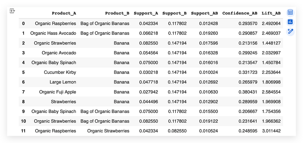
Whoever bought Raspberry also bought Organic Banana Bag.
This is exactly the same as what we saw earlier with the arrows — it’s the same thing — I just translated it.
I mapped each product code back to its name.
Now, I retrieve the text representation of the product. This is actually very interesting because, initially, the dataset included the product names.
However, we can’t perform mathematics with text. So, we converted the text into codes.
After making that conversion, we trained the algorithm (Apriori).
The algorithm returned exactly this mapping: whoever bought one product also bought another.
But the result comes back in numeric format.
So, what do I need to do? I need to return it to a human-readable format — back to text.
And that’s how it works:
- Start with the product names.
- Convert them into numeric values.
- Apply the algorithm.
- Convert the results back to text.
If you don’t want to do this, you can work directly with the text, but you’ll have to manually scan for these combinations.
Would you want to do that for 1 million, 5 million, or 100 million transactions? — It wouldn’t make sense.
So, this additional work is necessary — just be patient.
While doing this, I also took the opportunity to calculate the metrics, which are what we have described here at this point:
# 101. Loop
for i in range(len(temp)):

    # Calculate the support of A
    support_A.append(itemsets_ap[1][tuple([temp['itemA'][i],])] / 500000)

    # Calculate the support of B
    support_B.append(itemsets_ap[1][tuple([temp['itemB'][i],])] / 500000)

    # Calculate the support of A and B
    if tuple([temp['itemA'][i], temp['itemB'][i]]) in itemsets_ap[2].keys():
        support_AB.append(itemsets_ap[2][tuple([temp['itemA'][i], temp['itemB'][i]])] / 500000)
    else:
        support_AB.append(itemsets_ap[2][tuple([temp['itemB'][i], temp['itemA'][i]])] / 500000)

    # Calculate confidence
    confidence_AB.append(support_AB[i] / support_A[i])

    # Calculate lift
    lift_AB.append(support_AB[i] / (support_A[i] * support_B[i]))
We have support, confidence, and lift.
- Support measures the frequency or prevalence of an item or set of items within the dataset.
- Confidence measures the reliability of an association rule.
- Lift measures the strength of an association by comparing the joint frequency of two items.
What we did in this loop was simply implement the mathematical formula for support, confidence, and lift.
For support, we calculated the support of Item A.
What is Item A? — It’s the item listed on the left-hand side of the rule.
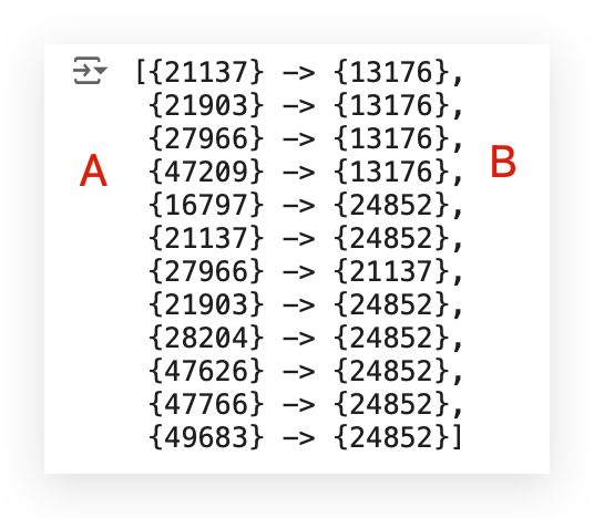
The support for Item B is listed on the right-hand side of the rule.
Then, we have the support for AB, which is the combination.
After that, we calculate the confidence and the lift.
This is purely the mathematical formula, implemented here using a loop in Python.
Later, I retrieved the product names in step #101, based on the mapping made by Apriori, and then compiled everything into the table at step #102.
Interpreting the Results for MBA — Support
We’ve reached the pinnacle of our work, the highlight, which is to precisely interpret this table.

Here’s the translation following prompt1:
Notice that we have Product A and Product B.
• Product A is Organic Raspberry.
• Product B is the Bag of Organic Bananas.
So, whoever bought Organic Raspberry also bought the Bag of Organic Bananas.
Now let’s interpret the columns with metrics:
1. Support_ A & Support_B
These are similar, simply pointing to each product individually.
What does this mean? It represents the individual support for each product.
Support for a product is the proportion of transactions that include that product.
- Support A
For Organic Raspberry, the support is 0.043.
This means that 4.23% of all transactions in the dataset contain Organic Raspberry. This is extremely valuable information for the business area.
- Support B
For Bag of Organic Bananas, the support is 0.12.
This means that 12% of transactions in the dataset include the Bag of Organic Bananas.
So, when looking at Support A and Support B, we’re looking at the individual percentage for each product.
2. Support_AB
Now it becomes easier to understand, doesn’t it?
Support AB represents the percentage or proportion of transactions that include both products.
In this case, 1.24% of transactions contain both Organic Raspberry and the Bag of Organic Bananas. This is the foundation of what we’re doing.
You can apply this same interpretation to each combination:
• The proportion of transactions with Product A,
• The proportion of transactions with Product B,
• And the proportion of transactions with both products.
Practical Example
Let’s think about a shopping cart. Imagine you’re at the market and looking at the cart next to you:
• Does it have bananas?
That’s the proportion for Product B: 0.12 (12%).
• Does it have raspberries?
That’s the proportion for Product A: 0.042 (4.23%).
• Does it have both raspberries and bananas?
That’s the proportion for both: 0.012 (1.24%).
Interpreting the Results for MBA — Confidence
Now we can interpret confidence. You’re probably wondering why support includes A and B, while confidence does not.
Here’s why:
Support can be calculated individually for each product, for each item.
And we also have the joint support (for A and B combined).
However, confidence and lift can only be interpreted together — as a relationship between two products.
It doesn’t make sense to calculate confidence or lift for a single item individually.

That’s why I don’t have confidence or lift calculated individually for each item.
Let’s interpret what confidence means, as it’s an important and relatively easy-to-understand metric.
Confidence simply measures the reliability of the rule.
In other words, it calculates the probability of finding Product B in transactions that contain Product A.
In this case, looking at the first row, what’s the percentage? It’s 29%.
So, there’s a 29% chance of finding Product B in the same transaction as Product A.
Think about this in the context of an online shopping portal.
If someone is browsing the website and adds Product A to their cart, what should the portal do at that moment?
It should recommend Product B. Why? Because there’s a 30% chance (rounded) that the customer will also purchase Product B.
According to historical data, there’s roughly a 30% chance of finding Product B in the same cart as Product A.
So, if someone adds Product A to their cart, what should the online portal do? It should suggest Product B, which is exactly how it works in real-life scenarios.
For example, if you browse on Amazon and add an item to your cart, what happens next? Soon, you’ll be flooded with suggestions for related items you might want — based on metrics like confidence.
Confidence is simply the proportion of finding one product (B) given that the other product (A) is already in the cart.
In this case, for example, there’s a 29% chance of finding Organic Banana in a transaction that also contains Organic Raspberry.
Interpreting the Results for MBA — Lift
I consider support and confidence to be two metrics that are quite easy to understand, as they essentially measure proportion. For example:
• The proportion of a product relative to the total,
• Or the proportion of the combination of products relative to the total.
Support and confidence are a bit simpler and more straightforward to grasp — Lift, on the other hand, is not trivial.
It takes a bit more effort to interpret what it means, such as the 2.49 example.
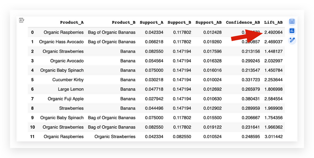
In this case, what does it mean?
It means there’s a 2.49 times greater chance of seeing both products purchased together than individually — As I mentioned, this isn’t trivial.
Look at the 2.49 value for this combination, Raspberry with the Organic Banana Bag. We have 2.49 times greater chances of these two products being purchased together in a transaction than individually.
In other words, people are much more likely to buy both products at the same time, in the same transaction, than to purchase them individually.
This is essentially what the lift tells us.
It shows how much more frequent the association between Product A and Product B is compared to what we’d expect if they were independent.
That’s why calculating the lift for each product individually doesn’t make sense.
The lift is calculated for the combination:
• Is the likelihood of purchasing the combination higher or lower compared to purchasing the products individually?
If the lift is greater than 1, there’s a strong likelihood that both products will be purchased together.
It’s more probable that this will happen than buying each product individually.
If the lift is less than 1, it’s the opposite — there’s a higher chance of buying each item individually than purchasing them together in the same transaction.
The lift isn’t trivial or easy to understand, but if you take the time to analyze it, it’s a very logical metric.
For example, in this little table here, the last item in the transactions has a lift of 3.0, which is quite high.
This means there’s a very strong likelihood that someone who buys Organic Raspberry will also buy Organic Strawberry.
This makes a lot of sense — they’re similar fruits.
If they like organic products, they’ll likely buy both Raspberry and Strawberry. Interesting, isn’t it?
You can also sort the results by Confidence for A and B.
# 110. Sort by Confidence and display the top 10 results
df_rules_ap1.sort_values(by='Confidence_AB', ascending=False).head(10)
When you sort by confidence, you’ll notice that the combinations change slightly because you’re focusing on a specific metric.
The same applies to lift, and you can also use Support directly.
For example, in the case of lift, the strongest combination we found was the one I showed earlier: Organic Raspberry and Organic Strawberry.
From there, you can reduce the lift and sort to focus on one metric or another — or even look at a combination of several metrics.
Modifying the Parameters of the Analysis
We created the first version of our Market Basket Analysis (MBA) using Apriori, with this minimum support value and this minimum confidence value.
# 98. Run the Apriori Algorithm with support = 0.01 and confidence = 0.2
%%time
itemsets_ap, rules_ap = apriori(transactions_tup[:500000], min_support=0.01, min_confidence=0.2)
Let’s adjust these two values and execute Apriori again:
# 105. Run the Apriori Algorithm with support = 0.005 and confidence = 0.2
%%time
itemsets_ap_1, rules_ap_1 = apriori(transactions_tup[:500000], min_support=0.005, min_confidence=0.2)

Notice that I’ll use the same volume of data, the same number of transactions, but I’ll adjust the minimum support while keeping the confidence constant.
Then, I’ll execute it again, generating a new set of results.
Next, I’ll choose exactly which elements I want.
Take a look at the rules here.
rules_ap_1
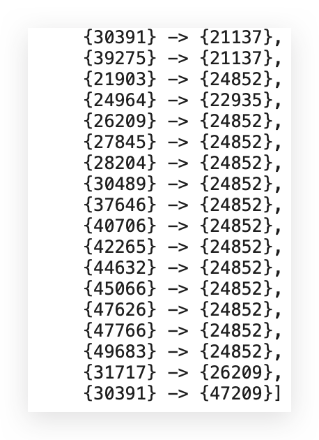
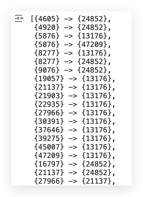
Notice that now I have more rules,
Because, after all, I reduced the minimum threshold value.
# 106. List of items to consider
item_A1 = [27966, 47209, 4605, 21137, 47766, 21903, 49683, 5876, 37646, 40706, 47626, 5876, 30391, 22935, 37646, 31717,
           28204, 27845, 24964, 45066, 9076, 16797, 21903, 8277, 30391, 21137, 27966, 19057, 26209, 45007, 39275, 30489,
           42265, 30391, 8277, 4920, 39275, 44632]
item_B1 = [13176, 13176, 24852, 24852, 24852, 24852, 24852, 47209, 24852, 24852, 24852, 13176, 13176, 13176, 13176, 26209,
           24852, 24852, 22935, 24852, 24852, 24852, 13176, 24852, 47209, 13176, 21137, 13176, 24852, 13176, 21137, 24852,
           24852, 21137, 13176, 24852, 13176, 24852]
temp1 = pd.DataFrame()
temp1['itemA'] = item_A1
temp1['itemB'] = item_B1
I will then take these exact values and extract Items A and B. These represent the products.
Let’s proceed to build the DataFrames.
# 107. Lists for the metrics
support_A1 = []
support_B1 = []
support_AB1 = []
confidence_AB1 = []
lift_AB1 = []
Now, let’s calculate all the metrics.
These metrics are calculated based on the transactions we just generated using Apriori.
# 108. Loop
for i in range(len(temp1)):

    support_A1.append(itemsets_ap_1[1][tuple([temp1['itemA'][i],])] / 500000)

    support_B1.append(itemsets_ap_1[1][tuple([temp1['itemB'][i],])] / 500000)

    if tuple([temp1['itemA'][i], temp1['itemB'][i]]) in itemsets_ap_1[2].keys():

        support_AB1.append(itemsets_ap_1[2][tuple([temp1['itemA'][i], temp1['itemB'][i]])] / 500000)

    else:

        support_AB1.append(itemsets_ap_1[2][tuple([temp1['itemB'][i], temp1['itemA'][i]])] / 500000)

    confidence_AB1.append(support_AB1[i] / support_A1[i])

    lift_AB1.append(support_AB1[i] / (support_A1[i] * support_B1[i]))
Next, prepare the DataFrame containing the names of all the products:
# 109. DataFrame with the association rules
df_rules_ap1 = pd.DataFrame()
df_rules_ap1['product_id'] = item_A1
df_rules_ap1 = df_rules_ap1.merge(products_data, on='product_id', how='left')
df_rules_ap1['Product_A'] = df_rules_ap1['product_name']
df_rules_ap1 = df_rules_ap1.drop(columns=['product_id', 'product_name', 'aisle_id', 'department_id'], axis=1)
df_rules_ap1['product_id'] = item_B1
df_rules_ap1 = df_rules_ap1.merge(products_data, on='product_id', how='left')
df_rules_ap1['Product_B'] = df_rules_ap1['product_name']
df_rules_ap1 = df_rules_ap1.drop(columns=['product_id', 'product_name', 'aisle_id', 'department_id'], axis=1)
df_rules_ap1['Support_A'] = support_A1
df_rules_ap1['Support_B'] = support_B1
df_rules_ap1['Support_AB'] = support_AB1
df_rules_ap1['Confidence_AB'] = confidence_AB1
df_rules_ap1['Lift_AB'] = lift_AB1
And now let’s print the results, sorting by Confidence_AB:
# 110. Sort by Confidence and display the top 10 results
df_rules_ap1.sort_values(by='Confidence_AB', ascending=False).head(10)
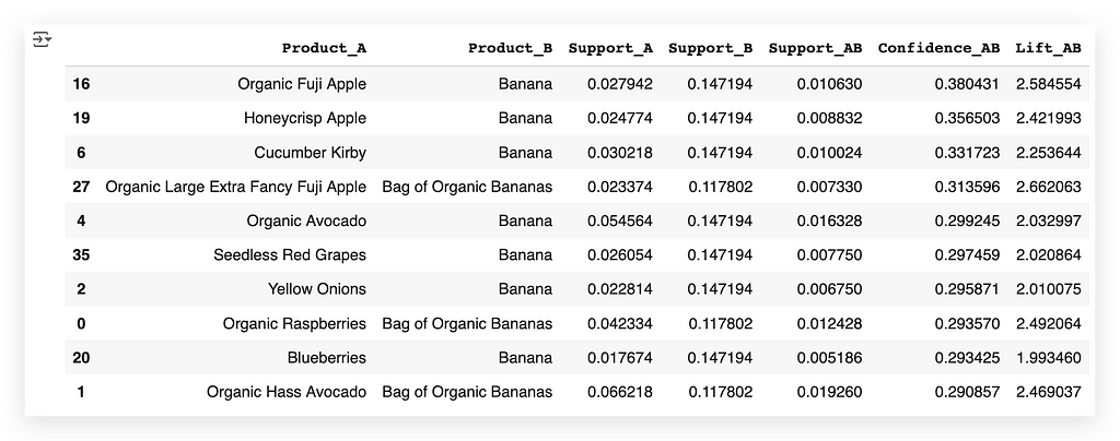
Notice that I have Organic Fuji Apple, and then I have the product Banana.
This is the main transaction, the primary combination, when viewed through the confidence metric.
Shall we take a look at the previous table 1?

You can see that the same item appeared again.
But here, I have a specific number of transactions, which is a smaller number compared to before.
Now, I have more transactions on #2. I’m filtering these transactions and showing you the top ten. This is also a way to perform fine-tuning.
In other words, to focus on the most relevant combinations for your company or business area, rather than showing hundreds of transactions that might not be as important.
But it depends — it depends on the business area and what they want to see.
Notice that now, with lift, I got different values. The lift value is also different because of the new combinations, right?
New combinations emerged when I adjusted the filter level, just as we did when running the Apriori algorithm.
Whew!
We’ve finished the work on this project…
I’m exhausted!
Delivering the Result
We’ve concluded the project — a project of extremely high quality, by the way.
You won’t find many people out there who know how to perform Market Basket Analysis (MBA), because it’s a high-level analysis.
You’ve seen how many small details are involved.
You need to:
Understand the metrics well, know exactly how to prepare the data, match the transactions, and resolve any issues in the data pipeline.
But the results are excellent.
Apriori isn’t a super-advanced algorithm — not by any means.
There are plenty of algorithms that are far more advanced, but they don’t do what Apriori does.
Sometimes, you don’t need the most advanced algorithm out there.
The question is: What do you want to achieve? This question must be asked at the start of the project.
- Do you want to identify which transactions happen most frequently?
- Do you want to analyze if people who buy one product will also buy a second product?
- Do you want to measure the strength of this relationship?
If so, Apriori is the tool you’ll use.
More and more, businesses need to understand these product combinations within their operations, especially in the retail sector.
When you’ve finished your work, you then prepare the delivery.
You can deliver the results through: A report, a spreadsheet, a graph, or simply a summary describing what you’ve found.
You can also filter the results based on one of the metrics.
I usually deliver this in the form of a spreadsheet, along with a report highlighting the key points to assist decision-makers.
Since this table can be quite complex — even for analysis — provide the table with an accompanying description.
I save it to Excel, generate the spreadsheet for the business to analyze, and then add a report summarizing the findings.
And that’s it — project complete. (and I move on to the next one.)
Take care!
Market Basket Analysis: The Complete Guide was originally published in Towards Data Science on Medium, where people are continuing the conversation by highlighting and responding to this story.
from Datascience in Towards Data Science on Medium https://ift.tt/Ar031on
via IFTTT


