Synthetic Control Sample for Before and After A/B Test
Learn a simple way to use linear regression to create a synthetic control sample for your A/B test

Introduction
A/B Testing is very powerful. I like this kind of experiment because it gives us the power to compare outcomes and determine if something is performing better than another.
A/B Testing has a specific type that adds the time component, which is the Before and After A/B Test. On that test, the comparison is between the situation of a given subject before and after an intervention.
Let us translate that previous sentence to a real-world example.
A company wants to know if an advertising would drive sales increase, so they can show that ad to a treatment group and compare the results to a control group that did not see the ad. The difference before and after the ad would indicate whether the intervention was effective or not.
Now, sometimes it is not possible to plan ahead and make that split of control and treatment groups before the intervention.
That is when the Synthetic Control sample will be useful. Using some statistics and machine learning, it is possible to simulate what would have happened with a sample if the intervention didn’t happen.
This is what we are going to learn in this post.
You can learn more about A/B testing in this post linked next.
My Easy Guide to Pre vs. Post Treatment Tests
Problem Description
We are working with a dataset from a retail chain of stores. To generate it, I used the Rossmann Stores dataset from Kaggle as my baseline to get a sense of sales distribution by store, so it would be closer to reality. Additionally, I selected control stores that are similar to the tested store. Therefore, the data was completely recreated and modified and has different store numbers and sales numbers.
The variables are:
- Store : numbered from 1 to 10. The test store is the #10.
- Date : daily dates from 2013 to 2015.
- Sales : Amount of sales on that date in dollars.
Intervention:
- A competitor opened a new store next to our Store #10, in March of 2014.
- The control stores (1–9) don’t have a competitor around.
We intend to understand the impact caused by this competitor on Store #10’s sales to take any necessary actions and fight the competition, if applicable.
Plotting the sales trends from control and treatment stores, we get the next figure.

Notice that the control stores keep following a steady pattern, with a slight growth even. On the other hand, the treatment store has declined considerably after the opening of the competitor.
Could this be related to the competition? Let’s keep digging.
Synthetic Control Sample
We just saw that there was a considerable decrease in sales for test Store #10 after the treatment event (the opening of a competitor in March 2014).
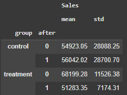
If we get the data and calculate the mean sales by week before the intervention date it was 68,199.28. After the intervention, 51,283.35. The average reduction is ~25%.
Now we could get the control stores and compare their performance against the test store like a regular Before and After A/B Test. After all, I pre-selected similar control and test stores when I was creating this data frame.
However, our intention is to compare the current performance of Store #10 with a hypothetical performance of Store #10 if no competition had been opened. To accomplish that, we need to simulate a performance without competition, thus we use the data from the control stores.
Let’s think for a minute:
- The control stores don’t have competition around, so the assumption is that Store #10 would have a similar behavior after March 2014 without competition.
- The Before versus After A/B Test is a comparison of two points in time of the same subject. Group A Before versus Group A after. Group B before versus Group B after.
- We have Group B before and after, which is the test Store #10 as is, with competition.
- We need a simulation of the behavior of Store #10 without competition opening.
So, here is what we are going to do:
- Use Linear Regression to create a synthetic sales series for Store #10 without competition around.
- That synthetic sample is fitted on the control stores — and that is the reason why the control stores must be similar to whatever we are willing to simulate.
Let’s do that.
Code
The libraries and modules used in this exercise.
# Data manipulation
import pandas as pd
import numpy as np

# DataViz
import matplotlib.pyplot as plt
import seaborn as sns
sns.set()

# Stats
import scipy.stats as scs
import pingouin as pg

# Modeling
from sklearn.linear_model import LinearRegression
from sklearn.metrics import mean_absolute_percentage_error
We start separating control and test stores.
# Select the control group
control = df2.query('Store != "10"')

# Treatment Group
treat = df2.query('Store == "10"')
Next, we must resample our data from daily sales to weekly sales (sum every 7 days). Here, we can already get the series of sales by date for the test store, given that it is a single store.
# Create dataset of control stores sales resampled from daily to weekly (7 days) sales
unit_control = control.pivot(index='Date', columns='Store', values='Sales').resample('7D').sum()

# Agregando as vendas para a Loja 983 para a cada 7 dias
y_sales = treat.set_index('Date')['Sales'].resample('7D').sum()
Then we will filter the control stores' dates on the same dates we have available for the test store, aligning both datasets. If any value is NA, we fill it with the median, and then we take the mean value of all the control stores, transforming the data on a series of sales indexed by date.
# Filter the control sample with only the dates contained in the treatment dataset
aligned_dates = unit_control.index.intersection(y_sales.index)

# Get the control data filtered with dates from the treatment series
X_sales = unit_control.loc[aligned_dates].fillna(unit_control.median())

# Transform the control data into a single series aggregated as the mean of sales by week
X_sales_mean = X_sales.mean(axis=1)
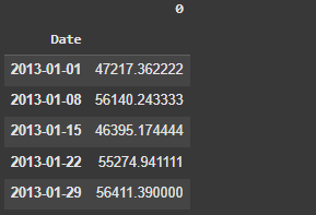
Here is a view of the X_sales_mean data.
Let’s plot both series y_sales and X_sales_mean.
# Set Date of the intervention
intervention_date = pd.to_datetime("2014-03-01")

# Plot
plt.figure(figsize=(12, 6))
plt.plot(y_sales.index, y_sales, label="Store 10", color='green', lw=2)
plt.plot(X_sales_mean.index, X_sales_mean, label="No Comp Stores", color='gray', linestyle='--')
plt.axvline(x=intervention_date, color="red", linestyle=":", lw=2, label="Opened Competitor for Store 10 ")
plt.xlabel("D A T E")
plt.ylabel("S A L E S")
plt.title("Sales GAP Store 10 vs Stores W/o Competition")
plt.legend()
plt.show()
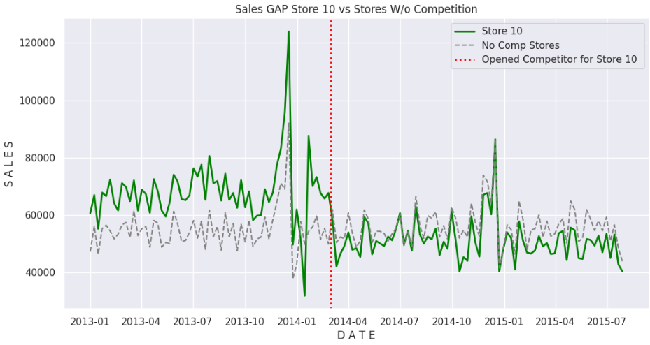
We can observe that the results of Store #10 are consistently higher than the average of the control stores before competition. But once the competitor opened, sales became consistently under the average of the control stores.
Now we should fit the regression model to create the synthetic Store #10 without competition.
- X: The sales of the control stores will be the predictor variables
- y : The sales of the test store will be the target.
- X_before and y_before are the training sets.
- X_after and y_after are the test sets.
# X & y sets
X_before = X_sales[:intervention_date]
X_after = X_sales[intervention_date:]
y_before = y_sales[:intervention_date]
y_after = y_sales[intervention_date:]

# Linear Regression fit
lm = LinearRegression(fit_intercept=False)
lm.fit(X_before, y_before)

# Predictions before and after intervention
preds_before = lm.predict(X_before)
preds_after = lm.predict(X_after)

# Synthetic Control Series
synthetic_series = pd.Series(
    np.concatenate([preds_before, preds_after]),
    index= X_sales.index
)
If we plot again both series, we are comparing Store #10 with competition versus Store #10 without competition (synthetic sample).
# Plot Synthetic (No competition) vs 10
plt.figure(figsize=(12, 6))
plt.plot(y_sales.index, y_sales, label="Store 10", color='green', lw=2)
plt.plot(synthetic_series.index, synthetic_series, label="10 W/O Competition", color='gray', linestyle='--')
plt.axvline(x=intervention_date, color="red", linestyle=":", lw=2, label="Opened Competitor for Store 10 ")
plt.xlabel("D A T E")
plt.ylabel("S  A  L  E  S")
plt.title("Comparison: Store 10 vs Synthetic 10 No Comp")
plt.legend()
plt.show()
Here’s the graphic.
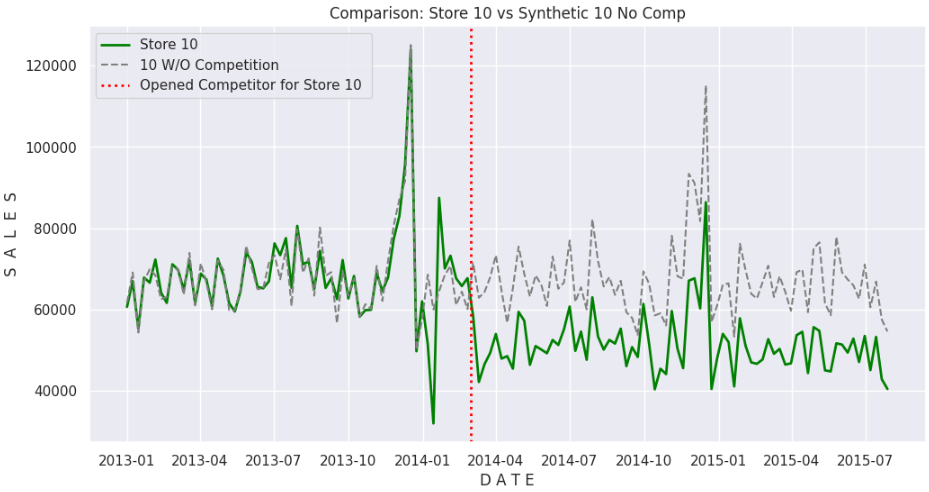
We can notice that the fit is pretty good for the initial part of the series, before the intervention date, then the lines open a considerable gap, where the actual Store #10 underperforms the synthetic pair, leading us to conclude that the cause of the drop in performance is, in fact, due to the opening of the competition.
To quantify this gap, let’s calculate the Mean Average Percentage Error (MAPE) of the predictions versus the real data.
# MAPE Store 10 versus Synthetic Store 10
mape_after = mean_absolute_percentage_error(y_after, preds_after)
print(f'MAPE after intervention: {mape_after:.2f}')

--------- OUT -----------
MAPE after intervention: 0.32
The calculation points to a drop of 32% in Store #10 sales after the opening of the competitor.
Let’s go one step further and perform a Before vs. After A/B Test using the actual values for the control and test stores, so we can check if the results are consistent.
Before and After A/B Test

The Before and After Test compares the performance of the control stores against the performance of the test store pre and post-intervention, which is the opening of a competitor around store 10.
Let’s set the intervention date for the test.
# Intervention date
intervention_date = pd.to_datetime("2014-03-01")
Next, we must resample our data from daily sales to sales aggregated by 7 days.
df_sales7d = (
    df2
    .pivot(index='Date', columns='Store', values='Sales') #pivot for resampling
    .resample('7D') #aggregate sales by 7 days
    .sum() #sum sales
    .reset_index() #reset to make Date as column again
    .melt(id_vars='Date', var_name='Store', value_name='Sales') # unpivot
    .assign(after= lambda x: np.select([x.Date <= intervention_date, x.Date > intervention_date],
                                        [0, 1])) # add after Yes or No
    .assign(group= lambda x: np.select([x.Store == "10", x.Store != "10"],
                                        ["treatment", "control"])) # add group treatment or control
    )

# View
df_sales7d.head(2)
Here is the view of the data.

Next, we calculate the averages and standard errors of the samples.
# Calculating averages and standard errors
ab_means = (df_sales7d
 .groupby(['group', 'after'])
 .agg({'Sales':['mean', 'std']})
 .round(2)
 )
Moving forward, we have to define a couple of functions:
- std_error_two_samples: This function calculates a single standard error for the control and test samples. This will be important for the confidence interval calculation of the difference between the Before and After groups.
- ab_test: a function to perform the A/B test and calculate the confidence interval for the difference between the groups.
- Note: Both functions can be found in the GitHub repository, here.
print('Control Before vs After:')
ab_test(data=  df_sales7d.query('group == "control"').rename(columns={'group':'grp','after':'group'}),
        group_col= 'group',
        target_col = 'Sales')

print('---------------------------------------------------------------------')

print('Treatment Before vs After:')
ab_test(data=  df_sales7d.query('group == "treatment"').rename(columns={'group':'grp','after':'group'}),
        group_col= 'group',
        target_col = 'Sales')
Resulting in the following output:
Control Before vs After:
The calculated standard error is 1635.206108090877
The difference in means Group B - A : 1118.971107665042
P-Value (two tails): 0.49378591381056647
confidence interval with 95% confidence is [-2085.97  4323.92]
---------------------------------------------------------------------
Treatment Before vs After:
The calculated standard error is 1695.1522766982898
The difference in means Group B - A : -16915.930695613657
P-Value (two tails): 0.0
confidence interval with 95% confidence is [-20238.37 -13593.49]
For the control samples, at a significance level of 5%, we cannot reject the null hypothesis of equal means. So the stores are statistically behaving similarly in both periods. The difference between both samples means will fluctuate between -$2,085 to $4,323 a week.
For the test Store #10, the p-value suggests that the sample means are statistically different. So that store was impacted by the competition and dropped about $17k (-25%) in sales a week, with this difference varying from -$20k (-29%) to -$13.5k (-19%), both numbers well below zero.
But, hey… I am a visual guy. I like to see the difference in a graphic.
plt.figure(figsize=(18, 5))

# Control Samples Before vs. After
# Creating Normal Distribution of both Control samples
plt.subplot(1, 2, 1)
plot_a = np.random.normal(loc= ab_means.iloc[0,0], scale= ab_means.iloc[0,1], size=10000)
plot_b = np.random.normal(loc= ab_means.iloc[1,0], scale= ab_means.iloc[1,1], size=10000)
plot = pd.DataFrame({'group': ['Control_Before']*10000 + ['Control After']*10000,
                     'mu': np.concatenate([plot_a, plot_b])})
# Intervention date line
plt.axvline(x=ab_means.iloc[0,0], color="royalblue", linestyle="--", lw=1)
plt.axvline(x=ab_means.iloc[1,0], color="darkorange", lw=1)
sns.kdeplot(plot, x='mu', hue='group')
plt.title('Control Before vs After');

plt.subplot(1, 2, 2)
# Treatment Samples Before vs. After
# Creating Normal Distribution of both Treatment samples
plot_a = np.random.normal(loc= ab_means.iloc[2,0], scale= ab_means.iloc[2,1], size=10000)
plot_b = np.random.normal(loc= ab_means.iloc[3,0], scale= ab_means.iloc[3,1], size=10000)
plot = pd.DataFrame({'group': ['Treatment Before']*10000 + ['Treatment After']*10000,
                     'mu': np.concatenate([plot_a, plot_b])})
# Intervention date line
plt.axvline(x=ab_means.iloc[2,0], color="royalblue", linestyle="--", lw=1)
plt.axvline(x=ab_means.iloc[3,0], color="darkorange", lw=1)
sns.kdeplot(plot, x='mu', hue='group')
plt.title('Treatment Before vs After');
And here it is.

I believe we have eliminated any doubts about the impact on sales caused by the new competitor.
Before You Go
Causal inference has been growing lately. It is more and more common to see new content about the topic. After all, as it is said, “correlation does not imply causation”, so when we are asked by a client or the leadership at work what is the impact (or cause) of some effect, we must have tools to assess that.
Some nice Python packages like DoWhy, Causal Impact are out there to help us infer causality out of the results.
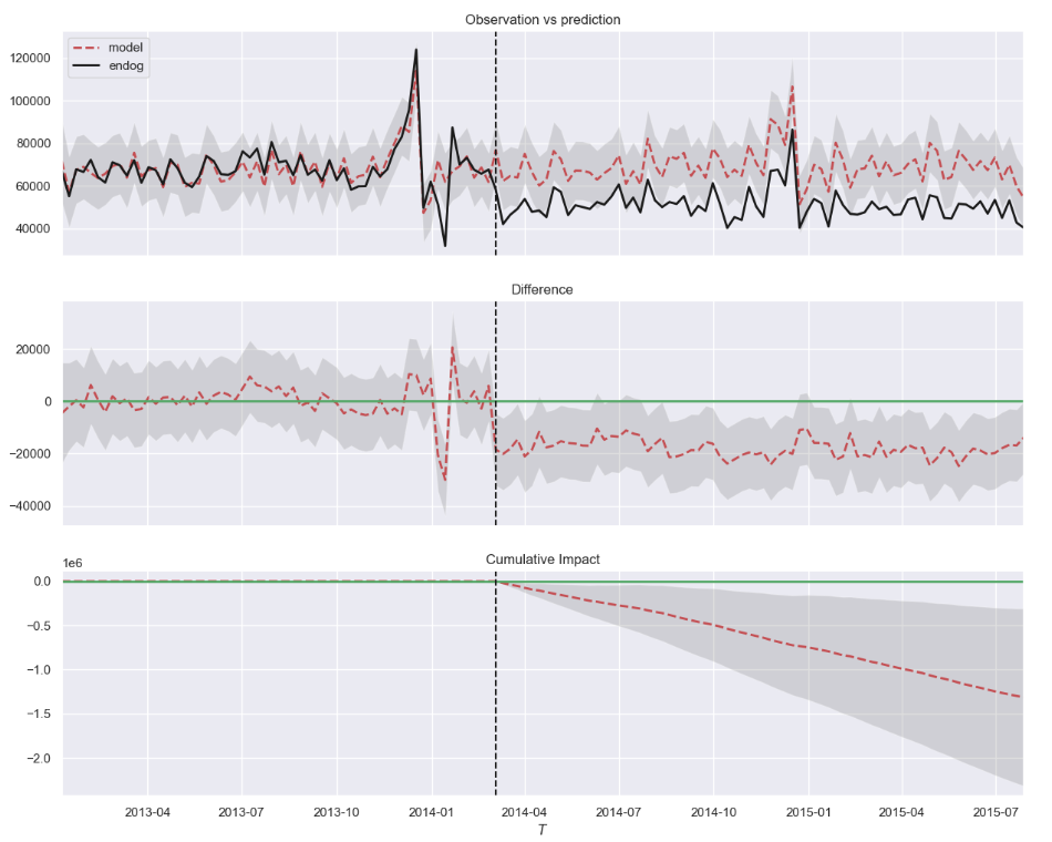
The exercise we performed in this post is very similar to what the package causalimpact does. If we run some code on it, the result should look familiar to you now.
# !pip install causalimpact --quiet
from causalimpact import CausalImpact

# Create dataset with mean of the control stores (x) and the test store (y)
df4 = (pd.concat([X_sales_mean.round(2), y_sales], axis=1)
       .rename(columns={0: 'x', 'Sales': 'y'})
       .reindex(columns=['y', 'x'])
       )

# Run Causal Impact
impact = CausalImpact(data=df4,
                      pre_period=[pd.to_datetime("2013-01-01"), pd.to_datetime("2014-03-04")],
                      post_period=[pd.to_datetime("2014-03-11"), pd.to_datetime("2015-07-28")])

impact.run()

# Plot result
impact.plot()

# Print Summary
impact.summary()

# Prin Report
impact.summary(output="report")
This is the result. Very similar to our previous comparison.
I recommend you to take a look. But be aware of some conflicts with newer versions of Pandas.
That’s it. If you liked this content, follow me for more.
Follow Me | Blog & Website
Complete code GitHub
Before-and-After-Testing/Python/Causal Inference at main · gurezende/Before-and-After-Testing
References
- Controle Sintético: Como Aplicar Inferência Causal na Prática
- 4 Python Packages to Learn Causal Analysis
- Notebook on nbviewer
Synthetic Control Sample for Before and After A/B Test was originally published in Towards Data Science on Medium, where people are continuing the conversation by highlighting and responding to this story.
from Datascience in Towards Data Science on Medium https://ift.tt/C1F0UBP
via IFTTT


