
Visualizing Regression Models with Seaborn
Using visualization to understand the relationship between two variables

Introduction
I am a visual guy.
I interpret the world around me relying more on images than in any other sense or format. I know people who prefer reading, while others deal better with audio. And that’s ok. That’s what makes us different and interesting.
The point here is that it reflects in my way of interpreting data at work as well. I will go for data visualization whenever I can, preferring it over tables or text. So I keep seaborn always at hand.
Seaborn is a visualization library with strong statistical features. To confirm such a statement, just look at the library’s plots. They bring confidence intervals and regression lines integrated with the graphics.
In this post, we will look at Seaborn’s ability to visualize regression lines between two variables, helping us to better understand the relationship between them.
Come explore with me.
Data Viz
Data Visualization, or simply Data Viz for shorter, is the art of showing data in the form of graphics. This way, we are exploring variable relationships and getting the best insights from graphics, helping to explain the complexity of a dataset.
Using Seaborn, we can also see the model line to understand how two variables relate to each other — how X can estimate Y. The library can plot mostly variances of linear models, and that is very helpful when we are working with regression.
Before we jump into the code, let’s import the libraries needed.
import seaborn as sns
import pandas as pd
The dataset we will use for this exercise is the Car Crashes from Seaborn (open source under license CC0: Public Domain). Our target variable is the total of drivers involved in fatal collisions per billion miles.
Looking at the correlations beforehand will help us to determine which variables are worth it to plot.
# Correlations
(df
 .drop(['abbrev'], axis=1)
 .corr()
 .style
 .background_gradient(cmap='coolwarm')
 )
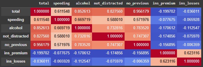
Well, we can see that there are strong correlations between the target variable total and 4 predictor variables. Let’s plot the estimated regression lines then.
Linear Regression
Linear Regression is a commonly used algorithm in statistics and data science. Its simplicity and effectiveness are the key to its success.
To plot a linear regression to visualize the relationship of the use of alcohol versus total of fatal collisions, we use the lmplot function. See the code snippet.
# Linear model Viz
sns.lmplot(x='alcohol', y='total',
           line_kws={"color": "red"},
           data=df);
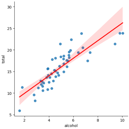
Very nice. It shows us a great model. With an 85% correlation, this variable presents itself as a good modeling option, and the graphic confirms that. Notice that the points don’t fall too far off the red line, which is good for a regression model.
Robust Linear Regression
Sometimes, a variable will have some points that are more than reasonably far from the rest. Those are called outliers.
These points can influence the regression model, pulling the line towards them. In statistics, these points are called leverage points. One way to mitigate this problem is running a robust linear regression, which we are about to see in Seaborn next.
# Robust Linear model Viz
sns.lmplot(x='not_distracted', y='total',
           robust=True,
           line_kws={"color": "red"}, data=df);
The code is the same as the previous one, but now we are adding the argument robust=True. To compare both the regular regression versus the robust one, I ran both and put them side-by-side in the next figure.
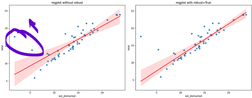
The circle shows the two points that are slightly pulling the regression line up, towards them. Observe on the right-side plot that when we run the robust regression, the line fits much better to the data, almost touching many more points than the left-side plot.
Polynomial Regression
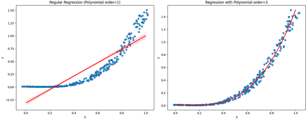
lmplot can also solve no linear problems, like polynomial equations. In the following example, I have created some new data with polynomial order 3. To plot and visualize that, we will add the argument order=3. The x_jitter is just to separate the points for better visualization.
# Polynomial Linear Model
sns.lmplot(data=df,
           x='X', y='y',
           order=3,
           line_kws={'color':'red'},
           x_jitter=0.04);
Looking at the left-side graphic, we clearly note that the regression line is not a good fit for this problem. On the other hand, the polynomial line fits perfectly.
Logistic Regression
Logistic Regression is another kind of linear model applied to classification of binary outcomes. So, whenever you have a target variable with two possibilities, a Logistic Regression model can do the trick.
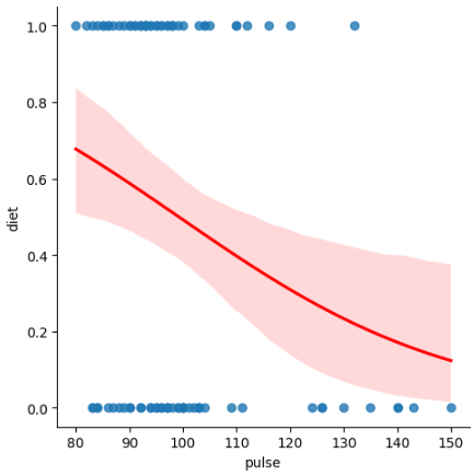
Let’s get the dataset exercise from Seaborn, under the license BSD 2. If we wanted to classify the diet (0) No Fat or (1) Low Fat based on the variable pulse , we can use Logistic Regression.
To visualize it with seaborn, we are still using the method lmplot. This time, the argument to be added is logistic=True.
# Logistic Regression lmplot
sns.lmplot(data=df,
           x='pulse', y='diet',
           logistic=True,
           line_kws={'color':'red'});
Lowess Smoother
Lowess Smoother (locally weighted scatterplot smoothing) is based on traditional techniques like linear and nonlinear least squares regression.
It is useful in situations where classical methods struggle, merging the linear least squares regression with the adaptability of nonlinear regression. It accomplishes this by applying simple models to localized portions of the data. The downside to these advantages is the need for greater computational resources.
To visualize it on the Car Crashes dataset, add the argument lowess=True. Let’s get a predictor with a lower correlation with the target variable to test this feature.
# Lowess smoother
sns.lmplot(data=df,
           x="ins_premium", y="total",
           lowess=True,
           line_kws={'color':'red'});
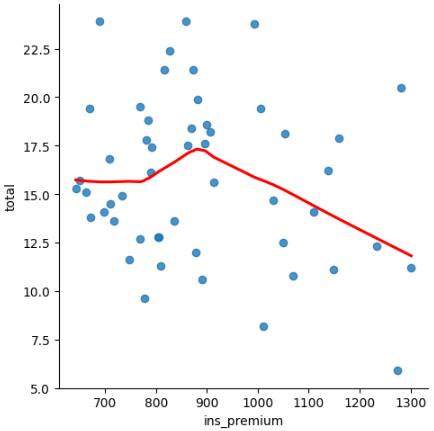
Nice. We can have a good idea of what happens with the total of collisions as the car insurance premium increases. It starts stable, has a peak at 900, and then the collisions drop as the premium amount increases. People with more expensive insurance are apparently more careful driving.
Residual Plot
The residual plot is useful to see if the regression between the two variables is a good fit.
The graphic is displayed using the method residplot. Let’s plot the residuals of the simple regression alcohol vs. total . The ideal is that the points are randomly scattered around y = 0 because it means that the errors for more and for less are about the same size.
#Residual plot
sns.residplot(data=df,
              x="alcohol", y="total")
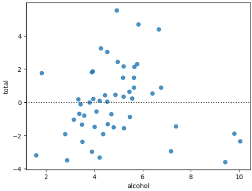
In this case, it looks fairly good. The points are going from -4 to 4, with just a couple of points going over that amount.
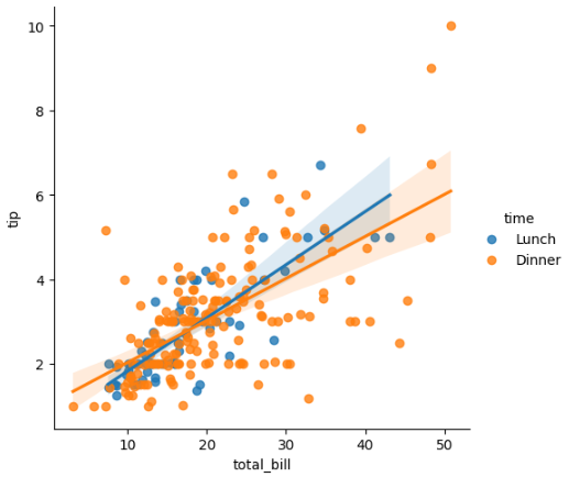
Regression by Group
Finally, we can still create some graphics of regressions by different groups in the same plot, just adding some arguments.
Let’s load the dataset Tips from Seaborn (license BD2) and plot the regression of tip by total_bill, but one regression for Lunch and another for Dinner.
Using the argument hue = time we accomplish that easily.
# Load data
df = sns.load_dataset('tips')

# Regression of Tips by hue=size
sns.lmplot(data=df,
           x='total_bill', y='tip',
           hue='time'  );
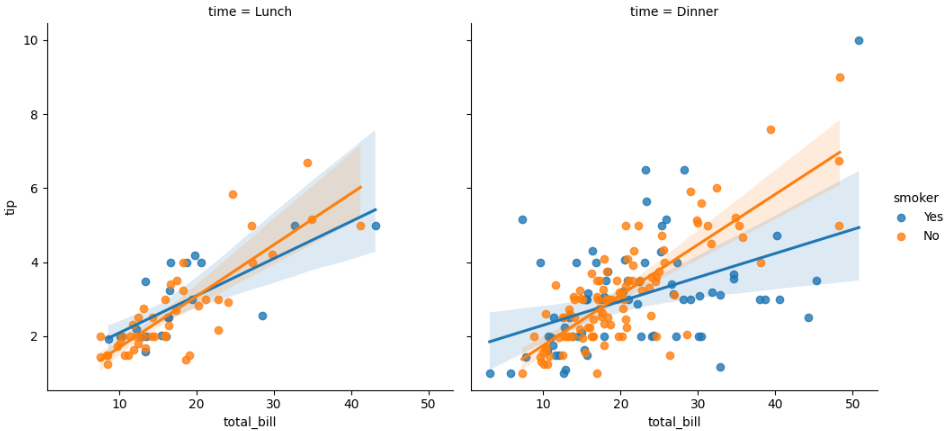
If we want to see that split in two columns by time of the day, we can use a facet grid. The argument is col = time to separate in columns, one graphic by group.
sns.lmplot(x="total_bill", y="tip", hue="smoker", col="time", data=df);
To add more variables separating it by rows and columns, use the arguments row and col with the desired variable. Next, a plot of smoker by time of the meal by sex.
# Split by rows and columns
sns.lmplot(x="total_bill", y="tip", hue="smoker",
           col="time", row="sex", data=df, ci=None);
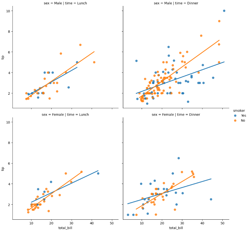
For example, the top left graphic is for males during lunchtime, where the regression blue line is for smokers and the orange is for non-smokers.
In general, looks like Non-smoker men and women tip more during dinner time.
Before You Go
Well, that is all.
Visualizing regressions can be very informative and help you during the exploratory analysis. Finding the best variables for a model is always a challenge, so having more tools like this can be beneficial, especially if you are better at interpreting images than text.
Seaborn brings us the possibility to look at a simple regression model with a single method (lmplot) and little code.
If you liked this content, follow me and check out my website for more.
Git Hub Repository
Find the full code for this exercise here.
Studying/Python/DataViz/Seaborn_Regression_Viz.ipynb at master · gurezende/Studying
References
- Visualizing regression models - seaborn 0.11.2 documentation
- seaborn.lmplot - seaborn 0.13.2 documentation
- FiveThirtyEight Bad Drivers Dataset
- Local regression - Wikipedia
Visualizing Regression Models with Seaborn was originally published in Towards Data Science on Medium, where people are continuing the conversation by highlighting and responding to this story.
from Datascience in Towards Data Science on Medium https://ift.tt/sFUGmb1
via IFTTT


