Awesome Plotly with code series (Part 8): How to balance dominant bar chart categories
Discover the #1 strategy to handle skyscraper bars in your charts

Welcome to the eighth post in my “Plotly with code” series! If you missed the first one, you can check it out in the link below, or browse through my “one post to rule them all” to follow along with the entire series or other topics I have previously written about.
Awesome Plotly with Code Series (Part 1): Alternatives to Bar Charts
A short summary on why I am writing this series
My go-to tool for creating visualisations is Plotly. It’s incredibly intuitive, from layering traces to adding interactivity. However, whilst Plotly excels at functionality, it doesn’t come with a “data journalism” template that offers polished charts right out of the box.
That’s where this series comes in — I’ll be sharing how to transform Plotly’s charts into sleek, professional-grade charts that meet data journalism standards.
PS: All images are authored by myself unless otherwise specified.
Intro — No chart is ready by default to deal with a dominating category.
When someone thinks about bar charts, they often picture clear and easily distinguishable bars that effectively present data.. But what happens if there is a bar that is so big that is dwarfs all the other bars? After reading my earlier Awesome Plotly with code series (Part 3): Highlighting bars in the long tails post, you might say: “Jose, you already showed how to deal with small and difficult to detect bar charts, just highlight them”. That is true enough, except that my previous post was highlighting 2 bars, not all-except-one bar!
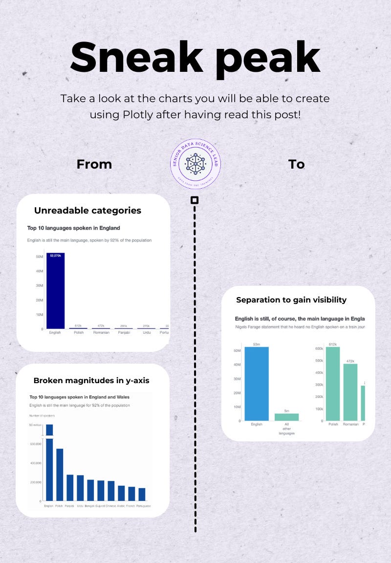
In this post I’ll show you how to present a chart where both the tall “skyscraper” bar and the smaller “one-story houses” are represented equally.
What will we cover in this blog?
- Scenario 1: The skyscraper — Plotting a default chart chart
- Scenario 2: The broken bar — Who invented this aberration?
- Scenario 3: The separation — Providing space for both stories
PS: As always, code and links to my GitHub repository will be provided along the way. Let’s get started!
Scenario 1: Skyscraper bar charts and default plotting issues
Imagine presenting a study about the languages spoken in England, and trying to create a bar chart that effectively showcases these insights. The idea is to focus on the non-English languages, as it is obvious that English is the dominating language. However, you still want to provide a view of how much more English is dominating over the rest. Here is the data you might be working with:
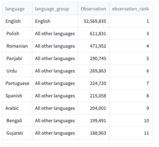
You can see that English is spoken by 52 million people… and the next closest language is Polish with 600k! That is a 86x+ difference! If you were to plot this information through a bar chart, without really considering what would happen to the languages which are not English, then you would find yourself staring at the plot below.
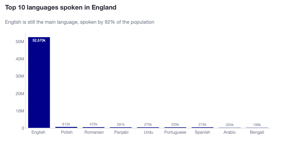
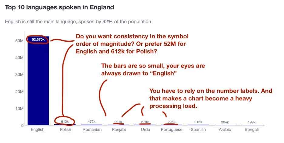
Where do I think this plot has issues?
- It is clear that the smaller bars are so tiny that it is virtually impossible to tell the difference in heights between them.
- Even if you added the data labels, you cannot visually see that Panjabi, Urdu, Portuguese and Spanish are close, with Polish being 3x these languages.
- In fact, because you want to show the data labels with “k” to represent thousands, what happens with the 53 million English speakers? Do you also plot the data label with “k”?
Scenario 2: The broken bar — Who invented this aberration?
My first encounter with a ‘broken bar chart’ was at school, and it’s a method I quickly learned to avoid in professional data visualization. I wish I hadn’t. It made so much sense when I was younger that it stayed in my head until I was faced with a presentation in my adulthood and stared at my broken bar plot with a “wtf” look.
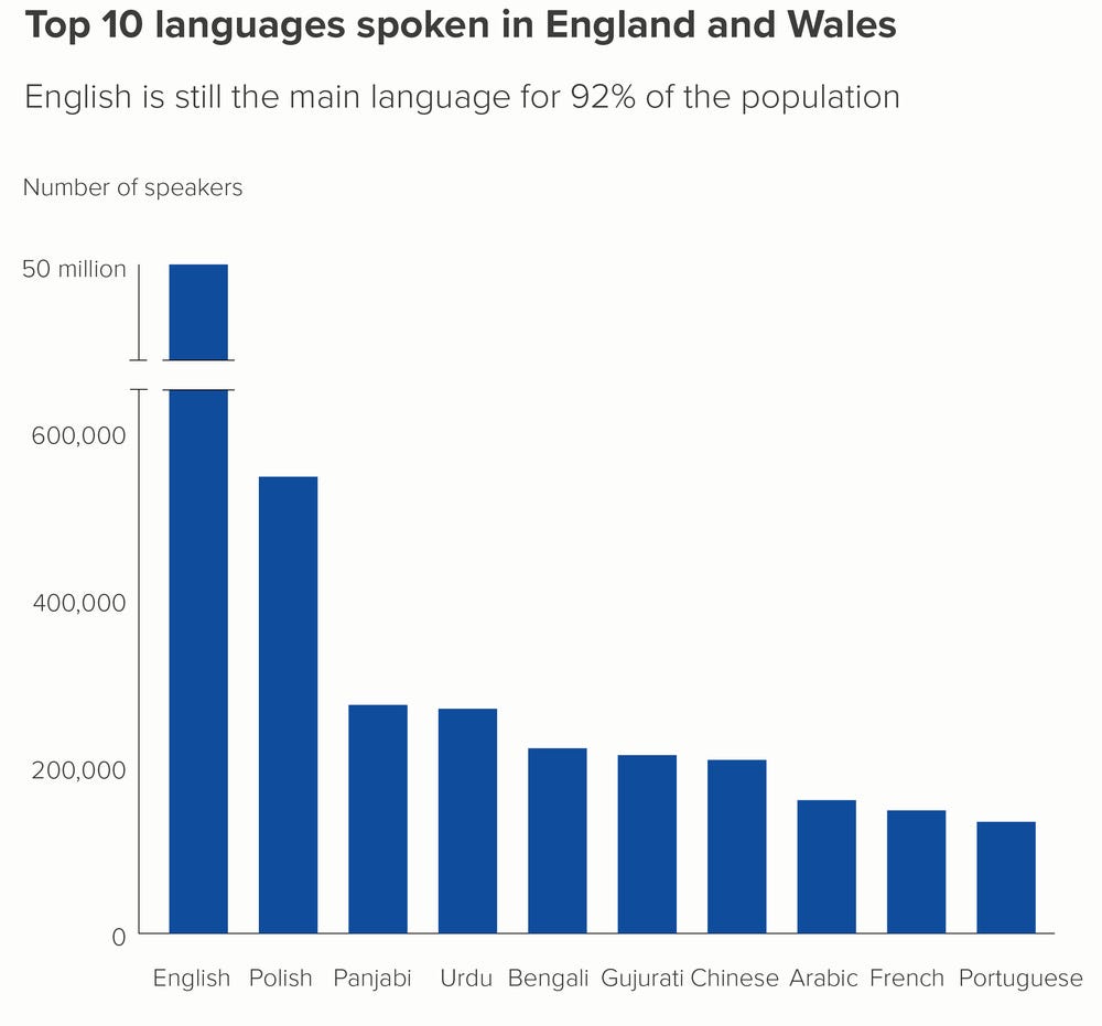
What is a broken bar chart? Well, it is a bar chart where you cut the dominating category. The most common way to break a bar is by using 2 parallel lines. Check the chart below.
Where do I think this plot has issues?
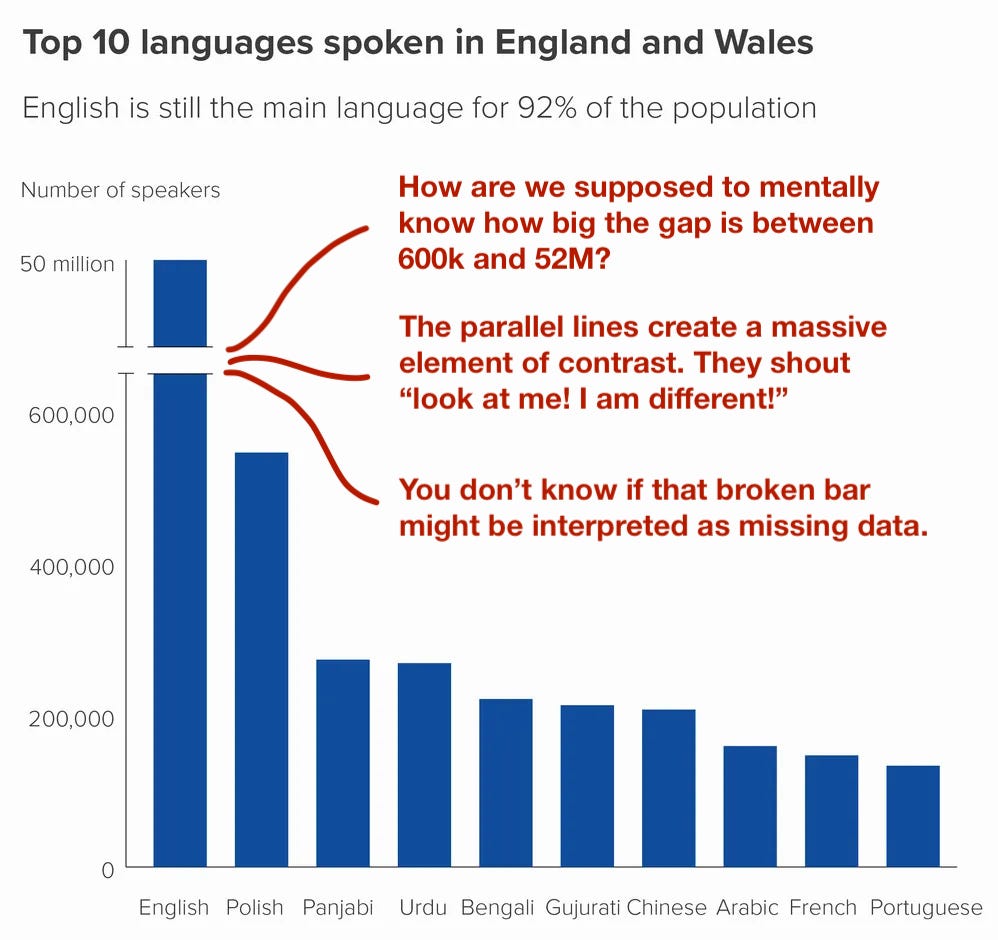
- The most important one is that it breaks the relationship between the rectangle dimension and the value of data. How are we supposed to imagine how big is the gap in the largest bar?
- The broken parallel lines are a massive element of contrast. Our brains are wired to pick up differences, and this one shouts “Look at me!” Therefore, instead of reading the title first, and then focusing on the differences between bars, my eyes went directly to chasm in the skyscraper bar.
- You don’t know if the reader might interpret that the story is about something completely different. For example, why wouldn’t they think the story is highlighting there is incomplete data?
Scenario 3: Using subplots to balance dominant bar chart categories
When faced with this kind of story, it’s much better to go back to the data and work out what you need to chart and why. Remember, you wanted to:
- Show the difference amongst the non-English languages.
- Provide the view of how English is still vastly dominating.
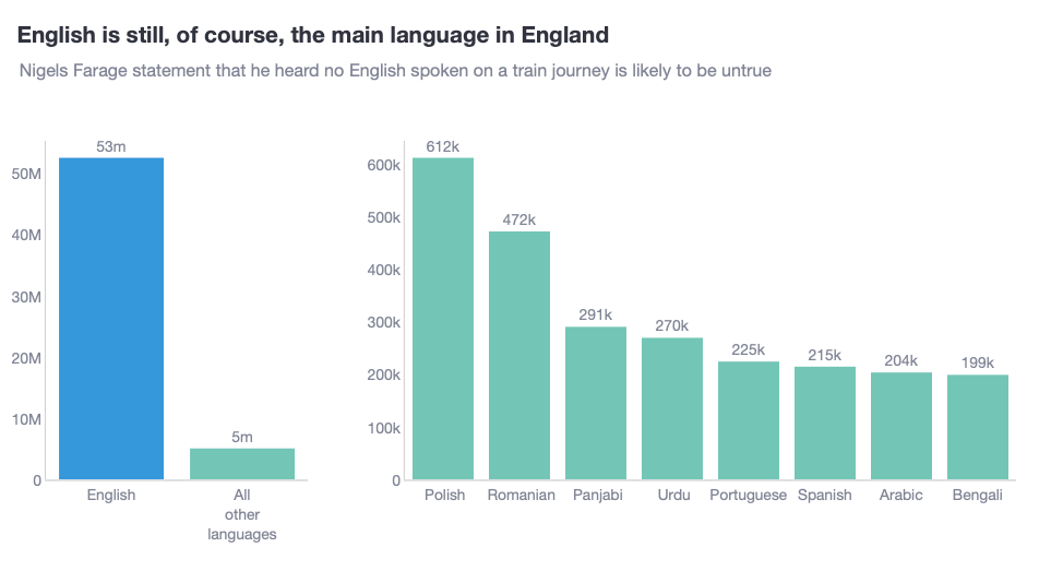
In this case, it seems we want to tell 2 stories. Therefore, my suggestion is to build 2 plots. Subplots are an essential tool in data visualisation, especially for balancing dominant bar chart categories. In fact, subplots should be part of your data visualisation toolkit! Below you can see my take at telling both stories.
Why do I think this plot is better?
- The plot clearly draws a boundary between both stories. The first is above English vs non-English. The second is above the relationship amongst non-English languages.
- The range of the y-axis is different in both charts. To ensure that the reader doesn’t get confused, I have used colour to ensure that the story flows from the “5m” small bar chart in the first plot, to the second plot.
- I have purposely given the first chart a narrower plotting space, whereas the second it wider.
Tips on how to create this plot
How to provide different widths for both subplots?
- Use the column_widths parameter within make_subplots()
fig = make_subplots(rows=1, cols=2, column_widths=[0.3, 0.7])
How to create different charts and add them to the subplots?
- Use add_trace(), create the go.Bar() and specify the row and col you want to assign it to.
fig.add_trace(
        go.Bar(
            x=first_chart_data['language_group_text'],
            y=first_chart_data['Observation'],
            name='main_languages',
            text=[f'{obs / 1e6:.0f}m' for obs in first_chart_data['Observation']],
            texttemplate='%{text}',
            textposition='outside',
            showlegend=False,
            marker_color=['rgb(52, 152, 219)' if lang == 'English' else 'rgb(115, 198, 182)' for lang in first_chart_data['language_group_text']],
        ),
        row=1, col=1
    )

fig.add_trace(
        go.Bar(
            x=second_chart_data['language'],
            y=second_chart_data['Observation'],
            name='other_languages',
            text=[f'{obs / 1e3:.0f}k' for obs in second_chart_data['Observation']],
            texttemplate='%{text}',
            textposition='outside',
            showlegend=False,
            marker_color='rgb(115, 198, 182)',
        ),
        row=1, col=2
    )
How to adjust the aesthetics of the axis for subplots?
- One easy way is to define the parameters inside update_layout(). Here, you can call yaxis1 and yaxis2, and Plotly will loop in the order the traces are being plotted.
- For example, yaxis1 will refer to the subplot in (row=1, col=1), whereas yaxis2 will refer to the subplot in (row=1, col=2).
fig.update_layout(
        ...
        yaxis1=dict(
            showline=True,
            linecolor='lightgrey',
            linewidth=1,
            showgrid=False,
        ),
        yaxis2=dict(
            showline=True,
            linecolor='lightgrey',
            linewidth=1,
            showgrid=False,
        ),
        xaxis1=dict(
            showline=True,
            linecolor='lightgrey',
            linewidth=1,
            showgrid=False,
        ),
        xaxis2=dict(
            showline=True,
            linecolor='lightgrey',
            linewidth=1,
            showgrid=False,
        ),
        margin=dict(t=100, pad=0),
        height=450,
        width=800,
    )
Summary
In summary, mastering bar charts with dominant categories involves thoughtful visualisation techniques, such as subplots, to ensure both large and small values are represented effectively. This blog demonstrates why a single bar chart often fails in this scenario, as the dominating “skyscraper” bar can obscure smaller values, making it hard to see relational differences among them.
Breaking the bar with “broken bars” disrupts data continuity, drawing too much attention to the break itself and confusing viewers. Instead, using subplots is a more effective approach: one plot can depict the dominating category, while a separate plot shows the smaller categories in finer detail. This way, each subplot can use appropriate scaling, color, and space to convey both “big picture” and “detailed view” stories clearly.
Where can you find the code?
In my repo and the live Streamlit app:
Acknowledgements
- Data source: ONS data (CC BY 4.0)
Further reading
Thanks for reading the article! If you are interested in more of my written content, here is an article capturing all of my other blogs posts organised by themes: Data Science team and project management, Data storytelling, Marketing & bidding science and Machine Learning & modelling.
All my written articles in one place
Stay tuned!
If you want to get notified when I release new written content, feel free to follow me on Medium or subscribe to my Substack newsletter. In addition, I would be very happy to chat on Linkedin!
Senior Data Science Lead | Jose Parreño Garcia | Substack
Originally published at https://joseparreogarcia.substack.com.
Awesome Plotly with code series (Part 8): How to balance dominant bar chart categories was originally published in Towards Data Science on Medium, where people are continuing the conversation by highlighting and responding to this story.
from Datascience in Towards Data Science on Medium https://ift.tt/Tog1S9I
via IFTTT


